For March 3

  • Take your learnings from critique and user testing and create a final iteration of your food project.
  • Be prepared to present your final iteration to outside critics. Total time for presentation and feedback will be 7 minutes.
    • I’d suggest presenting via a Marvel prototype, but this is not required.
  • Post your final iteration on the blog and include at least 2 user insights that you learned from prototyping
  • As a reminder, all assignments need to be posted on the blog for you to receive credit, so if you haven’t posted any Project 1 assignments, please post those along with you final iteration.

Boil Monitor – Slides, Prototypes & In-Class User Testing

Here’s my slides of Boil Monitor for latest iteration: BoilMonitor_pt

And Marvel digital prototypes:
iPhone: https://marvelapp.com/13i4103
Apple Watch: https://marvelapp.com/bj2f5d

User insights:

  • The interface and navigation flow was too complex, yet user could figure out where to touch; too much mental load to learn.
  • Without the “>” chevron icon, users don’t know a bar is touchable
  • An Apple watch is a good haptic feedback device.

#thursdayplays – The Mesh

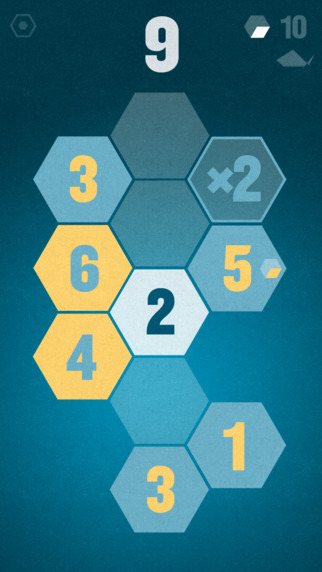
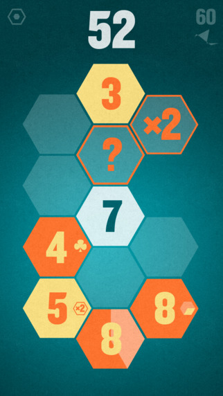
I have been played “The mesh”, which is a mobile game that available on AppStore, for a while and it is really interesting. Basically, players do simple arithmetic–addition, subtraction,multiplication, division, and the only goal is to match the number that shows on screen.


This way to do arithmetic is dragging the numbers. Numbers with same color do addition, otherwise subtraction. If there is a “x 2” cell then it means “multiplied by 2”, and if it is “÷ 2” then it means “divided by 2”. And it is almost everything a player has to know. At the beginning, player has 12 cells and some cell with given numbers. However, if player fails to match the goal, it will remove cells from the view. But the good thing is that player has many chances to get those cells back as rewards during the game play.

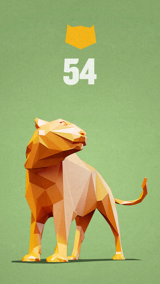
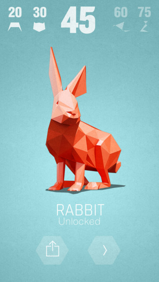
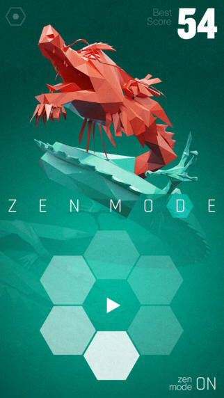
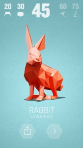
After passing a stage, player will get a geometrical animal statue, which is one of the Chinese zodiac animals. But I have not figured out what roles they play in this game or just awards. But they are really beautiful and amazing design. It is still great if they are just awards.


I am trying to pass all 200 levels but I only get to lv.104 recently. If you are interested in The Mesh, it is nice to give it a try.


Image Source: AppStore


food art app designed prototype + user testing


I did the user-testing and here’s what I found

  • they tried to tap and used other gestures(like swipe) to navigate and they got frustrated because they were expecting some gestures that would normally work and it didn’t.
    (for the moment, I used only tap without adding other gestures for the prototype so that’s why)
  • some of them said the design could be better
  • some of them could not navigate what they are looking for. (for example, I asked them to upload video and some of them could not find it)

What I learned from making paper prototype is that before I design details, I can show the interface and the app flow. For example, where the icons are, what will be the user flow or user experience of having the app and navigate. So it is better for designers to do user test before going into full detail page, in this way, we don’t lose time.

this is my app map and detail viewsAPPMAP

detail view

my app( only tapping..)

https://marvelapp.com/a8db02

This is a prototype tool, it didn’t allow me to add “swipe up” and “swipe down” at the same location so I just made everything tappable to make it simpler. However, I found that was frustrating for the users because they were looking for normal behavior like swiping up and down, right and left.(I need to change that)


Teller App: New App Map and Features

Invision app

After user testing I added a few new things:

  • a more prominent like button in the detail view (1.2)
  • the ability to like and save locations and view other plates from those locations (1.2a + 4.1), the my likes view (4.0) now includes a segmented control of “plates” and “locations”. In the locations segment (4.1), the filter of home-cooked, restaurant, or both is disabled as it doesn’t apply to locations.
  • I added a search view which filters searches using a segmented control of “people”, “tags”, and “locations” (1.1)
  • I created a loading screen

APPMAP


#ThursdayApps – Push For Pizza

When I saw the ad for Push For Pizza, I thought the idea was genius. I’ve never tried the app until now. As expected, it is almost as easy as a push of a button!

I love the ability to change to my preferred pizza restaurant in the checkout, without interfering with my experience of pushing for pizza. Plus, when I browse for another restaurant, I am informed of what toppings are unavailable in restaurants instead of listing a long, adventurous ingredients list.

After exploring the app, I realized how be great it would be to add a topping option for cheese and how less frustrating it would be if the remove button was larger. I had to tap a few times before it responded.

push_for_pizza_02push_for_pizza_03push_for_pizza_01push_for_pizza_04

I chose to examine this app for #ThursdayApps as research for the Go!Curry app to discover ways to engage with users through “personality” and fun and examine how apps simplify their UX to design a flow that ensures my purchase in the checkout!