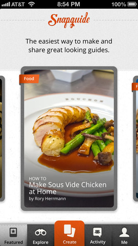
I haven’t downloaded it yet to try; but it caught my eye as I was doing some research for my thesis on mobile apps. I thought it seemed applicable to my research on the best ways to display “How-to” information for my food app as well.
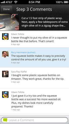
Snap Guide: Snapguide is a simple, beautiful way to share and view step-by-step how to guides. Discover new things to cook, build, wear, play and more. Create your own guides and share what you love making with your friends on Twitter, Facebook and more. Discuss your interests with other people who share your passions.
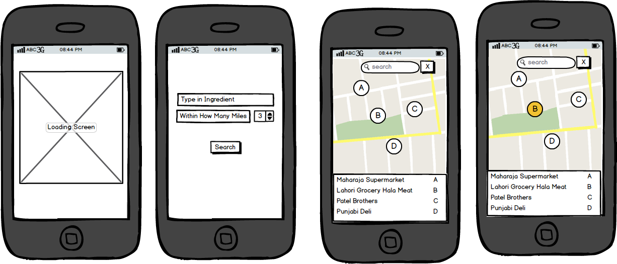
Mission: When moving to a new place or trying out a new dish,it can be difficult to locate the ingredients you need.Find ingredients without having to drive from place to place.
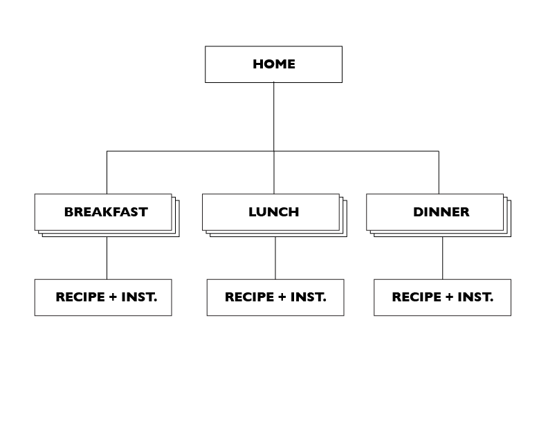
Nothing too extraneous or complicated. Keep it simple with choices: breakfast/lunch/dinner
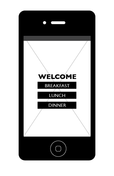
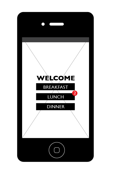
Welcome Page
Welcome page kept simple, but also will have one added recipe updates automatically monthly. or whenever a new menu would arrive.
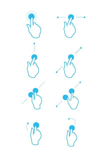
Types of gestures used for this app.
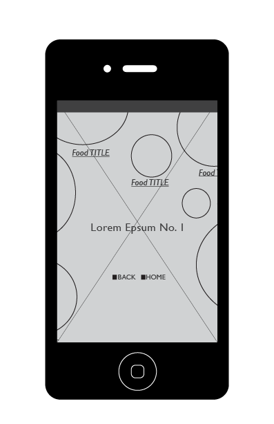
Bird’s eye view of Henry 8’s table setting, in this case, Breakfast.
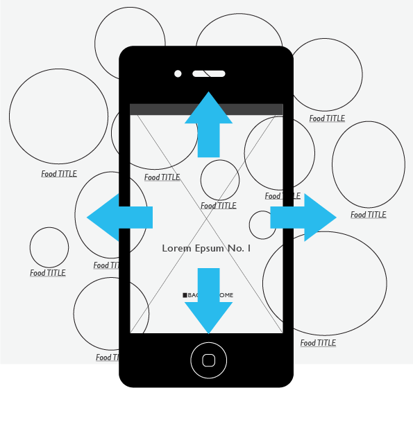
Planning a DIFFERENT APPROACH to other apps. Sort of having a large image (with active links) of the meals spread out that Henry 8th would have. The user would be able to: 1) pinch 2)pull 3)swipe left, right, up down, etc techniques to inspect. There will be opportunities to read recipes and cooking instructions by clicking on the food titles next to dishes.
Chosen “Breakfast”
Once the user selects from the welcome page menu, in this case breakfast. A list of breakfast types would appear.
Chosen Breakfast No.1 lay out…
The user lands on whichever one they choose.
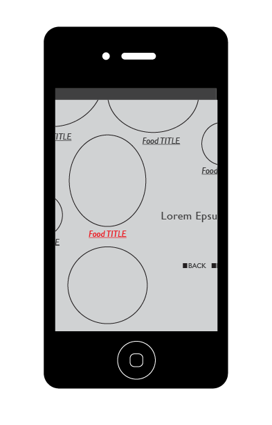
Spread fingers to zoom in if need
The user can zoom in, pinch, pull, swipe up/down/left right and click on the food title once spotting preferred or interesting food/dish.
Food recipe and instructions of Tudor cooking.
Once user clicks on chosen food, the recipe + cooking instructions would swing in from the right. Press close to exit.
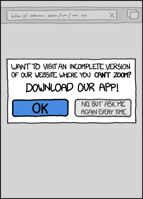
While i love apps, i think that the “appification” of the internet is probably the worst thing that ever happened to the internet. Why i need an App for the Weather Channel? it is so hard to just give the information that i want from the website? i know is not that hard because it used to work that way.
In a related issue, have you tried to read the news on your phone lately, it works like this:
How we used to read the news, back in the era of the Web:
Go to newspaper website.
Click on story.
Read.
How we read news in the era of fucking stupid pointless iPhone apps.
Go to website.
Be told you aren’t allowed to read the website.
Be redirected to an App Store.
Download the app. (This may involve typing in a password. Which may involve shuffling over to your password manager app to find your password.)
Wait while a multi-megabyte file downloads over your temperamental, expensive 3G connection.
Open the app up.
Familiarise yourself with an interface that has cryptic, weird touch affordances that aren’t actually revealed to the user and behave ever so slightly differently from every other similar app.
Struggle as the badly-implemented statefulness gives you a spinning loading wheel (on iOS) or flashing progress bar (on Android) because you had the audacity to use your mobile device on a slow or unreliable connection.
Attempt to find the story you wanted to read using a layout and information architecture that’s completely different from the layout and information architecture of the website that you’ve grown familiar with, because some arsehole decided that the process of reading the electronic equivalent of a newspaper needs to be “disrupted” because he’s been reading far too much Seth Godin or some other bullshit.
Realise that the app shows you different things depending on whether it’s in landscape or portrait mode. Now you can look like an utter nob on the Tube rotating your iPad around so that you can zoom further into the Page 3 stunna’s tits.
Not be able to share the story with your friends because it’s not a page on the web with a Uniform Resource Indicator. Because why do you need universal addressability when you’ve got shiny spinny touchy magical things to rub your sweaty greasy fingers all over?
Take time to download updated binary files the next time the application is updated in the App Store, that’ll provide you “new functionality”, even though there is no fucking functionality you actually want other than reading the fucking news.
If you are on Android, be sure to install some anti-adware softwarein case the app comes with some delightful bit of creepy privacy-intruding out-of-app advertising.
Give up, go to newsagent, buy paper edition, throw smartphone off a fucking cliff and start a letterbomb campaign against all the idiots who thought that turning newspapers into “apps” was a good idea.
In the “web vs. apps” war, I think you can infer which side I’m on. I wouldn’t download a BBC app or an NPR app for my computer. Why would I want one on my phone? Do I buy a separate radio to listen to different stations? No. The functionality is the same, the only thing that differs is the content. Apps ought to provide some actual functionality, not just blobs of content wrapped up in binary files.
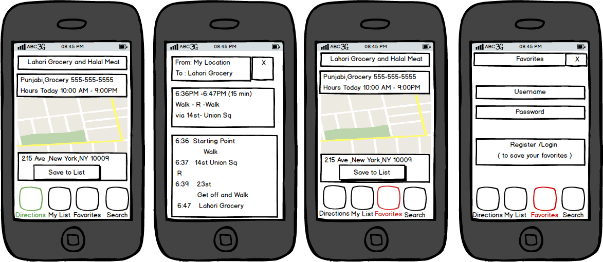
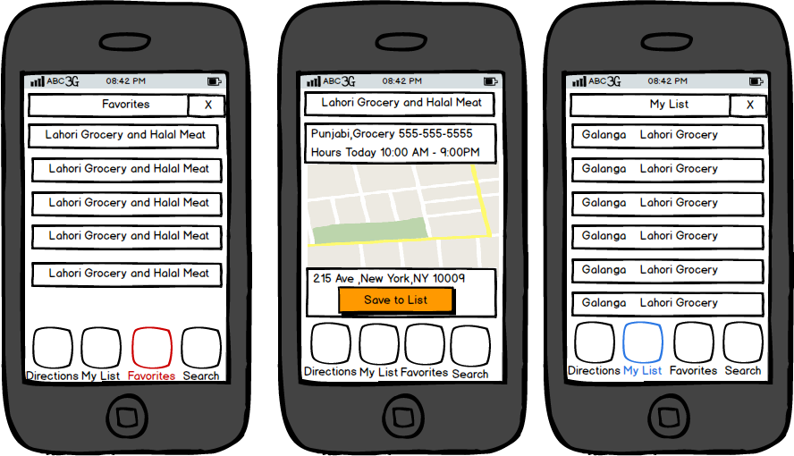
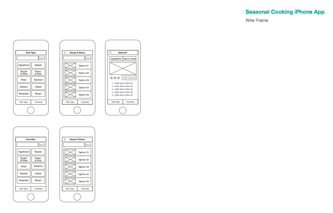
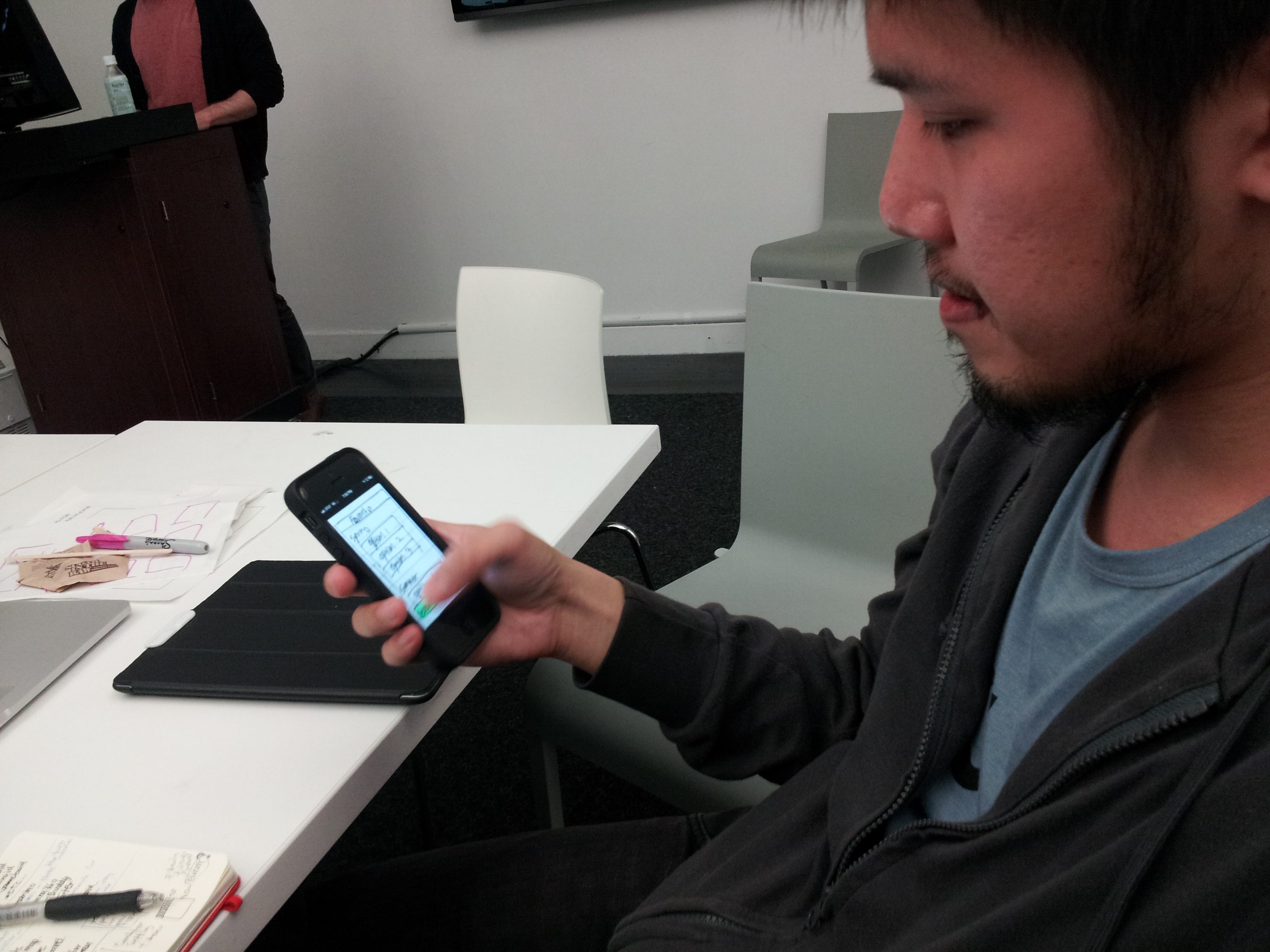
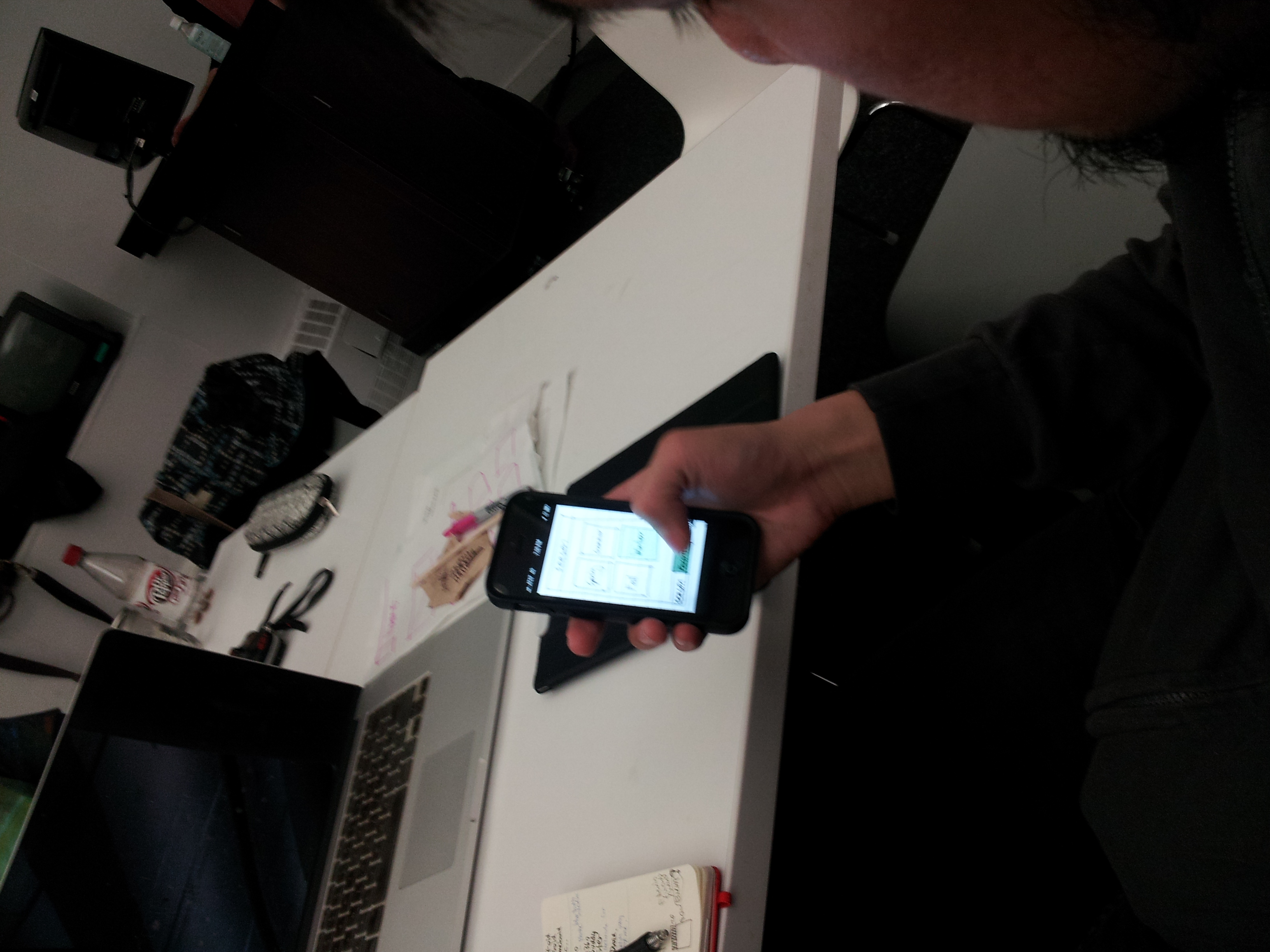
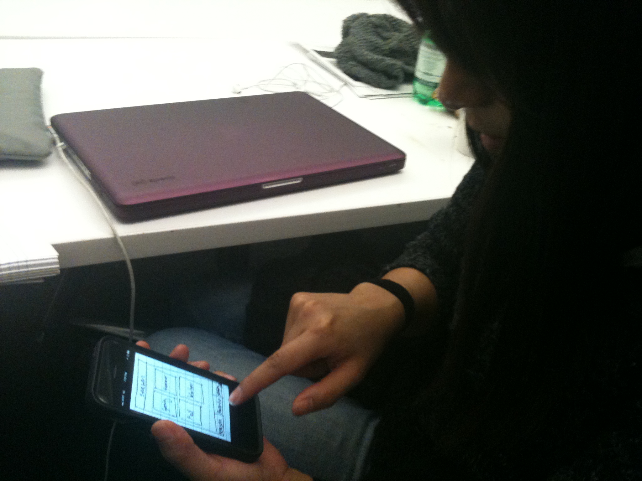
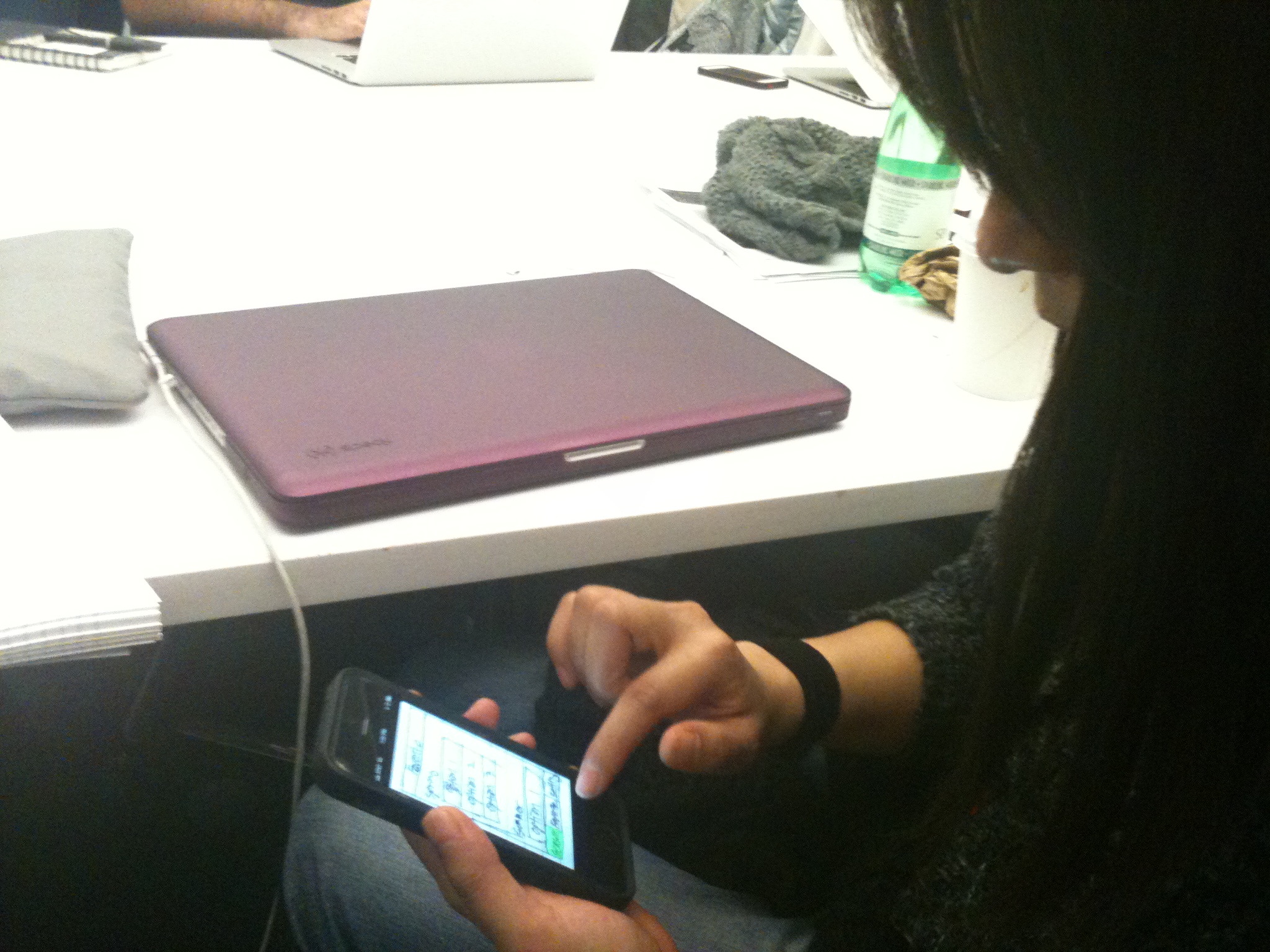
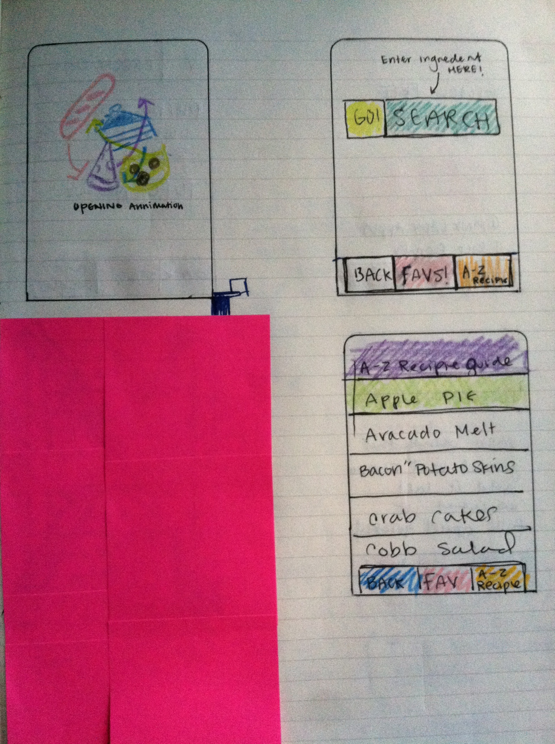
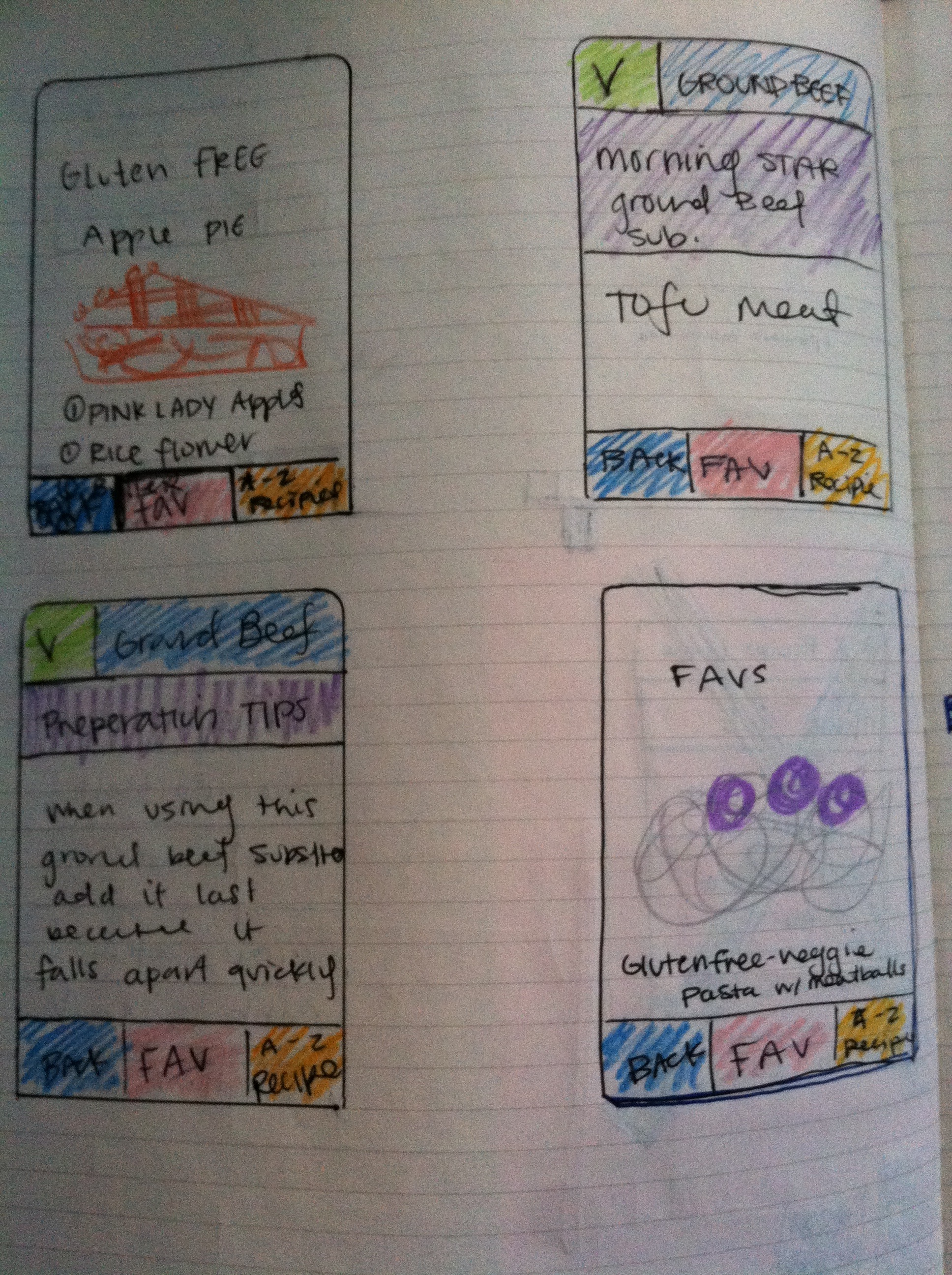
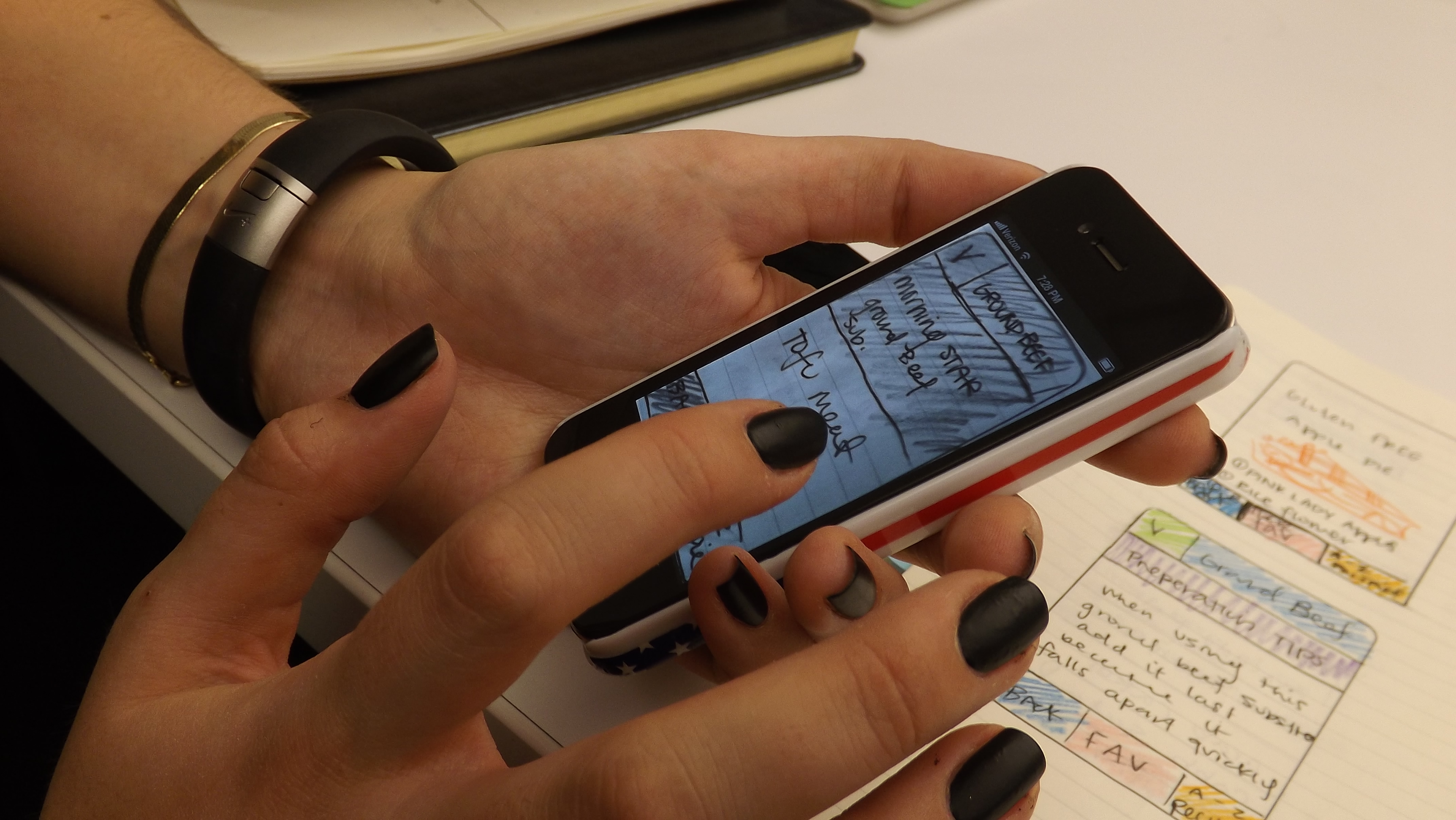
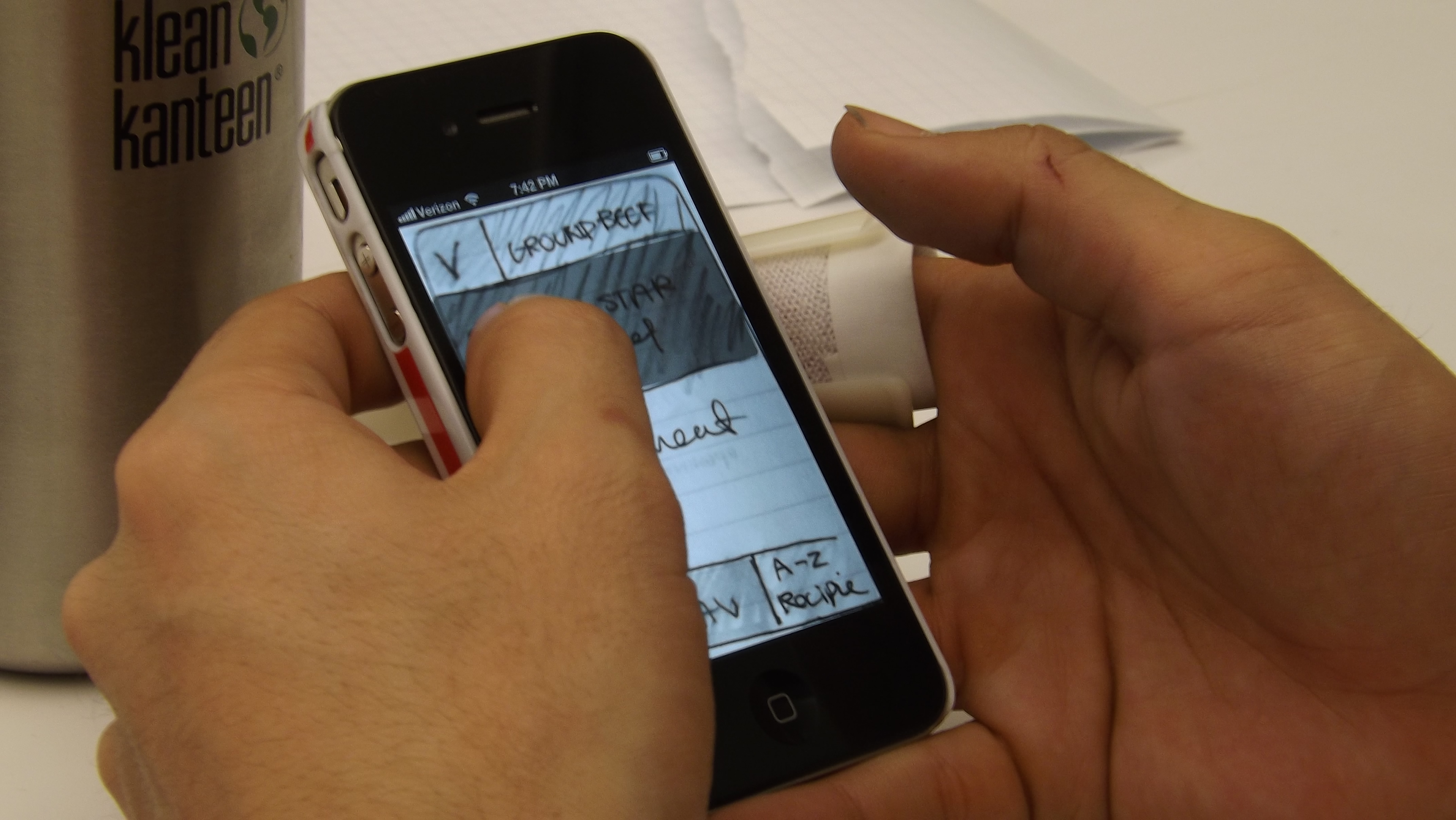
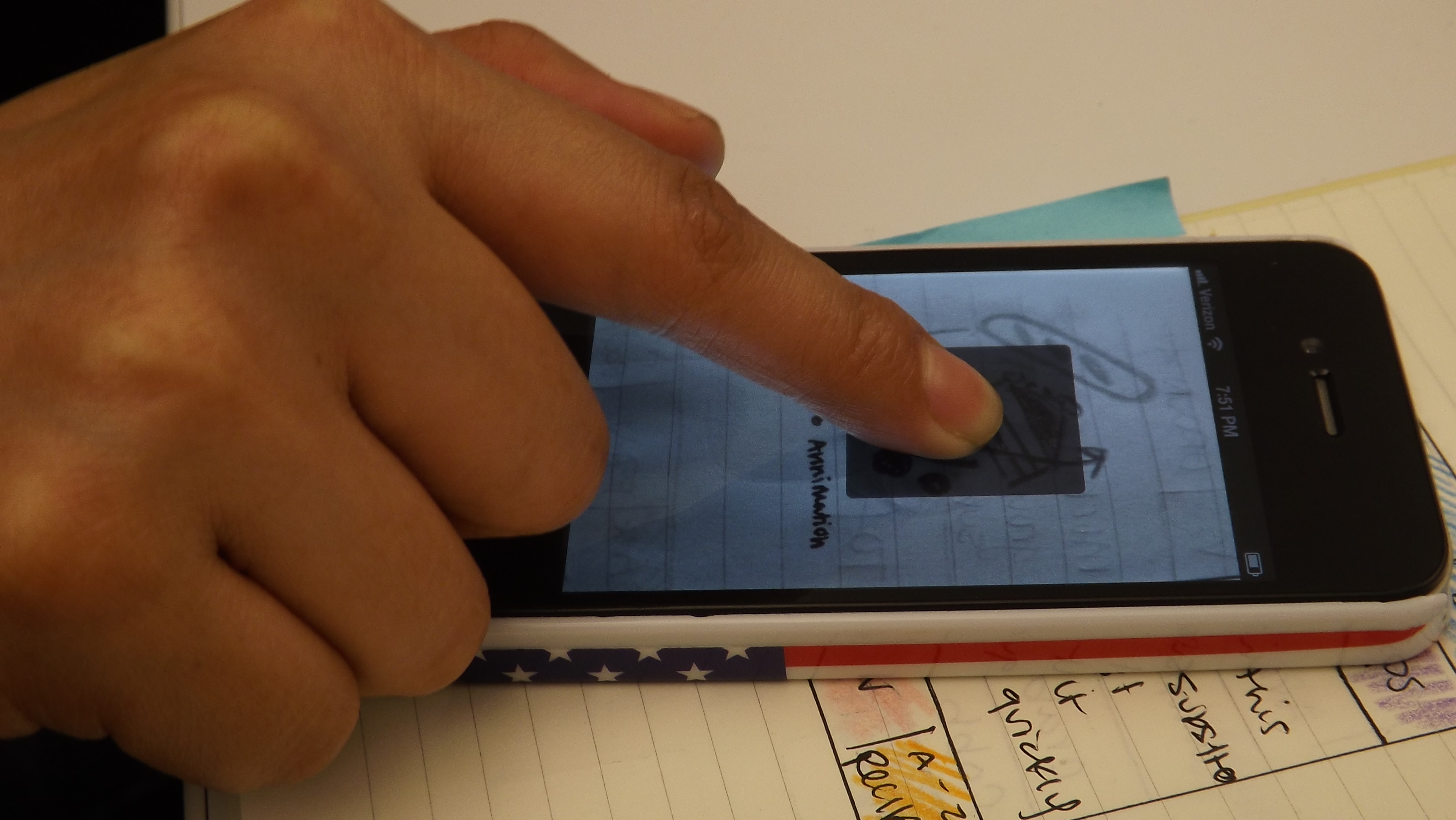
Here are a few images of additional wire frames and user testing photos. After user testing I was able to discover areas for improvement and I will revise my work based on the feedback provided.