We prototyped this app with Dan Kawasaki our user experience instructor and some of the insights and feedback we got were:
think about creating a reverse editing function, where all the media is automatically selected and the user then goes through and removes any content they dont want to use instead of having them add the content they want to include.
more editing functions for controlling speed of the content
including automatic editing filters for the stories
creating a user path on the map where you can see where you went through trail
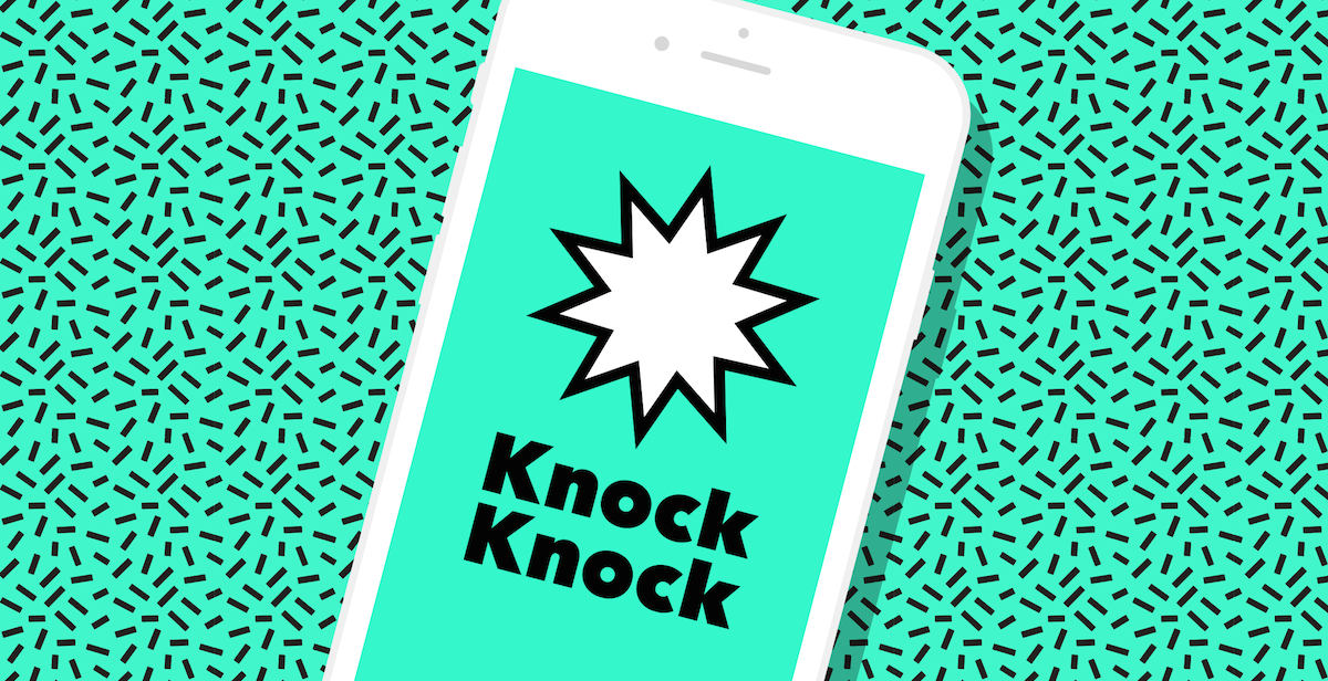
Knock Knock is contact sharing app which aims to remove the awkwardness in asking for the contact of a person you just met in a party or school . One can initiate contact sharing by knocking twice on the phone(assuming that the other person you want to share your contact with has the app already). This gesture brings up the knock knock app , even when the screen is locked.This app uses the phone’s accelerometer and gyroscope to enable that gesture even when locked.On the app, you can see only the people who have Knock Knock installed and who are within Bluetooth range. You can tap the person and they will get a knock notification on their phone. From there, they can either choose to connect with you or not, and you can also select just what information about yourself you want to share.
I want to introduce a simple, aesthetically pleasing and fun game called Stack. Rule is simple: there are blocks coming from 2 directions in a 3d environment, when user taps the screen, the block will stop to pile up. Stack up the blocks as high as you can by tapping the screen at the right time to get a high score.
The game mechanism is simple, and people love stacking blocks. This game is addictive, my original goal was to score over 50, once my score reached, I got even more motivation to continue to play.
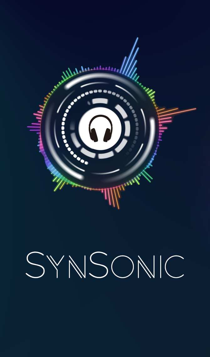
I wanted to also take this time to plug fellow MFA DT candidate Kiyo Yamazaki’s thesis project SynSonic which is also available now in the app store! I’ve been playing around with the app and I think its a really fun tool to create unique sound visuals through your phone.
It allows you to create some pretty cool dynamic content through the ambient noises through your microphone or allows you to choose a song from your music library.
I played around with the app on my rooftop in Brooklyn recently and the results came out very impressive.
This is not a new app but I recently discovered it within the past few weeks and wanted to give it a try, the function of the program / app is to reduce the amount of blue light emitted from you computer screen or mobile device which in turn is suppose to help with increasing your quality of sleep. I tried testing it out for approximately a week and I can say that this did seem to help a small amount.
However, I’m not sure if it was because of the reduction in the blue light from flux or it was because when the color temperate on the screen changed from normal to yellow indicating I should I be getting ready for bed that I decided just to close my computer and not use it for the rest of the night. However, as a designer needing the correct colors when working with creating design work this caused me to stop using the application. But I think it is a good tool to help remind you get off the screen and rest your eyes.
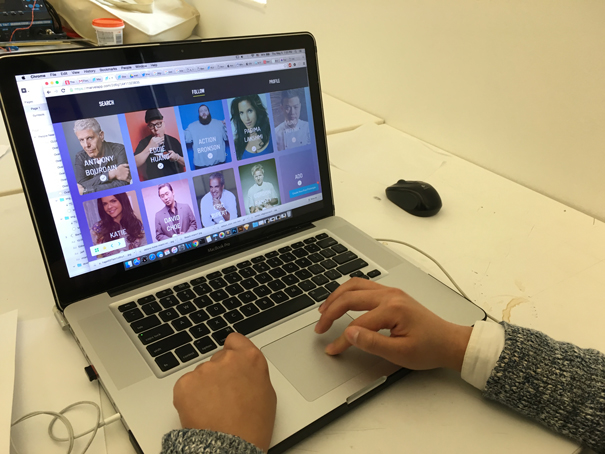
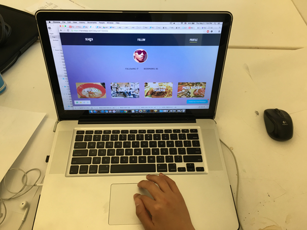
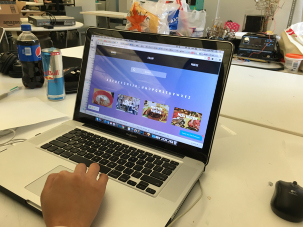
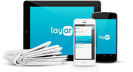
For my second Thursday Play, I am reviewing a VR/AR app, Layar, which I have been using for prototyping over the last few weeks. You can also check out this post on my personal blog.
What is Layar?
Dutch startup Layar is considered one of the front-runners in developing augmented reality interactions, famous for their Layar app for Android and iOS which lets users use their phones camera to ‘see’ digital information on top of A/R enhanced objects.
“Layar connects our digital lives with the physical world. With the Layar Creator, a self-service web application for activating print pages with digital content, Layar is pioneering the interactive print movement and paving the way for a more robust future for the publishing industry in a digital age.” Layar Website
I came across Layar last month when I needed to prototype an augmented reality experience my groupmates and I had created. In the middle of installing UNITY and ordering a Google Cardboard, my teacher suggested this website/app experience to us as a way to more easily prototype what we were trying to show. For this purpose, it worked great, although it had limitations on the free account regarding WiFi connection, advanced features (as usual).
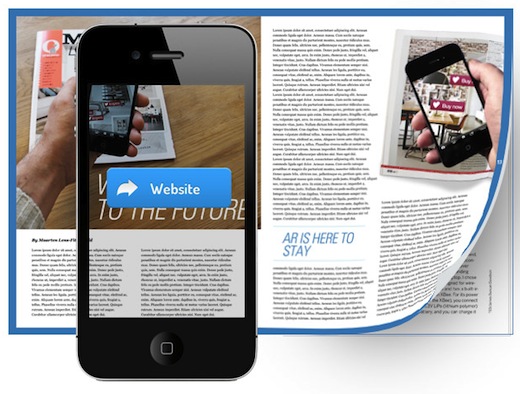
However, Layar’s strength lies in its development web app, Creator which may have the potential to transform, or at least keep transforming, digital publishing. Creator, paired with Layar, allows publishers to make static printed publications interactive by using a smartphone to create virtual/digital layer on top of the content. Publishers can include things like videos, links, buy buttons and attach them to any image that they scan in and set (think a QR code, but any actual image).
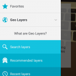
It also includes Ge0-Layers which is an A/R interactivity feature triggered by geofencing that a developer sets up using a connected JSON database and API. This part of the Layar experience is in contrast to the scanning images method, and is actually a whole separate part of the app. I didn’t get to explore this much because it’s a paid feature to create maps, but from a user standpoint – I checked out a couple of public ones – it seems to work really well.
The App
The Layar app itself supports the Layar experience, allowing the extended A/R functionality to work on user’s smartphones.
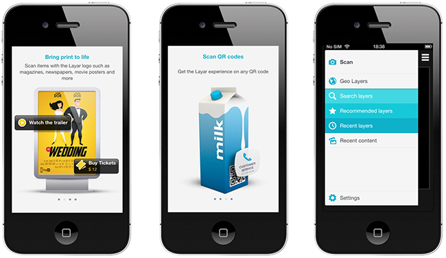
As far as an app goes, it is very simple, with few screens. I have broken down the user-flow in the following slideshow. You can also see a demo of the app below.
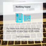
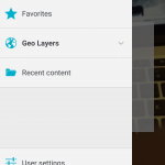
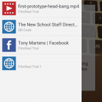
It would seem that the Layar app’s main functionality would be to scan for A/R layers, given that this is the home screen, and all else is accessible via the hamburger.
However, given that the Geo-layers menu button is actually a drop-down with much more hidden under it, I am a bit confused about why the app is organized the way it is. Are geo-layers not as important as scanning for an A/R layer with the phone? Is it newer?
One downside of this app is that the geo-layers are great because they actually alert you when near a geotag for the taggable thing. However, given that you need to actually scan something to get the layar experience, you have to know that you can scan it first and that it is A/R enabled.
Until a critical mass occurs and people assume that most things are A/R enabled or “layered”, I don’t think that a given user would find it easy to know what/when to scan for the additional content (unless maybe they partner with a specific publishing agency to do a promotion around this and EVERYTHING of there is scannable, and users know.)
At the end of the day, I think A/R has some really interesting potential and that Layar is beginning to explore some of the applications we may see with it in the future. While the navigation and some of the core functionality is confusing in terms of priority, I think that overall this is a great app for prototyping A/R experiences, and maybe one day it will be a good app for supporting them in practice as well.
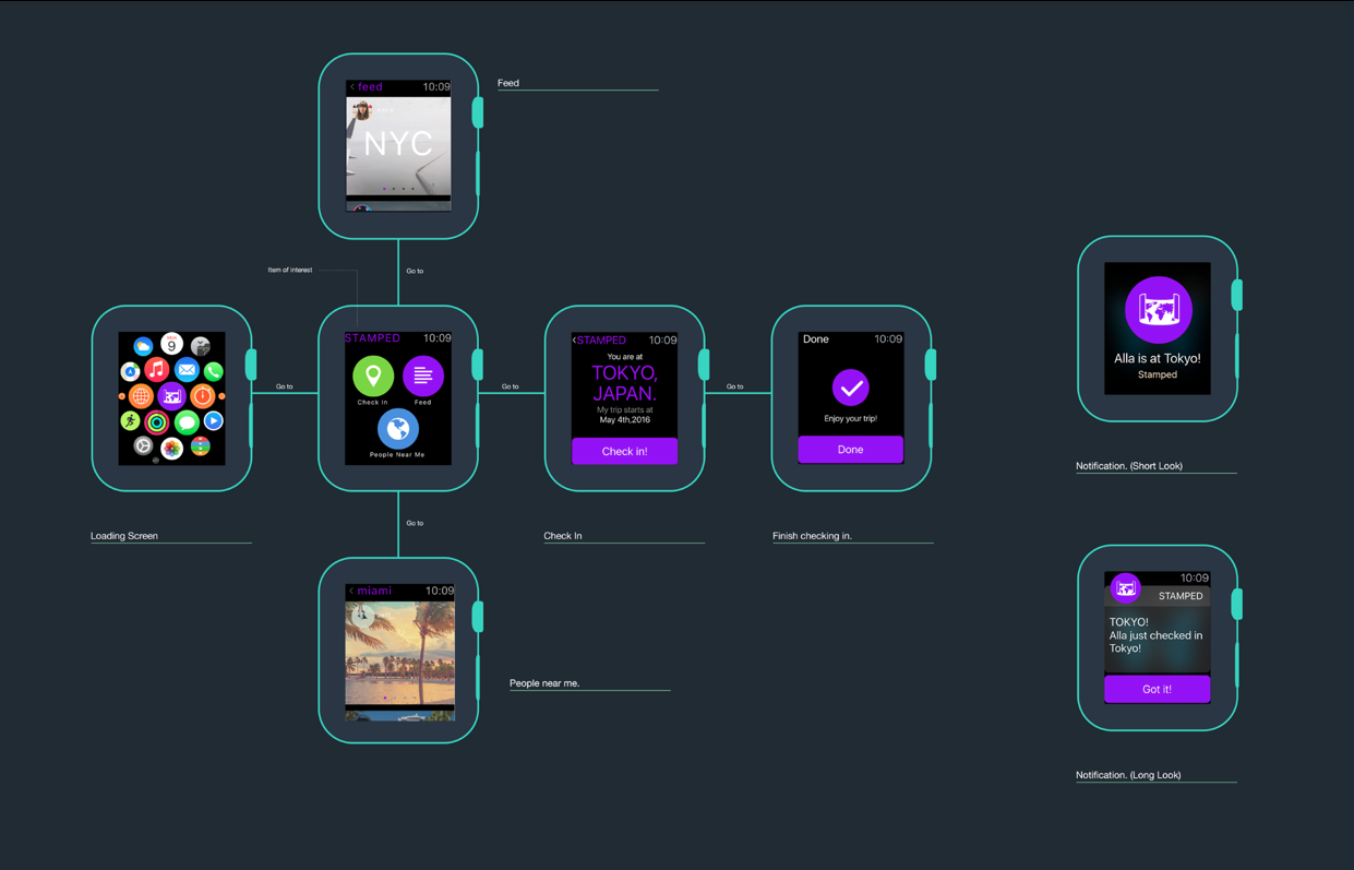
For the next iteration of our final project, Sneha and I were asked to reimagine functionality within our apps-in-progress for either an Apple Watch or AppleTV experience. Alternatively, we could explore accessibility functionality for the app on the phone (e.g. for those with vision or hearing impairment).
Given the purpose of FreeBox, to help students discover and share extra project materials on campus, we thought that the Apple TV experience would be irrelevant. Since the freeboxes themselves are located on campus, and half of the app’s core functionality is to show live streams of the different boxes, allowing people to see what is available and head over to check it out, we thought there would be no reason to be able to want to see it in your TV at home. Makes it kind of hard to get to the nearest box when something cool is added.
Given that this part of the apps functionality is both in the spirit of serendipitous discovery and that it has a certain immediacy and voyeurism about it – you are keeping an eye on the freebox and want to be the first to get there when something you want is added – we thought that it would fit nicely with Apple Watch.
Apple’s Human Interface Guidelines specify that Apple Watch app experiences should be lightweight interactions that support personal communication and maintain a holistic design (using both the watches hardware and touch interface as a seamless UI). After learning about these specifications – neither Sneha or I have ever used an Apple Watch – we both thought that it sounded like a perfect fit for Free Box, but also inspired us to make a couple of quick changes to the actual app to better support the watch experience – and app experience overall.
Add a “Pin to Top” function for messages. This will allow you to tag a message to that appears with a pin badge and is sticky to the top of your inbox. This will allow you to quickly save messages for later with the watch app.
Push Button Update Alerts: We had before discussed our idea to include one small on-site interactions near the actual freebox. We really want the whole act of leaving things at the Freebox to be as easy as possible, but we realized that people needed to see what the table looked like on the stream ( to arrange items in right way) and a way to update others that something was added.
Without this functionality, it might be a little too abstract for people to check a live stream of the Freebox, and a bit boring. With this solution, people can also subscribe to location alerts – something users rated highly desirable during our user testing surveys – and be updated when the freebox there has been updated. This also allows us to connect the Apple Watch to the app in a really concrete way.
The purpose of Freebox Apple Watch is to bring the immediacy of receiving important updates right to your wrist. Many apple watch apps use the watch interface to handle updates and quick interactions with content, and we think that this approach is best.
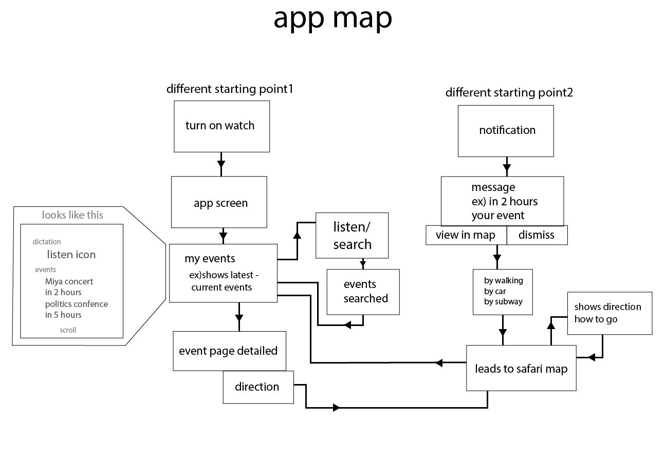
Core Apple Watch Functionality
Obviously, this means we need to cut down the functionality for the Apple Watch version of the app to only handle managing alerts and only really going one or two interactions deep into engaging with the content (e.g. reading and responding to a message)
With this in mind, we cut down the functionality for the watch to he following:
App Itself – Will show a stream of subscribed alerts for different types of app updates. Can scroll through and check.
Alerts – 3 Types
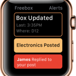
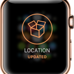
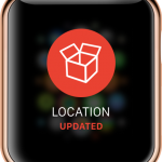
Freebox Location Updated – Activated when on-site push button hit and user is subscribed to receive location updates for that box
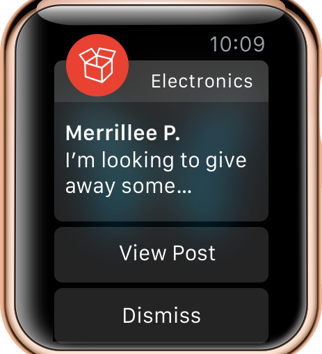
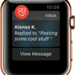
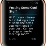
Message Replies – Activated when user receives a reply to a message board post, or to one of the messages they sent to another user
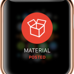
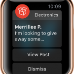
Tagged/Subscribed Material Updated – Activated when a post that has a certain material tagged (e.g. electronics, fabric, wood etc.) is added to the message board
Testing The App Out
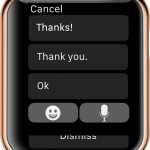
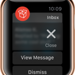
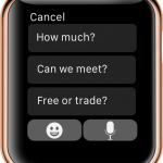
After making a couple of screens with how we thought the alerts should look, we were lucky enough to have a friend who owned an Apple Watch take a look and let us video her getting different types of updates and responding to messages. We learned that updates have a really cool animation where the app logo pops up then fades back into the message detail view that comes up after. We also realized that you have to use the crown on the watch (the circle on the right side) to go back to the watch home screen, or to exit the app when finished. Finally, we learned that you can swipe on the screen to bring up contextual menus to quickly edit/dismiss messages.
With these insights in mind, we redesigned our screens and started the interactive prototype on InVision (wanted to mix it up for once).
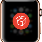
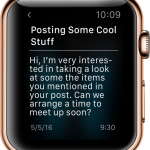
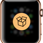
Pictures From App
Watch Home
Alerts Queue
Message Reply Alert
Message Reply Alert Detail
Message Reply Alert Extend
Contextual Response Keyboard
Material Alert
Material Alert Detail
Box/Location Updated Alert
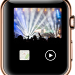
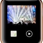
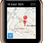
Freebox View
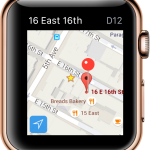
Map View
Feedback from Class & Changes
We presented our Apple Watch app to class last week and demoed how the app could be accessed from the home screen, as well as getting an alert come in. We had overall positive feedback however, we did make some mistakes with how apple watch apps can work in general and conventions/restrictions for in-app designs (logos, colors etc.)
Can’t Have Different Alert Colors – Must be App Icon
Video is Good to go! Can show the video on the watch, as well as opening up on the phone (will improve handoff to phone)
Contextual dismiss menu for messages is okay to have as back-up, but still need dismiss button to be there
Can fit lines of text in messages
After this feedback we fixed up the app and re-did the screens to incorporate the new changes.
Check out the new screens and our interactive prototype below.
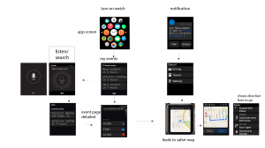
New Pictures From App
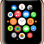
Watch Home
Alerts Queue
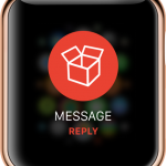
Message Reply Alert
Message Reply Alert Detail
Message Reply Contextual Menu
Message Reply Alert Extend
Box/Video View
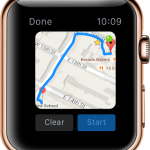
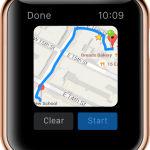
Map View
Navigation Map View
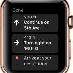
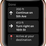
Navigation Steps View
Material Alert
Material Alert Detail
New Contextual Reply View
Interactive Prototype (Invision) – Most Final Version
Here is the most up to date version of our interactive prototype on InVision. We will text this with one or two apple watch users to make sure the changes work with the platform, and demo next week as part of our connected experience for our final.