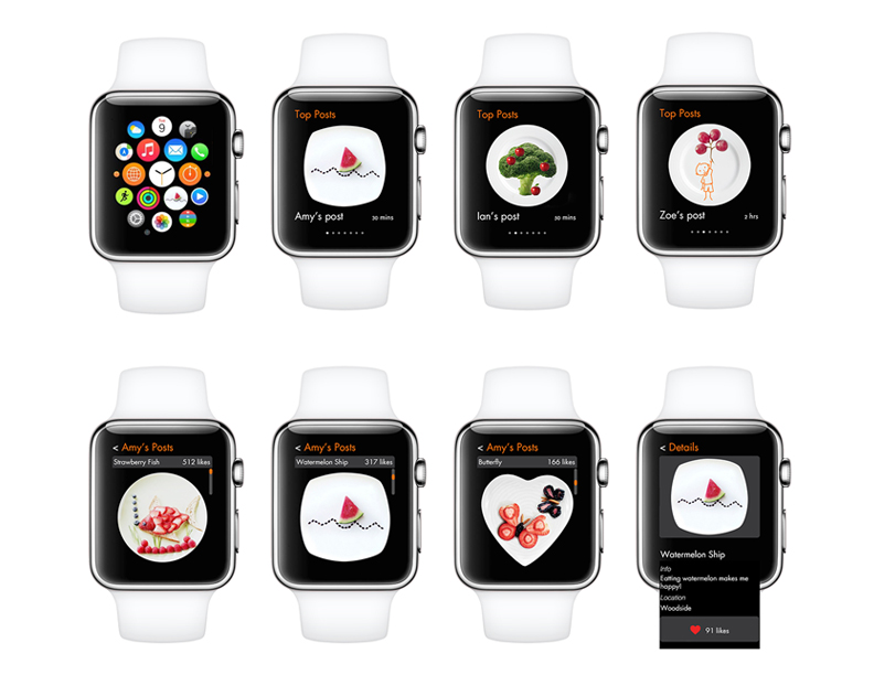
O K A Y?_App Recommendation Yihan

O K A Y? is a game that refreshing break away from the typical mobile games that are released. First of all this game received a 5 star rating from me as a result of its overall composition as a game. Artistically this game is great and uses a minimalistic style. It also incorporates a clever use of sound throughout the game that brings a delightful mechanic to the gameplay that compliments its artistic endeavors. Whereas the gameplay isn’t particularly deep or necessarily revolutionary its creativity and overall assembly stand out from it’s peers.


Download in APP store.
China AQI – What I Learnt From Paper and Digital Prototyping

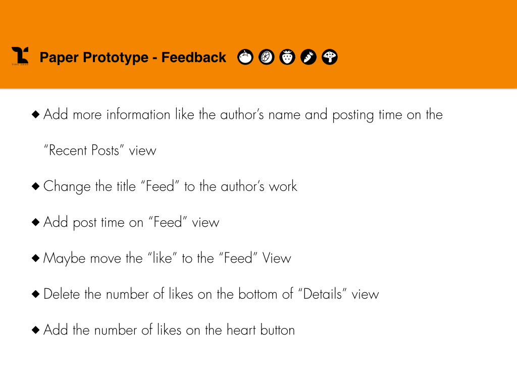
According to the feedback based on paper prototype, I improve the following aspects in my design:

  • I add the Air Quality Index in the long-look notification view. It was pointed out that it would be better to let user have a brief understanding of basic parameters.
  • In the main view, a user can allow the app to show multiple cities in a list. Some people liked this capability, while others expressed that they might only care about their current location. I keep this function for people to customize, but highlight the current city with an compass icon.
  • Also in the main view, AQIs of different cities have already been color-coded. It was suggested that the city names were not very clear compared to the numbers. So I prioritize the city names by putting them above AQIs and increasing the font size. AQIs remain their colors with a smaller font size.
  • There was a lot of text in detail views for specific cities. I add health advice icons as visual aids and reduce the text to facilitate reading.

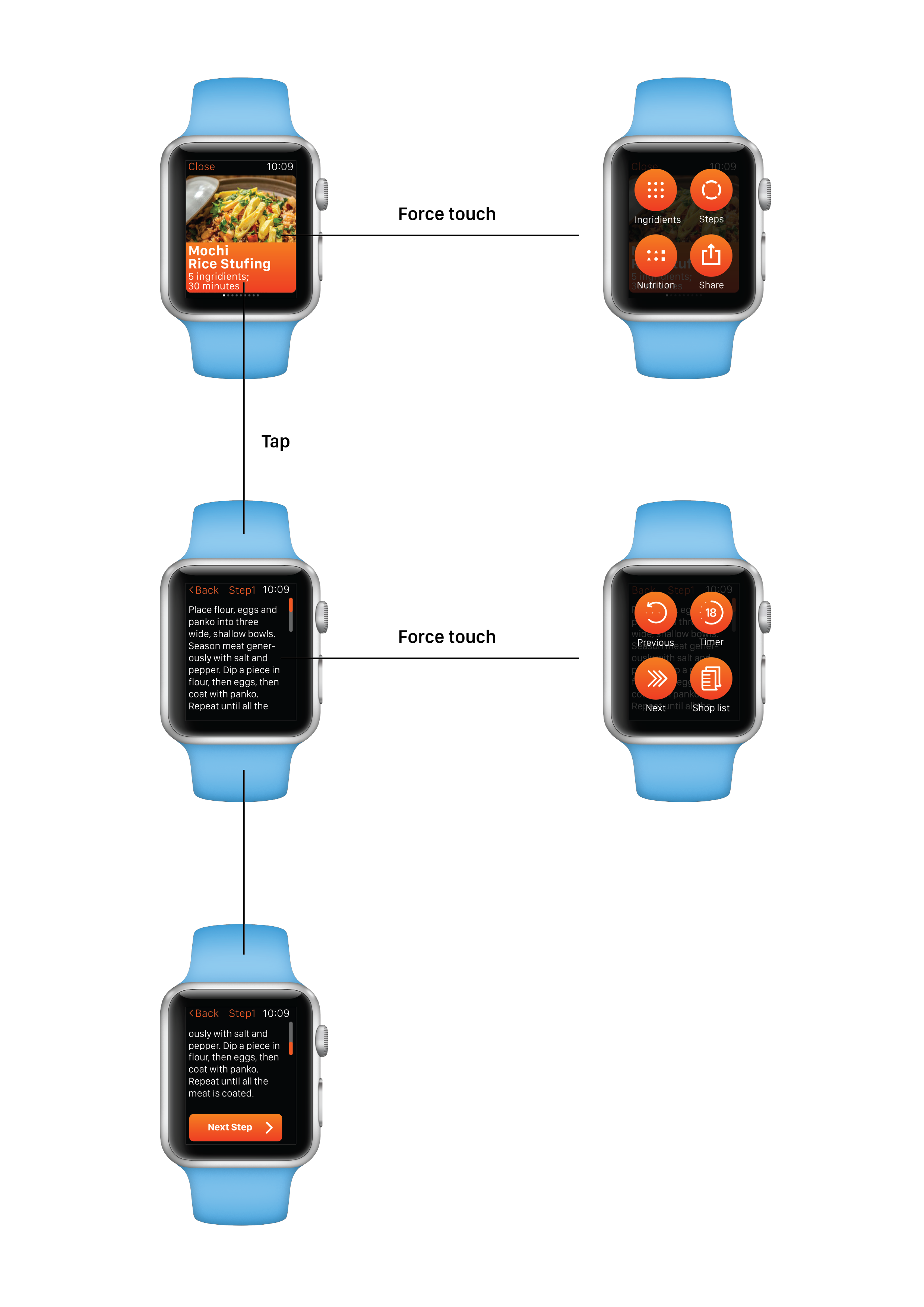
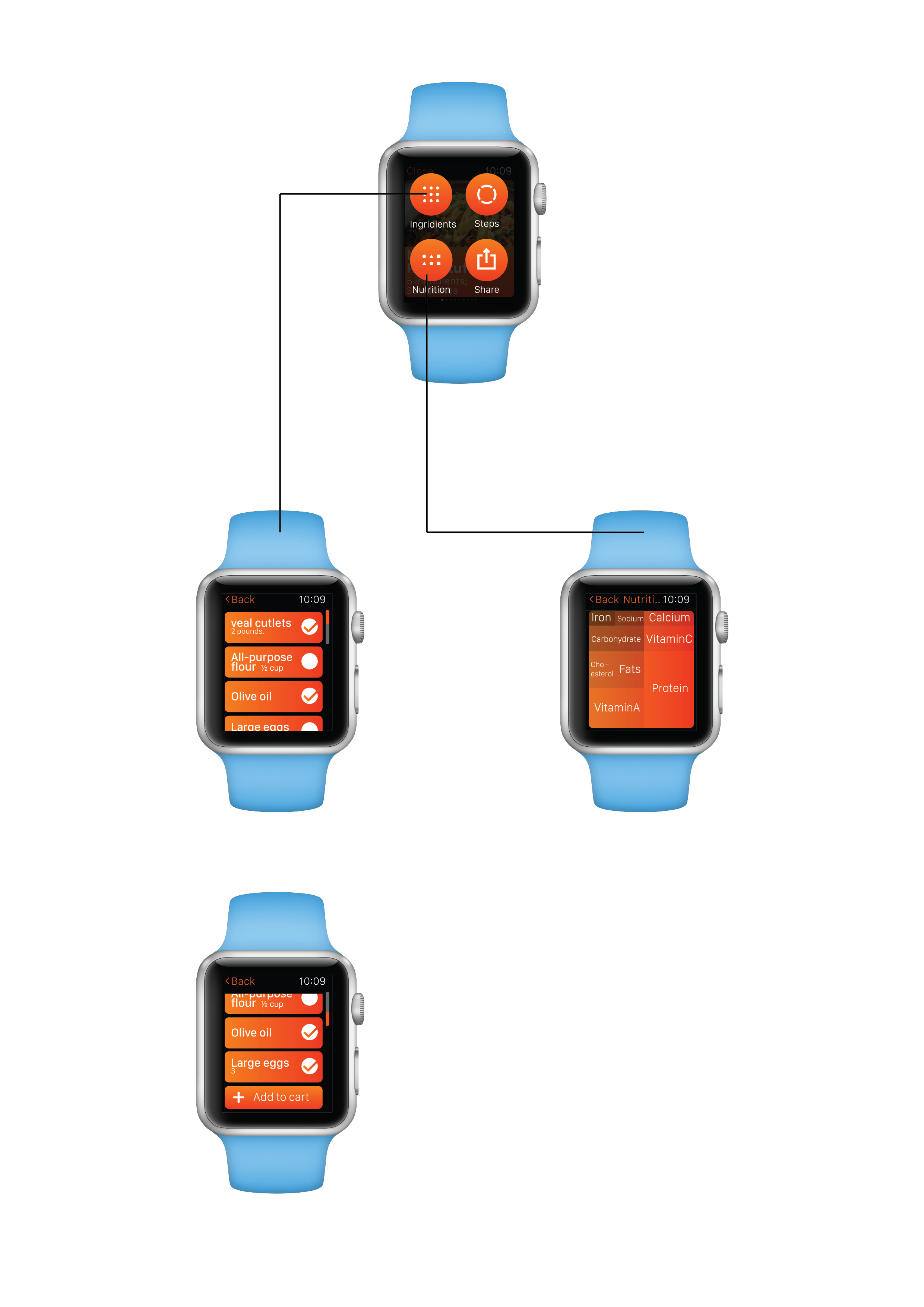
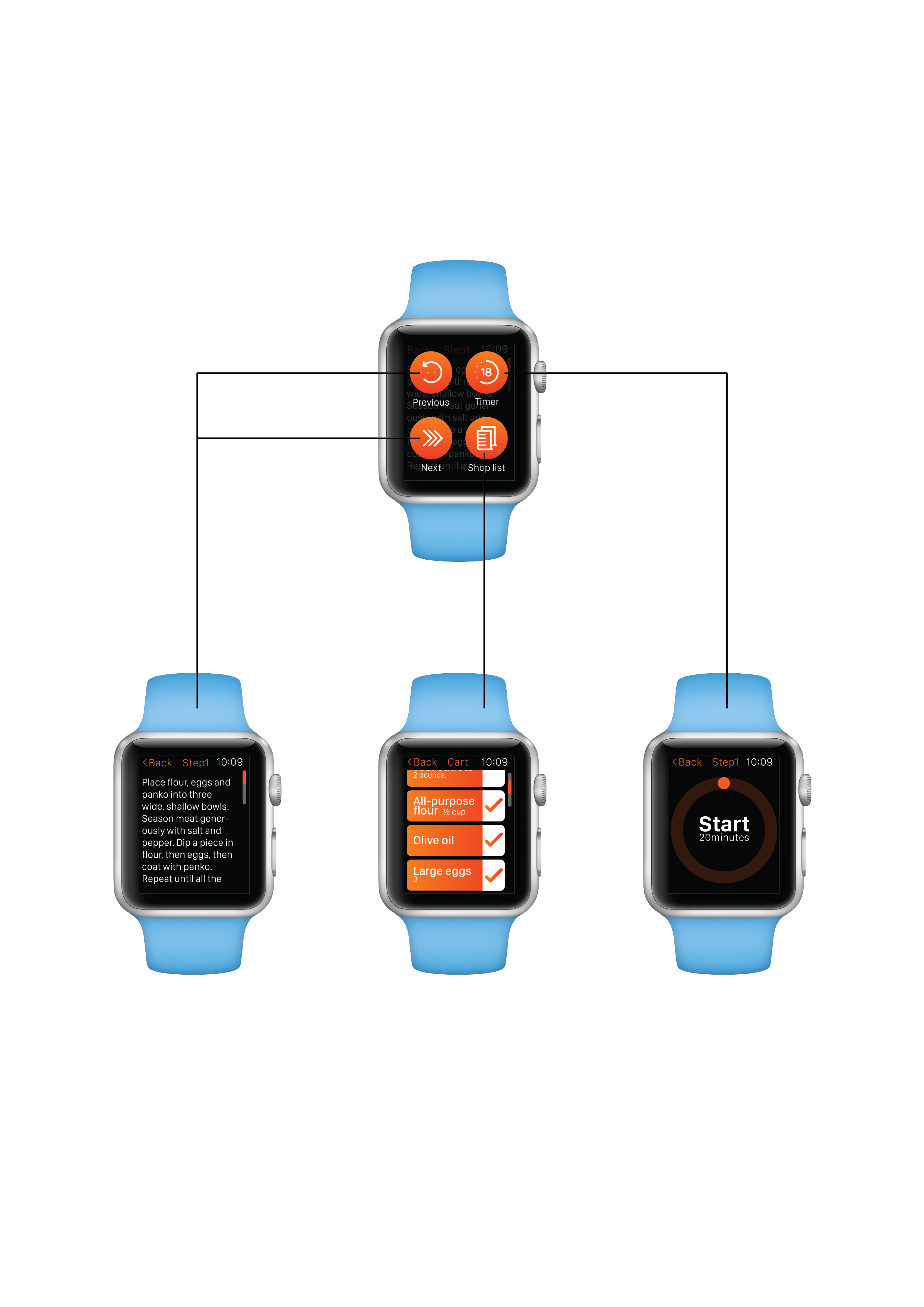
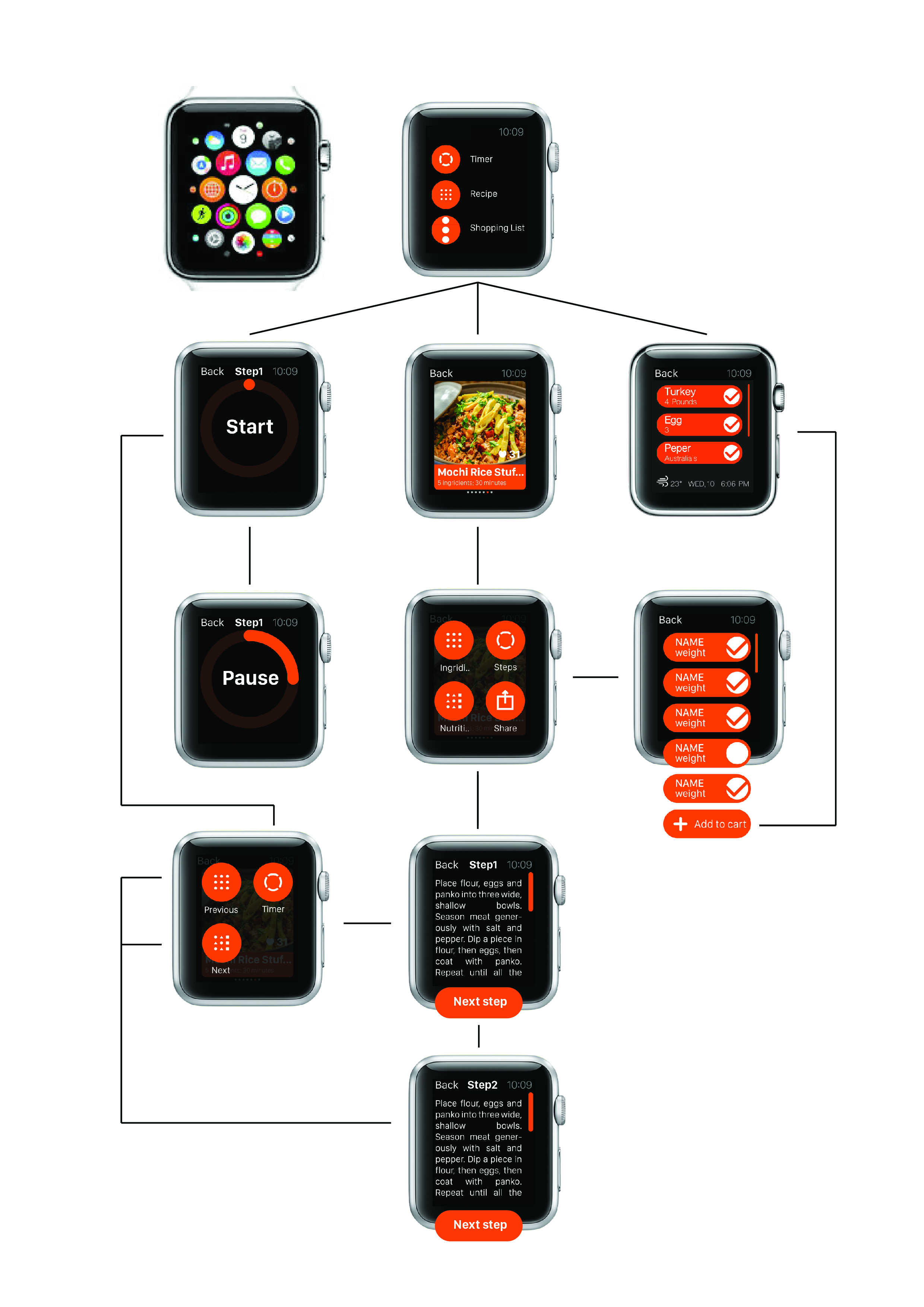
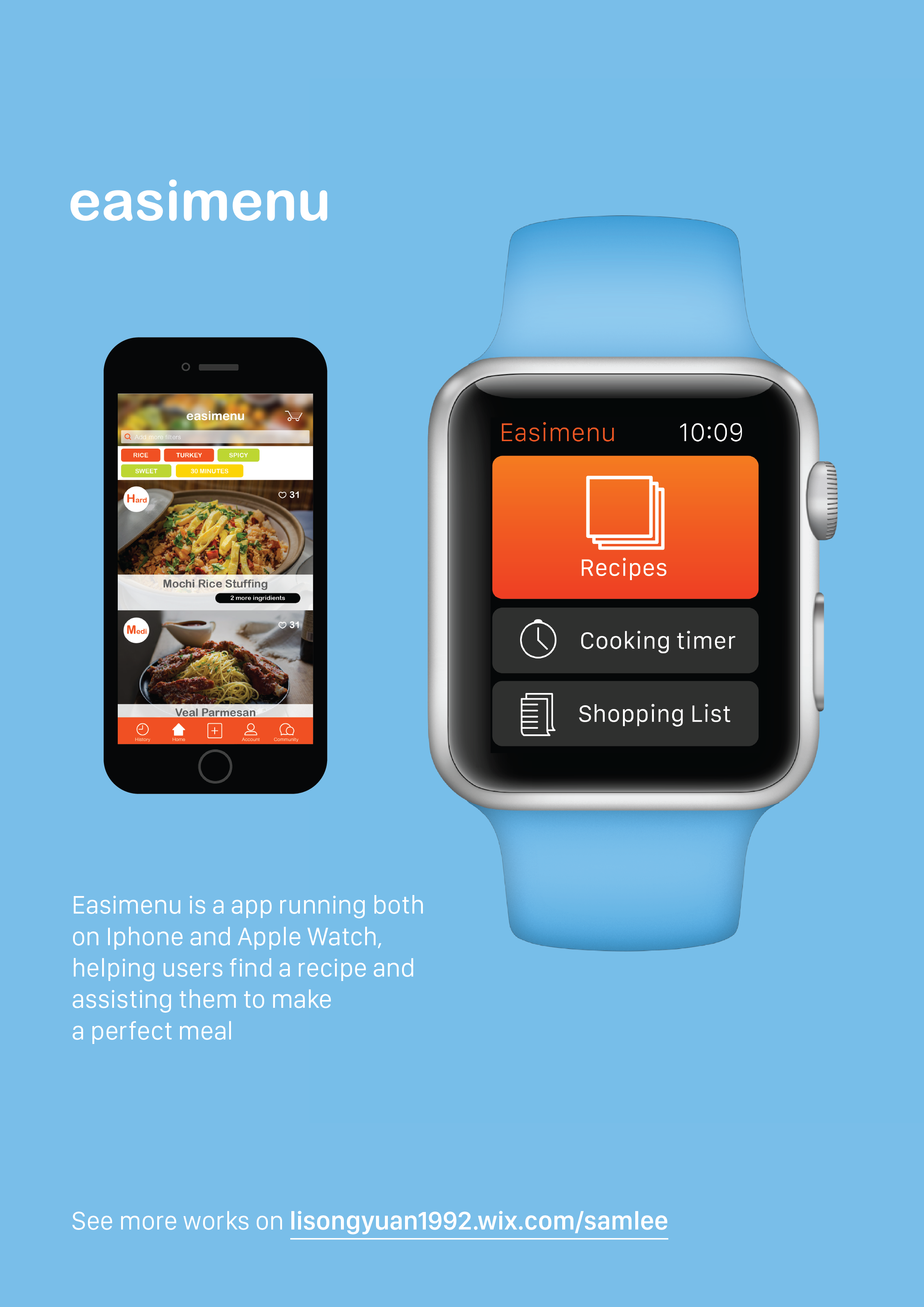
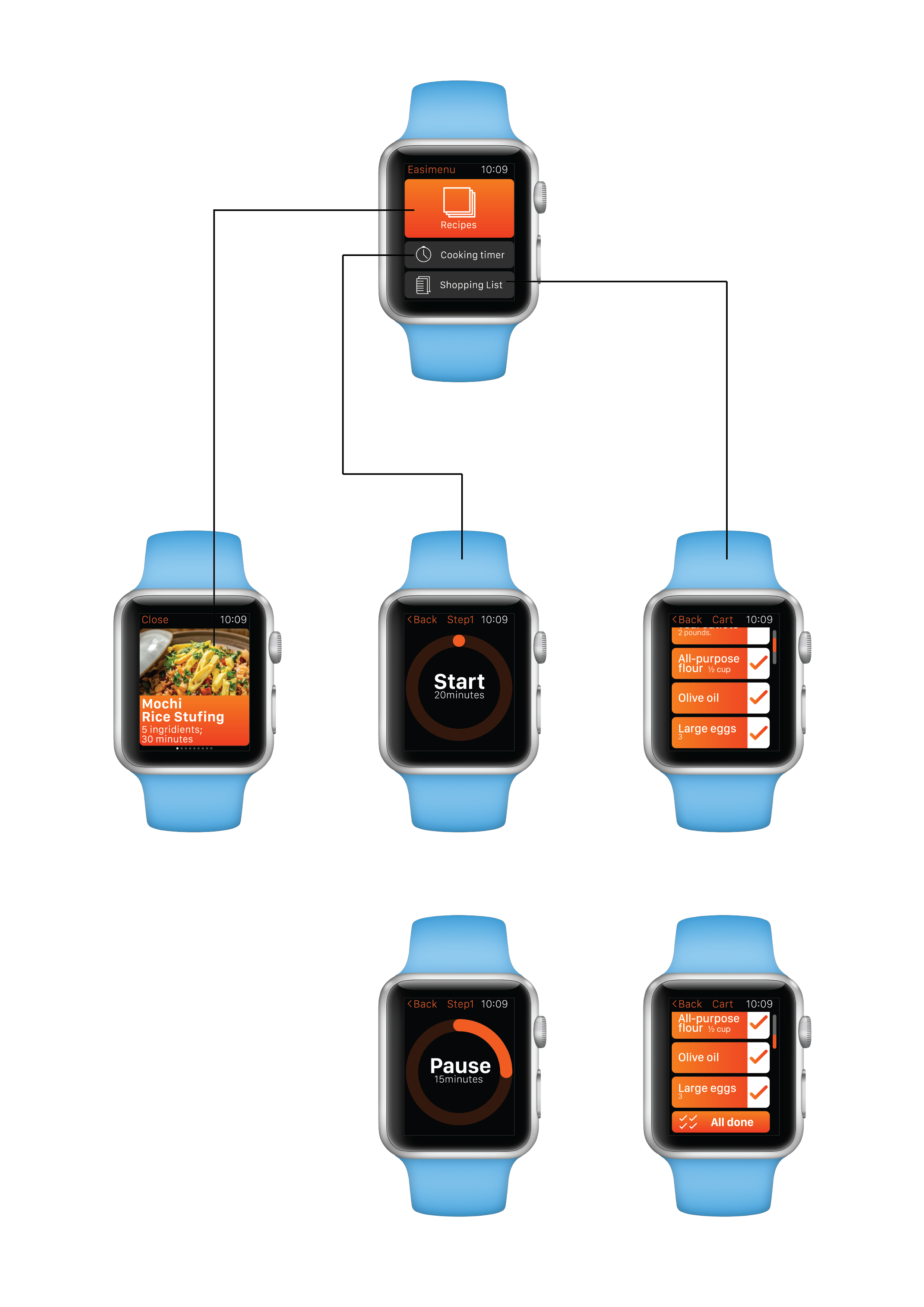
Apple Watch App for CookSmart Prototype3_Yihan Zhou

Feedback from user test:

– The text instruction is too small to read.
– Some of them need preparation for ingredients before start.
– They feel nervous when accidentally trigger the cooking instruction where time automatically starts count down.
– They want to go back once they accidentally start the cooking instruction but there is no back button.
– Recipe list is too small to be tapped on.

Update on Apr.9:

– Change the display of “saved recipes” list into a list of large pics. Using digital crown navigation tool to scroll down the list.
– Instead of showing name and time simply, add ingredients for users to prepare before cooking.
– Give the start control back to users.
– Add one screen for step 2 for a more clear expression of the UI design.
– Delete the pause screen, so when users tap when the time is counted down, the yellow time bar will stop and begin to blink.
– Add a “Back” button to every screen.
– Adjust font size, contrast, picture size with the apple watch standard.

Try digital mock up