Week5_Qizhao(Eric)

After more digital prototype testing and the presentation, I got more feedback from my users.

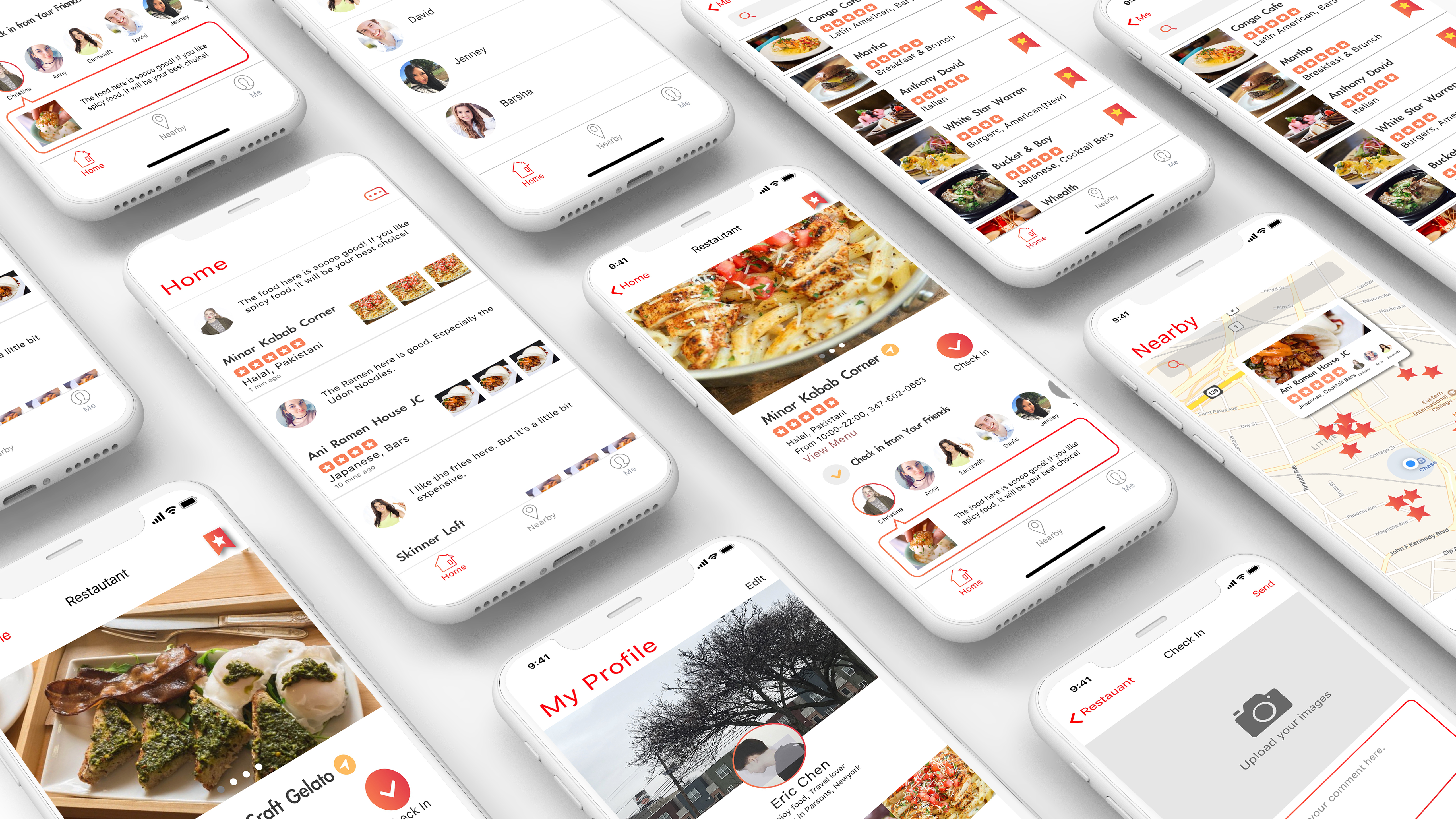
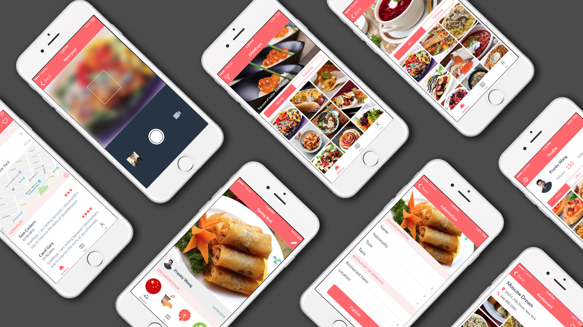
  1. The function of the search bar in the “home” view is similar to the searching function in the “Discover” view. It makes users feel confused.
  2. The position of the “Saving to the bookmark” icon is not good. Because the images of the restaurants are variable and unpredicted, there is possible that the icon and the image will mix together, making users hard to find the “Saving” icon.
  3. The “Check In” icon should be the most important function of my app, but the outline of it doesn’t make it in the most noticeable position. Since that the size of “Check In” icon is the same as the “Navigate” icon, users feel difficult to find the “Check In” icon.
  4. Some users said that the color of the app is too bright. Too much orange color make them hard to focus on the text and the detail of the restaurants.


Here is the whole process of my project:

https://www.chenqizhao.com/project03
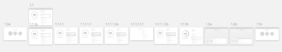
Digital Prototype:

https://marvelapp.com/2d1e4ja


wk06_Stella

What I’ve learned from the Apple TV Human Interface Guidelines

  1. Consider the user’s distance from the screen. Design interface elements appropriately, so they’re legible, easy to find, and aren’t overwhelmed by background images or adjacent items. I feel that it may be one of the biggest differences between designing an iPhone APP and an Apple TV APP. Users’s distance from the screen should definitely be taken into designers’ consideration.
  2. Don’t display a cursor. People expect to navigate fixed numbers of items by changing focus, not by trying to drag a tiny cursor around a huge screen.
  3. No need to show the “BACK” button.
  4. Design for different focusable item states. On Apple TV, focusable items can have up to five different states, each of which should appear visually distinct.


tvOS App Map

tvOS Wireframe

#thursdayapps

Monument Valley

Some screens:

In the game, player need too help a princess proceed on her mysterious quest, player will facing ingenious puzzles that involve lifting and spinning the environment. It uses different perspectives of the environment to create visual illusions for players. The graphic is very visually appealing. The game mechanism is not complex but it is very relaxing to play to me.

Week 7

Apple TV 

  1. The different visual cues that are critical for users to understand where they are focused

2. Apple TV has a disability mode where the layout has more contrast

3. Does not need a back button in the view because users can press the menu in the remote that takes them back to the previous screen

App Map

Wireframe

______________________________________________________

____________________________________________________________________________________________________________

____________________________________________________________________________________________________________

Week 6 – Franky Wang

Notes from tvOS HIG:

+++Consider the distance between users and screens. 

The distance may not be a big deal on the mobile device due to the small size screen and hand gesture operation. But when things come to the full-size TV screen, things may be influenced by the font size, picture clarity or composition compacity, etc.

+++Shared experience

People often enjoy TV in a communal environment. Consider how the app can appeal to a group, as well as what happens if the user is a different person each time when the app is launched.

+++Parallax as the indication of focusing elements

Through image layering, transparency, scaling, and motion, parallax produces a 3D effect with a sense of realism and vitality.

+++Delay sign-in as long as possible. 

People often abandon apps when they are forced to sign in before doing anything useful. Give them a chance to fall in love with the app before making a commitment to it. Avoid unnecessary information data input.

App design for Apple TV

I’m creating an app for Apple TV to recommend good episode, movies and documentaries about food for families. When they are watching, some food appeared in the movies are highlighted while the recipes will be provided by the app. In this case, users can follow the recipe to cook dishes appeared in the movies. The target user will be the family group. Taking advantage of the big screen, the recipe can be displayed on the same screen while the movie is playing, which make the experience to be shared by all the family members.

tvOS App map

Wireframe of App

#Thursdayapps YinHu

Gorogoa is a puzzle video game and it was released for Windows, Nintendo Switch, and IOS on 14 December 2017.

In Gorogoa players are presented with four images in a grid and must stack, combine, and explore each image to find a connection(buried signals) between them in order to advance and open new areas.Players are not guided through the process, as the game contains no language, and must work out what they need to do to finish each level.

The plot involves a boy seeking an encounter with a divine monster, exploring themes of spiritually and religion. The scenes in the game follow periods of time in the 20th century, including peace, war, and rebuilding.