Final Presentation – Pauline/Yihan

It Speaks: https://www.flinto.com/p/bf9db561splash page-1804

Since the last prototype, we learned and improved:

– hard to understand main functions of app: we added a splash screen with a short explanation


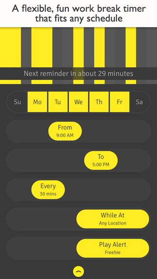
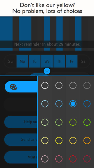
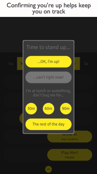
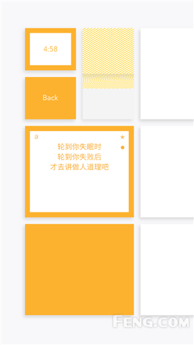
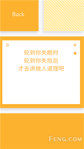
– tab icon to add a new entry and My Objects were not straight-forward enough: we changed the design of it

unpressed-filtered-2192


unpressed-2179


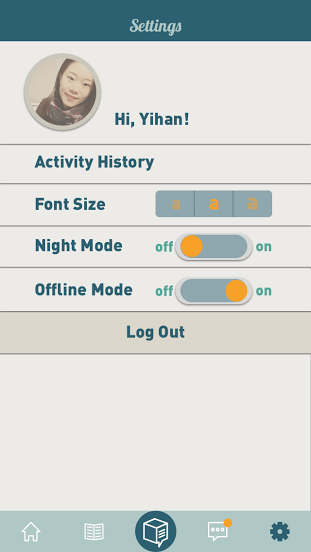
– if no connection, good to have an offline mode: we added an offline mode in the settings

setting-1921

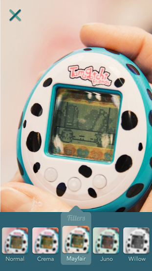
– users expected more creative elements after taking a picture of an objects: we added filters options

Take a picture  2-1335

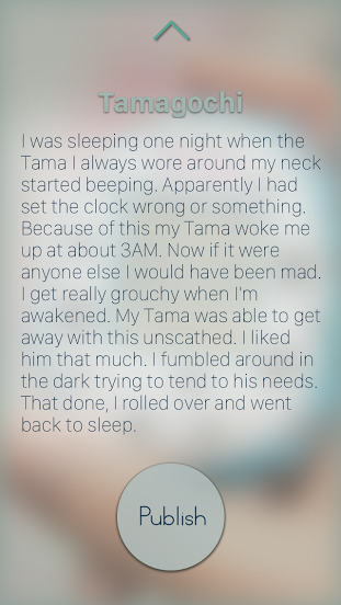
– users wanted more personal options when writing a story: we added more choices when writing a story (bold, centered,…)

Tell a story -2403      Tell a story  2-1342

– reading environment needs to be enhanced and more clear to see: we added a gradient layer to show the text more clearly, and added a “review before publishing” step.

Story-2441    Story-1351

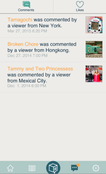
– in notifications, it is not clear when my personal history is mixed with other people’s likes: we put our own history (what I liked and commented on) in the settings and in the notification page, we only display what other people like or commented on my objects.

Screen Shot 2015-05-14 at 18.32.55

– the timeline of your own object is confusing (most recent last): we changed the order to most recent first (on top)

Screen Shot 2015-05-14 at 18.33.57

– there should be a link to social media: we added a share button in the story page to share on social media

Screen Shot 2015-05-14 at 18.34.32

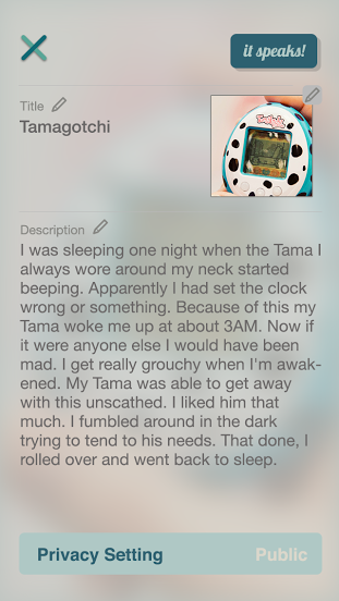
– there should be a way to delete and edit a story on my objects: created these two options on the object’s page

Screen Shot 2015-05-14 at 18.35.06

Iterations of PON

Slides:
https://docs.google.com/presentation/d/1F00RQVxIo-BUZ9C7aV5RZdYPBSHE-kSt1I9g-uxseGQ/edit?usp=sharing

First version of wires: http://invis.io/9Q28S95F6

First iteration: https://www.flinto.com/p/a7f3a844
(cut off some steps, make it simpler and more intuitive, add indication)

Second iteration: https://www.flinto.com/p/3664cdd4
(mainly simplified the sync process, hided the steps and timer, add setting, readability)

First UI: https://www.flinto.com/p/eec3a99d

iteration: https://www.flinto.com/p/6561cdd4
(add script before syncing all the stuff so that users won’t panic
iCalendar iReminder => calendar, reminder
tested Change Button on both left&right
smart suggestions => smart steps
call the user a name “hello, Poner” and can change later after
after finishing all tasks, says “peek at tomorrow”
add button to refresh the pie
change the readability on some of the screens
show the grey out in the pie chart after eliminating one task)

See more our learnings at: https://landzthesis.wordpress.com/

Learnings from Digital Prototyping Messageo | Zeqing Hong & Galit Lurya

iPhone App

  • Add set username in sign up
  • Import contacts only later on in the process when creating a new message
  • Add the pin-it button also on the top bar of creating a new message
  • Consider breaking down the bar to have the notifications and time limit under/above the write a message area- clarify the icons as they are not clear enough
  • Consider creating a more differentiated layout for the sent and received messages
  • Add titles to bottom bar buttons- the icons themselves are not clear enough
  • On pending messages that have a map add option to tap on map to get directions
  • Sent messages- is the time limit in hours? add H to clarify

Apple watch app

  • Only show sent and received messages + notifications
  • In the sent and received messages, create a combined view of map and list

Thursday Plays

Subway Surf!

This has probably been around for a while, but i just downloaded it the other day, and i love it. its quite addictive to an extent, plus there are constant updates for themes for the game.


subway


Just as the name suggests, you are “surfing” through that seems like abandoned train tracks, but they are actually running, and your character has to dodge the trains, get coins, and hopefully not get caught by the cops! its a fun game.

Feedback from Digital Prototype

* Change certain fonts

* Might consider having two columns for the price of equipments

* Get a feedback notification a day after using the space

* making the whole address line tappable

* Change map view

* work on the buttons on the reservations page

*Change the comments icons on the studio’s scroll view, and also work on texts

* Maybe having Auto selected time for reservations page

Thursday Play- ∞ Infinite Loop -Ning Sui

I talked about this iPhone/iPad app before in class which is called ∞ Infinite Loop by Jonas Lekevicius. It’s a surprised encounter as an Ad popped up when I played another game, but I like it very much because it’s the simplest UX & UI design I’ve ever seen in a game app.

Screen Shot 2015-05-13 at 4.06.34 PM


Infinite Loop is a very simple, relaxing and never ending game for iPhone, iPad and Android inspired by Flash game “Loops of Zen” by Dr. Arend Hintze. The goal is to turn all forms on the grid so that there would be no open connections. Most levels are algorithmically generated and randomly colored, and after successfully completing each level you will be rewarded with a beautiful design of your own making.

Screen Shot 2015-05-13 at 4.11.10 PM


The UI looks very extremely simple and there is no bottom at all. As a user, the only action you have to do is tapping, and the elements you tap will turn clockwise by the times you tap. When there is no open connections, The UI color changes immediately.

screen1136x1136screen1136x1136-2

I like the simplicity very much, but as a UX designer, I feel abnormal using a app with no button at all and sort of lost when playing. Finally, the recent update added some UX elements:

1. It tells the players which level they are currently at

2. It has navigation dots to control the sound and go back to previous level.

3. It has sharing function when the level is complete,but the camera icon looks more like do a screen shot for me.

IMG_2500IMG_2501IMG_2502IMG_2503IMG_2504


It’s on awesome game with a simple beautiful design, and after adding some UX elements, it makes more sense for the players.


Thursday Play #2 Orgami

Orgami is an unconventional note taking app. It’s UI and UX design is so creative that you actually will be surprised by how different it is. 14302848314786

First you will be surprised by its layout design. There is only one corner of the notebook one the home screen. You can categorize your notebooks by color. Slide on the top to easily change the category and double tap to enter the notebook.


14302848797674


14302848783733


It is a little bit confusing when it comes to diary panel. There is no working area or things we find normally on a note taking app. Instead of a paper, Orgami uses post-it size rectangulars to carry the content.


14302848761504 14302848775288


To be honest, it is indeed not that easy to use as a Memo app. You only can take notes by tapping on individual rectangular. Also if you tap on the wrong place, all the content of the note will be gone instantly.  Therefore Orgami is a very innovative app in terms of the UX. However, it is not an app for everyone!


14302848519669 1430284850961  14302848301870

thursdayplay 1 HIGH DIVE

14314213165369


High Dive was developed by The Frosty Pop Corps, they published few apps before but none of them received these much attention as High Dive.14314213714954

User needs to control of an athlete to jump into the water smoothly. In the game, the spray of the water is not the priority. It seems very easy at the beginning. But when the height starts to be raised, it becomes more difficult since the user needs to avoid to bump into birds or barriers before the athlete gets into the water.


14314213716082 14314213706980 14314213711635 14314213423721

Also during the fall the user can collect diamonds to get more points.


14314213411391 14314213411337 14314213402103