Please find my presentation here.
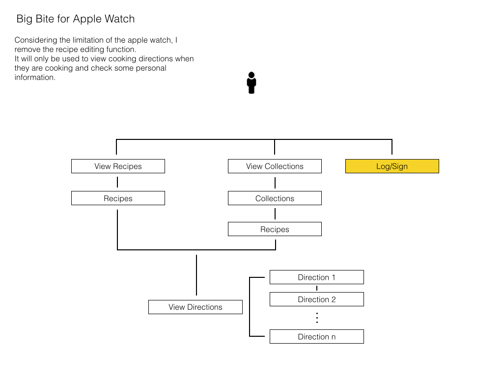
Big Bite for Apple Watch_Feng
Project Concept: Big Bite is a iphone app to help chocolate lovers easily and orderly editing and organize their own recipes. However, considering the limitation of the apple watch, the Big Bite for apple watch removes all the editing function and only keeps viewing recipes function. It turns to a convenience tool which allow users to take a quick look for their recipes.
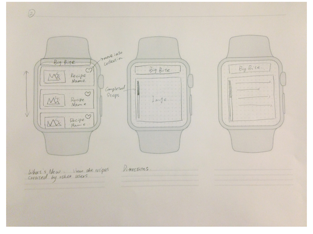
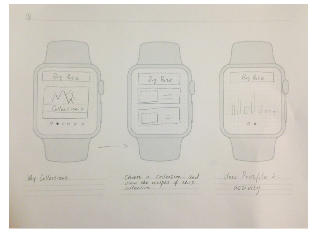
Here is my Appmap and wireframe version 1.

Shuangshuang Huo- Apple Watch Home Feast
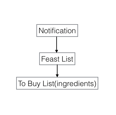
Home Feast – Apple Watch Extension App
This extension app can help people remember when they need to start to prepare for the feast and what they need to buy for the feast.
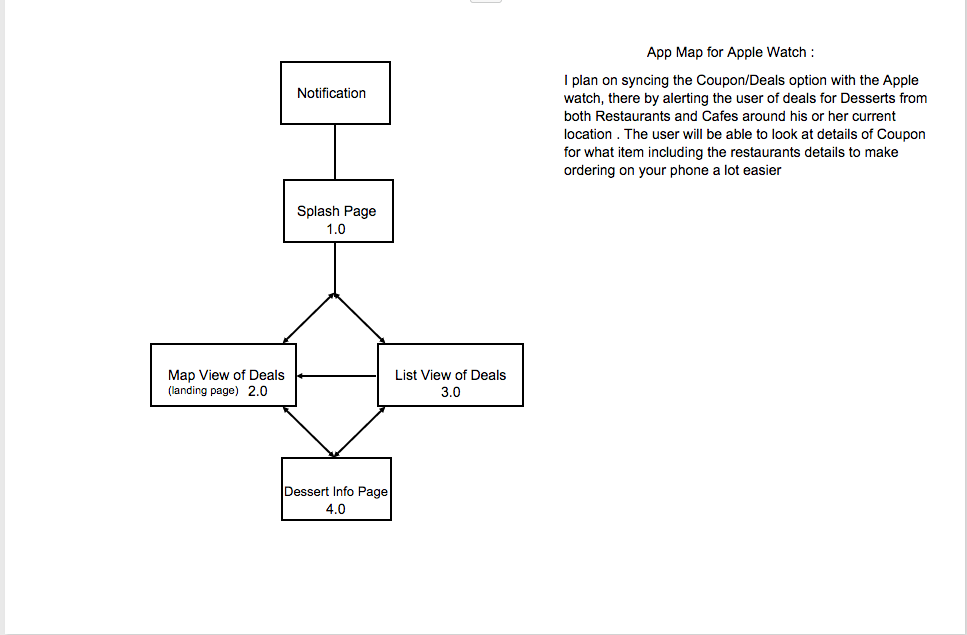
App Map:
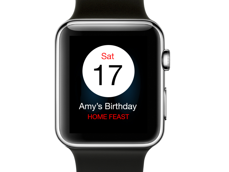
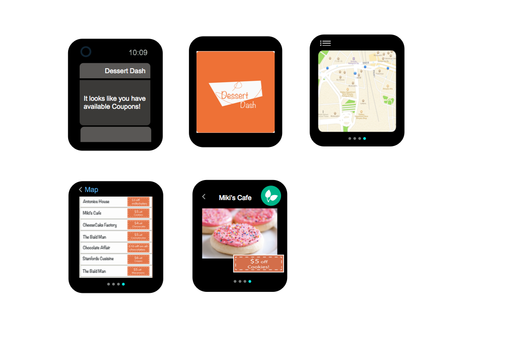
You can get notification when the feast you added before is coming soon:
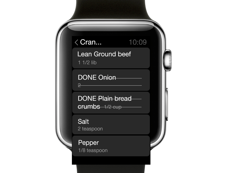
Open the app, you’ll see your own feast list created in iPhone.You can swipe up or screw the Crown. The color bar at the left side indicates the type of the dish in the same order as the iPhone app, such as appetizer, main course and so on. But I changed the original colors a little bit to make them more saturated, because in the iPhone app, the color contrast of different sections is subtle and it’s hard to see the difference in Apple Watch.
 ‘
‘
Tap on each item, you can see all the ingredients you need to buy for this dish. After buying each ingredient, you can mark it as “DONE”
When extending my original iPhone app to Apple Watch, I found many differences. First of all, according to HIG, the background of Apple Watch is better to be dark so that the screen can match the watch frame perfectly. Since my iPhone app uses light background color, I changed it to dark.
And the legibility of text in Apple Watch is super important, because the screen is very small and people are always in different movements with the watch on the wrist. That’s why I used large text size and used high color contrast of the text color and background color.
To keep the handy trait of my original iPhone, I tried to make the structure of this Apple Watch extension app as light-duty as possible.
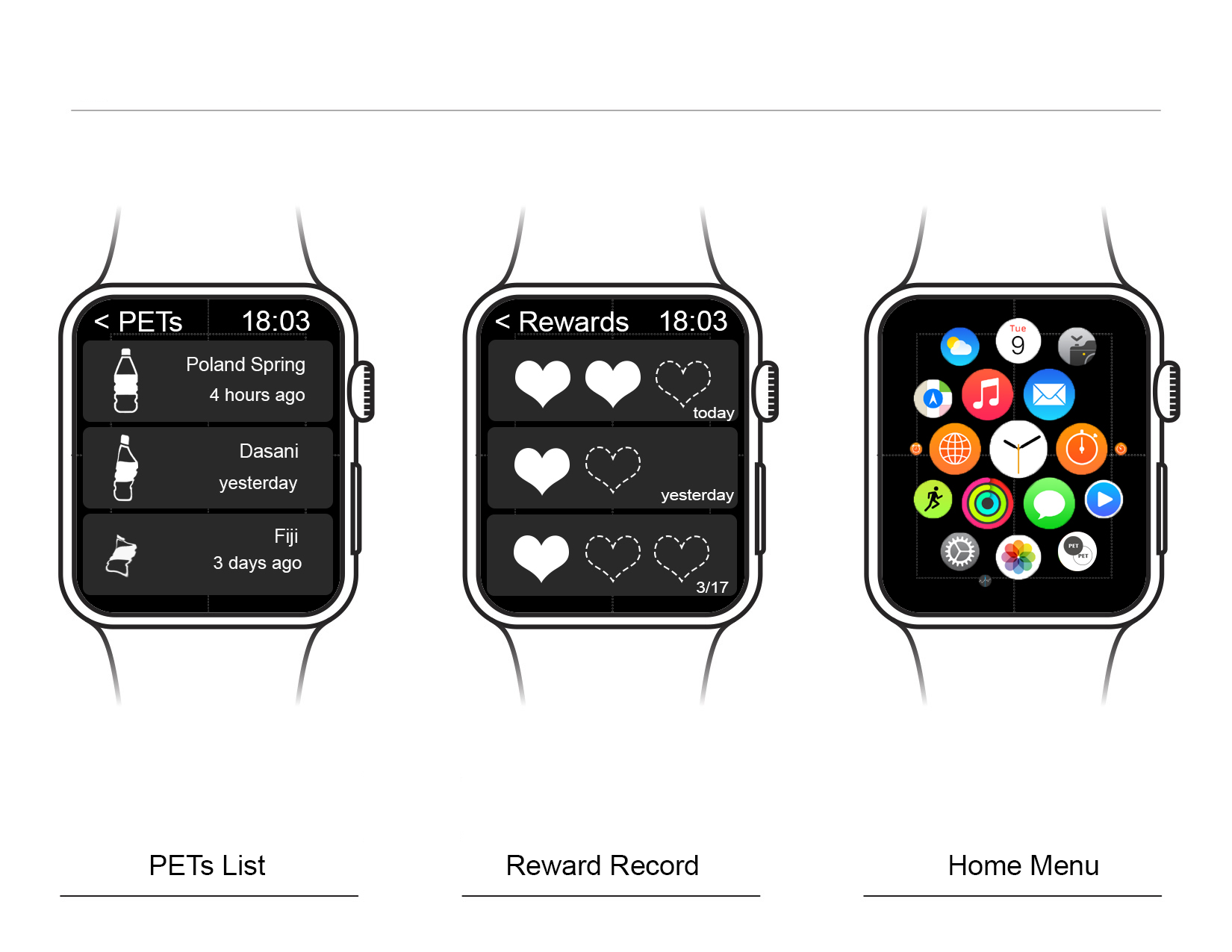
Apple Watch AppMap + Wires – Ning Sui
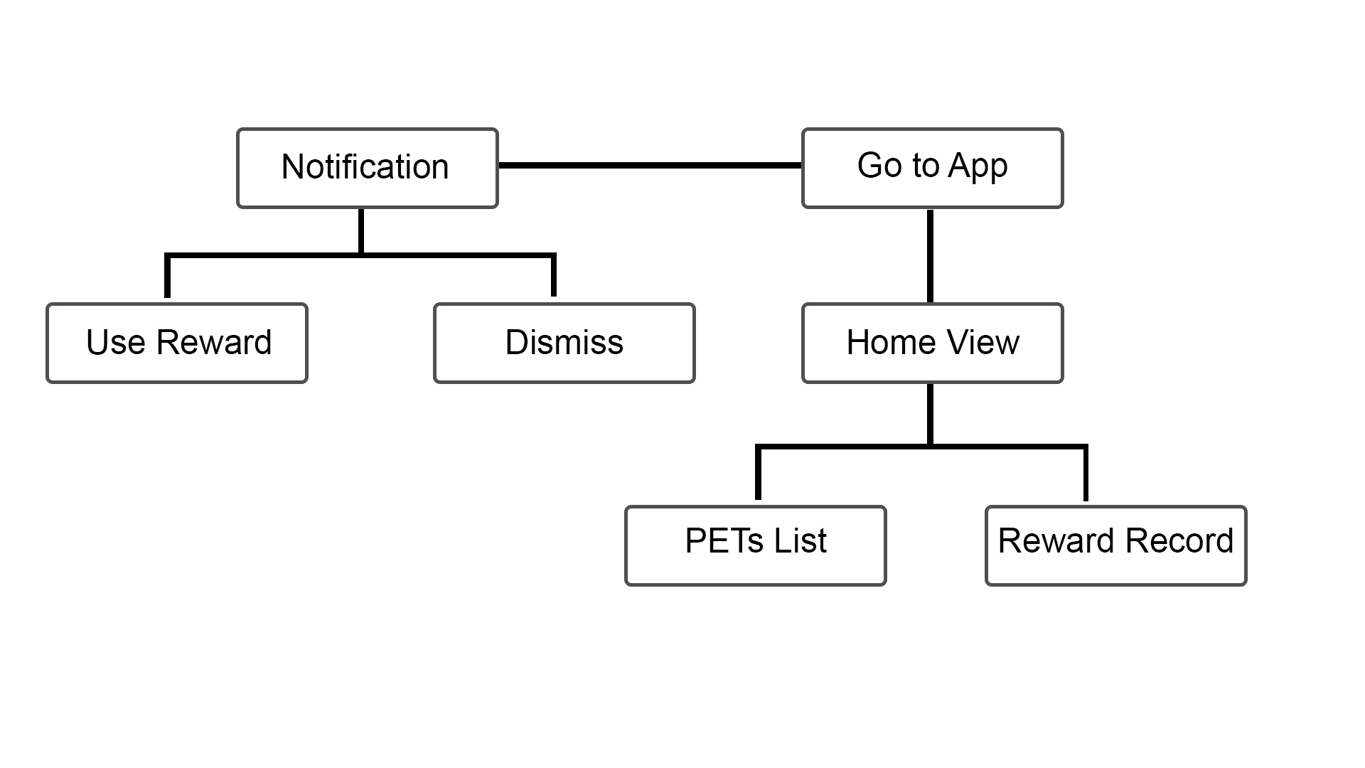
After reading about the Apple Watch HIG, I realized the limitation of Apple Watch, so I decide to only transfer partial functions from the iPhone App to the Watch app. Here are the list:
1. Push-Up Notification
2. Bottle lists
3. Rewards

Little Kitchen – Apple Watch IA/MAP
#thursdayapps – Pauline Hadad – QuizUp
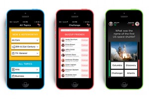 This week, I downloaded the game application called QuizUp where you can play against your friends or random people. I really like that there are so many themes available for the quizzes. The interface is very straight-forward. One thing that caught my attention is the “burger” menu, which is located on the top right of the screen. Usually, burger menus are on the top left.
There are also two options that are a bit confusing: “Messages” and “Discussions”. I think they should have made it clearer for the user what the difference is between the two (I still don’t know).
Other than that, it’s a great app! Very entertaining!
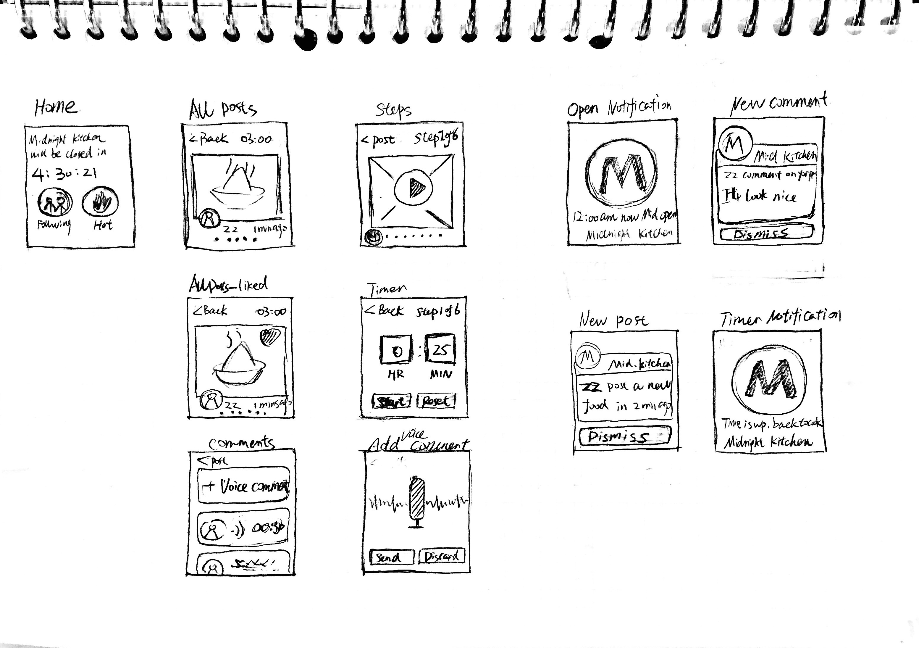
Midnight.K – Appe Watch Map+Wireframe
Map:
Wireframe:
Apple Watch First Prototype
Digital Prototype
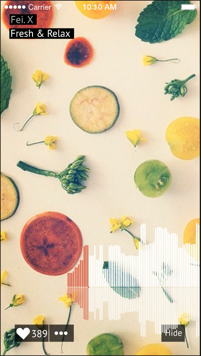
Apple watch design prototype — Jackie
Apple watch app design:
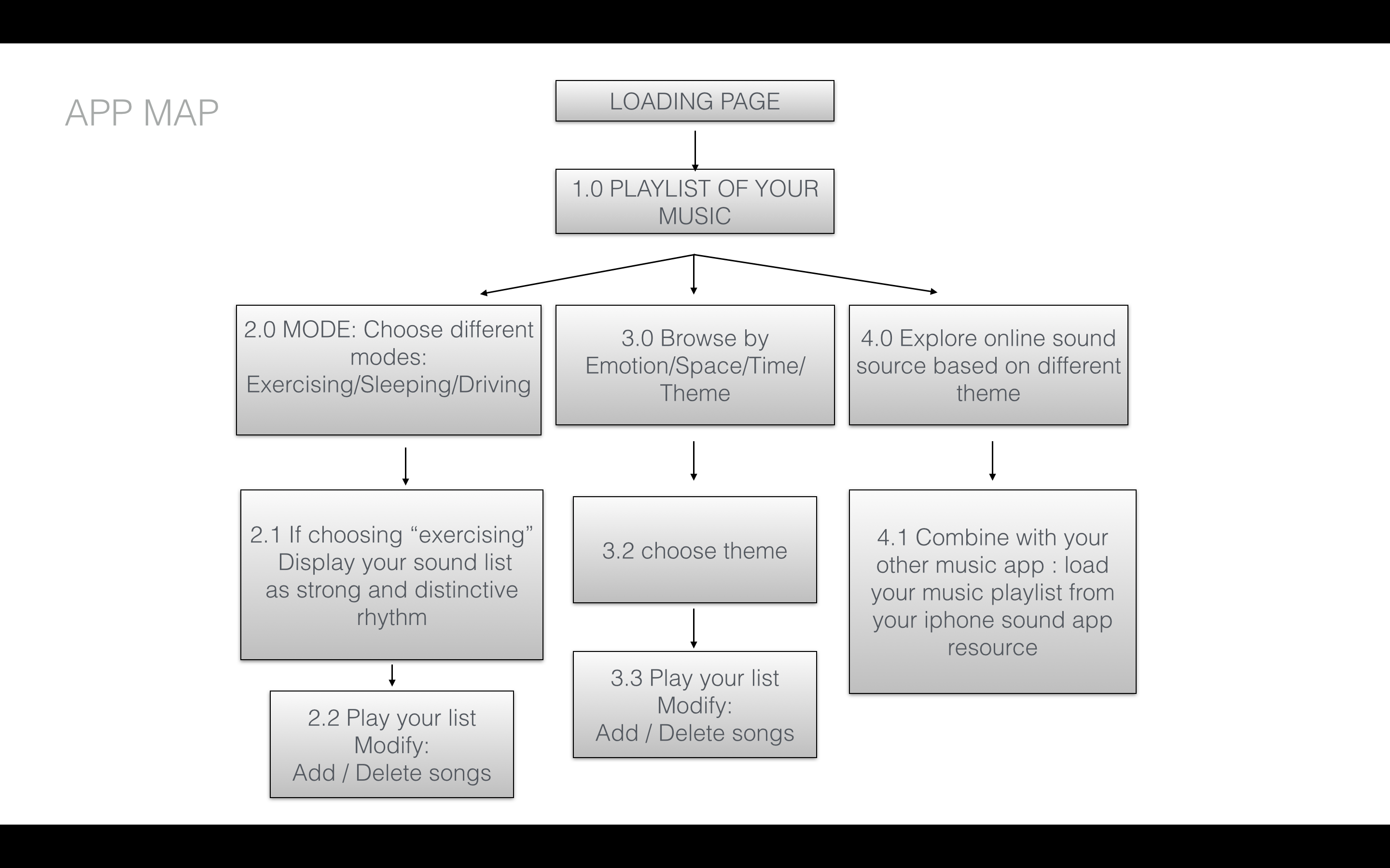
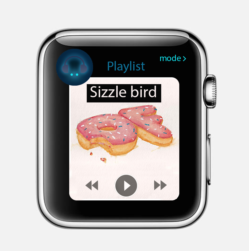
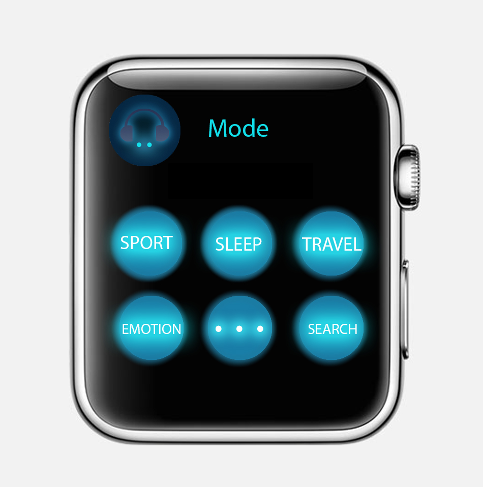
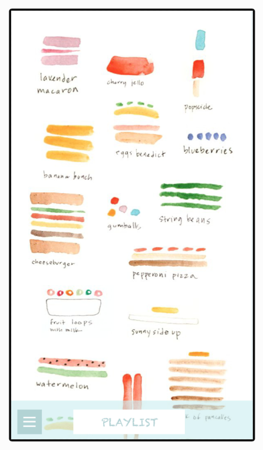
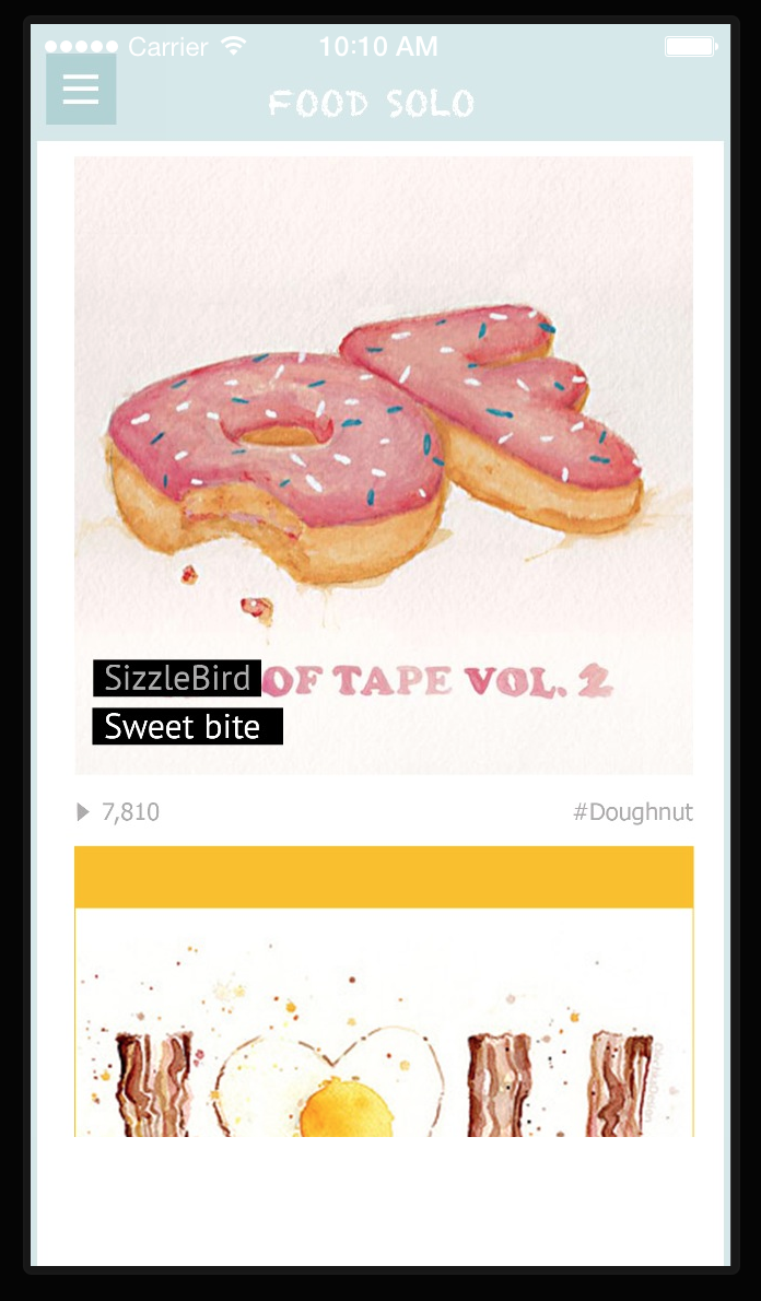
Through my first iPhone application design, I was focus on the the entertainment features of using food elements to design sound app. So when I start to thinking about the apple watch app, I want to continue thinking through the function point to improve my first app to design my UI to adapt to various devices and modes , such as apple watch. So that users can enjoy the app in as many contexts as possible.
Concept: People usually listen to music when they are taking exercise. Connecting local music playlist to the sport app. Controlling your sound list by your running length or your heart beats. The new apple watch music app support different modes for people. For example, when you choose “sport” mode, your sound will be random choosing by intense and Cheerful sound, such as hip hop or rock.
If you are very calm down and peaceful, like sitting or sleeping, seems like you didn’t take any exercise, your heartbeats are as normal speed. Then you will get your playlist arrange as calm and charming sound, such as country music or indie environmental music or any soothing and calm music.
![]()
DIGITAL PROTOTYPE:

What I have learned from my paper and digital prototype -assignment 1
1. First play app : https://popapp.in/w/projects/54ef6f365cbda7bd3fcf2283/preview/54ef87a98c60e0633fb7c951
2. Modify play app:
https://www.flinto.com/p/627ef587
Through the prototype to the midterm final presentation, I have lots of chantings on my app design:
1. Switch sidebar icon from bottom to top:
2. As we discussed on the class, I get suggestions from Andrew to change the main page as sound list menu, which the is recent sound you already created or the sound which person you followed.
Main menu first prototype Main menu final effect
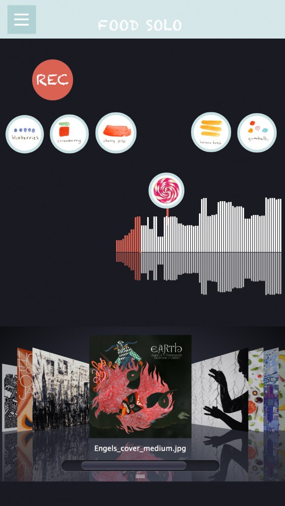
3. Add sound creating page for users. So that they can directly playing their sound on the sound track.
4. Separate “record” sound function and “play” sound function in different pages. Easily let users finding how to play this app and get content step by step.
Record page Play page
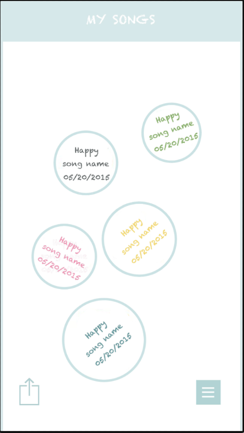
5. Changing the sound list lay out completely and clarity, showing as the song album with users’ name, song name and date. Instead of the last version prototype which was creating date and design emotion.
first version second version