Design concept:
We are designing a weather application that uses AI to generate everyday outfits based on the users preference and weather condition.
APP MAP:
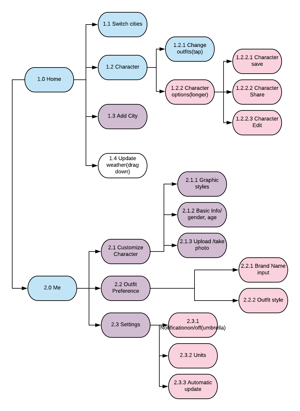
Wireframe:
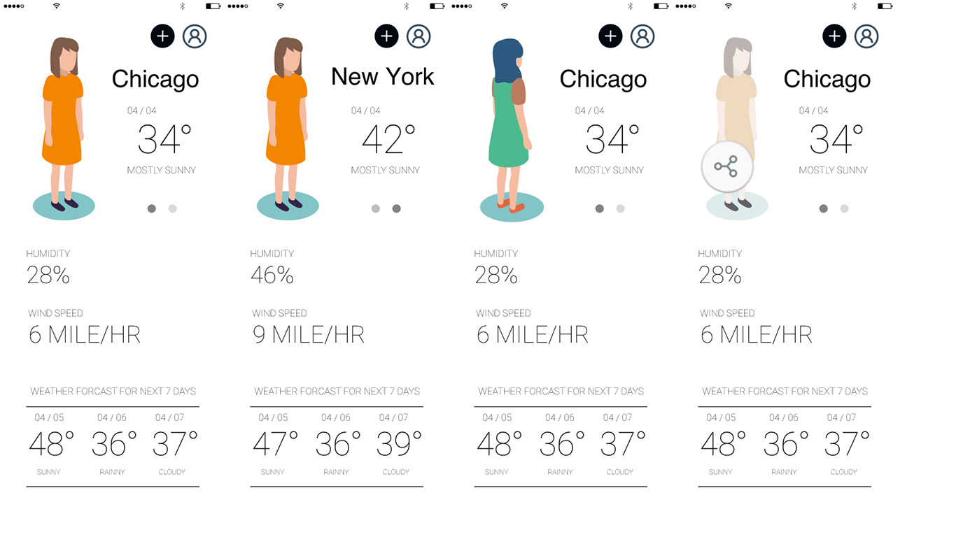
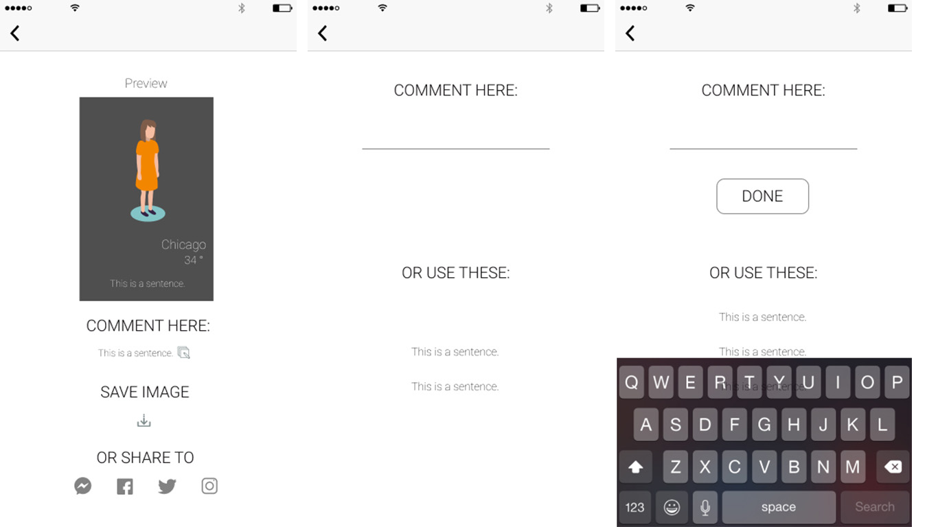
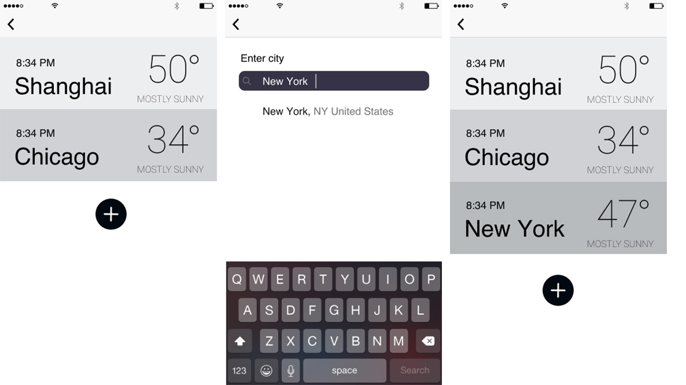
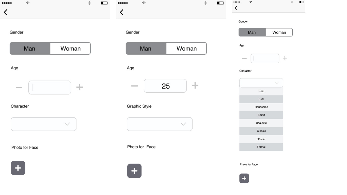
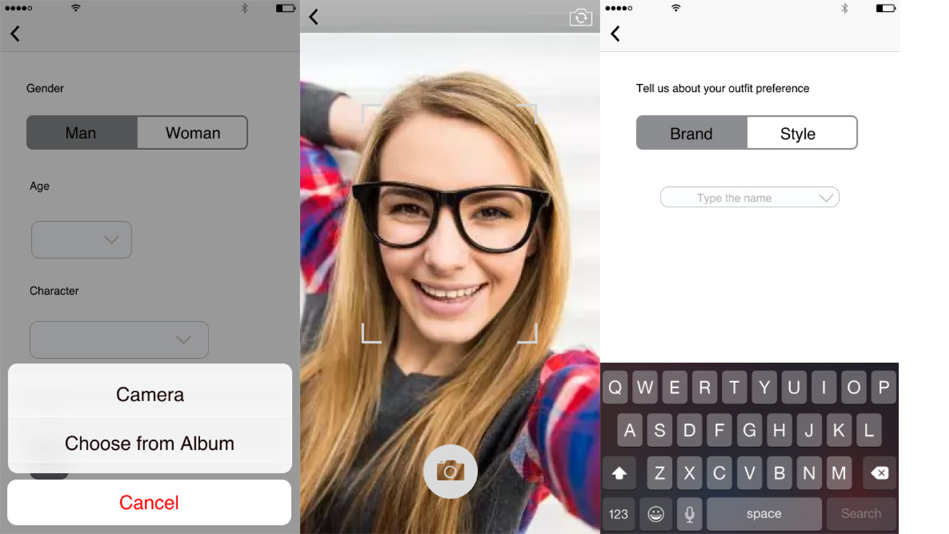
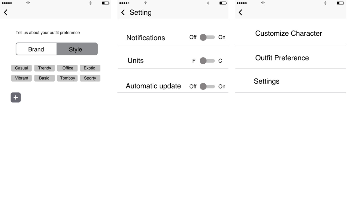
Design concept:
We are designing a weather application that uses AI to generate everyday outfits based on the users preference and weather condition.
APP MAP:
Wireframe:
App Idea
We are creating an iMessage extension that allows 2 or more people find a place to meet up at a midpoint between them. It picks up keywords from your conversation with the person to figure out what kind of place you want to meet up.
App Map
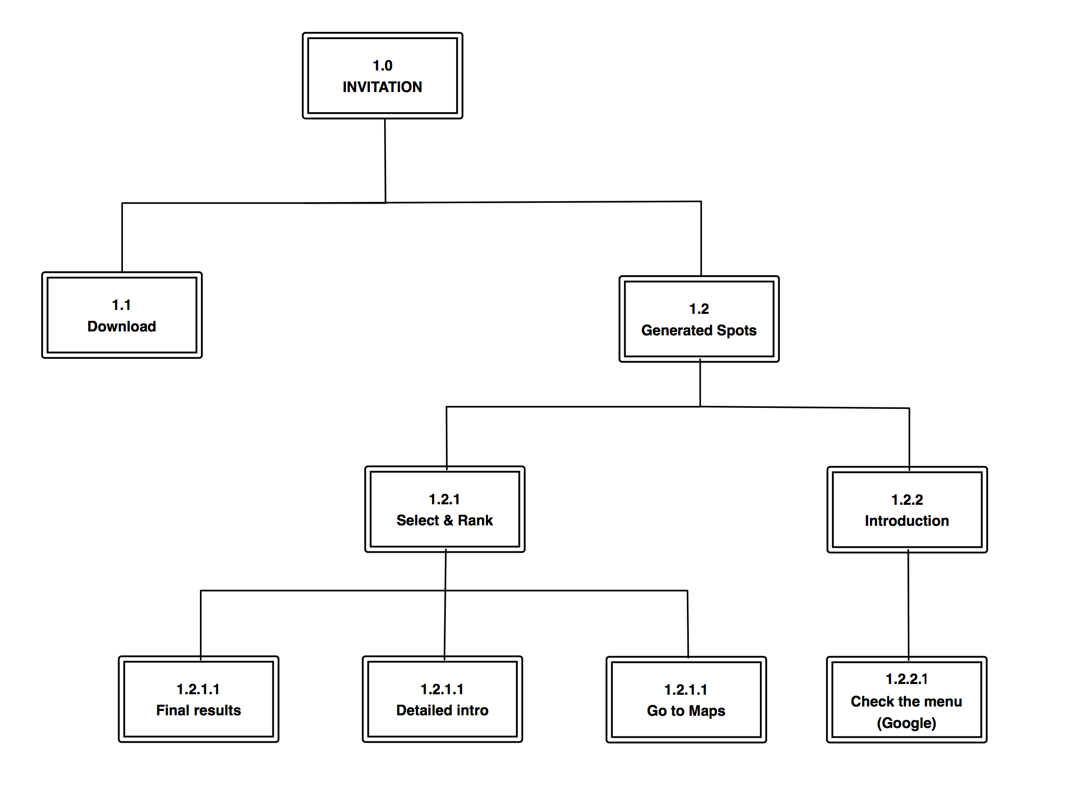
Wireframes

Smart app for meetings.
We are designing an app to record, analyze, and provide related references for group meetings. 
Inspiration:
Every time during the studio critique, guest crits always give us so many references and suggestions which are so hard to catch up in such short time. We usually take notes on the notebook but still miss out a lot. Also, we all have the experience that the crit gave an unsure name or terms which needed to be looked up afterward. Record the whole conversation could be a way to solve this problem, but how can we use Machine Learning to improve this experience?
Questions:
We followed this guideline from Human-Centered Machine Learning by Josh Lovejoy and Jess Holbrook to start off.
+++ Group work with Yin Hu +++
We are designing a mobile app to provide automatic remote service for cars that allow users to control their smart car accessories and stay informed about the vehicle conditions when they are not in the car cabin. Also, users can make simple adjustments to car functions from the app for better convenience.
 Wireframe
Project3
Feedback:
Feedback from the first prototype and user testing

Last week, I made a paper prototype and did a user test. Here is some feedback I got from user testing:
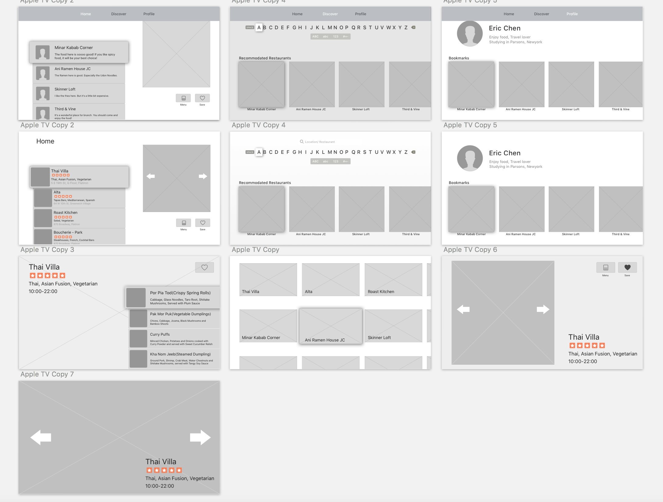
So I change my concept a little bit. In this version, the main value of the app will be searching interesting restaurants and enable users to see the 360-degree images of the restaurants so that they can know if the environment of the restaurants is good or not. What’s more, users can also check the menu and see the food intuitively.
Here are the wireframe and the visual interface.

User test feedback


Final prototype: https://marvelapp.com/62851b1/screen/40297763
What I learned from paper prototyping:
1.The tab bar should be hidden on the top. Users can have access when scrolling to the upper screen.
2.QR code buttons are not useful on every product page.
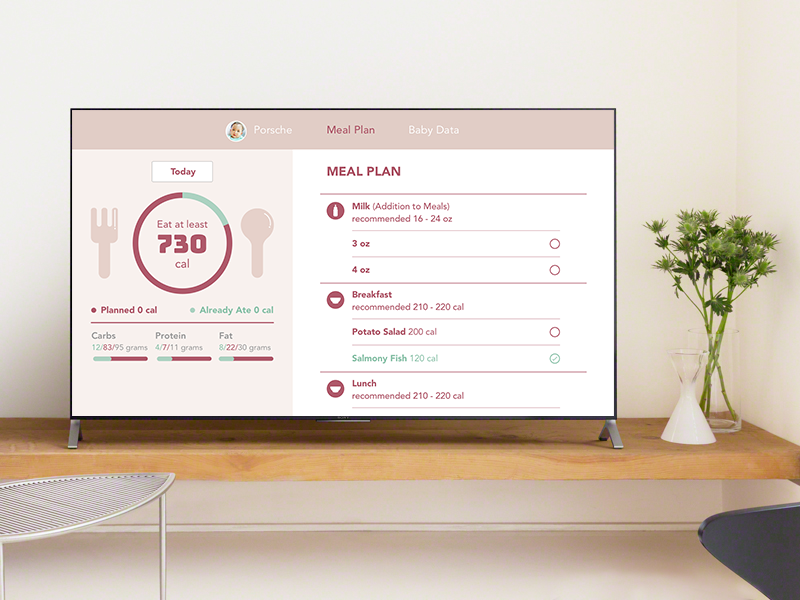
In this Baby Balanced Apple TV version, the emphasis is on the viewing part which will help parents prepare the food for the baby easier when viewed from the TV.
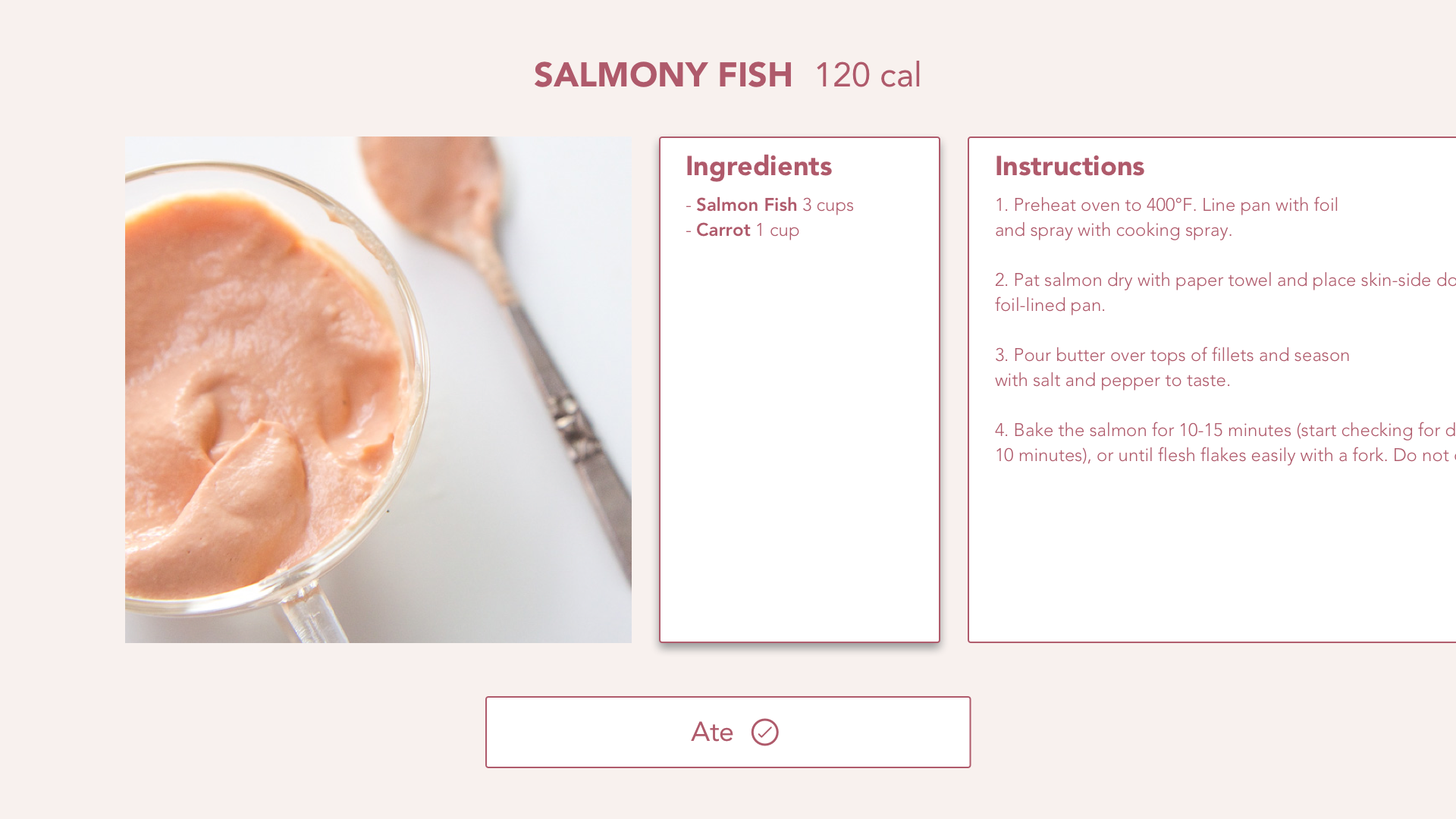
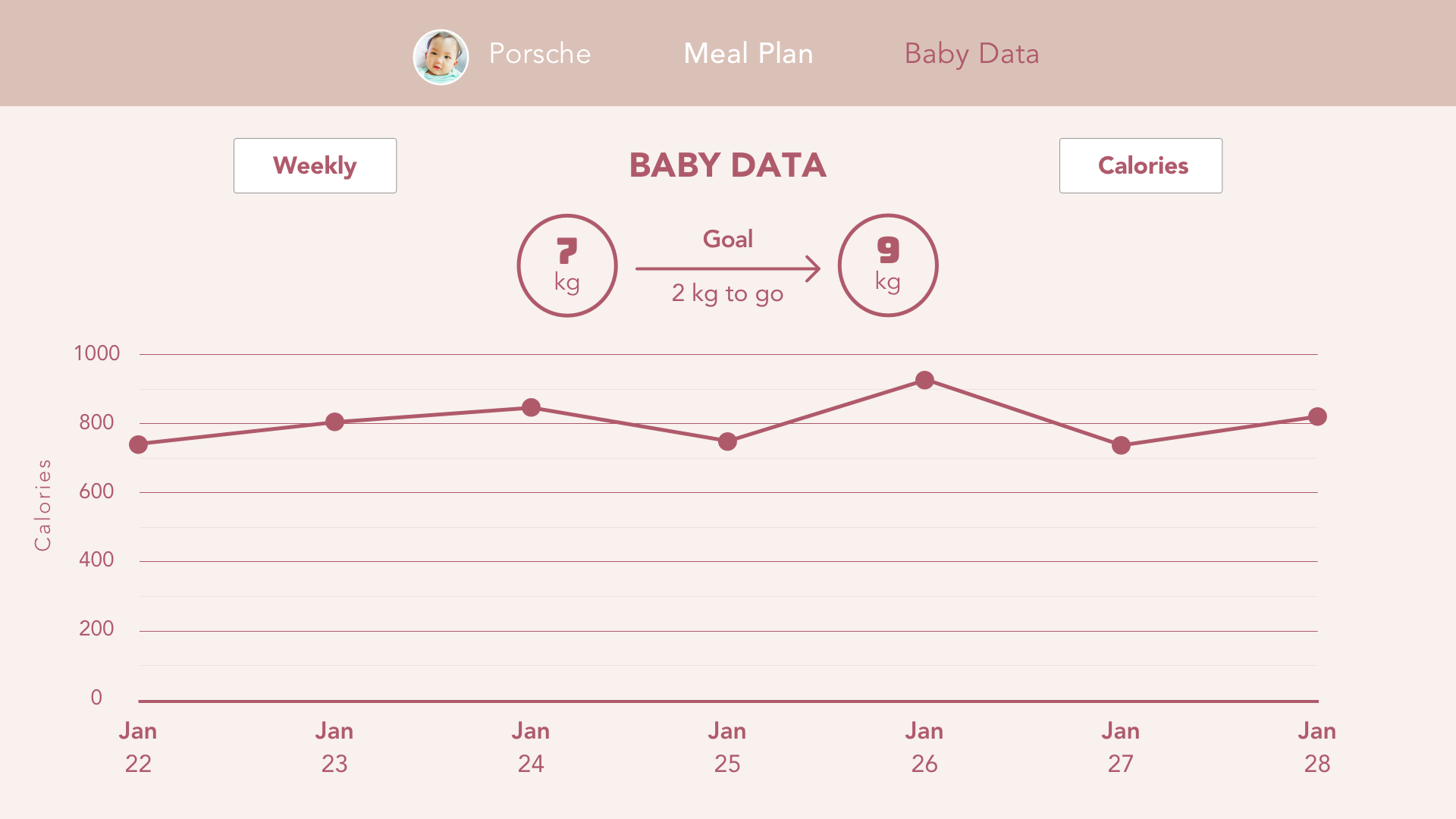
From the first prototype, I changed the Baby Data content for Apple TV because if there is too much unnecessary information. My assumptions are parents will only want to see the progress of the baby in the Apple TV and not the details of what the baby has eaten since they will not be able to plan meals from the Apple TV anyways.