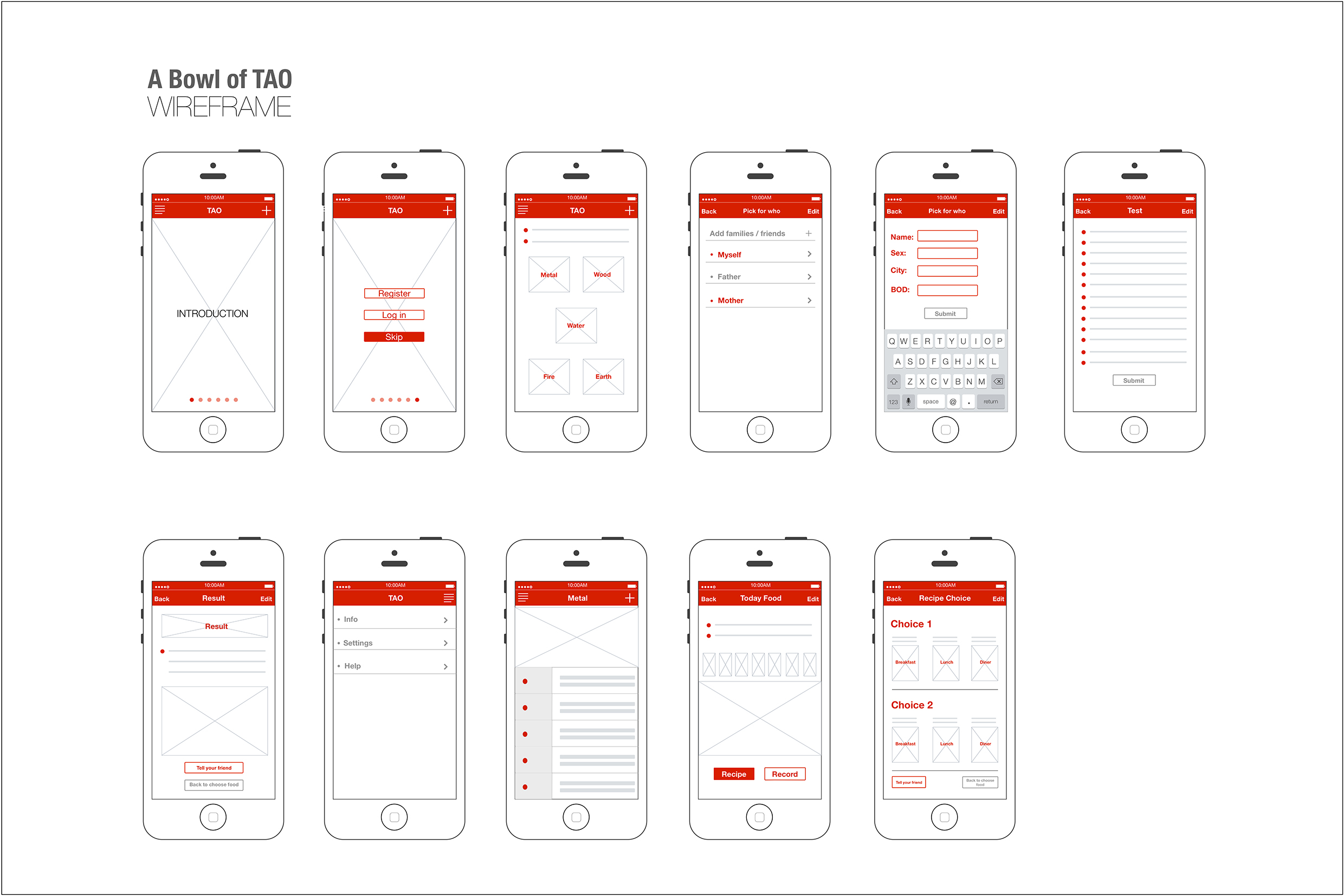
After reading the “iOS Human Interface Guidelines”, I realized the design of mobile apps basically should follow the guidelines, because the apps are on the iOS platform, as a designer, I should know deeply about what iOS7’s concept, what iOS7’s advantage and restrict, what iOS7 designers care about and what they have done.
I aware that the legibility is so important, because of the mobile screen is smaller in contrast with other interfaces, the text must be legible at every size. I also noticed the iPhone apps’ text size normally controlled in the limit of 22pt to 34pt.
Use plenty of negative space, this rule is what I need to follow, I always try to express more in this limited screen, and the consequence is all information looks like crowed, and no one want to pick the information in such a mess screen. Negative space is very helpful to highlight the real important text.
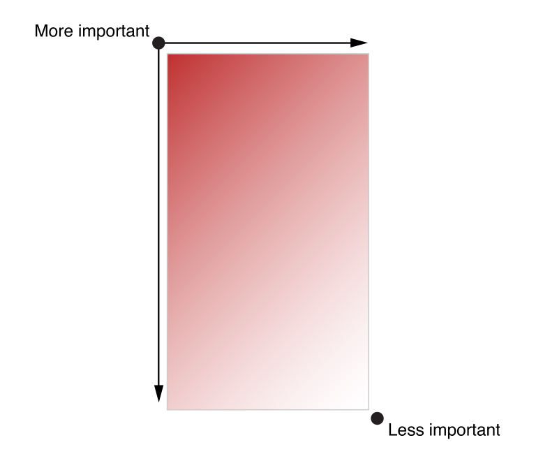
The confusing part is the more important area is on the upper left corner, I always consider it should be in the center, because of the iPhone’s screen is small. But when the whole page is all texts, like a novel, the most important area must be on the upper left corner, according to people reading habit. Only if images on this view, the most important area should be the center or on the image area, I’m not sure it is right.
I noticed some well-designed apps not follow the frame of UIKit, they do not have navigation bar or tab bar, if they do not want use these tool, they have to design a simple way to let users learn their frame and how to interact part quickly and easily.
The app I introduced in class was Magisto. This app allows the user to transform their personal videos and photos by adding filters, audio, and effects. The user has a limited set of options to select from (in terms of filters, audio, and effects), and then they wait while Magisto generates the video.
What I didn’t like about the app was that it does not let you know that you have to pay to share your video until after you’ve invested time creating it. I felt like I completely wasted my time and was not interested in purchasing the “upgrade”.
:: Pictaste Final Presentation ::
https://drive.google.com/file/d/0B4Rrr4zuLT7qMmlLaWtWelpSdHc/edit?usp=sharing
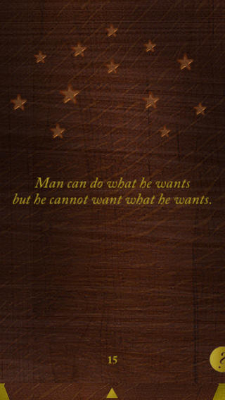
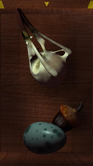
This is an old app. I found it when I was finding presidents for my thesis. But I think this app is really interesting. Cuz it has a simple format with a really deep concept. it’s in the entertainment category. however, I think the idea of this app is more about philosophy.
In the arts, vanitas is a type of symbolic work of art especially associated with still life painting in Flanders and the Netherlands in the 16th and 17th centuries. This can be also told from the style of this app. So for the UI part, the concept, name and style match.
For the function part, the only thing people need to do is to tap the box. So every time users open the box, there will be three randomly stuffs appear. Also with the time left, some objects will change the forms depending on their physical forms. Once users get the same object, one star will light up on the cover of the box. The philosophical idea behind this gesture is that: To lift you up when you’re feeling down. And drag you down when you’re up too high. It’s A memento mori for your digital hands.
For me, the attractive part is the simpleness of the function and the philosophy idea behind. Like what that famous sentence said: “People can not step twice into the same river.” every time people use this app, they will get something new. However they are loosing what they had before. I have never seen any of the apps achieve or provides this kind of ideas before. That’s the reason I like it.
Cuisinary Final Prototype Presentation
Interactive prototype is here.
I found an interesting app for android (They don’t have ios version yet) called “Spritz”
Based on a regular way of reading people eyes are moving around paragraphs to find words and read them. With the traditional way, our reading takes a bit of time be because of eyes movement.
However, “Spritz” app has changed your way of reading by providing word by word reading style into a reading box and each word has a red letter to be a focusing point. (each word has different focusing point) then users don’t have to move their eyes around to read. They mentioned that with this new method users can read faster than before.

I think it’s an interesting app since it’s simple and very piratical especially user interface that they designed on the phone.
More information
http://www.youtube.com/watch?v=NA5iPw3SKrM
http://www.spritzinc.com/
http://www.smartplanet.com/blog/bulletin/this-app-makes-reading-500-words-per-minute-easy/