One thought on “Presentation, App Map and Wireframes – Assorted”
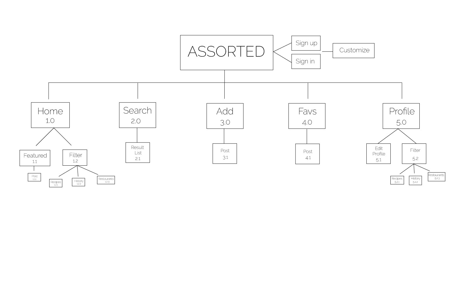
On your app map, it’d be good to keep all the boxes and all the type at the same size. It’s difficult to read the little type the way you have it set up, and in an app map, every view matters!
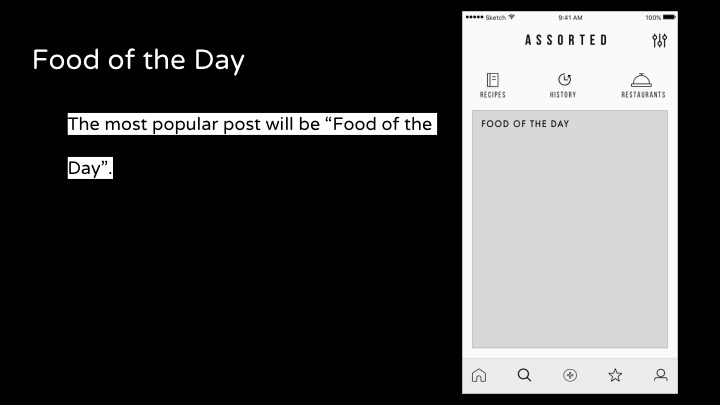
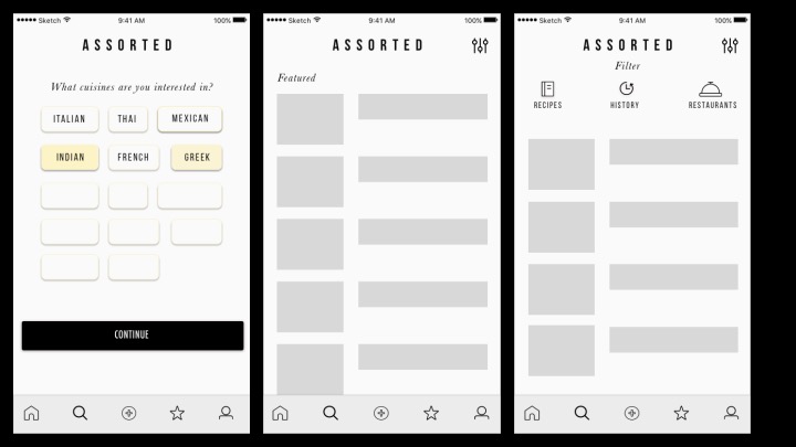
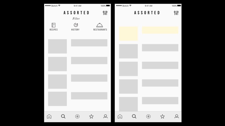
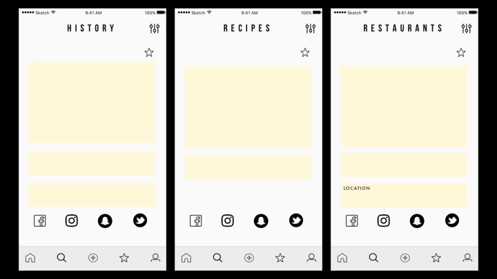
We talked about this in class, but the main thing you need to focus on is simplification. Your app is doing too many things right now. Focus instead at doing a few things well.
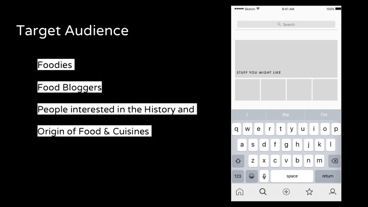
Once you decide on the core thing your app is going to do, you can approach your strategy for categorizing the content and making it sortable so that users can find things that they’ll be interested in. Whatever way you go, your app is based on content and users finding things that they’ll be interested in, so help them find cool stuff.
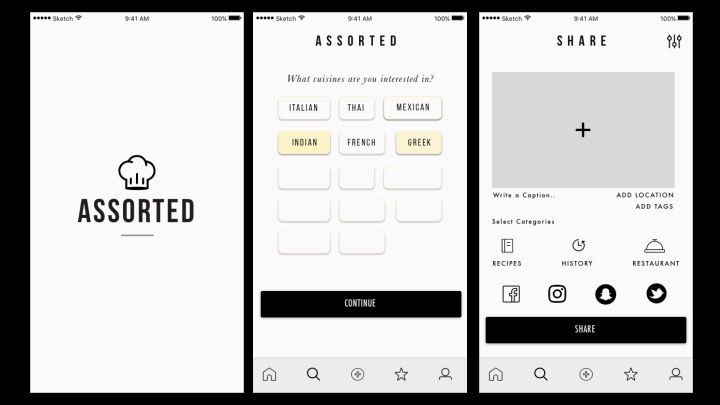
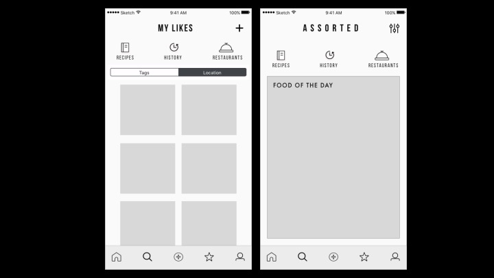
The grey boxes that you’re using on some of your views as placeholder are too basic to know what you’re imagining there. Images? Text? Images and text? If you simplify, you’ll have time to think through more details.
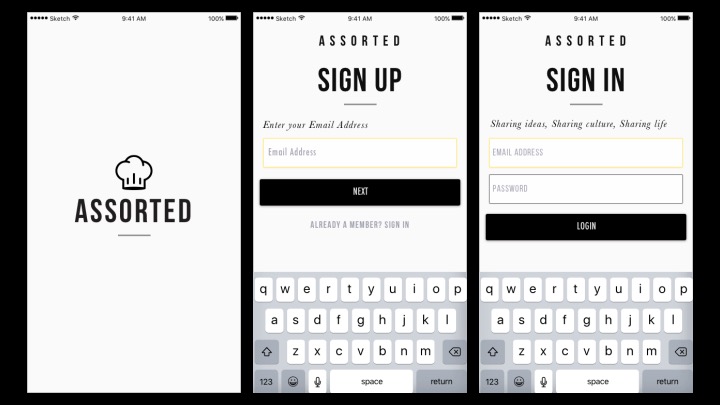
If at all possible, delay sign up and customization until you’ve proven the value of your app. Why should I care about what the app can do without having ever used it.
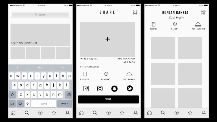
Again, once you’ve chosen what you want to focus on, you can think through the share view. Whichever type of thing is being shared will require different steps and different interface. Make that work feel easy for the users.


On your app map, it’d be good to keep all the boxes and all the type at the same size. It’s difficult to read the little type the way you have it set up, and in an app map, every view matters!
We talked about this in class, but the main thing you need to focus on is simplification. Your app is doing too many things right now. Focus instead at doing a few things well.
Once you decide on the core thing your app is going to do, you can approach your strategy for categorizing the content and making it sortable so that users can find things that they’ll be interested in. Whatever way you go, your app is based on content and users finding things that they’ll be interested in, so help them find cool stuff.
The grey boxes that you’re using on some of your views as placeholder are too basic to know what you’re imagining there. Images? Text? Images and text? If you simplify, you’ll have time to think through more details.
If at all possible, delay sign up and customization until you’ve proven the value of your app. Why should I care about what the app can do without having ever used it.
Again, once you’ve chosen what you want to focus on, you can think through the share view. Whichever type of thing is being shared will require different steps and different interface. Make that work feel easy for the users.