Please check the link below to check the completed project.
https://kelsey-yuyue.squarespace.com/new-page/


Please check the link below to check the completed project.
https://kelsey-yuyue.squarespace.com/new-page/
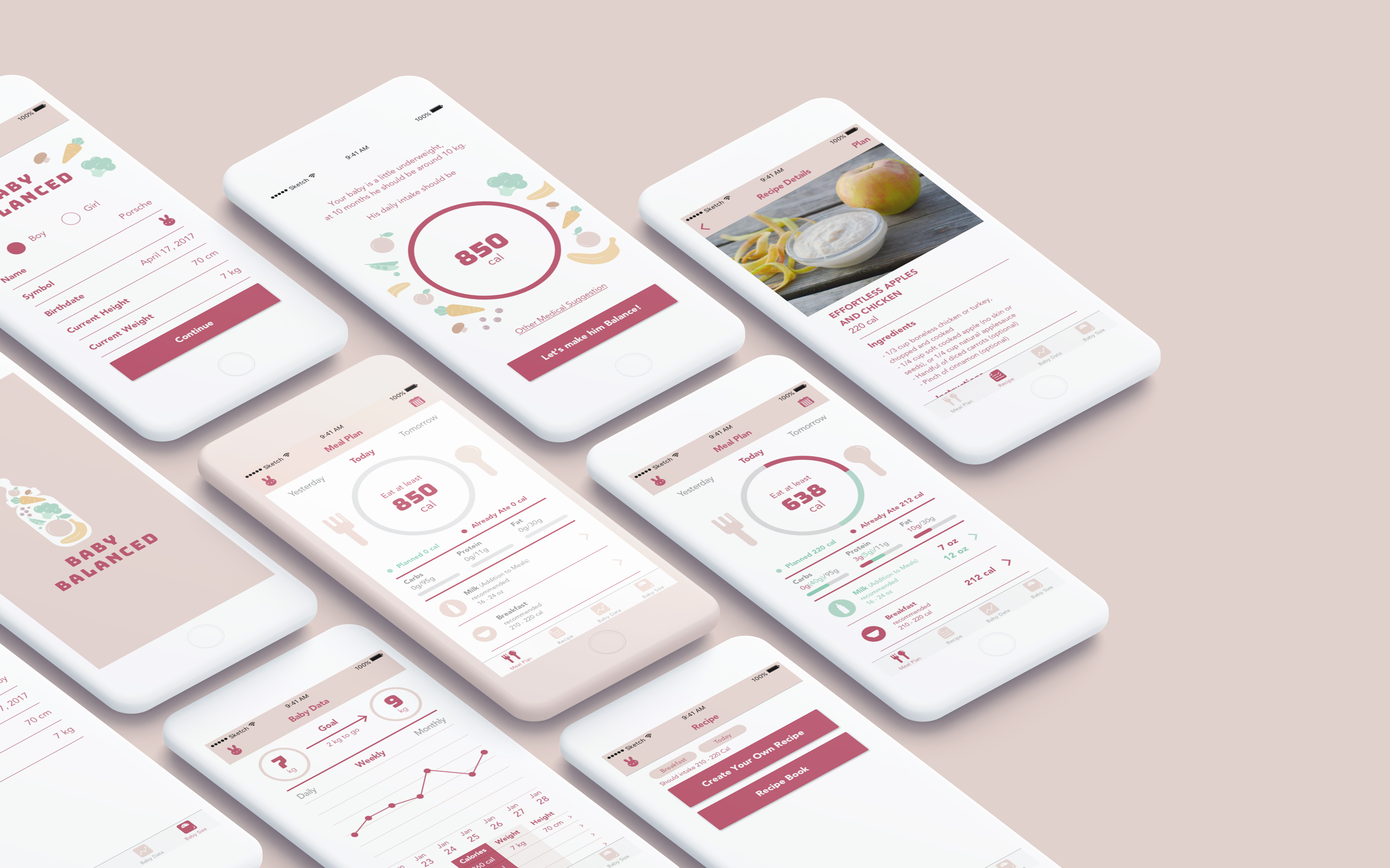
Insights from Week 5 presentation and user test:
Final Version:
https://marvelapp.com/c1efe2j/screen/38996736
After Presentation Insights:
https://marvelapp.com/7ii6e4b/screen/39124748
User Insights:
User insights:
User insights:


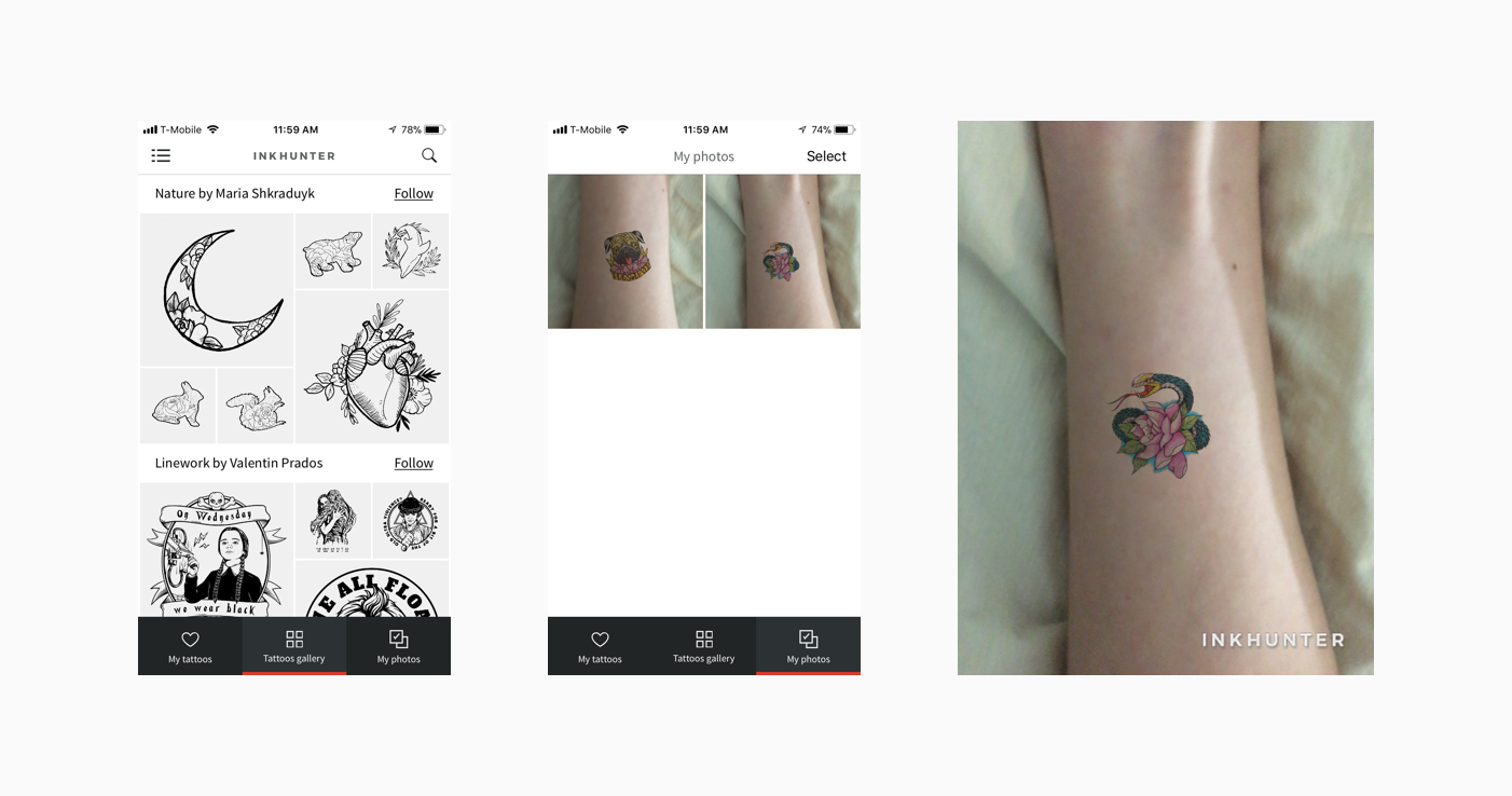
inkHunter is an AR mobile app for people to virtually “try on” various tattoos. By drawing a cross on the skin you want to have a tattoo on, you could easily preview the tattoo via the inkHunter.
Basically it is a simple app with this only feature, but I feel that it is great example to combine the AR technology with the mobile app in the real life. Users could select their favorite tattoos in the Gallery and tap on “Try” to try whatever tattoos they like.
User Insights
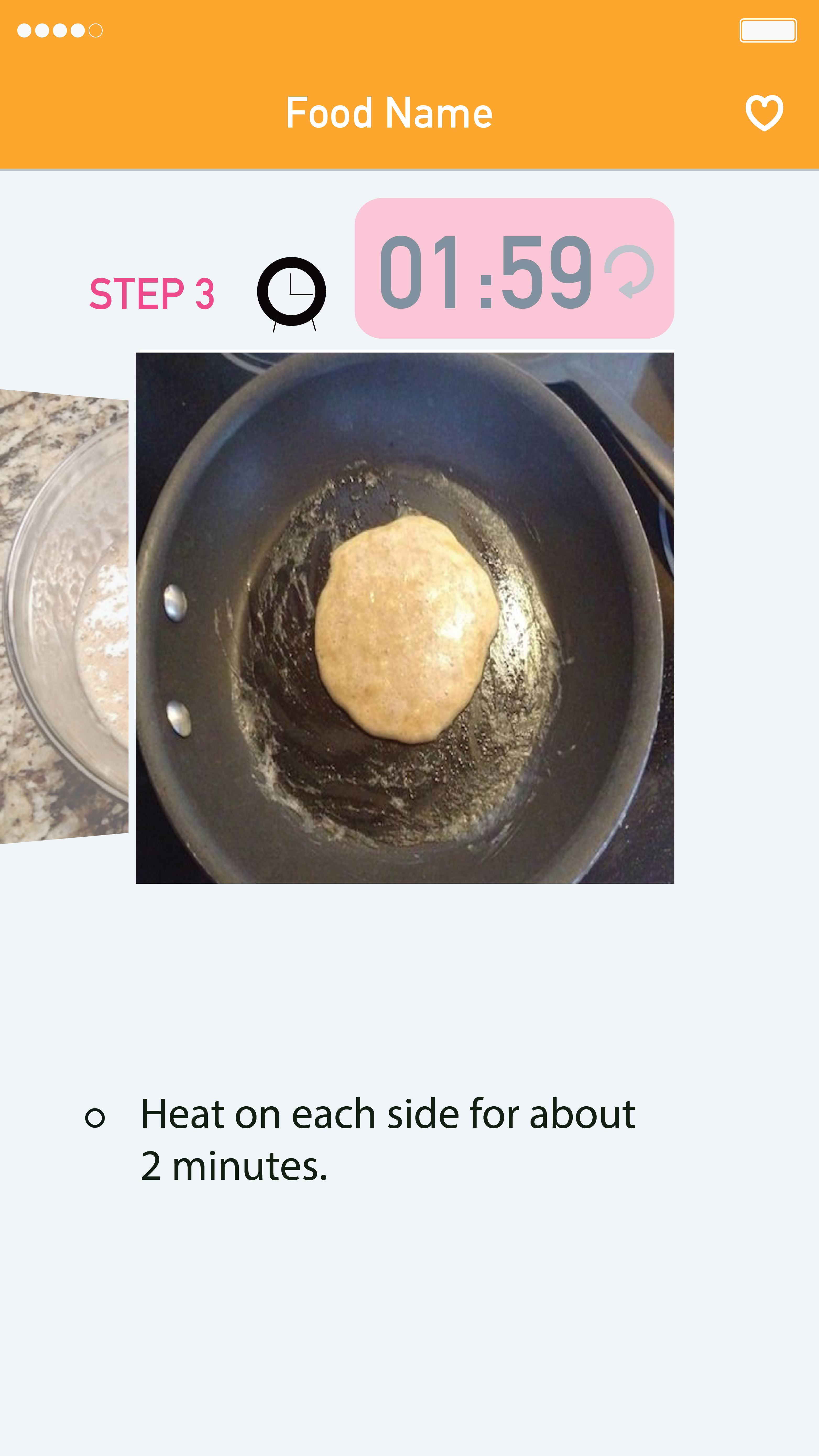
1. Clock Icon – Still does not look like clickable button
also, the Reset Button on the timer screen does not seem clickable.
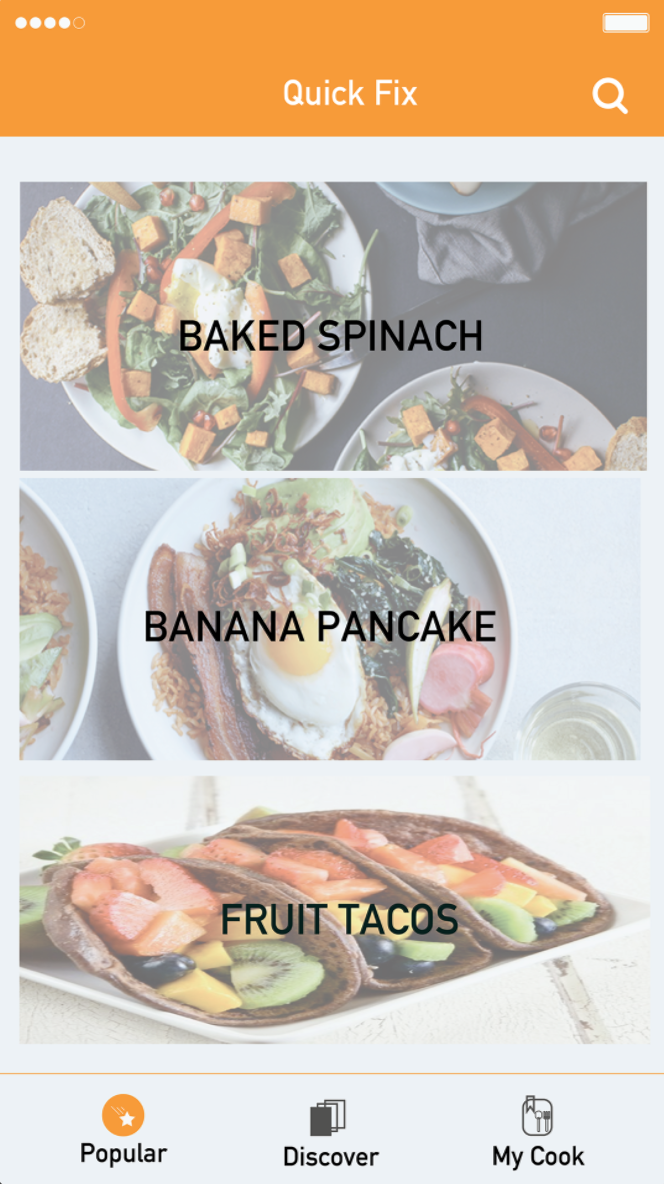
2. Pictures of the food do not look appetizing.
3. Two search parts have to be combined, so people do not get confused.
4. Still need a Home button so people can go back to the main page while reading step pages for the people who are not cooking but just exploring the recipes.
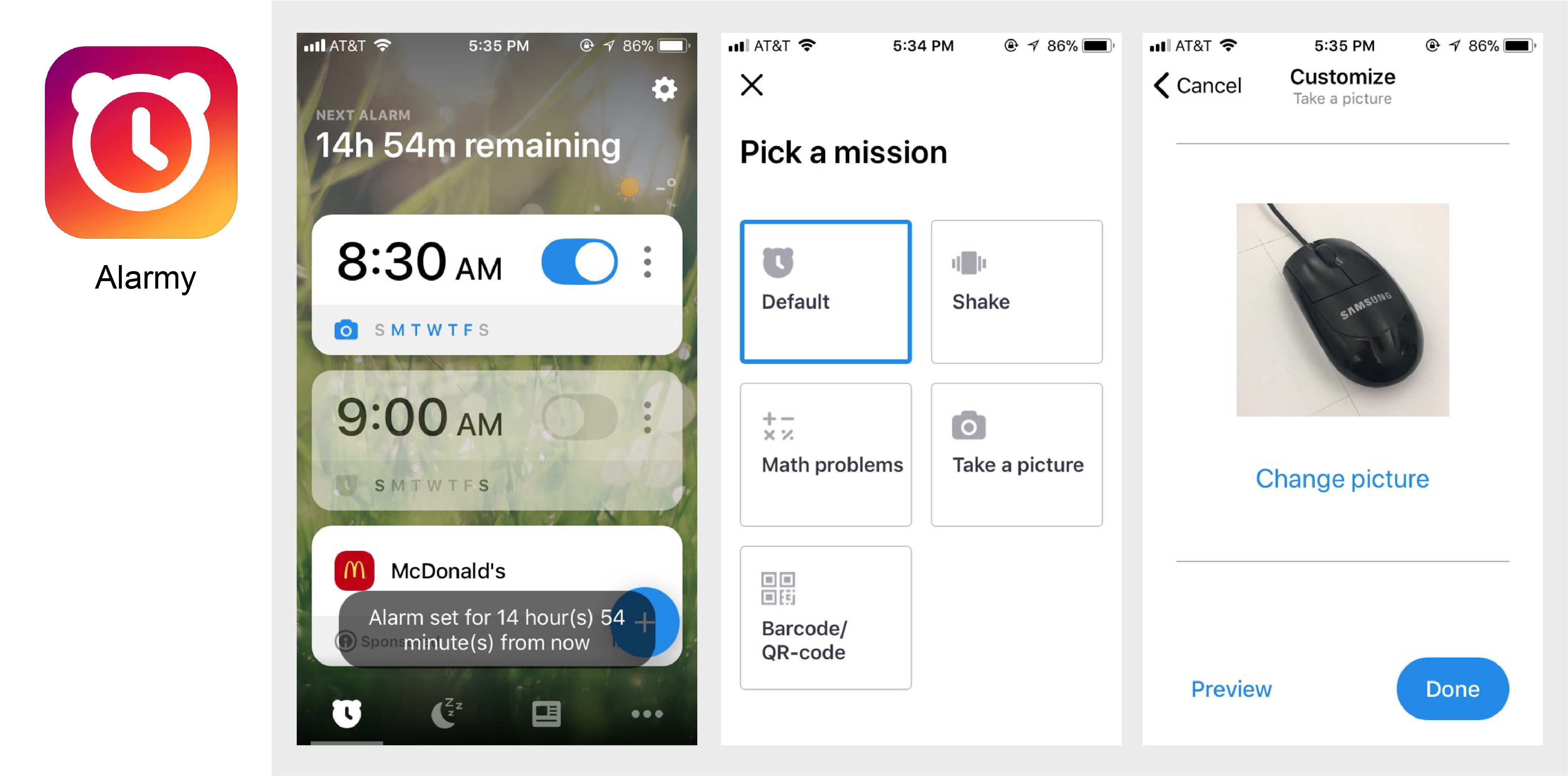
‘Alarmy’ is an alarm application, which ensures an easy start to the day by forcing you out of bed.
There are several activities you can choose.
1. Take a Picture -Move to a specific location.
You set it up by registering a photo of an area or room in your house. Then once the alarm is set, the only way to make it stop ringing is to get out of bed and go take a photo of the registered area. This function also helped people to connect to make habits in the morning naturally. For example, take a picture of the book they have to read, or take a picture of email account, so it helps people to read a book or check email every morning when they get up.
2. Shake – Physically exert yourself.
People have to shake the phone until they reach their preset goal to dismiss Shake Mode alarms. Their body could use some exercise in the mornings.
3. Solve a Math Problem – This activity allows for people to wake up the brain, as well as the body.
Solve some math to stop their alarm. For example, easy math problems: (61 X 8) + 12 is a lot harder in bed. They can customize the level of difficulty and number of questions to solve in the morning.