I reviewed the game app called “Clash Royale ”
it’s really fun!
Architecture of Radio has, in my opinion, deservedly received a lot of attention lately; it’s one of my all-time favorite apps (and one that I sincerely wish that I’d created). Basically, it’s a site-specific data visualization (and sonification) of wireless networks, employing geolocation and an entertaining interface.
Prior to this assignment, I had, admittedly, never viewed the iOS Human Interface Guidelines (nor, in all honesty, did I know of its existence). That said, as both a technologist and everyday user who only recently switched from Android to iOS, I found it a fascinating read. Perhaps most of all, I was intrigued by the mere existence of a set of guidelines for designing and developing for iOS—of course, it totally makes sense to exert this degree of control over your products, but it was not something I’d considered (although this speaks mostly to my not possessing a background in design).
Studying the guidelines, I was excited by the discussion of the two main modes of user navigation throughout an app, i.e., a hierarchical app in contrast to an app with a flat, i.e., non-hierarchical, information structure. I’m quite interested in what other, non-standard modes of user navigation might either already exist or remain undiscovered or created.
In addition, I learned a lot from the section on consistency, i.e., whether or not an app is consistent with (1) iOS design standards, (2) itself, and (3) its earlier versions. Here, it made sense that Apple would emphasize the use of system-provided controls, views, and icons, as well as a stylistic uniformity.
Last—at least for this short post—I spent a lot of time fascinated by the depth of technologies built into iOS. Having only recently purchased my first iPhone—a 6s model—this was an opportunity for hands-on learning as I experimented with technologies such as 3D Touch, thinking more broadly about how I might implement them within future app design, and more specifically about the relationship between these technologies and the aforementioned unconventional modes of user navigation.
final presentation
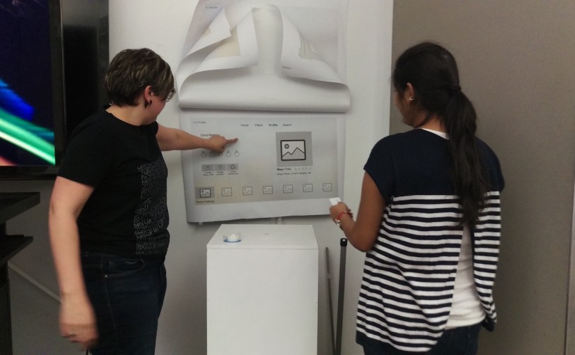
This week we presented our final design for our Apple TV version of our mobile apps from our first project.
Last time I presented several wireframes for Spice It Up TvOS that tried to communicate the essential experiences of the app as translated for an at home experience.
Throughout this process I did a lot more thinking about what it means to be using a TvOS app at home. How does it fit into one’s life? Who will you be using it with? What kind of interactions will change given this new technology?
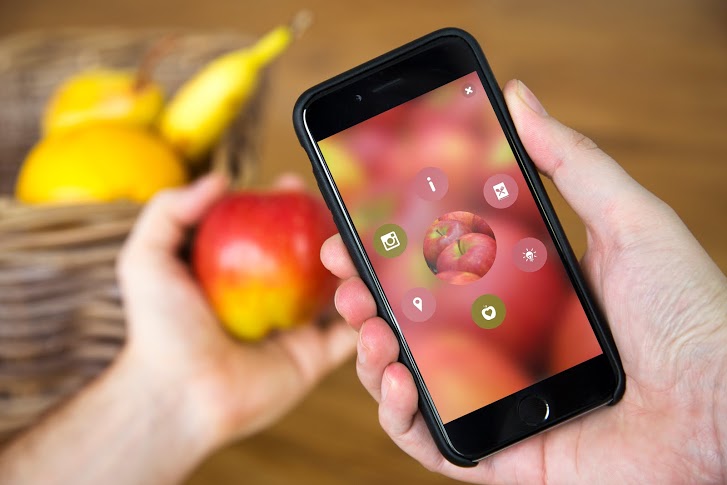
‘Blipping’ is simple:
1. Download the app and you’re ready to start ‘blipping’ almost anything in the world around you – from plants to pets, fruits, even your dinner! Try it and see what you discover.
2. Also, look out for the Blippar logo on packs, magazines and posters. ‘Blipp’ the whole page or product for amazing Augmented Reality experiences from your favourite brands.

Blippar can also be used in education. Help start an education revolution by transforming classrooms and museums into digitally interactive learning environments. Stoke the imaginations of students of all ages with textbooks and materials that come to life with immersive experiences.
With Blippar, educators can seamlessly enhance learning materials with digital content that students can access using a smartphone or tablet.

“Artifact Uprising App (AU Mobile) is an app can make custom, quality photo books, photo albums, cards, and print photos online. Inspired by the disappearing beauty of the tangible.”
Since almost everything is getting more and more digitalized nowadays, photos are taking by phones instead of taking by cameras, and people get used to save their photos in their phones. The reason why I love this app is not only because it’s really well-designed, clean and simple for users, but also the concept of this app is bringing people back to the “physical era”, which means photos are supposed to be printed out and share with friends in person. So the great things about this app are combing the digital software with physical/tangible things, and people who love taking photos by phones still can print out their pictures without so complicated steps by the camera. With this app you can just simply send the photos through either your camera roll or instagram or even VSCO cam.
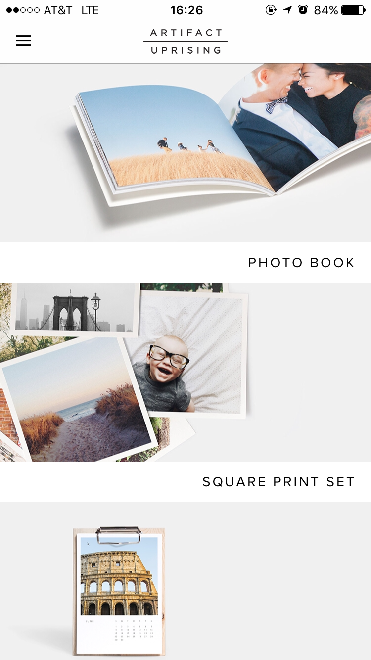
The first view is really simple and clean. It also provides the outcomes of the products for users to explore in different styles. Also, the kerning of the font makes the whole view looking very elegant.

The side bar is very simple and easy to understand. It is obvious to see the “log out” is doing totally different things with the buttons on the top, so users won’t accidentally tap on the wrong one. However, personally speaking, I will combine “my account” with “my orders” if I’m the designer. Because even though they’re doing two different things, they are still under the same category.

One simple key sentence to show the style and also price, which can let users to catch the most important information in a short time.

When you tap “get started”, it will lead you to the picking process, which allows you to pick photos through either photo apps or your photo library. This is very thoughtful to consider those filter lovers, also there are the commercial benefits inside(work with other companies).
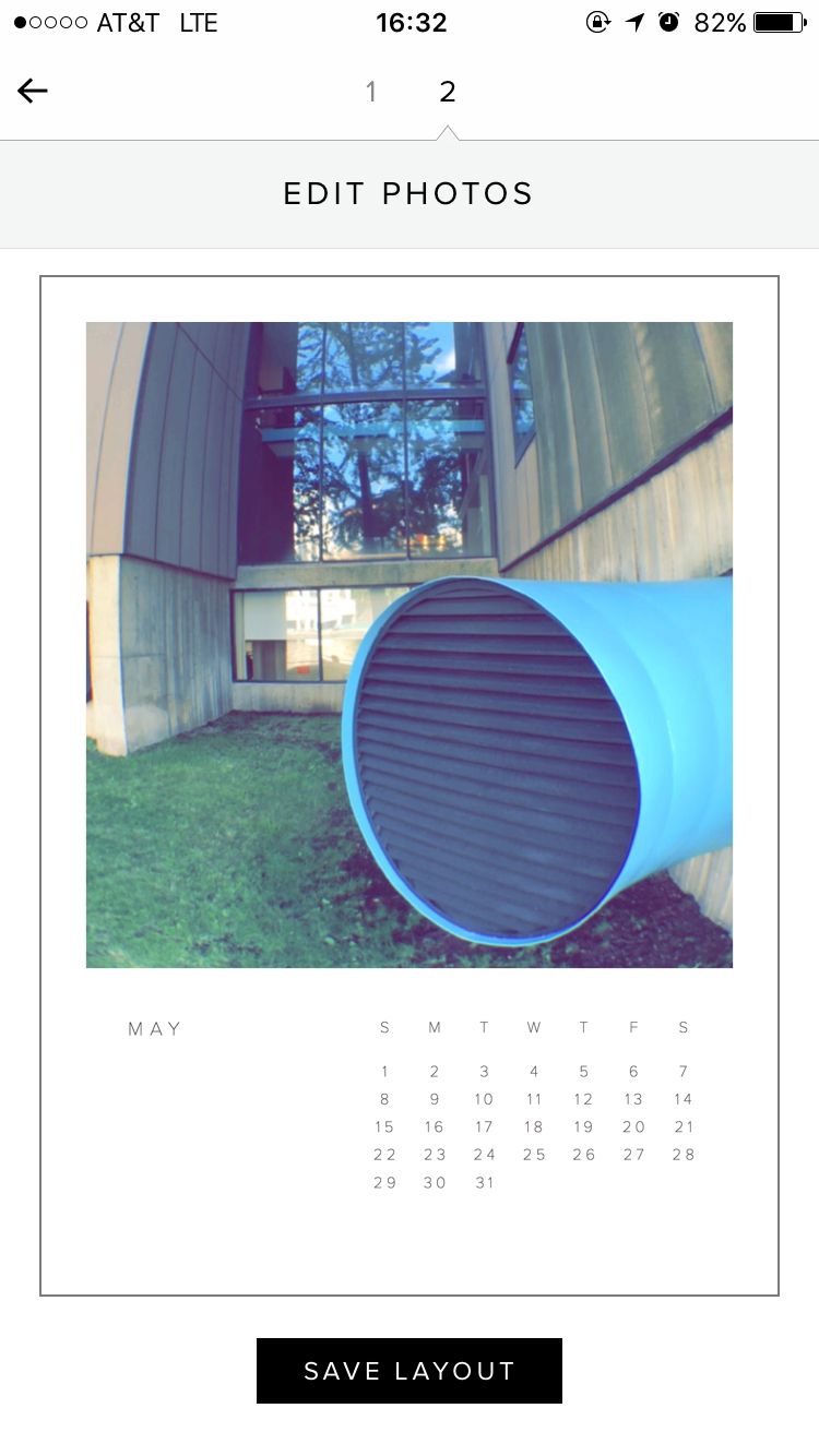
After picking the photos, which is the first step, users can edit the photos that they picked into the perfect position and inside of the frame by moving around the picture. Meanwhile, the nice thing about this view is the mock-up style, which allows users can view what the final product will look like.

When users finish processing each step above, the system will automatically upload the photos for you, which is very convenient. Also the “Cancel Upload” locates on lower left side, so users won’t accidentally tap on it to cancel, or very hard to reach if it locates on top side.


changed the wording of the segmented controller after user feedback saying “both” confused them, and also put the segmented controller into the search view as a way to filter in order to make the main discover page have more room for larger images.