Prototype #2 – COOKSMART Yihan Zhou

Prototype#2 in Flinto

CookSmart Prototype #2

After the first paper prototype, I re-design my idea with all the feedbacks. Also enhanced the interface.
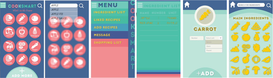
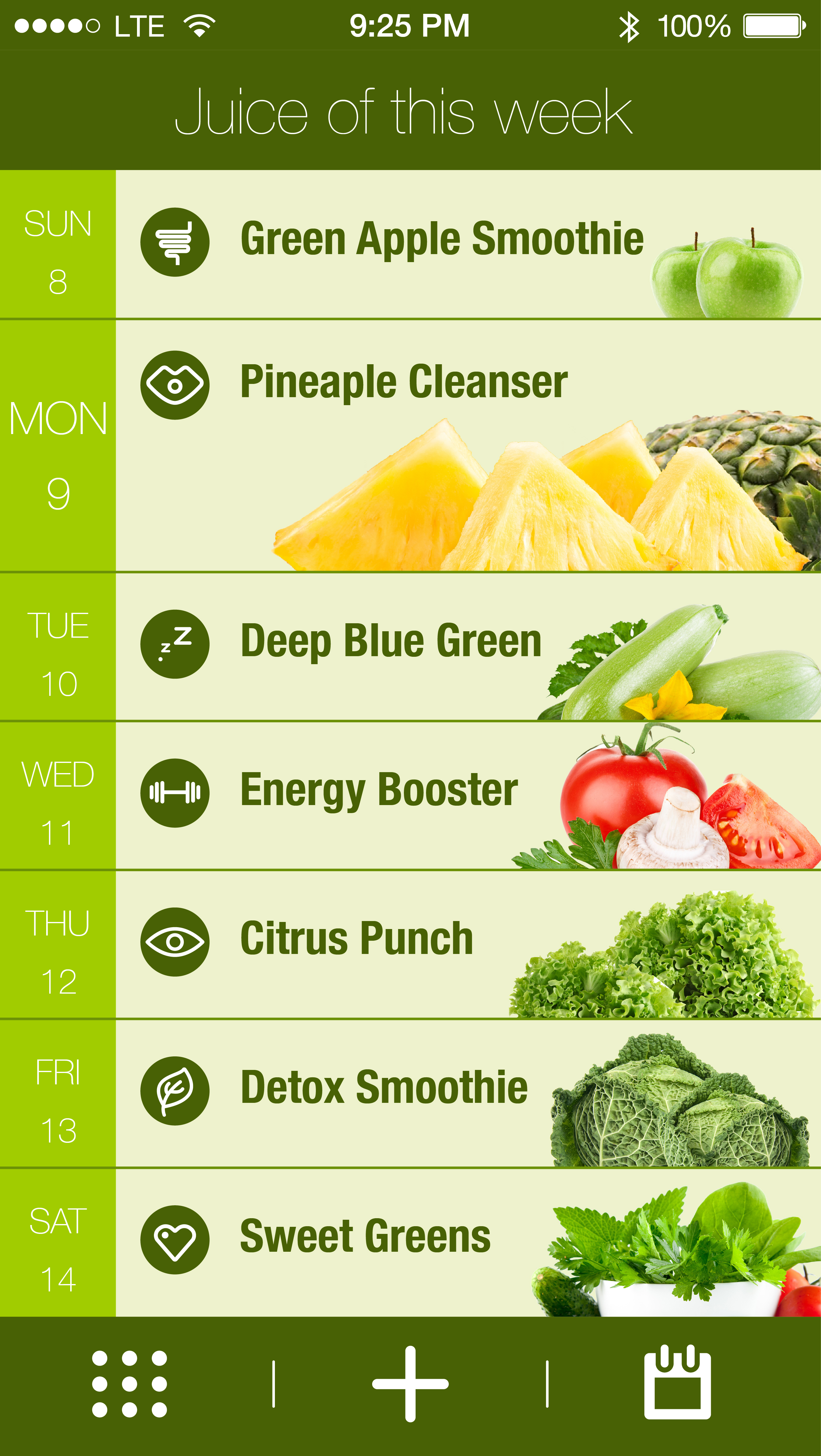
-Change the home page from preference set to inventory content, so the users will more easily manage their food. Also the magnifying glass on the right top is designed for user to search a certain food if they have numerous ingredients.
-When users tap on one ingredients, it jumps to the preference set interface.
-Add a button at the bottom for adding new ingredients.
-Linked all functions to a hamburger bar on the left so the user will know where they are.

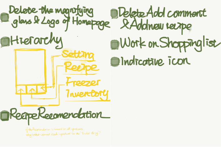
Things I learned from second time paper prototype
-Keep working on hierarchy
-The hamburger bar does not work well, it’s still confusing while jumping to the preference set interface.
-Still, shorten the process of in put ingredients.

Go Foodies! – Digital Prototype 1/2

Please find my first digital prototype at https://www.flinto.com/p/db9835a0.

Paper prototyping helps me realize that the bottom navigation bar should clearly indicate all the views available in an app. A user should always stay on one of the views. It becomes obvious that a constant navigation bar will keep the interaction flow, i.e. avoid that a user got stuck at some point in the app.

Apart from this, I do have a feeling that paper prototyping for mobile app is becoming less efficient compared to evolving, convenient digital prototyping tools we have today. Because the mobile application is a species born from the very medium of digital screen, a traditional medium is not capable of many of the interactions the mobile screen cultivates.

For Feb 26

  • Take your learnings from your wireframes and create a design for your app.
  • In your presentation and in your blog post, be sure to call out what you learned from prototyping. Post one to two learnings from your paper prototyping along with your design on the blog.
  • Create a Flinto prototype (https://www.flinto.com/) of your app.


  • Group 2 will present designs
  • Group 1 will prototype

Prototype 1


I made the prototype in Adobe Muse and the link is zeqinghong.com/simplejuiceScreen Shot 2015-02-10 at 12.10.19 AM


Changes I made

1.To unify the looking of the icons appear on the first screen, I added solid color background.

2. The calendar view is changed and now the user could be able to distribute the functions to the calendar.

3. Procedure bar is changed to three dots.

SimpleJuice-02


4. The icon for calendar is changed since it was unclear.SimpleJuice-05

we eat | Design

design-01A link to “we eat” on Flinto https://www.flinto.com/p/2ca9d101

Things I learned from paper prototyping:

Added a current tab for the meal plan so that users know their location and have an easy way to get back

Share meal plan button look like a call to action and not a place to see who you are collaborating with – changed labeling to “members”

In meal plan, changed the first day to be current day. View show upcoming days only


Capptivate.co

Capptivate.co is originally a website for collecting kinetic iOS UI/UX elements that was launched in June 2013. The author Alli Dryer, together with developer Claude Sutterlin, successfully turned the website to an app in January this year. The app allows users to check short animations showcasing delightful UI/UX design. They are catagorized by patterns and components. You can also view them chronologically. I find it a great asset for interaction designers.

2015-02-10 10.05.16 2015-02-10 10.02.49 2015-02-10 10.08.002015-02-10 10.07.272015-02-10 10.08.132015-02-10 10.02.40