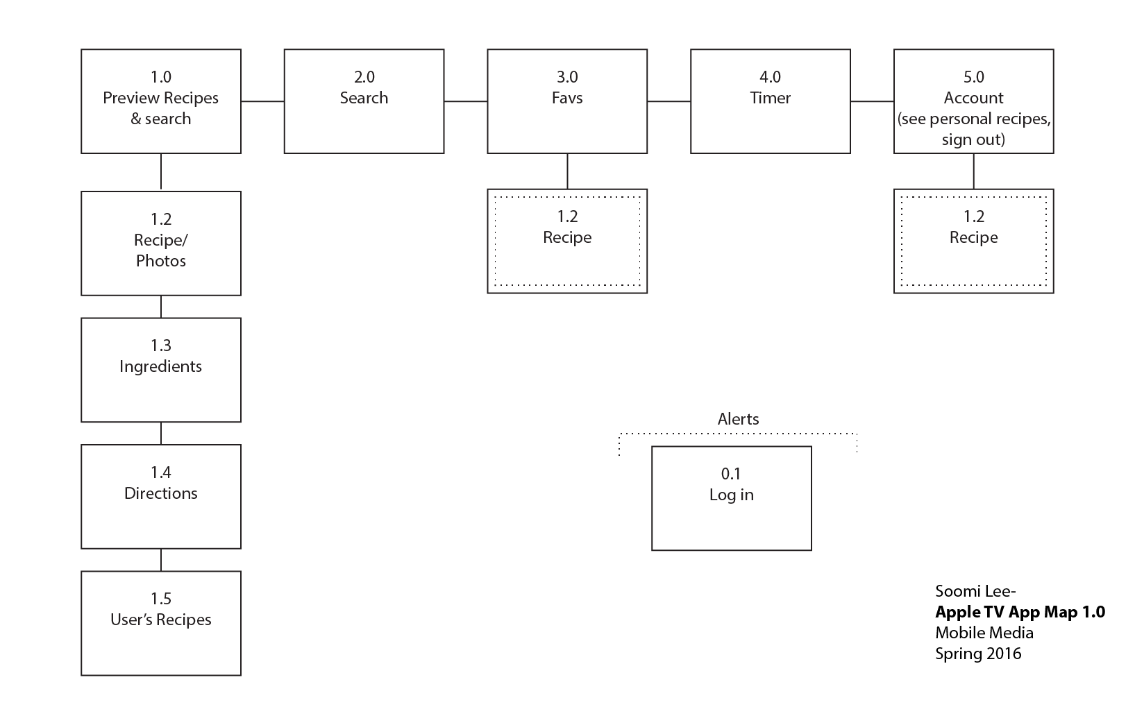
Project #2: Food Guardian on Apple TV – User Insights & Design

Photo 3-17-16, 20 54 32 Photo 3-17-16, 21 10 35Photo 3-17-16, 21 08 43Photo 3-17-16, 21 09 14

  • User Insights

    1. Are showing bigger pictures or images necessary?
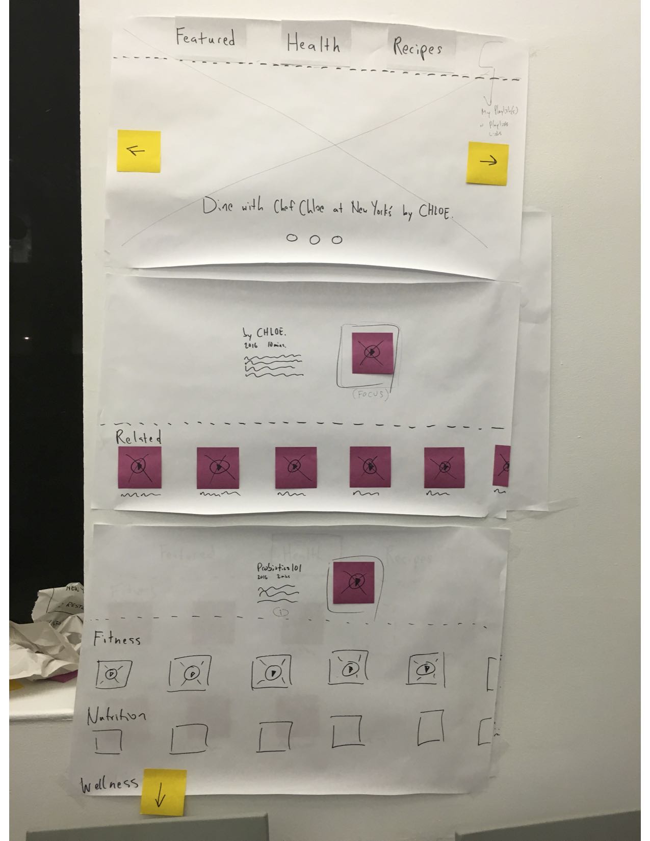
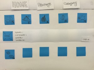
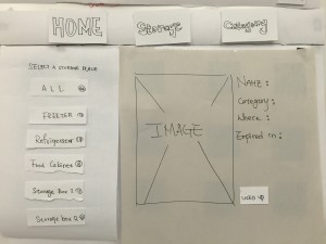
      Basically People know what their groceries look like, so it seems not very necessary to show larger pictures to users while browsing. It might be better use the way how details display under Home tag in Storage and Category tags.
    2. How focus move while there is a new layer?
      While user click a image, it will shows you a new layer and the details of the image, like name, category, expiration date and where it is. And there is also a button on that layer. Since the layer pop up, where the focus go? It should be more intuitive and simpler to users so they don’t have to think about how to control or where their focus go.
  • Design

Marvel App


Dump Cook: Apple TV edition

To translate my app successfully as a companion to my iPhone app, I removed some functionalities like adding recipes sharing, and focused on searching and cooking.

To facilitate a seamless cooking experience, the Apple TV app has a timer that the users can get to from the directions view and main tab bar. Because the TV has a much larger screen, all the directions are written on the same view so users don’t have to use the remote all the time while cooking.

App Map:app map2-04

Marvel Prototype

apple tv paper prototype

IMG_6104IMG_6104IMG_6104IMG_6104


user insight:

  1. This format is much better than the last time, the menu on the top, in the middle and the content on the bottom is more organized and reasonable.
  2. The page of “challenge” still need to be modify or revise, it still confuse and the content is not that clearly.
  3. The page of “me” doesn’t show on the paper prototype
  4. How to fit so many text in apple tv is a challenge!

Food Story_version 2.0

Food story

Hi guys, sorry I forgot to post this. It was left in the draft box.


This is the second version of Food Story. Learning from the feedback of the first version (the wireframe), I adjusted the user flow and worked on the visual design.

屏幕快照 2016-03-31 上午12.31.32屏幕快照 2016-03-31 上午12.31.43屏幕快照 2016-03-31 上午12.31.58屏幕快照 2016-03-31 上午12.32.14

屏幕快照 2016-03-31 上午12.32.37屏幕快照 2016-03-31 上午12.32.27屏幕快照 2016-03-31 上午12.32.48

Got great feedback from the class. This is what I learned from the user test.

1 . It takes so many steps to add restaurant&dishes informations. Considering the possible scenarios, I will add a function of “draft box” for users to save the stories later. Also I tried to cut down unnecessary steps.

2. There is too much things going on the feed page. A better visual layout is needed because the users don’t know where is more important.

3. Users are confusing about the difference between the “feed” and “discover”. The feed is for the stories that I followed. And the “discover” is for the stories that are very popular. Partly because I used the exactly the same view for both tabs.  So I need to design a new view for the “discover”

4. Users are also confusing about the calendar in the “me ” view. The calendar is designed for a clear view to show which day did the user post their stories. Testing reveals that users care little about it. This function will be cut off.


For this version, you can try the prototype below. Please feel to leave comments here about your experience exploring it.  https://marvelapp.com/4db87c6


Pengpeng


Boil Monitor (TVOS) – Slides, Design

Here’s my slides of Boil Monitor for latest iteration:

BoilMonitor_appletv_design


Prototype:

prototype_s

User insights:

  • User hopes to start a timer near the pot (like on phone/watch) so he can accurately measure the time right after he adjusts the heat (walking back to the couch and then interacting with the TV would take ten to twenty seconds). But when he sits in front of the TV and the pot in monitor seems good, he want to edit the timer just on TV without going to kitchen.
  • User doesn’t want to attach and detach the phone above a hot pot frequently (which increases chances the phone falls into the pot), so the function to edit/reset timer on another device like TV or watch is important.
  • When user is watching TV using the picture in picture function to monitor the pot, he won’t switch back to the app if he doesn’t need to edit the timer.
  • User wants to keep all the cooking status in app temporarily for reference, before the app goes back to initial view, even if he detaches the phone.

tvOS Concept Presentation & Paper Prototyping

Below you’ll find my early tvOS concept presentation, which was developed in response to the need for a version of my previous dietFinder iOS app for the Apple TV platform. Given its grounding in geolocation and mobility, the iOS app didn’t translate well conceptually to the latter platform, so a genuine rethinking was necessary. The new, tvOS app presents diet and lifestyle video content.

brogproto2

I continue to prototype to address concerns raised in user testing, e.g., what happens after the user views a video—i.e., is there an autoplay function or are there recommended videos. In addition, I am addressing a desire for making playlists. More updates soon!

brogan-tvOSpresentation