Introducing FreeBox 2.0
Posting this a little late (had trouble with Mobile Media blog), so have been hosting on my own blog.
Wireframes
Here are our wireframes & background explanation for Freebox 2.0. We will post our redesigns shortly for the next step, still collating some more user testing before summing up last rounds changes.
As always, you can also see the full post on Dana Marten’s blog.
For the past 5 weeks, Sneha and I have been part of a design team with our classmate Hannah for our Design for Usability class. As part of our learning process, we were required to start an awesome project called “Paper Me Usable” which focuses on designing a solution from start to (almost, really never…) finished, placing emphasis on pieces of the design process integral to executing a good human-centered design.
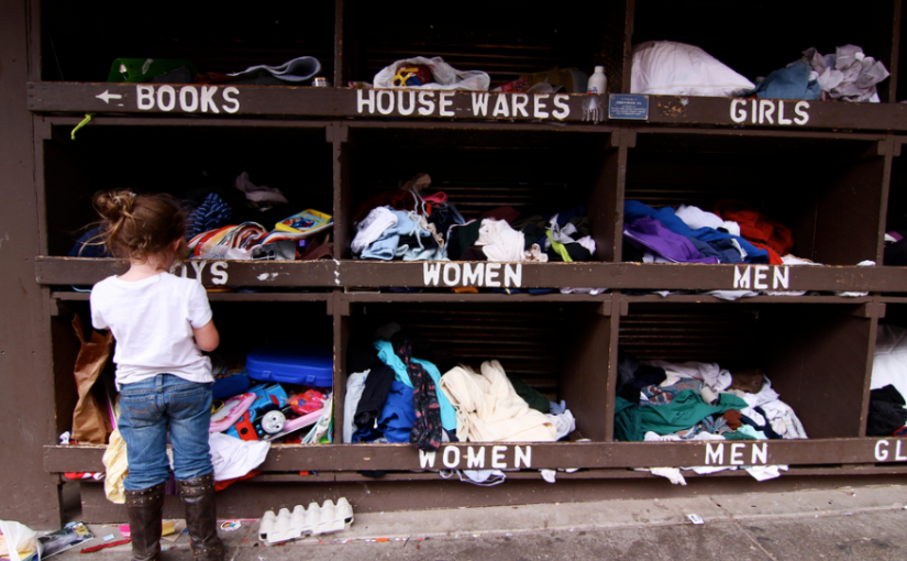
We started the process by brainstorming ideas, generating research questions, and performing interviews and observation studies. Soon it was decided that our design solution would focus on meeting the challenge of helping New School students share leftover materials from projects. Several students across departments have leftover scraps or whole pieces of material (wood, foam, cardboard, fabric, electronics etc.) remaining when they finish work. This material is often thrown out or left over the summer to be thrown out. While some departments do have relatively well-used scrap bins (such as the wood shop) these areas are not well publicized and several students from programs not necessarily requiring woodwork would have no idea that the resource even existed.
Several students across departments have leftover scraps or whole pieces of material (wood, foam, cardboard, fabric, electronics etc.) remaining when they finish work. This material is often thrown out or left over the summer to be thrown out. While some departments do have relatively well-used scrap bins (such as the wood shop) these areas are not well publicized and several students from programs not necessarily requiring woodwork would have no idea that the resource even existed.
For a full write up of this process, check out our wrap-up post which contains all the aspects of our process: brainstorming, framing a design question/challenge, research & interview setup, generating personas, design requirements, scenarios, and our first round of usability prototypes and testing results.
Unfortunately, the project was over too early for Sneha and I’s taste. With such wonderful evaluation and iteration frameworks now within our range of expertise, we both wanted to see the project through and keep testing new and better prototypes. Also, we identified serious design and user-experience flaws in our tested prototypes that we wanted to iron out.
Both Sneha and I believe that this solution could be a really awesome tool for college students and given all the hard work we put it nurturing and growing this idea, we wanted to finish more usability prototypes and move towards a look & feel prototype of the designed application. Eventually, this would help both of us develop and implementation prototype of the connected technologies necessary for this to work (the back-end has a strong iOT requirement)
Eventually, we hope this additional prototyping will help iron out usability and visual issues necessary for us to strategically develop an implementation prototype of the connected technologies necessary for this to work (the back-end has a strong iOT requirement). It’s always best to save the tech and coding for last, so we are determined to get this working as best as possible design-wise, then start making necessary cuts due to the functionality and limitations of the systems we want to harness.
In this post, we will document the next two usability prototypes we undertook, which are both only wireframes with no formal visual and branding elements. The first was the result of feedback from the end of the Paper Me Usable project prototype, and the second is a result of another round of user-testing and rapid iteration done with traditional paper prototypes.
Freebox 2.0 | New Wireframes
Version 1
We started out this iteration of prototypes with feedback from our last version.
The areas of issue during user tests were:
- Overall Navigation
- The Message Board page
- How Messages & Alerts worked together
Navigation:
Users understood how to use our app generally however, they thought several pieces of the navigation was awkward.
- Hamburger menu is confusing. It opens from opposite side of the icon
- Expanding messages in the inbox to “read more” and only having reply controls available after opening
- Users never use the bottom navigation (looks too much like mobile website) and didn’t notice it was even there (we actually removed this mid-way through testing b/c so useless)
The Message Board
- Expanding message board items to “read more” was a pain point for many users
- Confused about how to reply to posts, reply button is hidden under read more (same as in the inbox)
- Confused about what icons mean, no words to indicate what they are and they aren’t standard enough to be intuitive (free, swap, paid etc.)
Alerts & Messages
- We first called alerts notifications on the page, way too confusing. Updated to alerts
- Different categories of alerts are redundant with inbox for messages
- Confusing how alerts badges are only on the menu, means you have to refer back to navigation to see how many you have each time.
Updates to App
In response to these concerns, we made several changes to Freebox 2.0 for the next iteration of testing.
Standard app conventions
Make sure to pick standard app conventions and use them to make navigation easier (menu direction, tables in menu etc.)
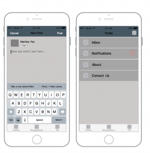
Swapped Hamburger Menu for Tab Bar
Structured the main parts of site better, collapsed extra items under profile because secondary features
Terminology & Categories
Labeled icons to remove confusion, set definitive character lengths to keep messages short and to the point. Standardized page names and other terminology.
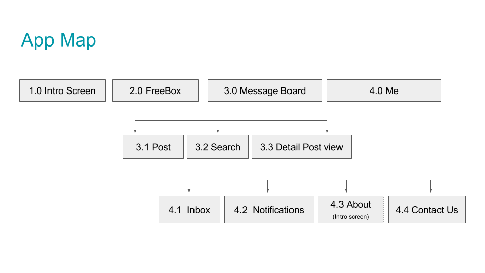
Below is an app map and the first round of new wireframes we created to address these issues.
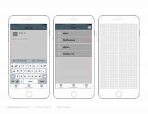
Wireframes for Paper Prototype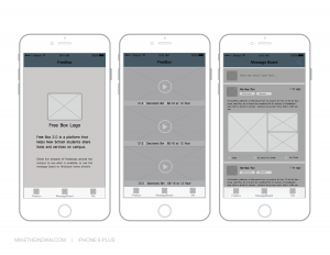
Feedback
- Overall we found that this iteration was MUCH more successful than our previous ones and users rated it more highly overall in every category
- However, users also thought that everything was too small. They found it hard to read what each of the different UI elements were, especially if a block of text.
- People were also confused about “setting for similar” when it came to the alerts. They thought that this was a bad way to add alerts and didn’t make sense on the Message Board page. Weren’t sure what the “similar” meant since there were multiple tags
- The placement of text labels next to actionable UI elements was also a problem for several people. They either didn’t realize they couldn’t tap on the button, or thought they could additionally tap on the labels
In order to continue prototyping after presenting our initial wireframe in class, we quickly decided to make a refined version with bigger text since it was such a problem. We also took the time to fix a couple of UI elements that were confusing for people (blue vs. white) navigation items etc.
WIREFRAMES – Version 2! (More readable/testable)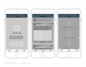
After we made these adjustments, user testing went much more smoothly as everyone could actually read the text we had. This led to some more feedback regarding content.
- Inbox and notifications is still a problem for people. Users were confused why it was under the “Me” tab.
- The drop-down menu on the “post message” page to set tags is confusing. Rather than be visible when adding them
- Want more in-between screens to help show how to set notifications etc.
- Alerts would be a better name than notifications
After collecting these insights, we set out to address these issues in our next prototype, which also included visual elements.
Stay tuned for more!
Check out our full presentation on Google Drive.