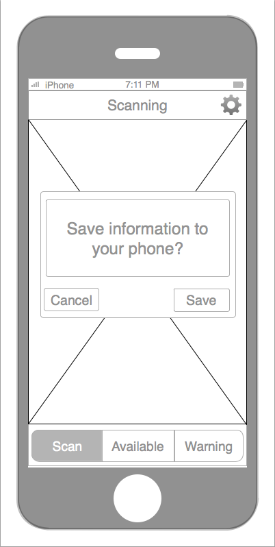

If you buy vegetables in the market, you need to swipe your bank card, at the same time, this app can scan the barcode from list, and save the information in this app. Because you can’t always remember what’s missing from your fridge. So this app can help you to know that what kinds of food you need to buy and your have bought something. And also this app can remind that what kinds of food that you can’t eat together.
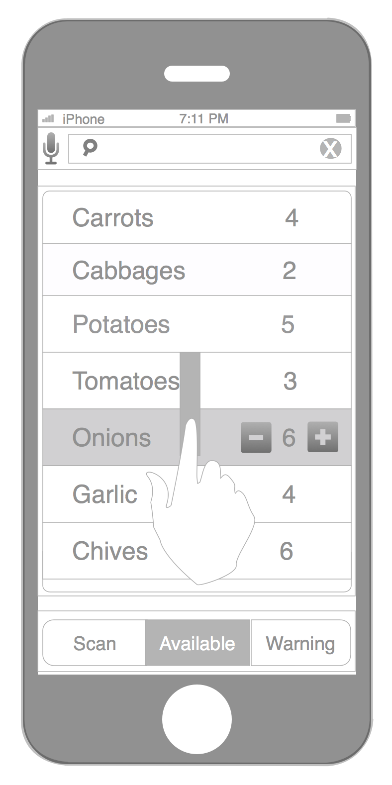
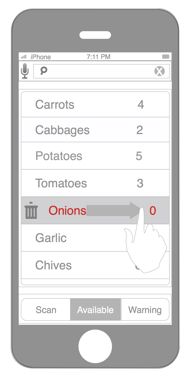
Of course, if you had eaten some things, you can delete the balance in your free time, and also you can through Siri or click to increase and decrease your new foods.
I think your core idea here is still interesting, but we need to need to clean things up to make a clearer user flow. I want the actual app to feel as smart and useful as your description makes it.
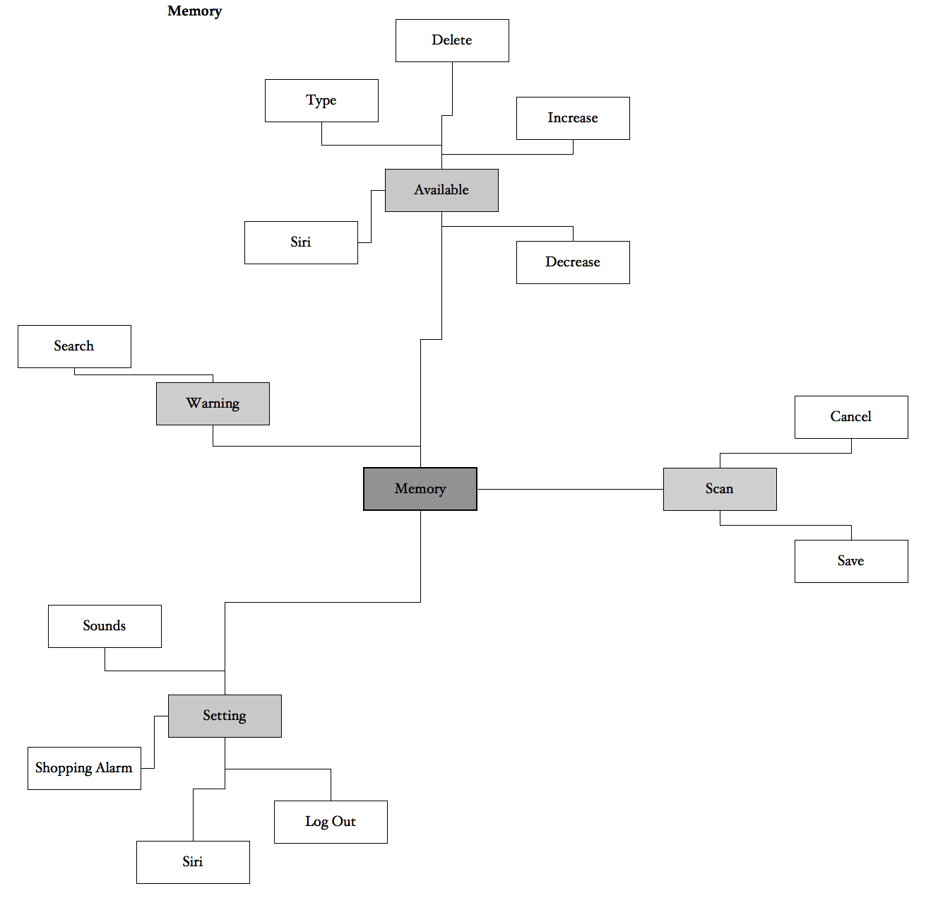
Your app map seems like more of a brainstorming cloud than an organized arrangement of views in your app. If you organize them so that you can present them more clearly, it will in turn make your app more clear. I count 17 boxes, so I’m guess there should be 17 views, but you only have 8. 17 would be a huge number though, so again, simplify and organize the map.
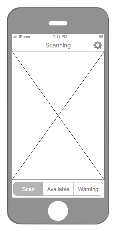
I’m unclear about how the scanning page is working. What am I scanning? An object? A barcode? A receipt?
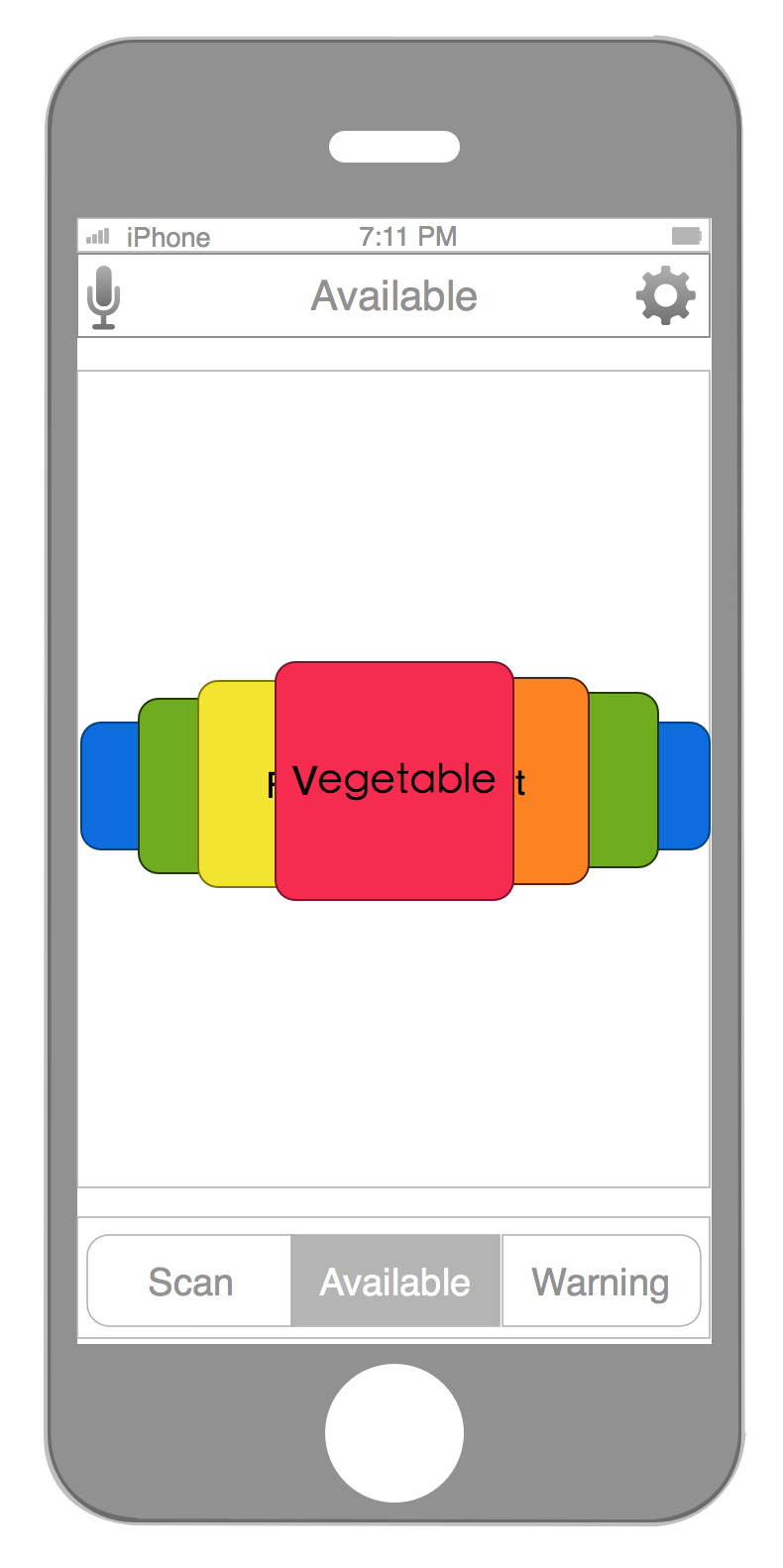
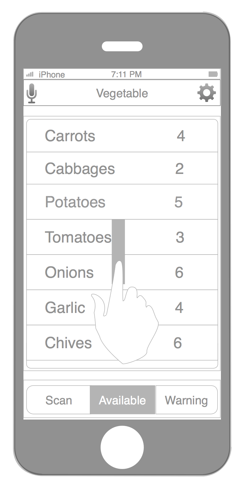
On the available page, what is being listed there. Instead of using ‘list 1’, etc., use real names of real items to show what you’re taking about. How are these items arranged? Can I sort them? What’s the most useful information? How many of them there are or when they were bought or something else? Expose that info.
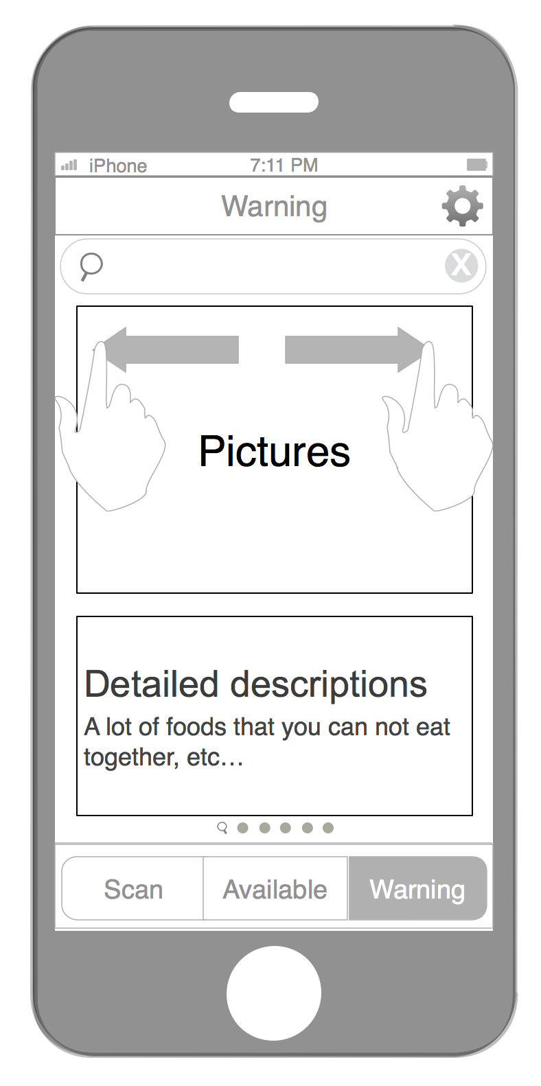
The content of the warning section is confusing. Is this items that are in danger of going bad? Why should that be in a separate list than the available items? What are the pictures and descriptions you’re showing here? And what is the search for?
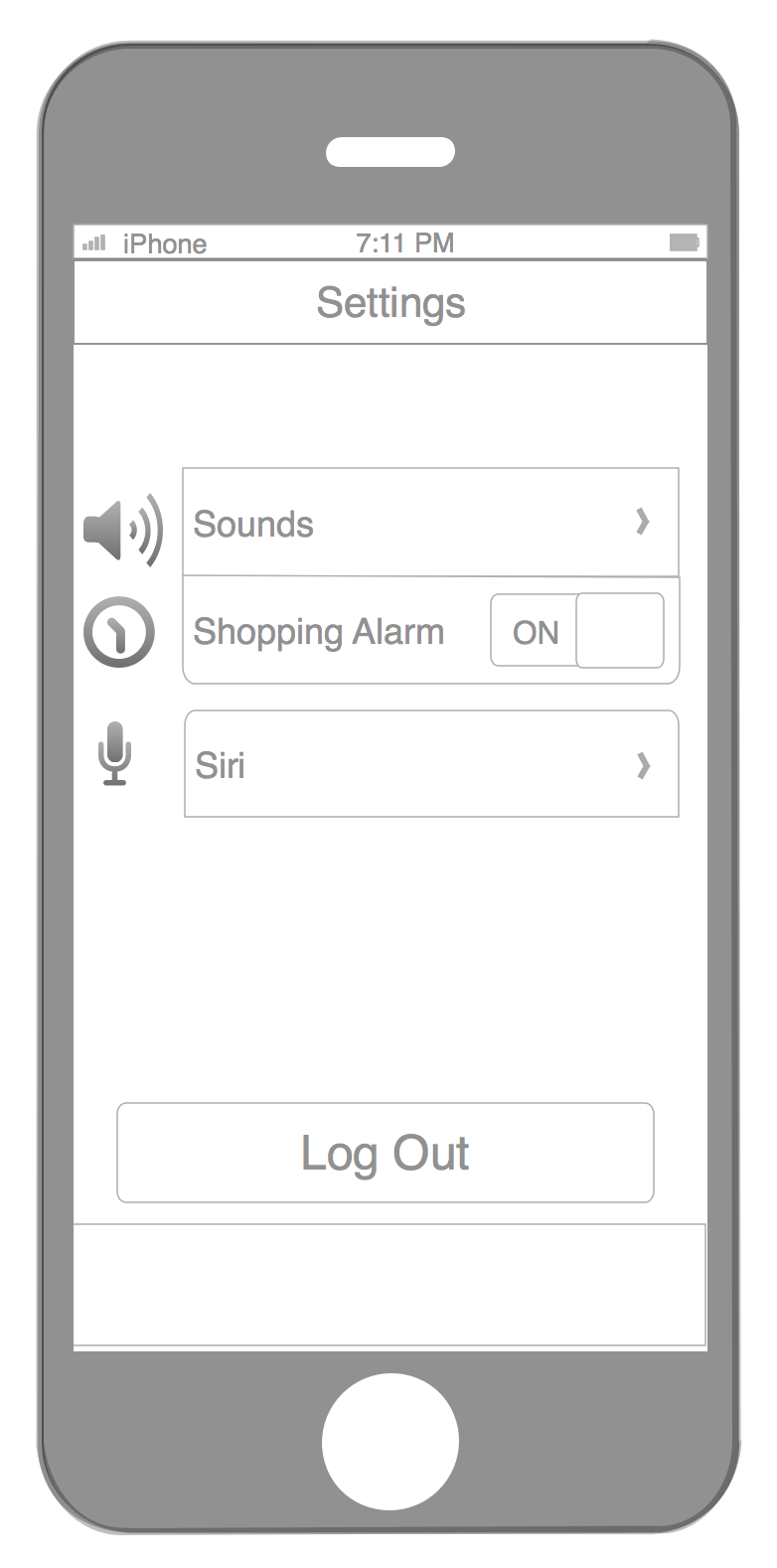
The settings seems overkill. Why would you need Facebook? Leave this stuff alone until you get the main app fully figured out.