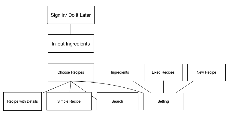
APP MAP
User Test
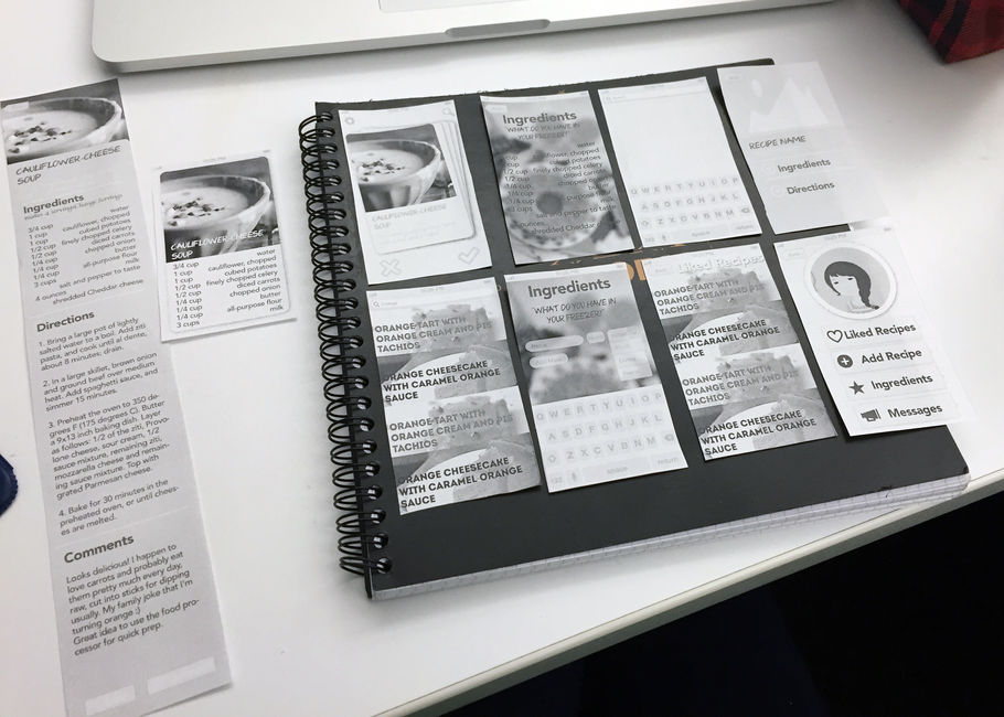
Things I learned from first time paper prototype
-Reconsider the hierarchy so the user can know better why they are on this app.
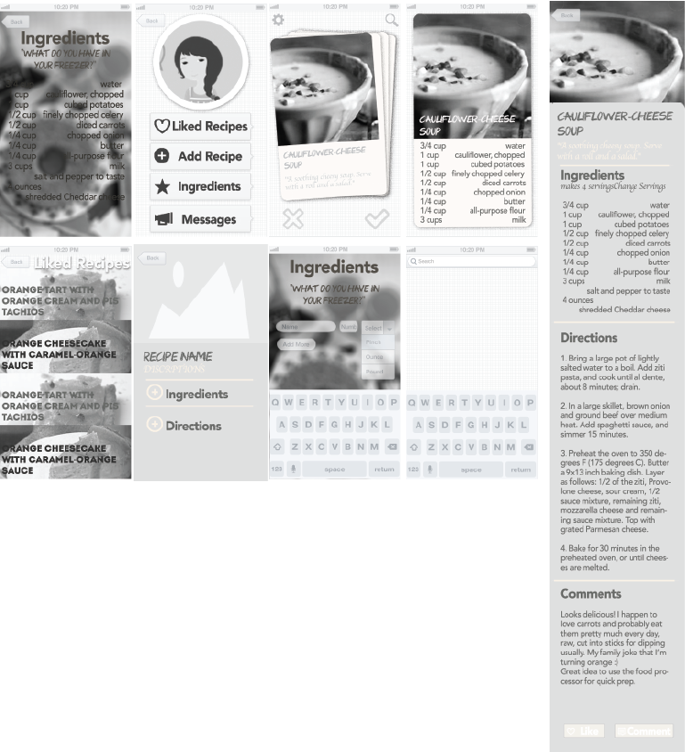
-Instead of showing the simple version of recipe, just directly lead users to the full version of recipes.
-Simply “Ingredient-input” as much as possible, do not create more pain points while solving the problems.
-Think deeper with the essential logic of “Tinder design”
We talked pretty extensively in class, but just to reemphasize my main two points: focus on elevating the freezer management and try to explore non-Tinder like interactions for finding meals.
The arrangement of the views on your app map is clear, but the yellow lines between the views are a bit hard to read, and it would be helpful if you labelled the detailed view in the same way that you have the views labelled in your map.
Like we talked about in class, focusing on the full lifecycle of the detail oriented and eco-conscious cook could make sense. How do you make it easy to input pantry items, find recipes, and create shoppings lists (which will turn into panty items which will be used in recipes….)
A single recipe page will like make sense instead of having the two views.
Also, when you’re working on your wireframes, don’t worry so much about fonts and design. It’s good that things are grayscale, but it would be worth freeing yourself up even further.
Your app map shows a sign in screen, but I’m not sure why that would be necessary. It seems that you should be able to save all the info locally to the device without an account.