Note: There is no official name for the app yet.
Art Direction
Bread-related colors. A little bit of vintage to keep up with the trend. Homey, but professional.
Icons
There are two versions, with the second one as my preference.
![]()
Interface
Splash screen as a loading page.

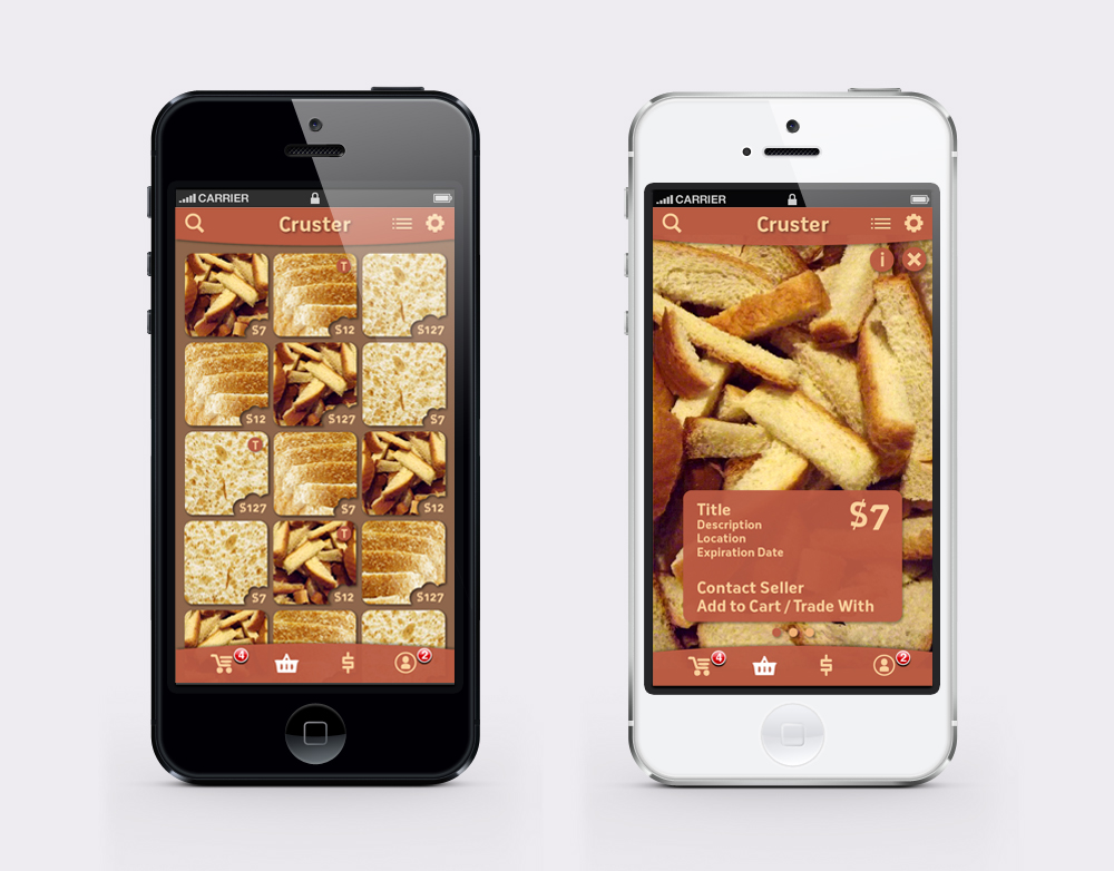
The app starts with a buy page that displays photos of selling bread parts with pricing as a gallery in a newest to oldest order. There is the list icon on the top right corner for changing the ordering (nearest, lowest price, mostly random). Next to the list icon is a gear icon for the settings page. On the lower tab bar is a set of icons to access other pages (from left to right: shopping cart, buy, sell/trade, profile).
The (T) icon on the top right corner of each photo indicates that the item is available for trade.
Once tapped on a photo, an item page will pop up over the buy page. Here, the item’s photos can be viewed in the background by swiping horizontally. An information box on the lower part of the page can be turned on/off using the info (i) icon on the top left corner next to the close (x) icon. Under the information box is a row of dots displaying the numbers of item photos.
The shopping cart can be viewed by tapping the first icon on the lower tab bar. It will show items you want to buy and trade in separated categories. For the sell/trade page, which is accessible through the third icon on the same tab bar, there will be a form to fill and upload photos.
You can always go back to the previous page using the arrow icon on the top left corner. To go back to the buy page, use the shopping basket icon, which is the second one from the left.
