Three Things I learned from Paper Prototyping:
What I learned from prototyping is that most people will not take the time to signup to use an app that they’re unfamiliar with. So I found that adding a guest login option is an alternative direction to take. Regarding the feature for signing up for a free membership, the benefits consists of giving users a 10% discount on all meals they purchase. I also have learned that the way things are worded are key for simplifying the users experience. For instance, my landing page stated “Meals designed by professionals.” Instead of specifying who the professionals are. Another key value that I have learned from user testing is that there had been confusion with the profile page. The users didn’t understand the functionality of what this feature had provided. Overall the feedback that I have obtained had been positive, There is still much work that needs to be iterated through the next developmental process. But I have gained useful feedback.
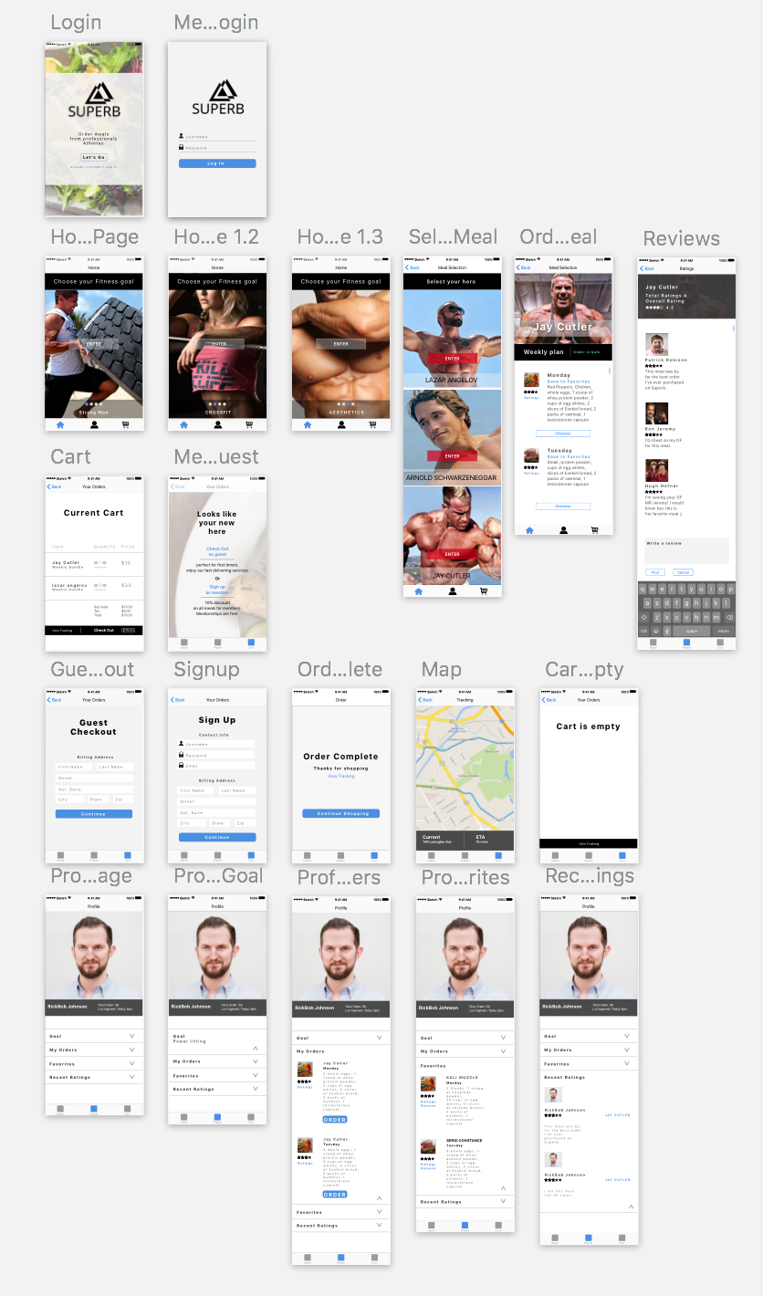
Critique Notes
• Change display name on the landing page. (“Meals designed by professional athletes”).
• Change “Homepage to Meals”
• Homepage should consist of all categories and specific meals assigned to their parent. (Allows the user to analyze most data without having to search.) Faster traffic for consumers
• Fix typography, Color Scheme, Make 40px of padding in-between each tappable element. (Between ratings and favorites inside the profile page).
• Make the interface on the Meal page(Orig Homepage) more engaging and visually appealing through hieratic elements.
This is the PDF
Hey Brandon,
Here are some examples from dribbble that I think could give some ideas about how to use photos in fitness-related apps. You want to use really high-resolution photos, and adjust them to a similar style.
https://dribbble.com/shots/3278196-038-Fitness-profile
https://dribbble.com/shots/1810273-30day-Pushup-Challenge-App-dark-theme-final
https://dribbble.com/shots/2827530-Fitness-Dark-iOS-App
https://dribbble.com/shots/2786873-No-Excuses-app
https://dribbble.com/shots/2080002-Adasse-mobile-web-app-design/attachments/373693
https://dribbble.com/shots/2086463-Fitness-App
The spacing between letters is a little strange in whole, you might also adjust that.
Rating:
It seems like rating is very important in your app. You can check your previous ratings in your profile view. You can see both the rating and comments in the food plan for each day. But I do notice that you don’t have a place for people to rate, you only have a comment view. And speaking of the comment view, if you are going to show all the comments, it is not very wise to put the input bar and the submit button at the bottom. You may be want to make them fixed at the bottom. If you want people to rate, you should consider using a “rate” button to link to another view.
Profile View:
I am not sure about using such a big portrait in this view. It is when socializing involves in your app that users’ portraits become very important. People want to show their personalities. But your app doesn’t have socializing, so who is going to see my portrait? You have lots of functions in your profile view, it would be a better idea if you leave more space to them.
It is very interesting you use this kind of “folding tabs”(sorry I don’t know how to say it in English) It definitely has some advantages. But also, you should consider a possible scenario, what if I have 36 orders? That list will be very long. So you maybe need to consider about using them as buttons and link them to another view.
I like you put “order” buttons in “My Orders”, it is convenient and definitely encourages users to reuse your service. You can use words like “order again” to give your app a little personality. You can also think about adding this button to “Favorites”. Why don’t you offer an easier entrance for your users to buy their favorites food plan?