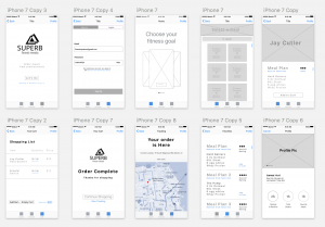
Three Things I learned | Note there are many problems with the first prototype. These are the Top 3 errors found from user feedback
Main View | Display errors
After presenting my first iteration for Superb, I quickly found out from user feedback that the home view was to complex. The display consisted of three main divs in the center of the screen. Each div was intended to function as a carousel to scroll through and choose different options. The user thought that the carousel was an advertisement, and took around 5 seconds to realize its function.
Solution: Make the home view show possible options to choose from, without stacking each element. (Simpler the better).
Meal Selection View | Layout and usability
As the user continued onto the next view, they suddenly became distracted with the disorganization of each display element. All of the fitness star names were on this page, without images of food. Causing the user to become aggravated with the choice selection. Ultimately making the user choose a random person without knowing which meals they were going to review.
Solution: Create a system that displays each category with some of the top meal options in the view, As selectable.
Profile view | Functionality
The profile consisted of three main elements. One section for Rating & Reviews, another for Total orders, and Favorite Meals. Now the user instantly questioned the reasoning behind this page. Since the elements had been designed for information and nothing more. The profile had no use. So my main feedback was for the user to be able to go back into the profile and reorder the previous meals.
Solution: Give the Profile Functionality, or take it out completely. Developing an ordering system that operates as a simple checkout could be a nice touch to bring back users.
Paper Prototype | Notes


