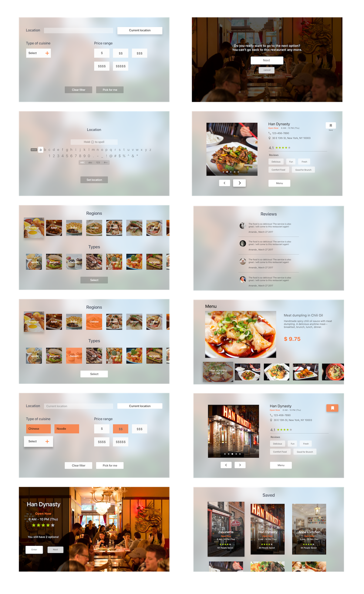
Based on the user test last week, I changed some parts in my app:
- When the user opens the app, it would focus on the current location button. (It was not clear that user tended to ignore this button.)
- In the restaurant detail page, I change the layout of “menu” and “save” buttons. (It was confusing when they placed together.)
- Remove the popular tag on the menu page. (It looked like a clickable button.)
Prototype: https://marvelapp.com/599ii57