After doing some user test, I got some feedback from my users.
Here are the feedbacks I got from them:
- In the home view, the horizontal outline of restaurants lists displays fewer restaurants information than the vertical outline. If my goal is to show users a large number of different restaurants, a vertical outline may be a better choice.
- The “Save” icon is strange. Since that the icon is similar to “like”, users easily misunderstand the meaning of this icon.
- The font size of restaurant detail is too small. They cannot be read on a digital device such as mobile phone.
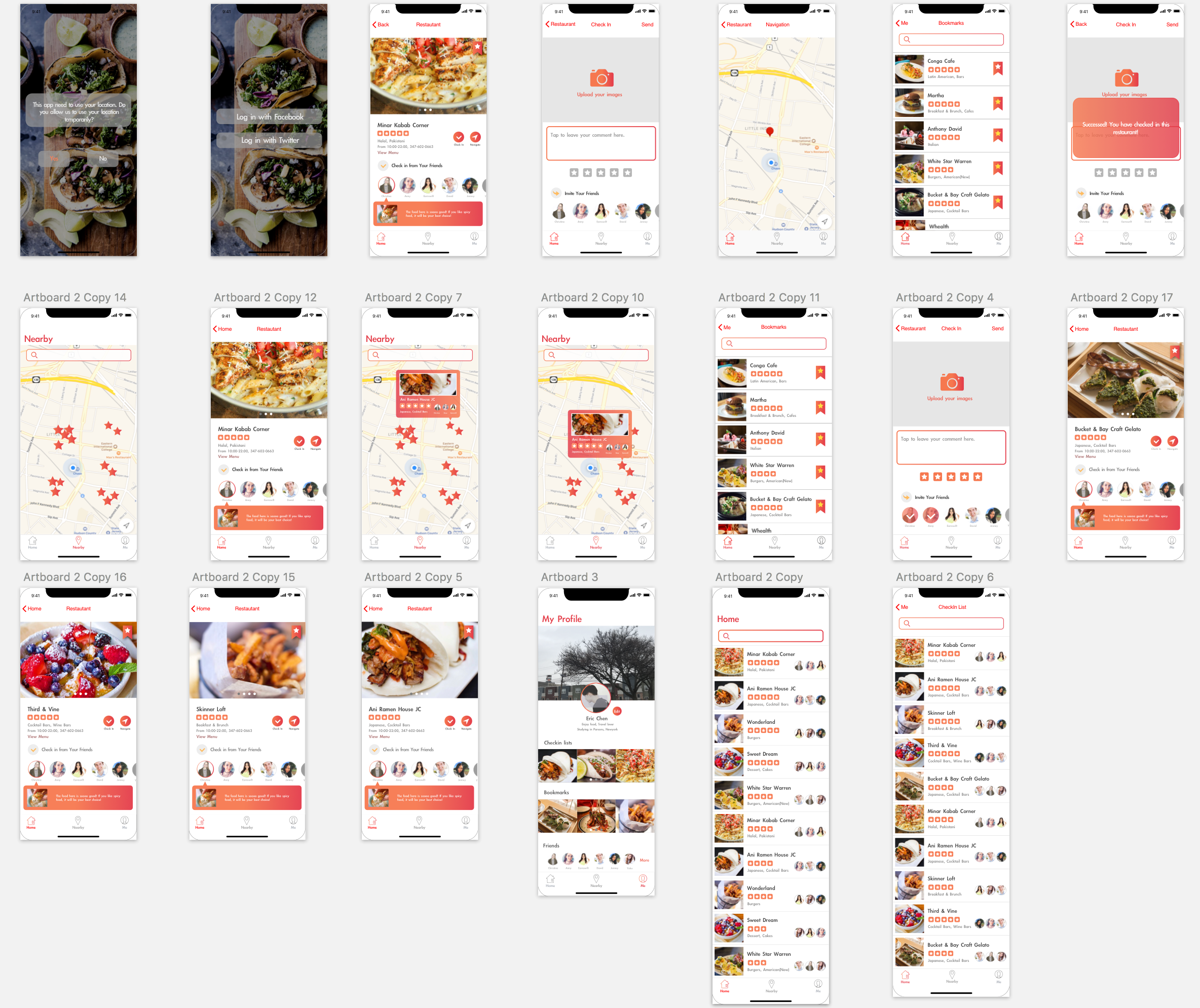
Then I modified my wireframe and made a digital prototype.
This is how it looks like:
This is the link to the digital prototype:
https://marvelapp.com/2d1e4ja/screen/38563933