User Insights from the first user test
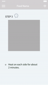
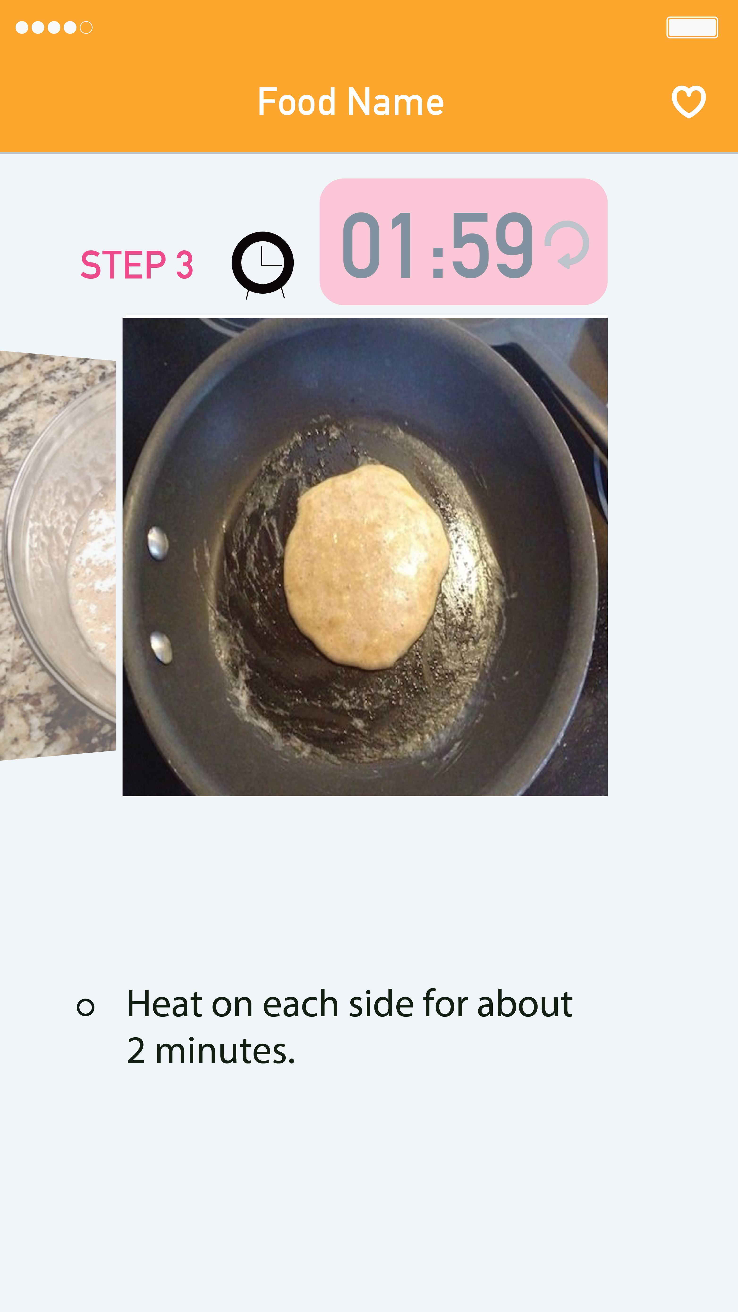
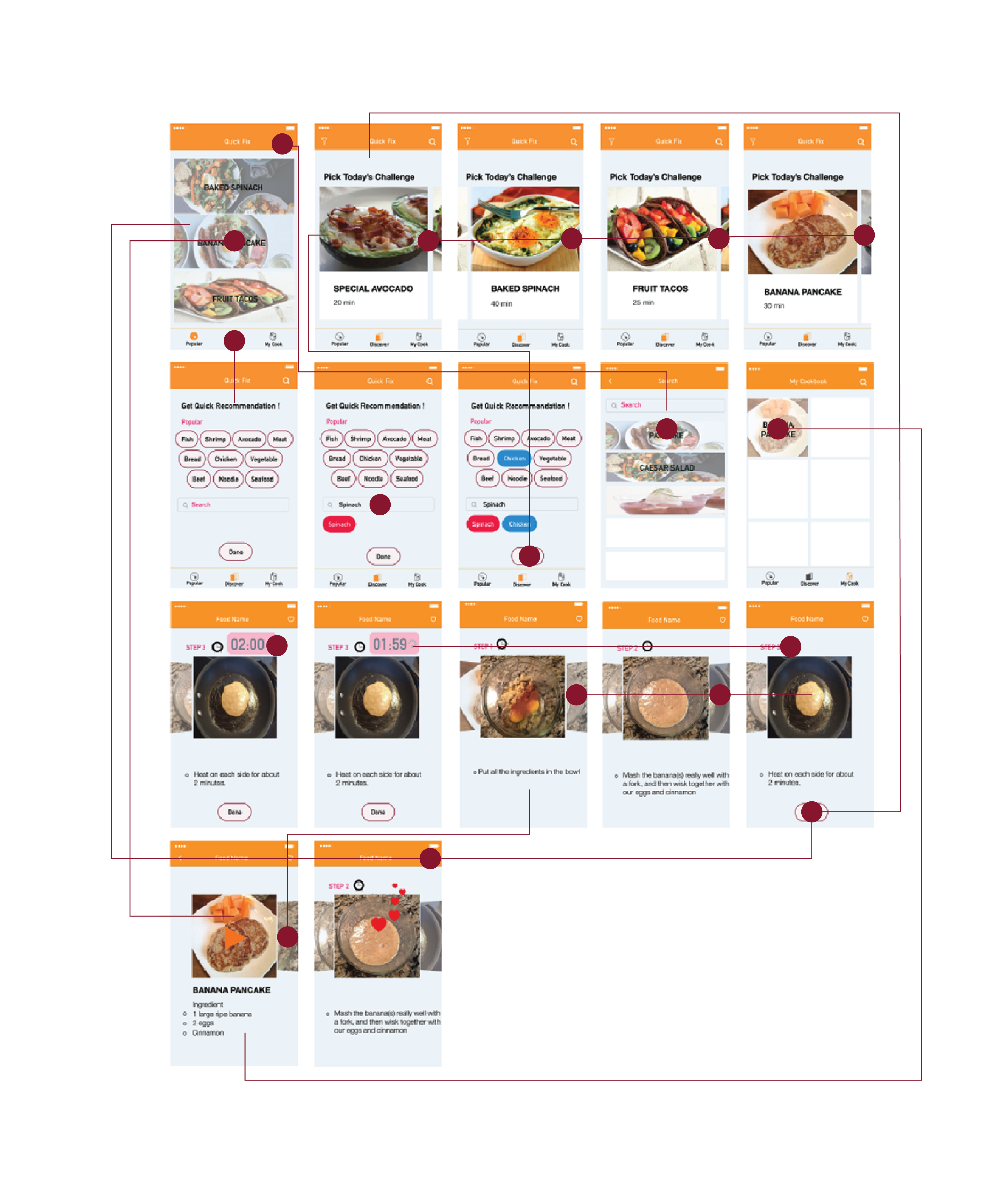
Sign for the last page of a recipe.
Users were confused about the last page of the recipe because on the step3 page; there was no clue to figure out the page is the final step. Also, users wanted to go back to the main page where they chose a recipe for the first time from the last step of a recipe. But they had to take two steps to go back; which was tapping on a menu and then home button.
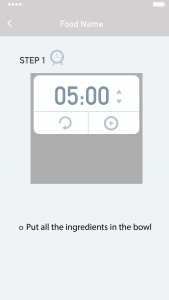
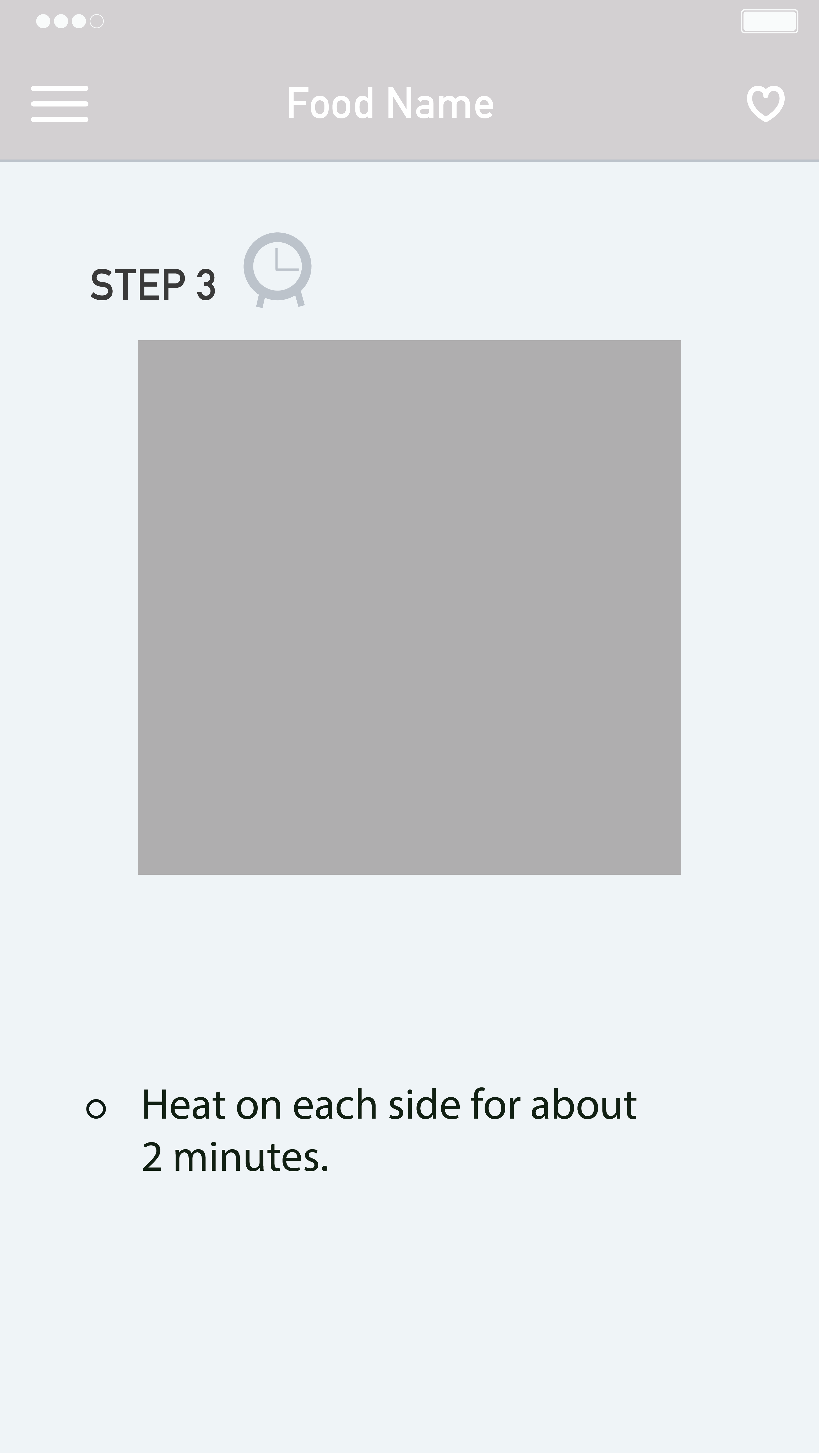
Timer function.
Nobody recognized the timer icon. Users said icon does not look like clickable. The timer is needed when people boil while cooking, but once they click the timer, it should be minimized, so it does not cover recipe photos. Users no need to set the time themselves because based on the recipe, a timer can set it automatically for them.
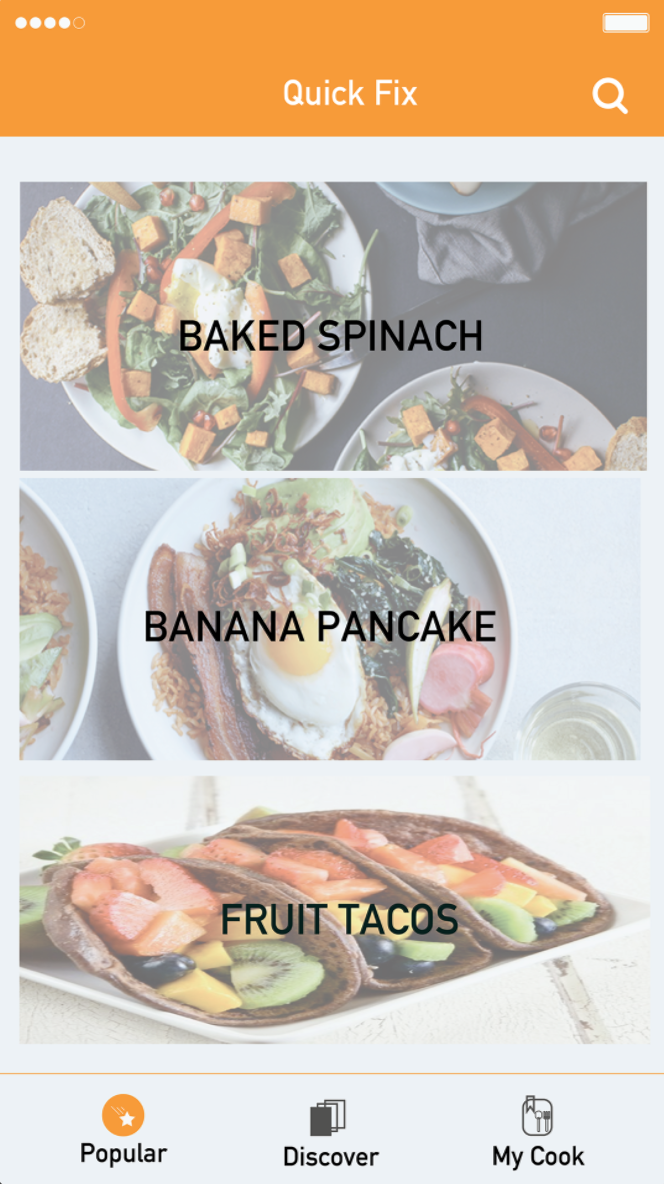
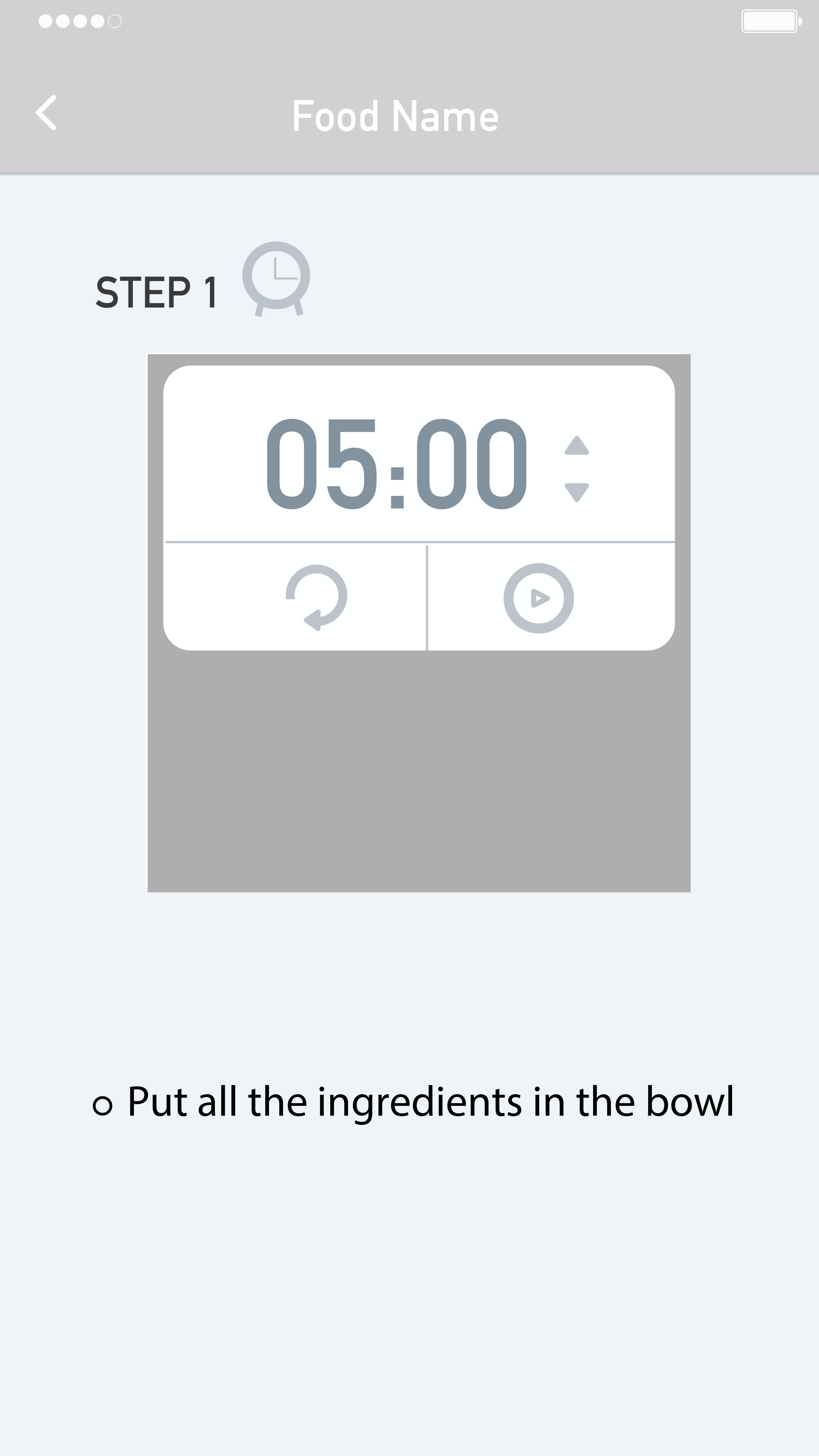
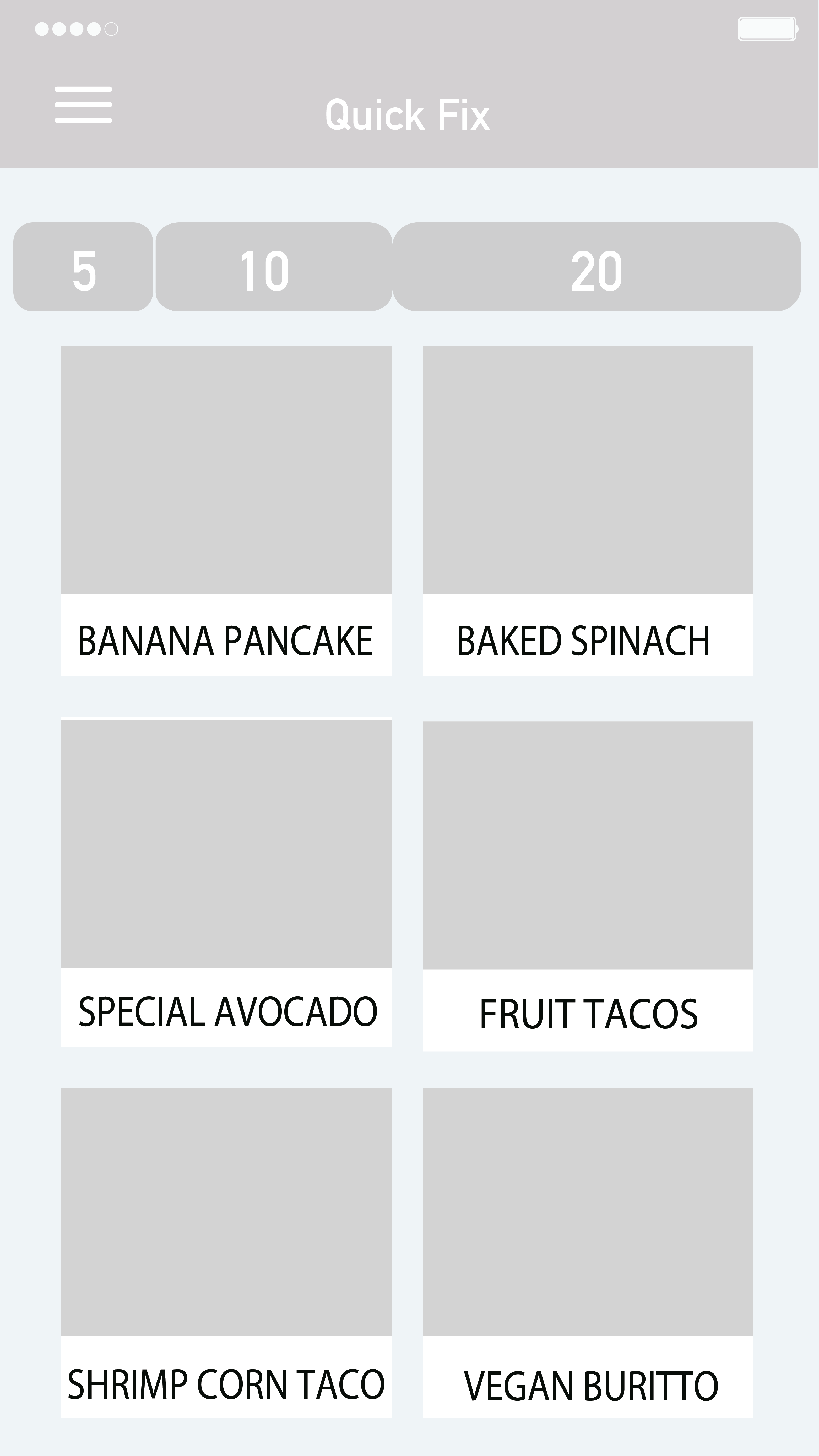
 Navigation.
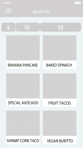
Basically, there is a menu bar on the left to navigate, but has two buttons, which are ‘home’ and ‘my cookbook.’ Users said there is too much blank for the menu navigation, so they suggested me to put those two buttons underneath of the whole interface. Another navigation bar is choosing a recipe based on time. There are three options 5, 10, and 20 minutes. Users said split into three times seemed restricted. Many recipes cannot fit into those three options and suggested me to think about how to make this filter flexible.
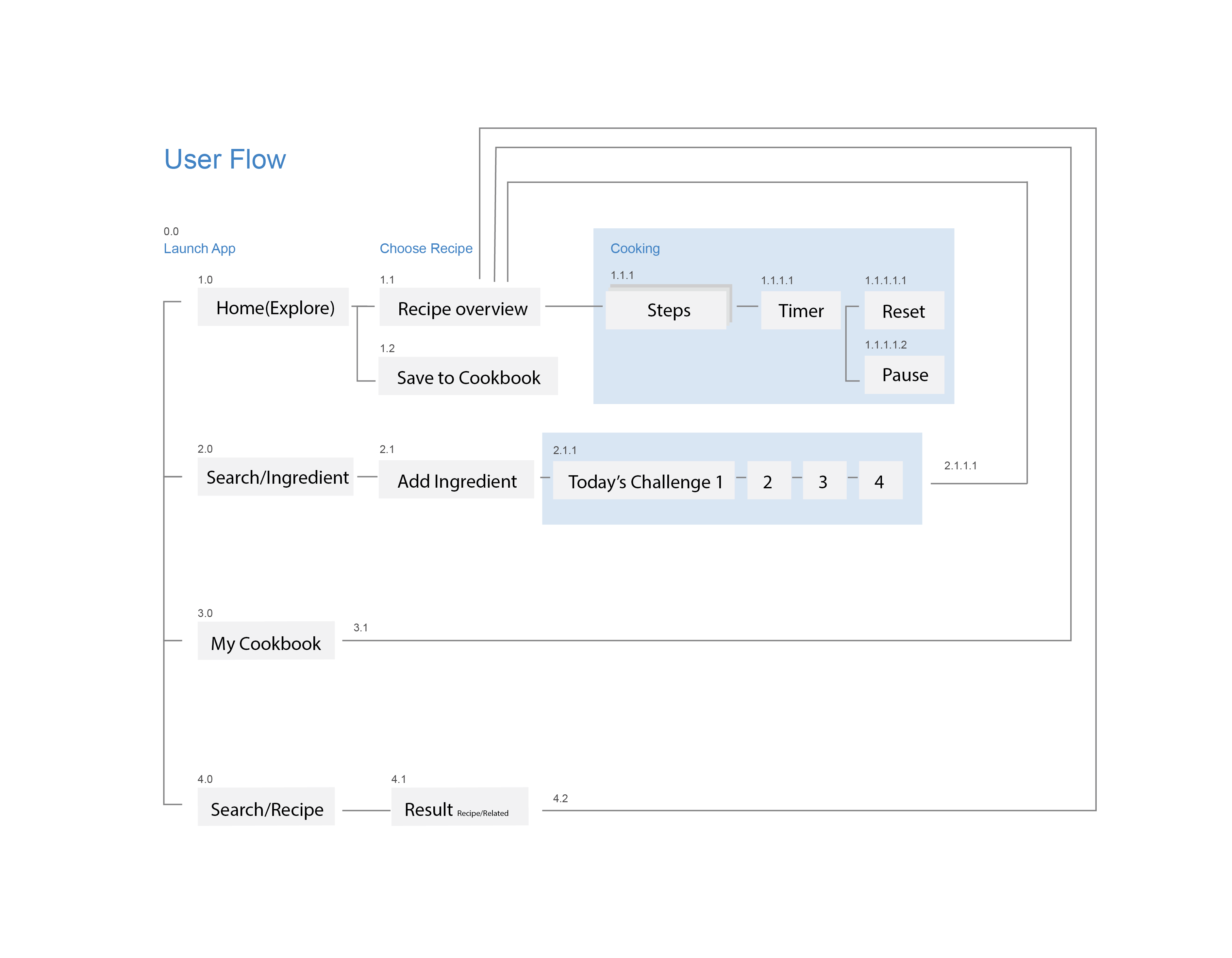
Based on the feedback, I iterated the prototype.
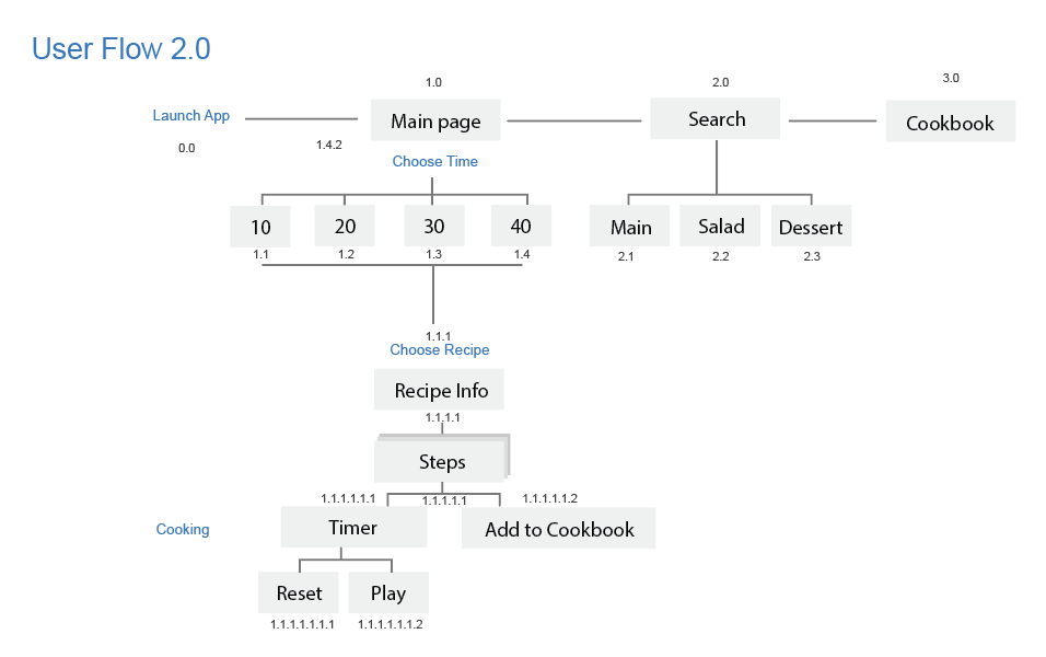
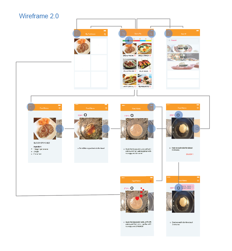
Below are the second user flow and wireframe.
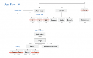
<First user flow>
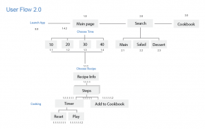
<Second user flow>
<Second wireframe>