#Thursdayapp Westy West by Marcelo Barce

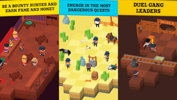
This is a game that created by Marcelo Barce using Unity. It gives you an opportunity to explore downtime as whoever you; like sheriff, cowboy, or as a native worrier. Your mission is to rescue people from the black hat gang! Westy West is fun and easy to play. You will be glued to your phone for hours enjoying the game.

The most astounding feature about this game is its exploration aspect giving you opportunities to defeat your enemies, obstacles, and challenges. You have to overcome all these in order to move to the next level. Levels have banks, deserts, towns, saloons, gun shops you can enter into and buy tools to be used to rescue innocent lives from the hands of the Black Hat Gang. You should take precaution as you explore the Wild West due to the presence of snakes, wild horses, and traps on the way.

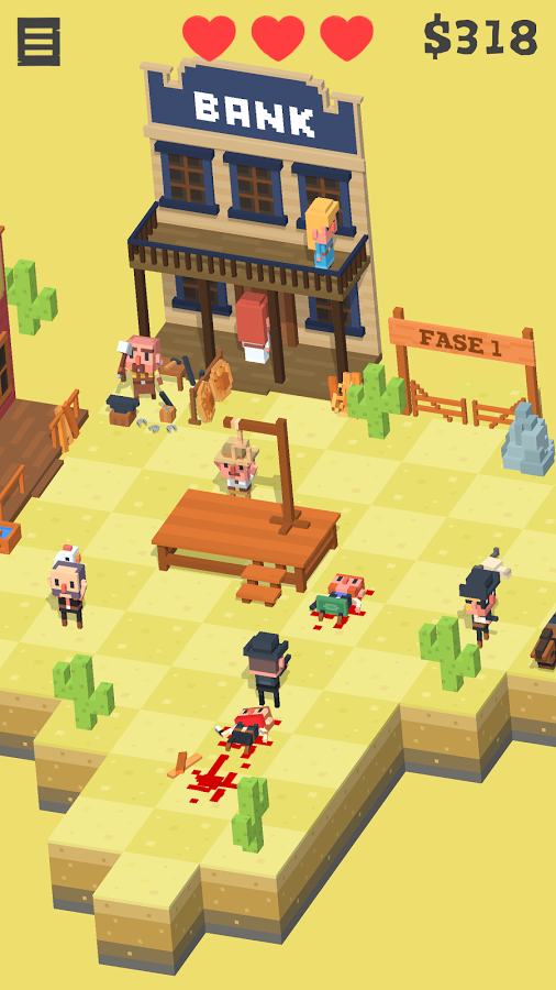
As any other action game, there are consequences for all your actions in Westy West. For instance, shooting an innocent person will increase your wanted ratings. This will attract more cops who will strive to hunt you down. When you shoot a piano guy in the saloon, all the dancing girls will come to a halt assuring you that this is a reality game.

There are townspeople strolling around as well as banks where you can walk inside and collect money, blacksmith to buy weapons and the wanted gang to track and find for a reward. You are rewarded with money after surviving for long. The money gained can be used to buy new characters, weapons and updated skills.


Apple Watch | Three Things I Learned | Brandon Palmer

Three things I learned from our WatchOS critique. First the color of the background needs to be changed from white to black. WatchOS uses black as the default background because it takes up less power. Second, achievements are a huge part of our app. We need to add proper notifications in order for the user to experience their rewards. Third, fantastical uses a method where it sends your upcoming appointments through notifications. We would like to adopt this method, so it give the user the incentive to glance at their “look” view while tracking their appointments.

Brandon Palmer | Three Things Learned | 2nd Iteration | Weather App

Three things I learned from our second Iteration of our weather/calendar app is that the swipe functionality doesn’t work.

Swiping Error:
When we swipe down our initial intention was to display our calendar and weather view. The issue with this is the top bar. It displays the date without transitioning from the main view.

Solution:
The Solution would consist of developing an animated bar to appear, or to readjust our nav.

Temperature or Time? Error
Our main view consisted of a transitional bar that allows the user to scale between day and night. Indicating the weather on a timely basis. The problem that the user becomes confused with the colors. The specific colors we chose were blue and orange, they need to be changed.

The Navigation
The third error we stubbled upon was the navigation. Our main Tab Bar would take the user to an identical view as if they were scrolling down to our weather/calendar.

Solution:
Remove the Tab Bar, or change the view. This was a repetitive problem that was addressed above, yet it is an ongoing problem that creates dysfunctionality multiple sections.


#Thursday App | King Rabbit | Brandon Palmer

Image result for king rabbit

King Rabbit is an IOS game developed by RareSloth. This game uses puzzle based mechanics in order to complete each stage. Although the mechanics are similar to Frogger, which makes the game attractive. The usability for this app is complicated. The menu view is confusing to get around, the icons don’t symbolize their functionality, and the payment system is scattered. Overall I enjoy playing this game because I am into puzzle games. But there is much work that needs to be addressed to further develop this game.

#thursdayapps | moodnotes | Hanyu Zhao

website

Moodnotes is an application that can capture your instant moods. By asking couples of questions, Moodnotes can analyze the users’ feelings in professional ways.  Moodnotes not only just records the users’ thoughts like a diary, it also will give the user a lot of solutions and suggestions to make their moods better. The part I like the best in Moodnotes is the way the user to select his/her mood. By using a finger to slide up or down, the user can create either a smiley face or a sad face. The whole animation is very smooth and attracts people keep using this application. Moodnotes is made by Ustwo studio who also designed Monument Valley, therefore, the visual design of Moodnotes is pleasing as well.  Since I always want to do something for Healthcare, I really like Moodnotes and think it is useful.


Litterati_Misung Kim & Nan Huang

Here is App visual design link:

https://marvelapp.com/88i246e

What we learned:

Design details
1. On the launch page(main page), take out the refresh button
2. Merge my profile & launch page: seems like my record is more important and intruging component.
3. On boarding: what if there is no trash-> add a copy saying that “If you cannot find any trash, you can ,,,”
4. In order to engage people -> need a reward system
5. Term changes: collection (in my page) -> “garbage bag on April 4”
6. When users finish taking photos, tagging-> Swiping (putting into the trash bin) the button should be there as the feedback as well like a ritual (in order to let users to show their action has finished.)
7. Keep consistency!->page for adding tags (apply the design that we’ve designed onboarding)
8. When the user finishes taking photos -> a term ‘Done’ might be confusing -> use proper word (maybe “upload”) -> so that we need to make it clear by showing certain feedback (swipe to the trash / copy: your (collected pieces of trash) impact has just added on the total impact… / you can add more tags in your profile page)

TV OS_Misung Kim & Nan Huang

TV OS (add on) file is here:

tvOS

TV OS: general environmental issues / raise awareness

There will be editors (content creation team) to create content every months

Documentaries (type of video)

TV OS: We should clarify ‘what to focus.’

On impact page: Take ‘X’ button out

App:

On my page: articulate why the user get ‘Superb’ badge (There should be reasons)

-May be we will put another layout for explaining what’s going to be the next badge (“if you get 100 more, you will get 000.”)

Launch page: Take blur out in order to have a live camera

+ Updated App design
Based on the last feedback, we have modified some of user interfaces.
Here is the link:
https://marvelapp.com/382fhjh

For May 11, 2017

  • Iterate on both your app and add on based on feedback and user testing. You’ll present both to outside critics for your final presentation.
  • Post any and all of your assignments on the blog that you have not yet. Everything should be posted before class starts. As always, if it’s not on the blog, you don’t get credit.