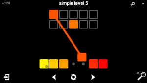
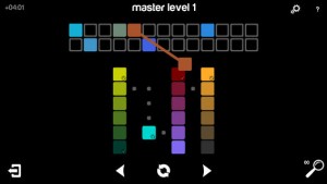
I have one more app to share today. It’s called “Blendoku.” It’s a color game where you arrange swatches of colors in the right blending order. The game play is super simple, but I think it’s one of those successful puzzle games that you can play for a long time without getting bored. The levels are easy at first, but it gets pretty difficult as your level goes up. The visuals and interactions are very simple too (you either tap or drag the swatches to place them in order). Everything in this app works coherently and smoothly.
Month: April 2014
Tress
ThursdayPlay – Tengami
I’d like to introduce this game called “Tengami” today. It is an incredibly beautiful platforming game where everything looks like fine paper craft. The world and the music have a Japanese folktale-like feel, and works very well with the paper craft aesthetic.
The entire world is built in the aesthetic of pop-up paper art, and the player character looks like a piece of paper too. There is only one character in the game, and you control him to solve puzzles and revive a withered cherry blossom tree. In the game, you literally “unfold” new stages and hidden stairs by touching the screen. It’s a simple interaction, but it was exciting for me because it felt as if I were flipping through a real pop-up book.
There actually isn’t much narrative or explanation, so you never find out why your character is trying to revive the tree in the first place. As a game, it also gets a bit frustrating because the character moves so slowly. You need to move back and forth a lot to solve puzzles, but because your character moves super slow, you end up spending most of the time just watching him walk. Also, you double tap to move your character, but I think there needs to be better controls for the character. The “unfolding” interaction I mentioned above feels good, but the double tap feels rather incoherent with the visual and musical themes.
The gameplay is not the best, but overall, Tengami is an extremely pretty and delightful app. I really enjoyed the visual experience. I would recommend it!
SnapGuesser – Prototype 1 + User Testing
Team: Kamilla, Carrol, Seungkyun
Our first prototype is HERE.
Learnings from user testing:
– The most important learning was that there needs to be a clearer indication that this app is a guessing game. The home screen didn’t contain any hints as to what the users should expect from the app. Users seemed just as lost even when a snap loaded, and didn’t know what to do. Even when we walked the users through the steps, they seemed confused, so it is important that we embed better cues. In terms of prototyping technique, we learned that having a placeholder photo would have helped the users understand what was going on in each view.
– Another reaction we got from all the users was regarding the score display. We decided to show the user’s score after the rating has taken place, but users were confused that they didn’t get to see their scores right away. The sequence of “rate –> score” was different from the general expectation. We were suggested that we combine the score and rating views.
– When viewing a snap before making a guess, users said they wanted to skip and make a guess instead of waiting until the time was up. We figured there needs to be a button that lets users jump to the screen to make his/her guess.
FoodTracker – Improved UI Prototype
Things we’ve learned from prototyping & user testing last week
- Think about all possibilities that can be happened by users. If we don’t consider about this, users won’t understand what”s going on during user testing.
- Keep our identity, it’s more important than any other elements for UI design. We need to take care of color, font choice, layout, graphic, etc., then keep same style on every pages.
- Push notification sometimes bothers users. They don’t want to see any advertisements or notices that aren’t important to them. If we must use this function, we need to figure out what users want and what they want to hear from our app.
After user testing last week, we improved UI design.
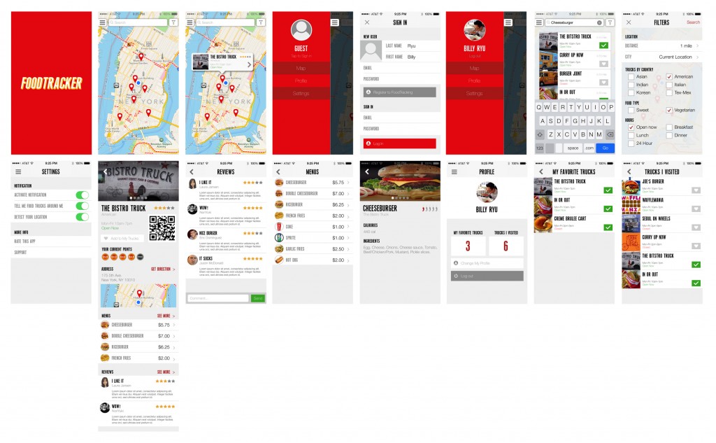 prototype01-3
Rave: Visual Update
One of the most important note I took from my initial user testing is that people do not read introduction text. Besides a number of users have limited ability in reading English, native English speakers also found reading irritating when operating a mobile application.
Pin-pointing the challenge, I removed all text instructions and introduction screens. Instead, I experimented with a few different visual hierarchy to encourage swipe gestures. At the end, I have discovered that laying screen on the edge of the screen while using shadow to indicate the depth appears to be the best solution.
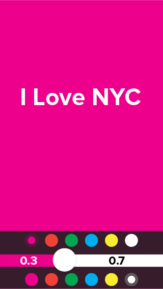
The least confusing part is the color selectors for both air writer and screen flasher. Therefore I have kept the design.
One of the debatable visual element is if the layering design should remain when a user has entered the flashing screen. My decision is to break the consistency due to the fact the flashing screen must take up the entire screen to work properly – especially when using air writer.
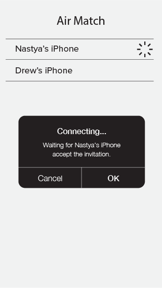
Therefore users must be experimental in order to discover ways to go back to the previous screens or entering the air match mode one they have entered the flash screen. The test result shown that they are able to do so based on the fact they have previously educated by the gesture control environment.
#thursdayplays – Artsy

Artsy is an art app that has more than 100,000 artworks. It’s very beautiful and clean. If you love art and willing to see more collections in museum, this is the best app for you. Users can interact with art daily and even for those new to art alike. It’s easy to navigate, the content is excellently curated.


#thursdayplays:venmo
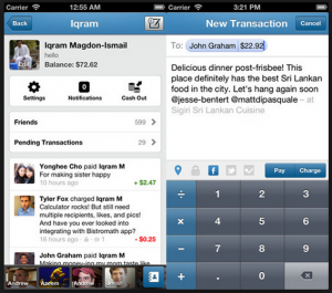
Venmo is a wallet app that makes easy to pay friends for just about anything.
This is like a paypal mobile version plus facebook.
The good thing of Venmo than other competitors like Square Cash or Google wallet is friendly and simplicity of the interface.
While I was using this app, it was quite troublesome to set up my debit card with an app but it’s secure because exchanging payments with people in my facebook friends.
The interface of venmo is simple and easy to use once user link a debit card.
Theory: table game (Decho and Julie)
Snapguide [#thursdayplays]
Snapguide is a how-to app for… everything! It is easy to filter by categories and follow the step by step instructions.

