Yummy_ Final Iteration

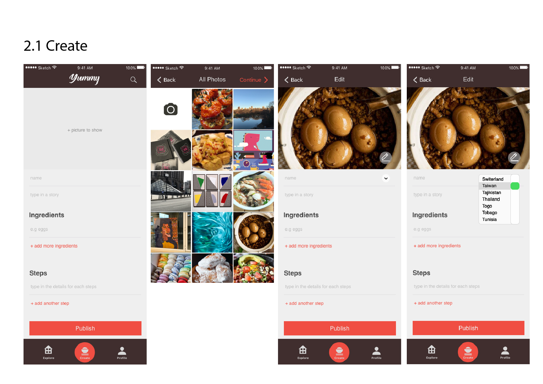
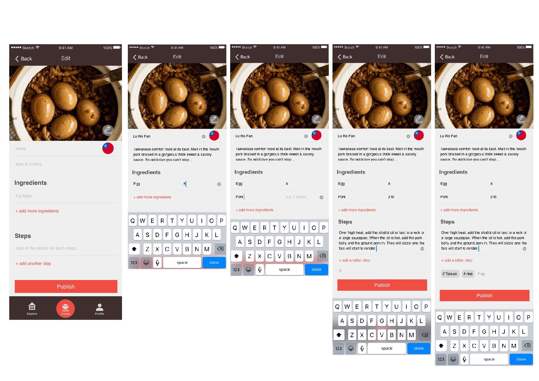
Critique from midterm presentation:

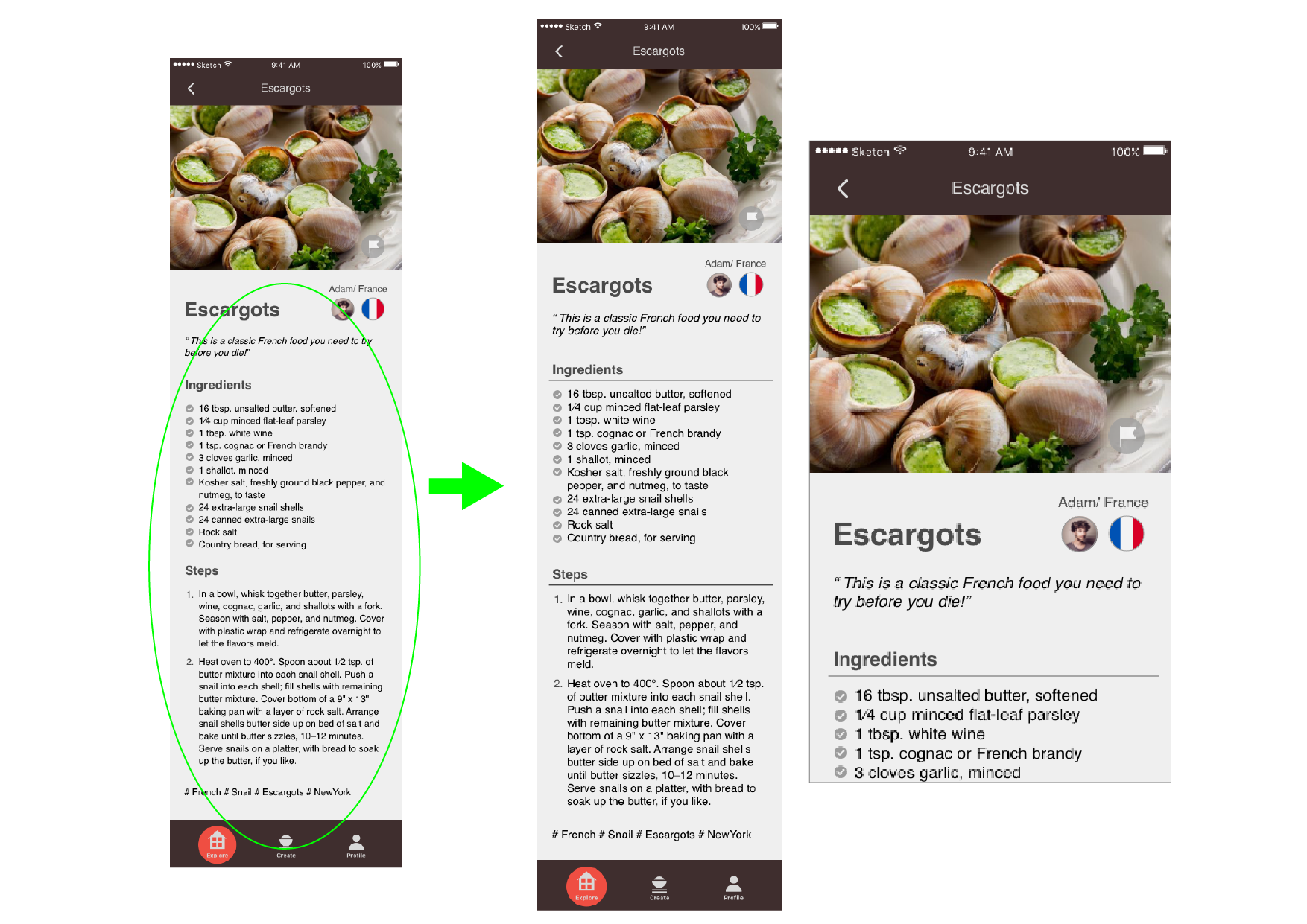
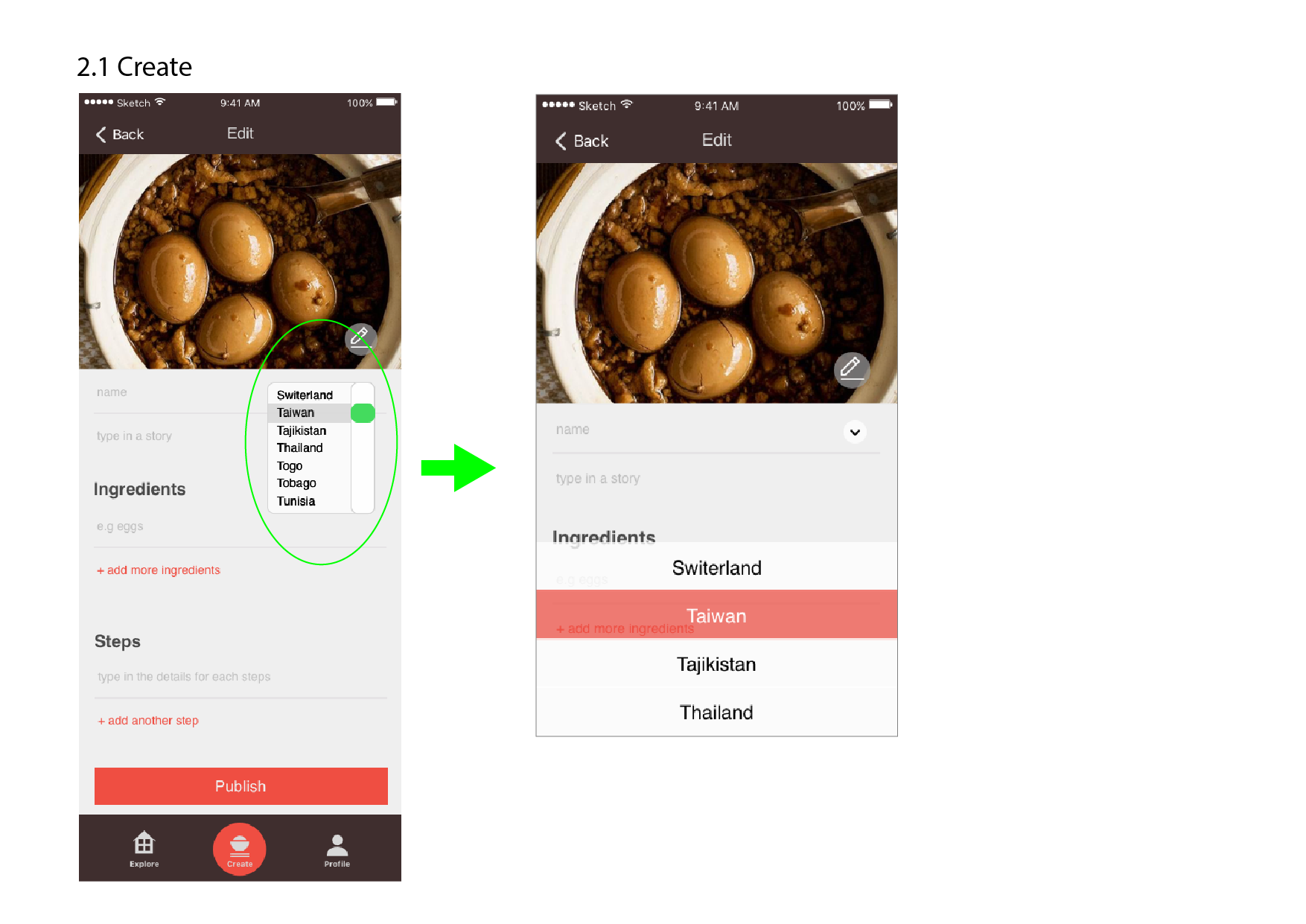
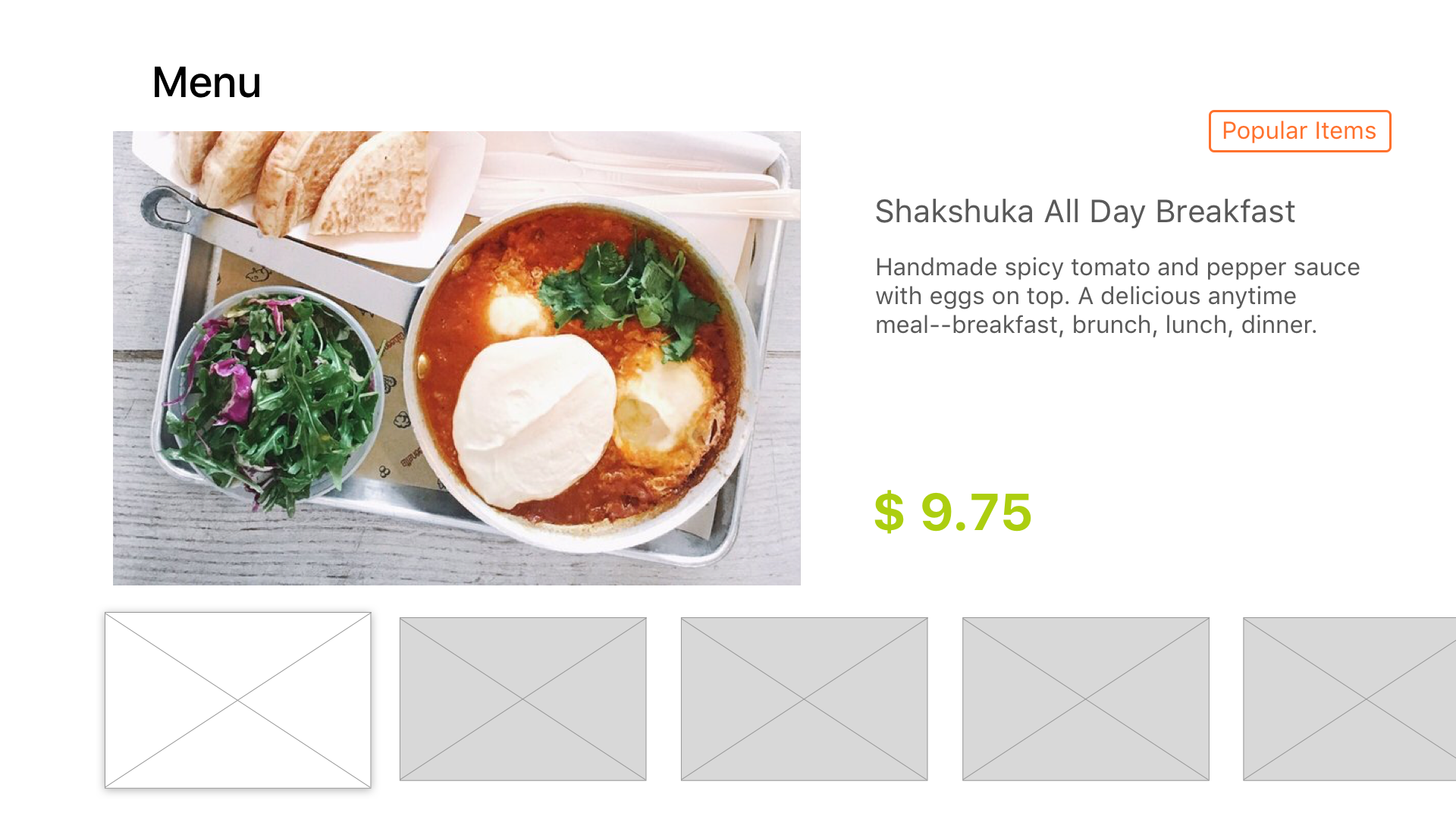
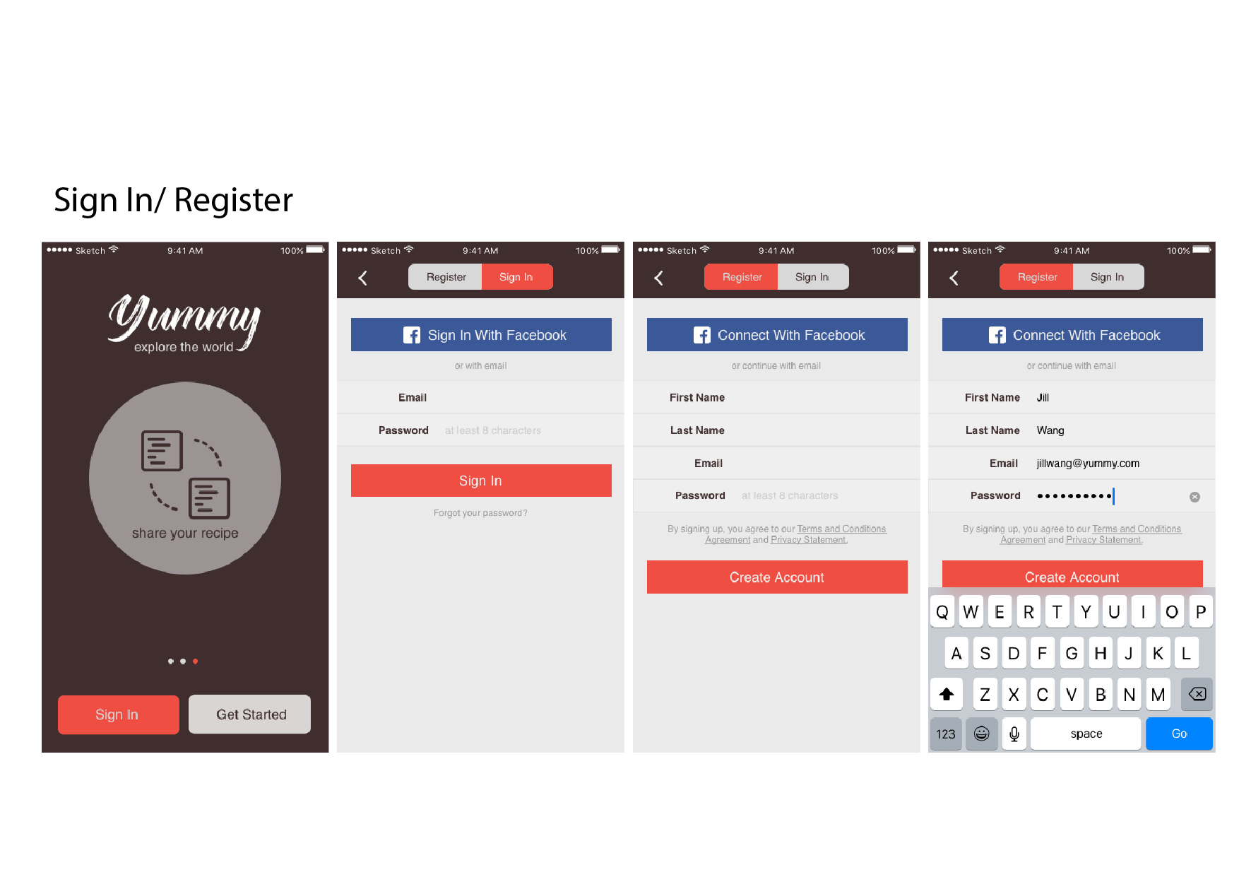
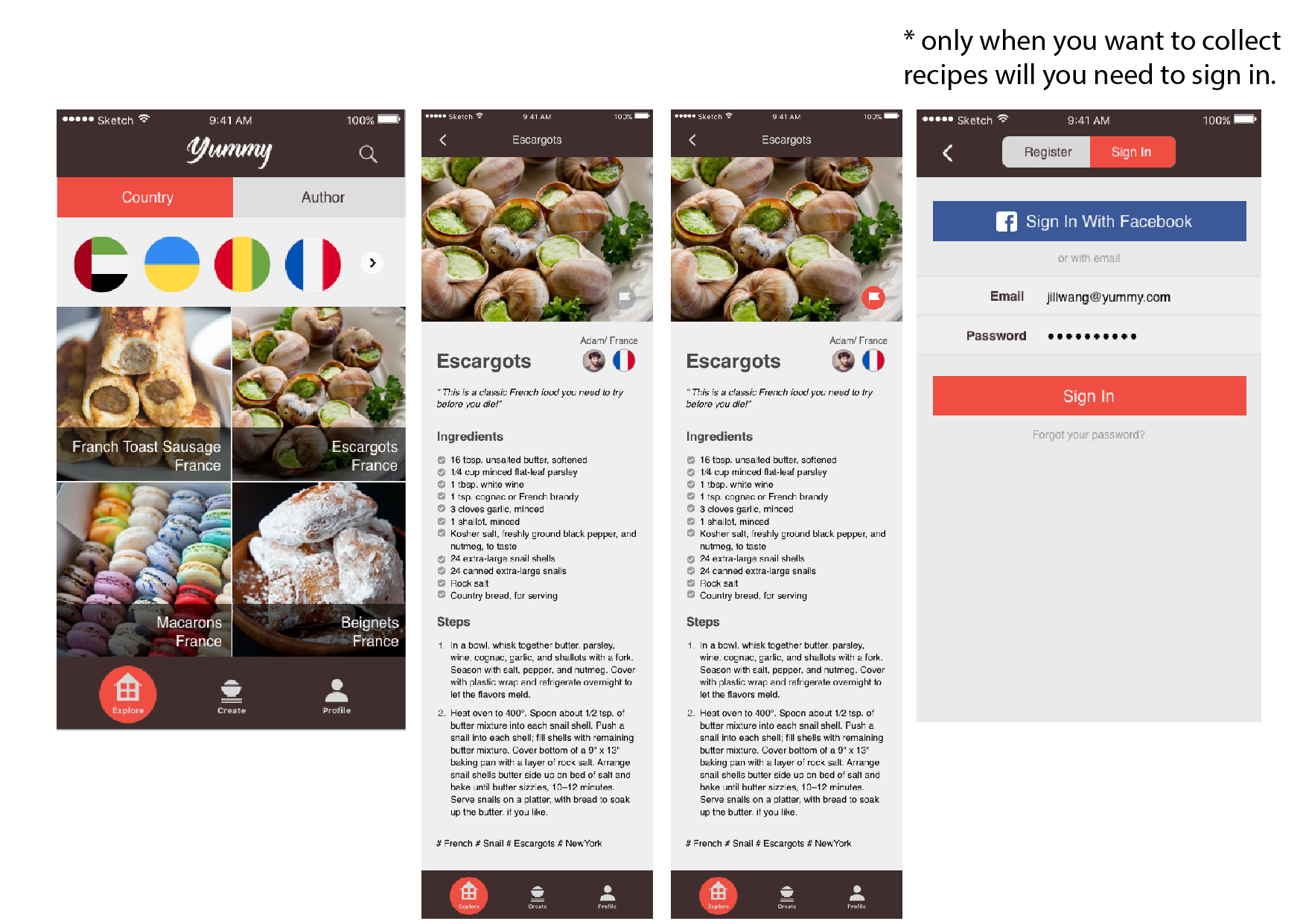
  1. Create page: (1) when creating the recipe, it would be better to have a save function (eg. every 5 minutes) (2) the text on the recipe are too small, and also, add on lines in between the content will be clearer. (3) the select button on the country is wrong (it is for websites)
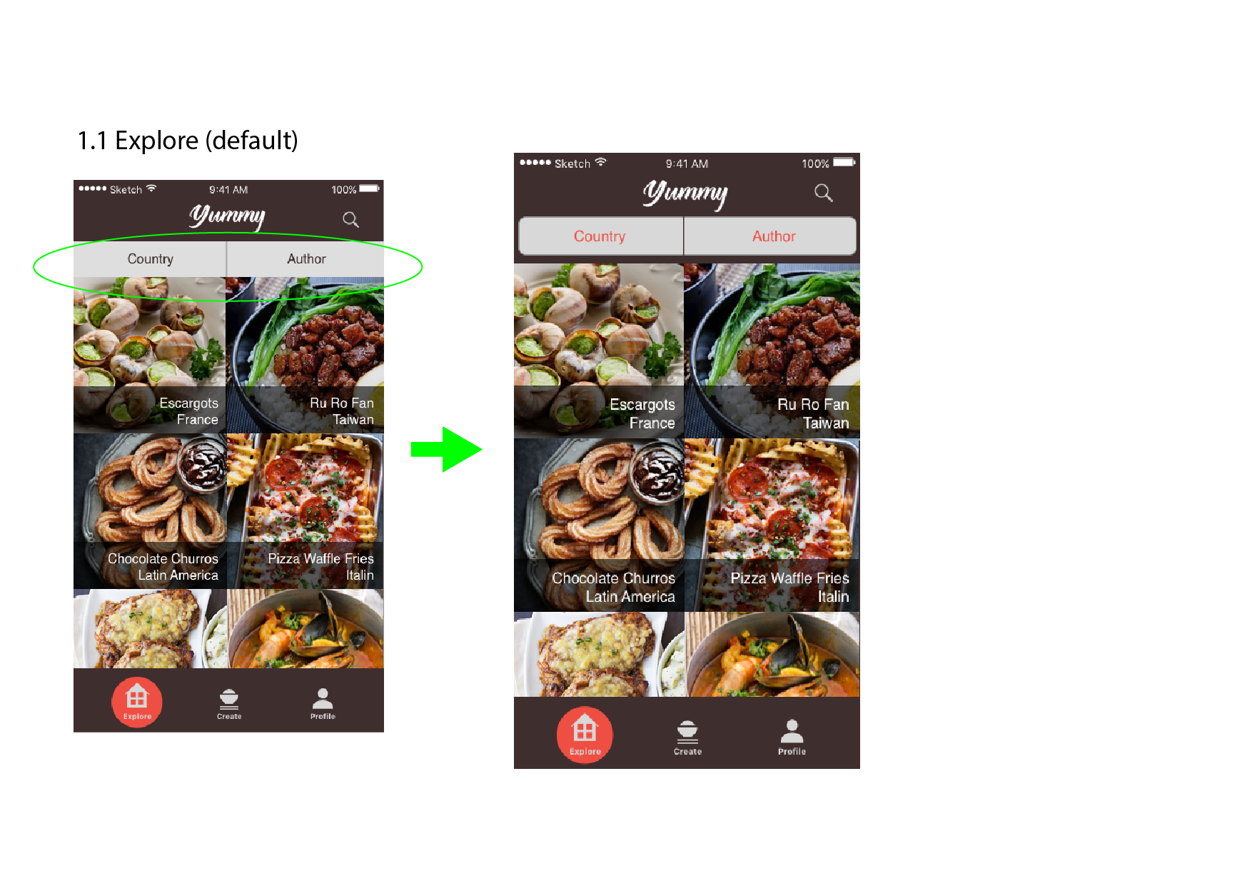
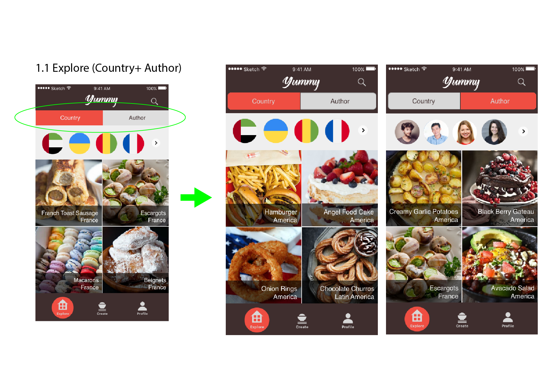
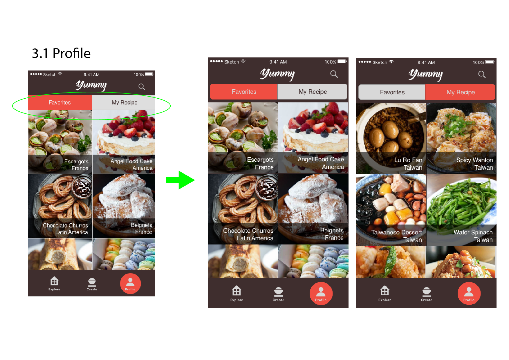
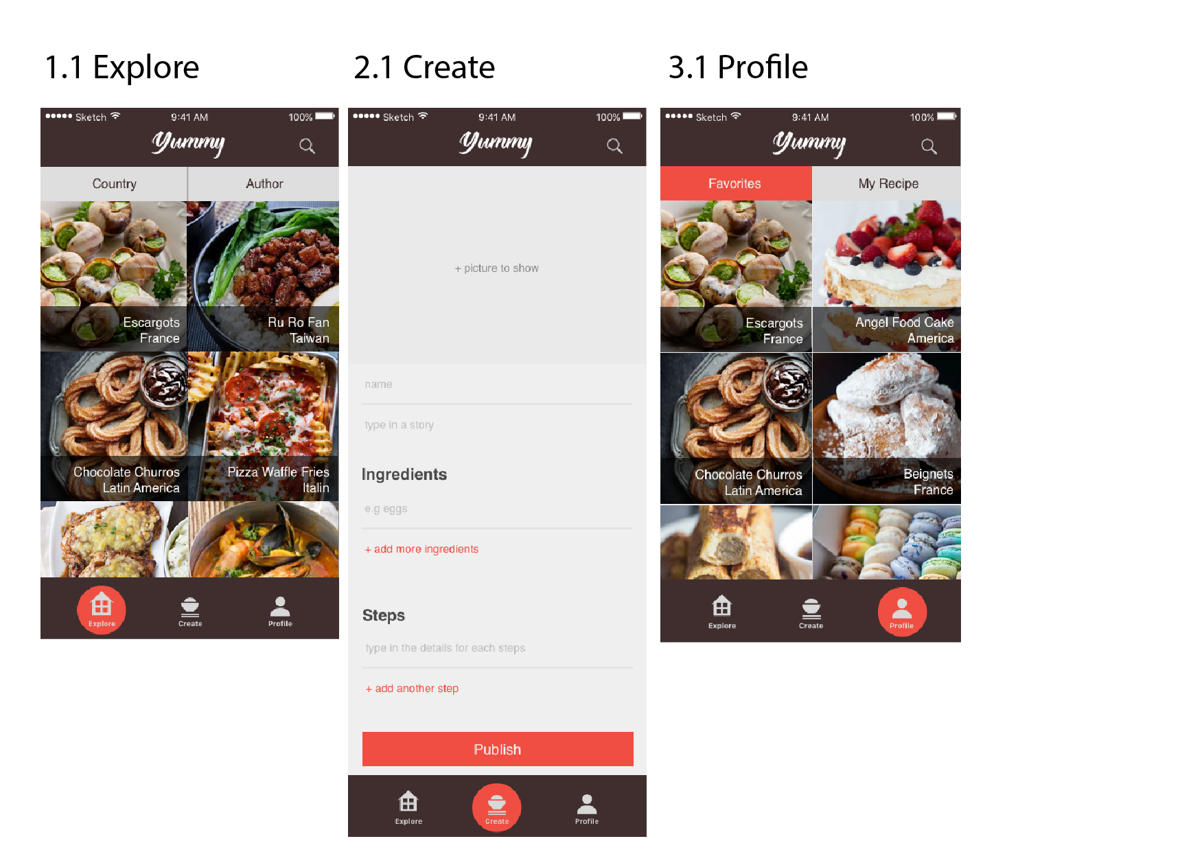
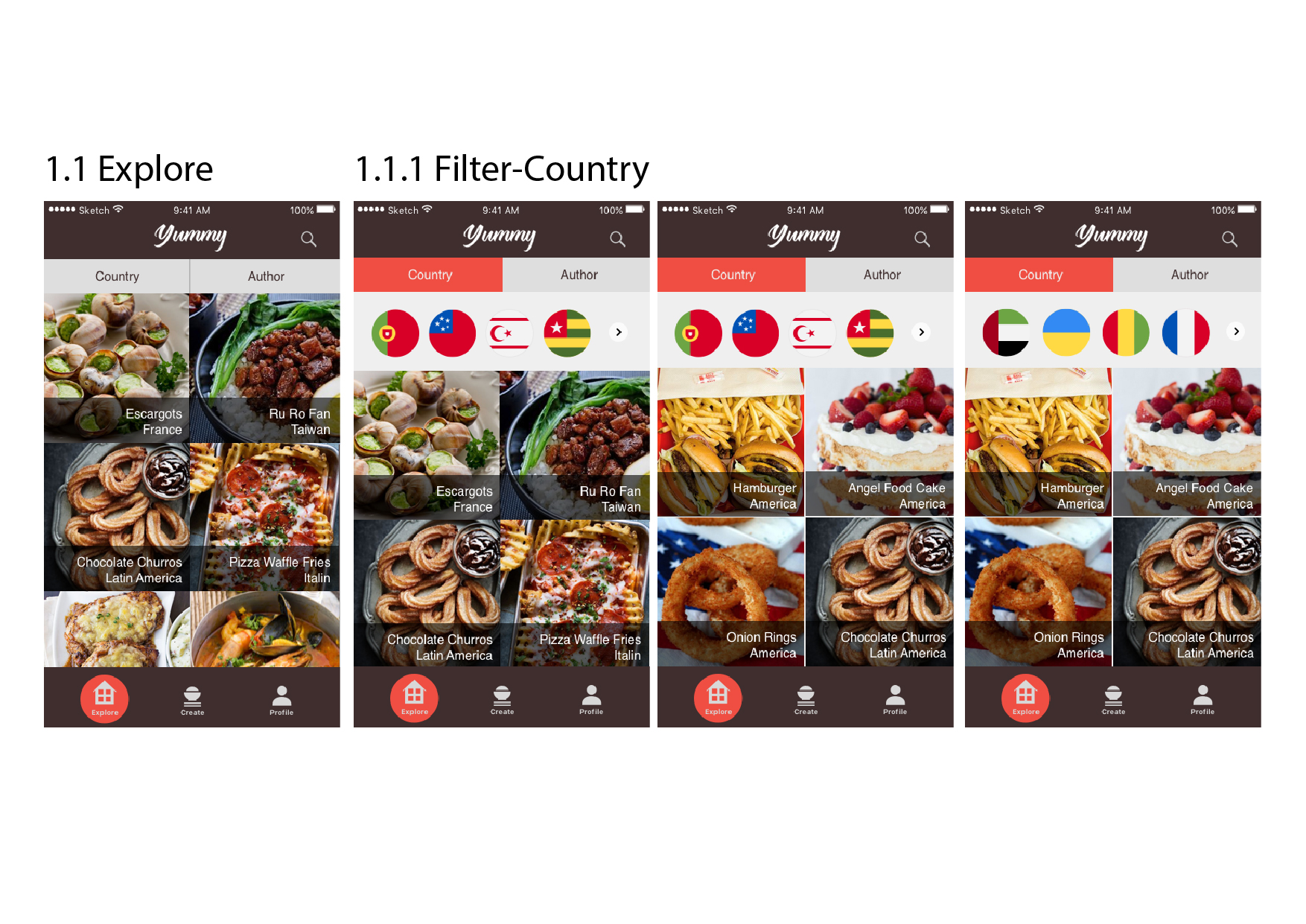
  2. Explore page: (1) COUNTRY/ AUTHOR– make it like a button (2) Is it a good way to make the country bubble flag? playable?? (3) How to highlight the filter?

Things that I have changed in this final Iteration:

  1. the text: (1) change font from 15pt to 17pt (2) add lines to separate the content in order to be clear (3) save text every 2 minutes
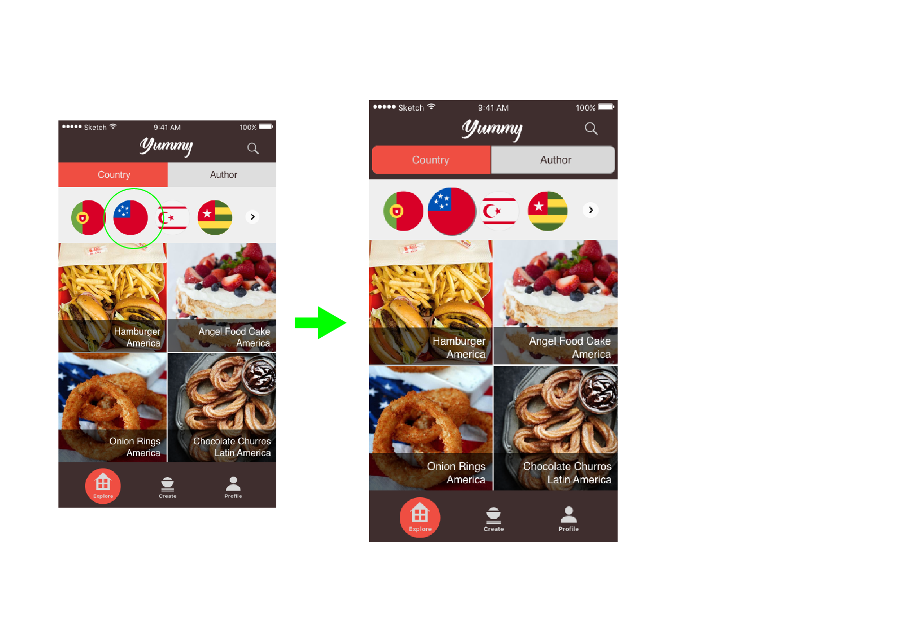
  2. correct the select country button
  3.  change the shape of the filter (COUNTRY/ AUTHOR), in order to make it like buttons.

Thursday App

Image result for limbo

The app I want to talk about is LIMBO, which is a great puzzle game based on IOS platform. Technically, every application should have obvious interaction implication, but LIMBO has no implication at all. The first impression of the game is impressive and confused, because the image is so pretty and I have no idea about how to play this game. After serval attempts, I started to understand the game mechanism. It makes u want to try everything in the game, such as pushing the box, jumping on different item, and grab some unknown things. Moreover, every puzzle is well designed, and you even don’t get board if you play twice. Those unusual things make you doubt about it is a mobile game, which looks really like movie.

After playing the game, it makes me doubt about the principle of interaction. The game destroy those traditional principles totally. I believe we should not simply follow those princple without actual thinking about the story we want to tell. Everything we built should center on the concept/topic/story, even the interaction.

Related image

tvOS – Wireframe

tvOS wireframe

  • Direction: it seems that not easy to scroll horizontally from step 1 to step 2, so probably i need to add two clickable left and right arrow button that allows the user to interact more smoothly
  • Should i combine recipes tab and categories tab together?
  • I was wondering if there are anyway i can add preferences on Main page or some other places so that the main recommendation recipes page will be truly personalized to the target users’ specific needs. (such as vegetarian diet types, allergy restrictions..etc)


# Thursdayapps

   Walkr

Walkr is an game app that wish you to walk out with your phone. When using this app, users are like traveling through the galaxy. Users can collect a lot of beautiful planets to achieved the goal. Each planet are designed in a fancy way and are be categorized into food, planet, element, and so on. Such as Caramel Apple, Octopus Cavern, Heart of Flames, etc.


The things that attract me with this app is not only the interesting story and beautiful design in it, but also people can get in shape and have fun at the same time. 


QuickMeals Final Prototype

https://marvelapp.com/7hba879/screen/25718242

Things learned from Final presentation critique:

  • Preferences page – personalized your recipes recommendation based on your choices (now my preferences page has food type and food restriction section since my food recipes provided based on the time period, it would be better that I can also add a time period selection, such as 15 mins quick meals, 30 mins…etc. )
  • Direction section – I realized that I got some problem with the structure. it seems I hide some secondary information (direction section)  inside of the food details, because this is the important part in my app features that allows the user to learn how to cook a quick, simple and healthy food, probably I may think about an alternative way to make the user feel that they do not need to take the extra steps to achieve that goal.