
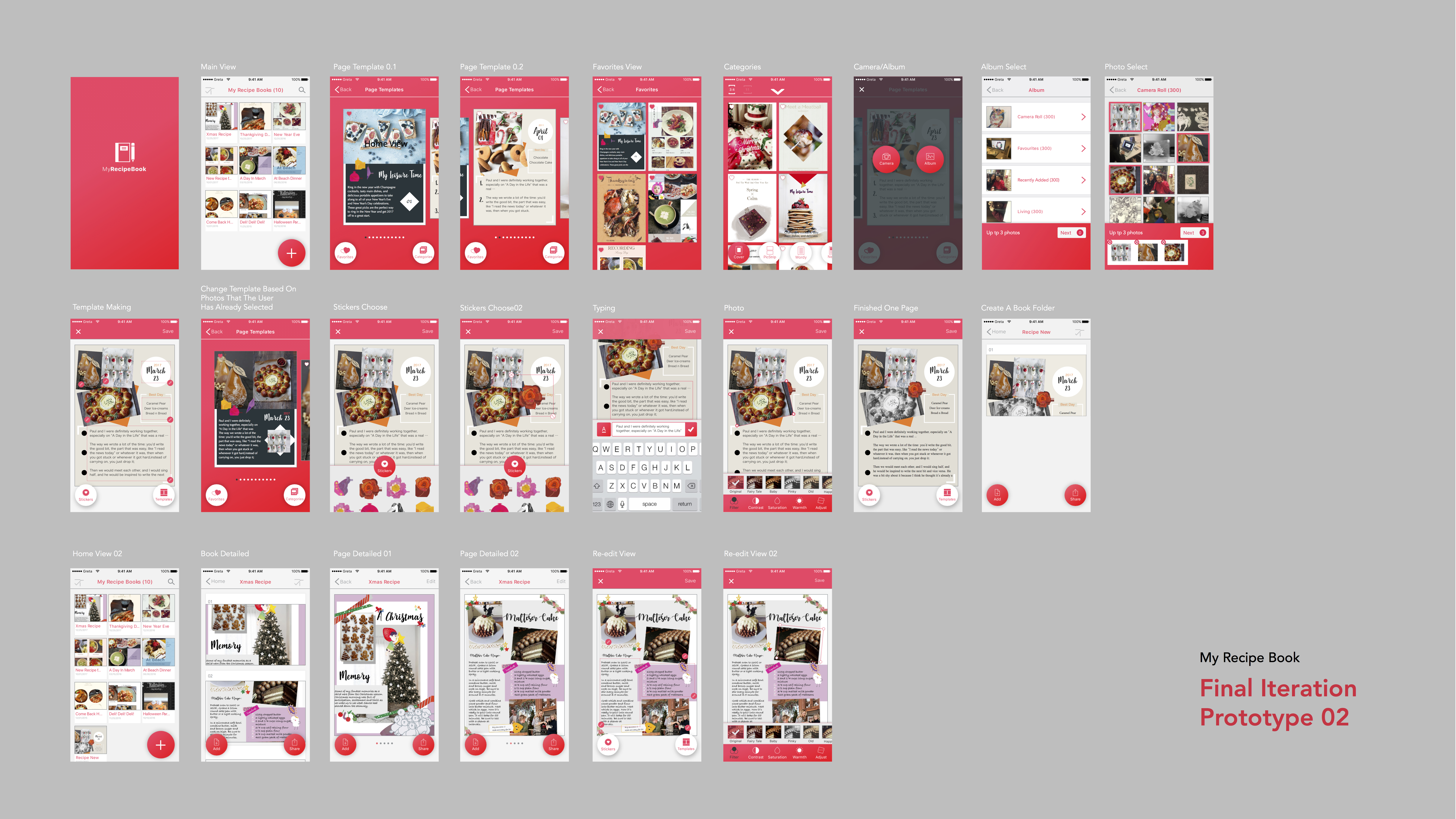
Hanyu Zhao | Food App | My Recipe Book | Final Iteration
User Test Feedback:
- There are some typo errors. Also it is better to keep spelling style to American spelling.
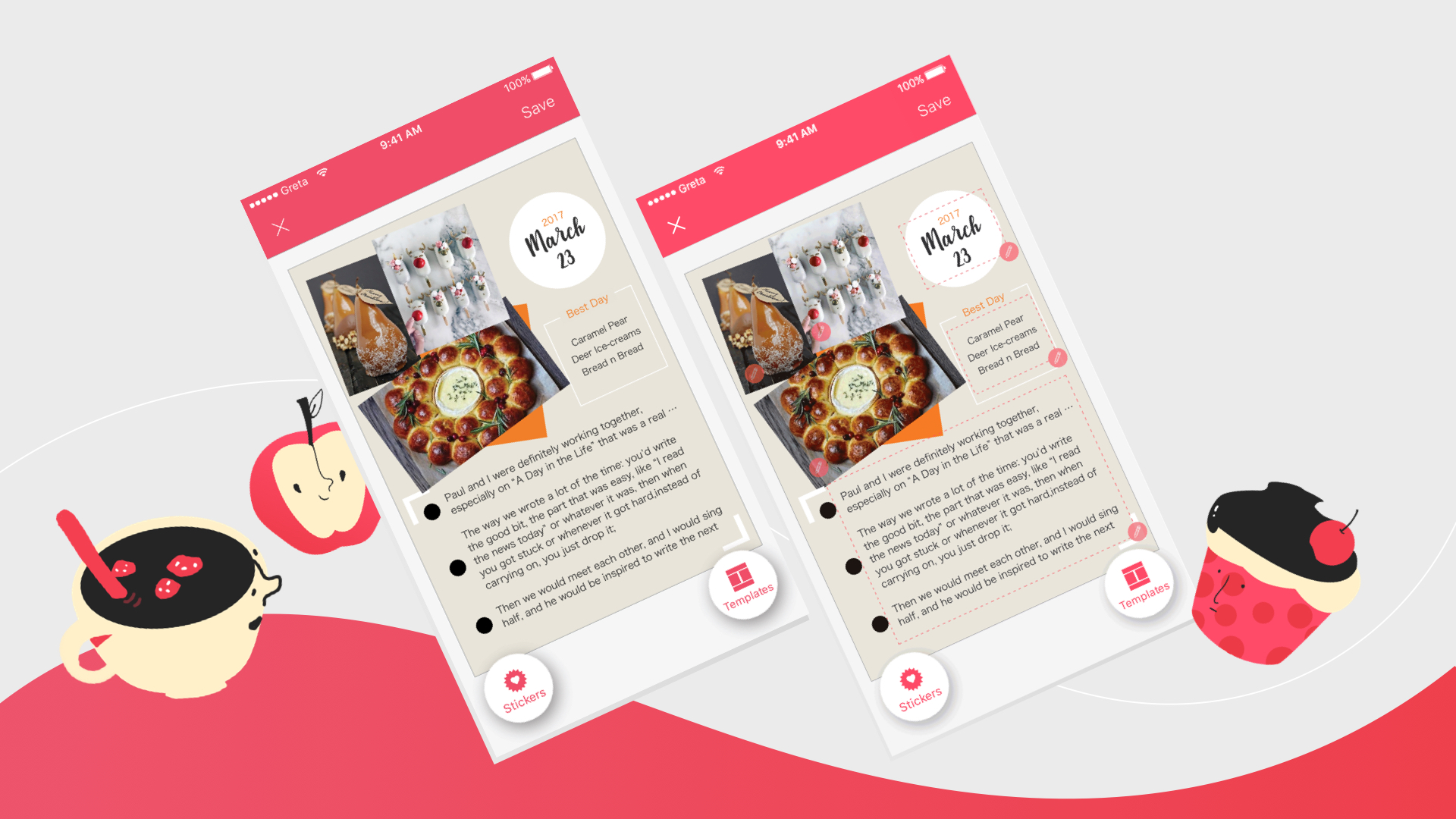
- In ‘Template Making View’, it is hard to know where is tappable. It is better to have some instructions to show.
- Add button may block the view of main contents.
Motion Design (Click to see)
Assorted Final Presentation
Concept:
Assorted is a mobile application to grab a meal with nearby friends. You login through facebook, find nearby friends and get matched!
Audience:
Students and Working people who want to grab meals quickly with friends.
Precedence:
Snapchat
Facebook (Nearby friends)
Presentation:
https://docs.google.com/presentation/d/1N-gmAwt6RvHw8S-221tDlLJX7qVFy6Fv1GsY4cXhfIY/edit?usp=sharing
Marvel Prototype (Please click on the link):
Feedback:
- Work on the Chef’s button. How does a user get back to the map view?
- The user and friends have gradient circles around them. Does it signify something? For now – no. It can signify close friends, etc.
- Thinking about setting up images for restaurants, etc.
#Thursdayapps
The Battle of Polytopia
The Battle of Polytopia is a turn-based strategic adventure. It’s a game about ruling the world, fighting evil AI tribes, discovering new lands and mastering new technologies. Auto generated maps make each game a new experience, with unlimited replay value. Pick and choose among different tribes. Wander in the dark cold forests of Barduria, explore the steamy Kickoo jungles or claim the lush field of the Imperius empire.
I really love this app. Firstly it is an offline game app, so I can play it while I am in the subway. The game is really attractive. In this game, you can create your own kingdom. After you develop your kingdom you can go attack and occupy other kingdoms. There are two ways that you can win the game, one is that kills all your enemies, another one is that becomes the richest and most developed kingdom. The visual part of this game is bright and colorful. I also really enjoy the user interface. The game is really easy to play and understand. I love this game.
For March 30, 2017
Next week, March 23, is Spring Break!
For March 30:
- Iterate on your Apple TV app wireframes
- We will create paper prototypes in class based on your wireframes. No need to do these ahead of time!
Quik AppleTV adaptation
Stamp Stamp Final Prototype
According to the feedbacks from prototype 2, I revised:
• Enlarge Text and test on the phone
• Add logout button on profile page
• Add a special icon for some restaurants which have special offers to help users get information easily.
• When you finish the all the stamps collection, all the stamps will be shining.
• Change “Sign in” to “Create an account”.
• Delete language bar.
• Simplified tap bar to be more efficient to access on QR scanning.
• Add more restaurants sample in my prototype.
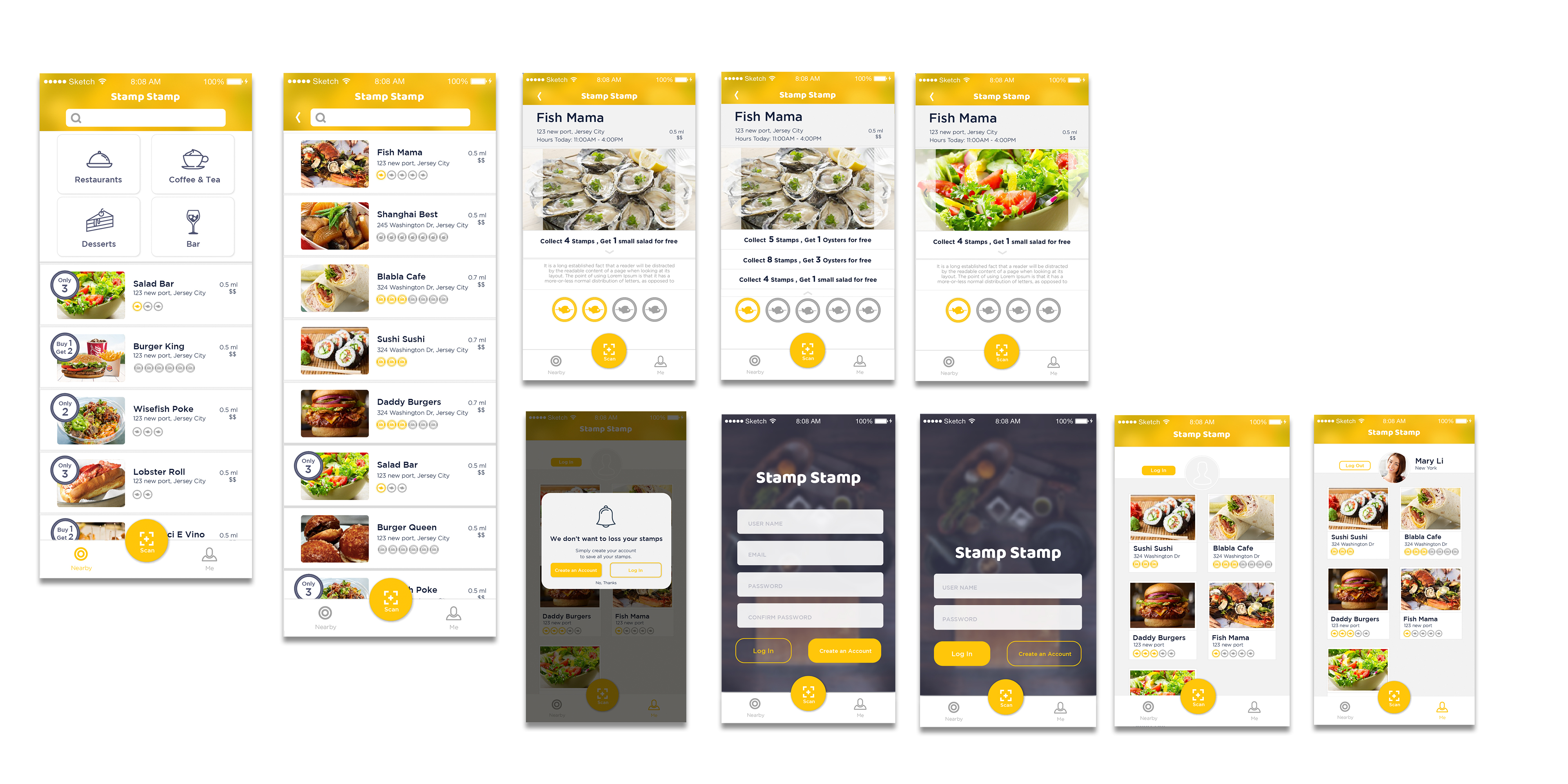
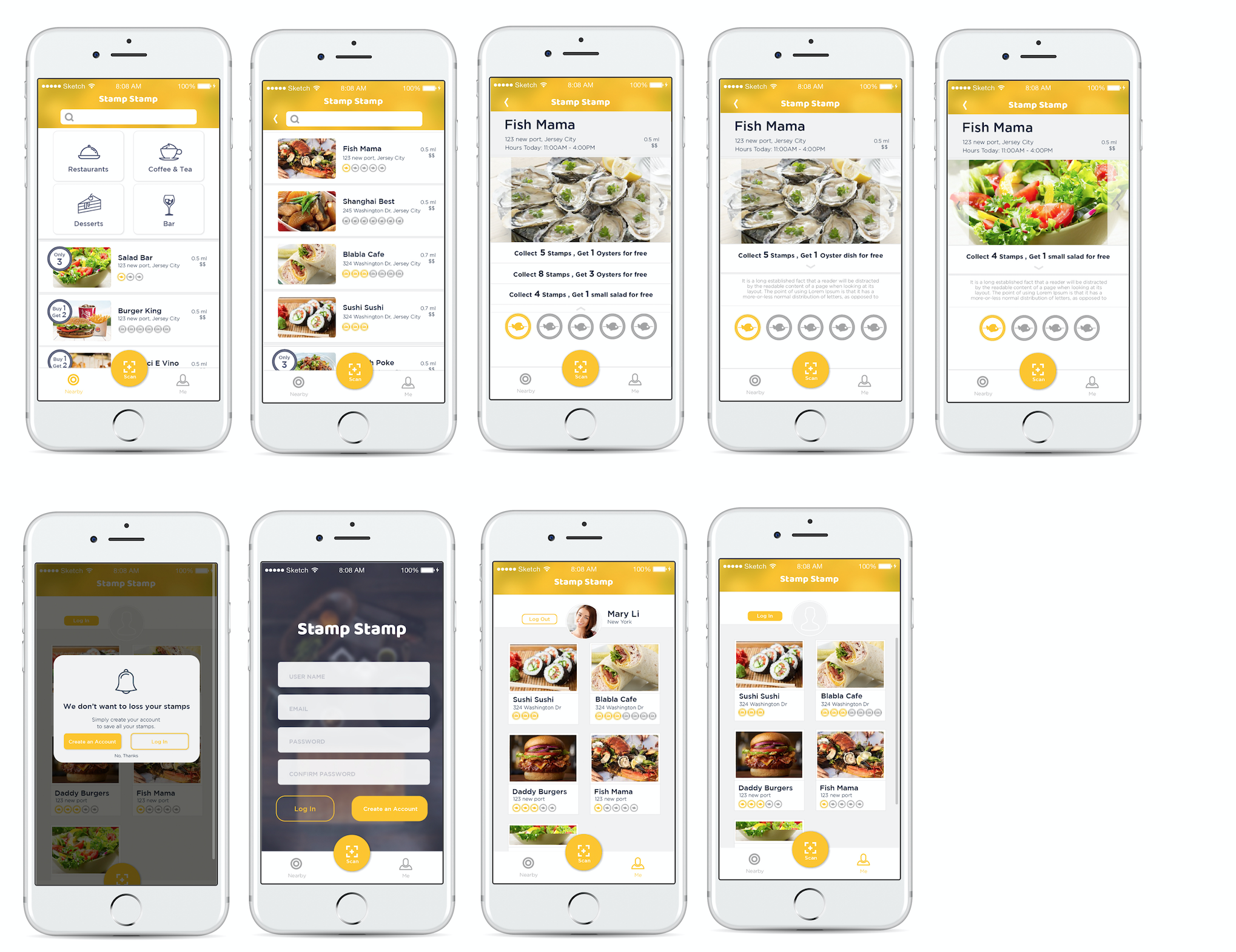
Marvel prototype: https://marvelapp.com/55104ch
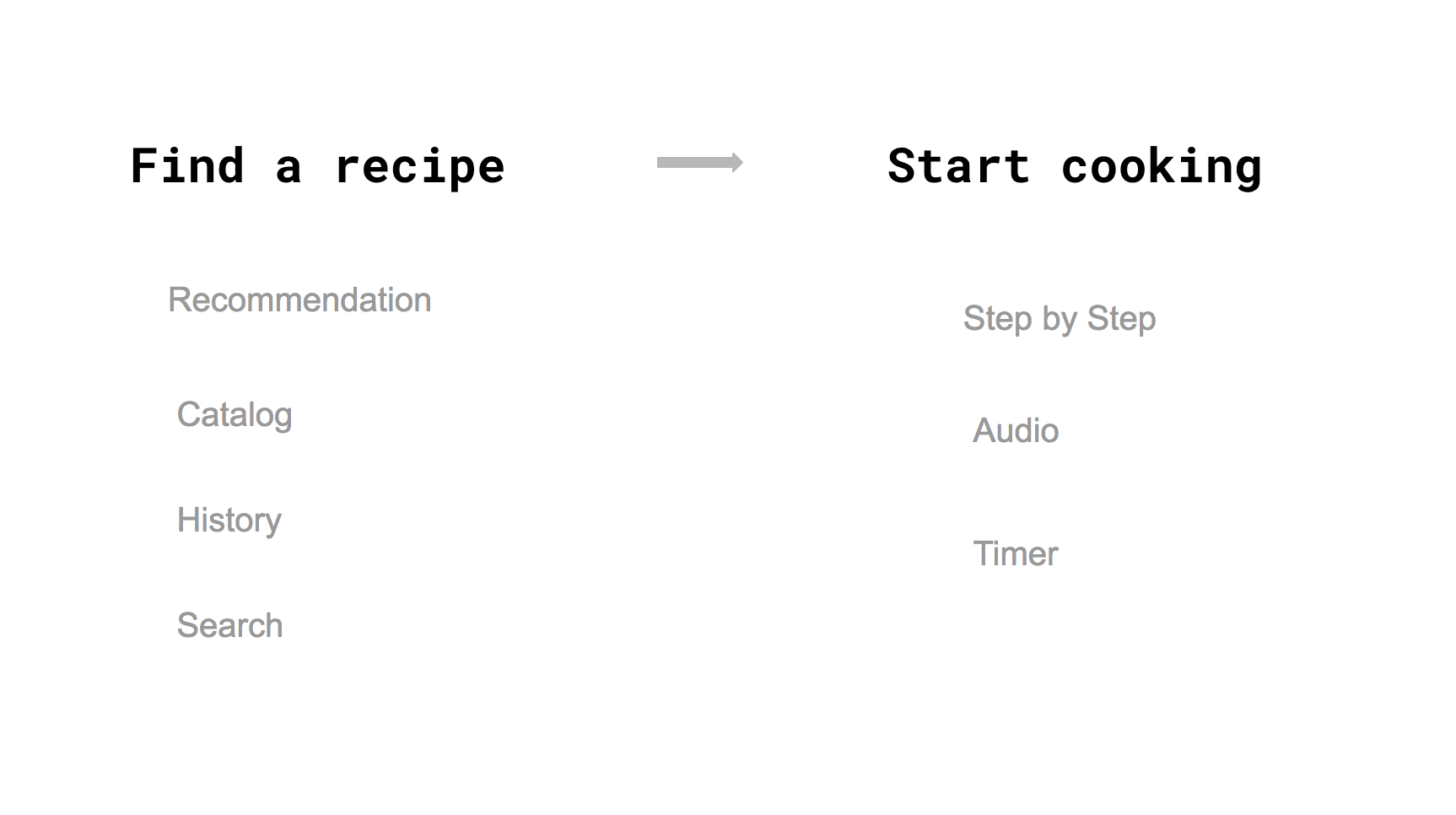
EASIPES_Final Iteration
Concept:
I am creating an app to help cooking lovers easily access high-quality recipes, and making an engaging, easy and fun? cooking experience for them.
LINK to Digital Prototype
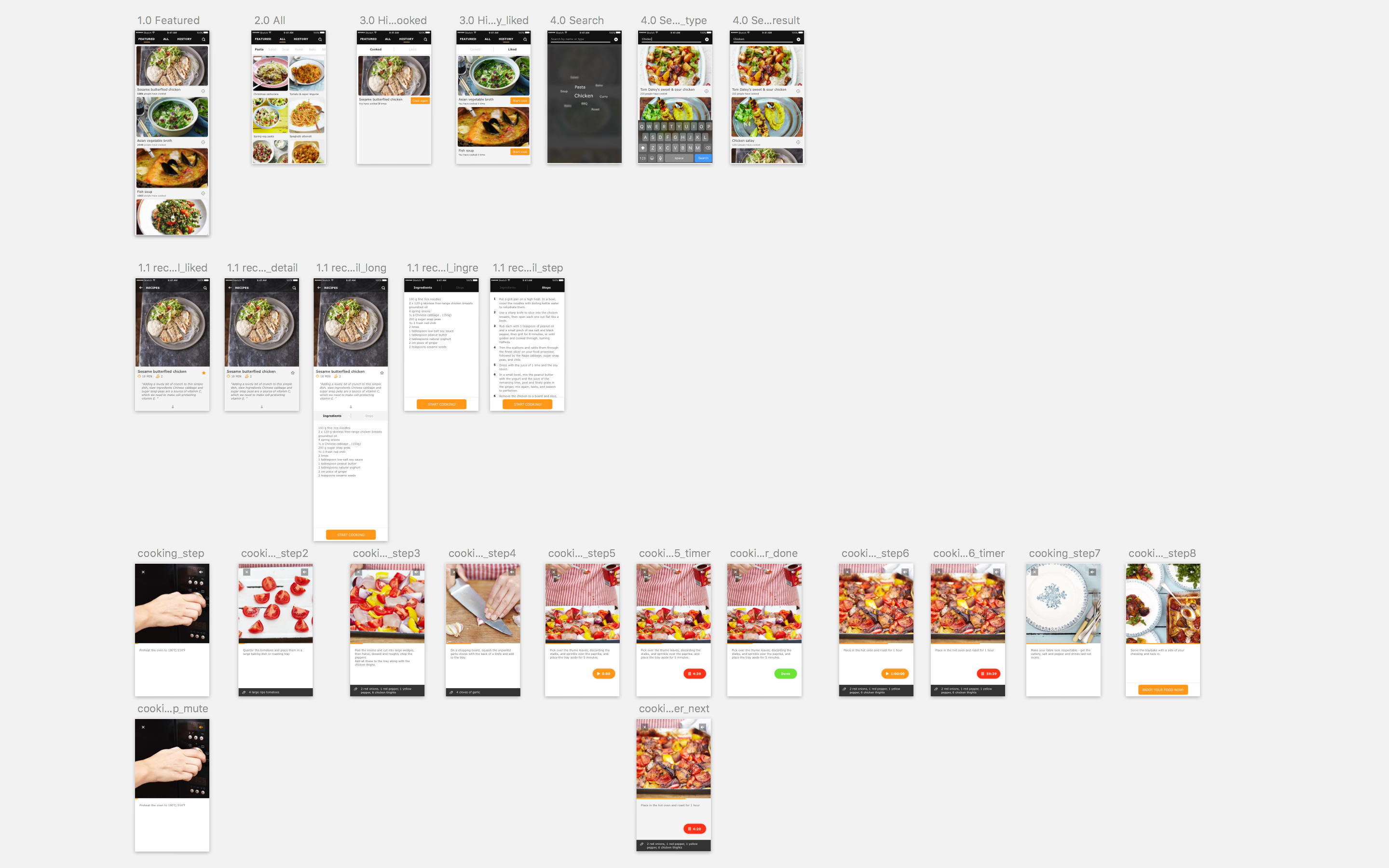
Iteration:
-Polished the visual
-Restructured the menu, changed into the form of Tab
-Redesigned the layout of Recipe detailed page
-Switched the interaction of Timer function
-Added audio elements
-Used a real example to make complete experience
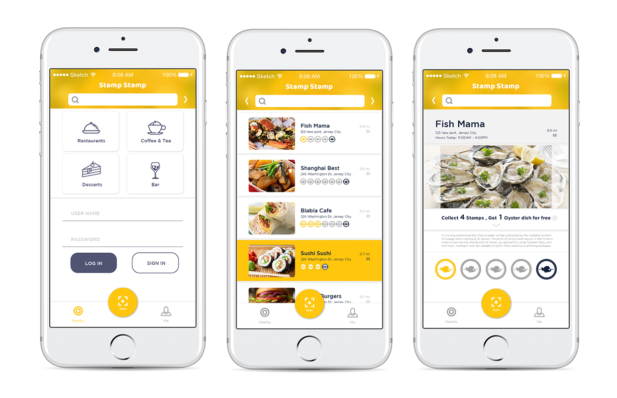
Stamp Stamp Prototype 2 visual prototype _1

Marvel prototype: https://marvelapp.com/24bcg1a
Feedbacks:
• The context text is really small.
• There is no logout button on the user profile.
• Show something special marks some restaurants which have special offers to help users get information easily.
• Change another visual symbolization to symbolize when you finish collecting the stamps. The yellow color I used before looks more like a tap respond.
• Change “Sign in” to “Create an account”. It may help users to understand easily.
• No need for language bar, because iPhone has its own language system.
• Make QR scan button more easily to access.
• Test what happened if there are more restaurants.
EASIPES_Visual Design
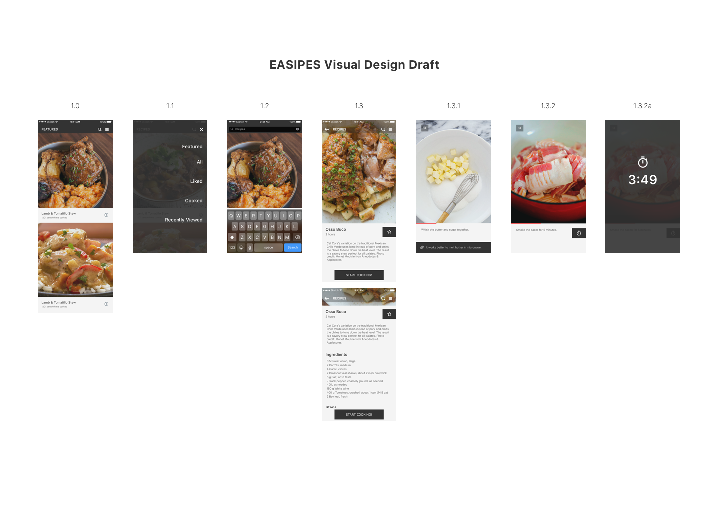
LINK to Digital Prototype
-Used real content, and adjusted the ratio of the pictures
-Changed the title “RECIPES” into “FEATURED”
-Changed the layout of navigation bar, moved the menu icon to the right side so that users can access menu page even in the recipe detailed page