For March 9, 2017

Here is the link to my final documentation

First digital prototype: here

Final digital prototype: here

Three things I learned from the digital prototype.(Visual Elements will look & feel totally different on the screen with the paper prototype.)

  1. I  change those pages background of adding activities from white to the gradient, which make them consistent with other pages.
  2. Adding unit behind the number of calories progress bar, which clarifies the mean of the number.
  3. Switch the ranking sequence of calories remain on the dairy page, which avoids the confused between calories progress number with the remains.

About Me + 3 things I learned from Apple HIG

About Me

My name is Chuyi Sun. I am from China. Currently, I am the first year MFADT student. I graduated from the University of California, San Diego as a studio art major student. After one-year internship experience in graphic design, I am trying to transfer to be an UI/UX designer. I am a big fan of comic, game and music apps.

3 things I learned from Apple HIG

• Widgets on the Search screen and Home screen

iPhone provides the widgets for people to quickly and easily to view the useful information from an app without the need to open it. It not only provide a more efficient way for users to get notice but also use a creative way to attract users to open the app. Because if the widget shows some interesting notices or information about the app, the user will open the app to check that.

• Integration with Siri

The Siri is one of the artificial intelligence that applies on iPhone for assisting users to finish their tasks easily by using voice commands. Currently, the voice recognition of Siri can recognize different languages. The Siri interface also provides another easy access for users get useful information quickly. It reminds me when we design the app, don’t forget to provide a concise notice or information widget for Siri interface.

• Expanded Notifications

The expanded notification allows users to press their notification or swipe the notification down on an unlocked device. It also provides users a connivence to take immediate action without leaving their current context. It is really useful when we need to do multi-tasks. It provides more possibilities for users to finish their tasks quickly and efficiently.


Homfood_Final Iteration_Misung

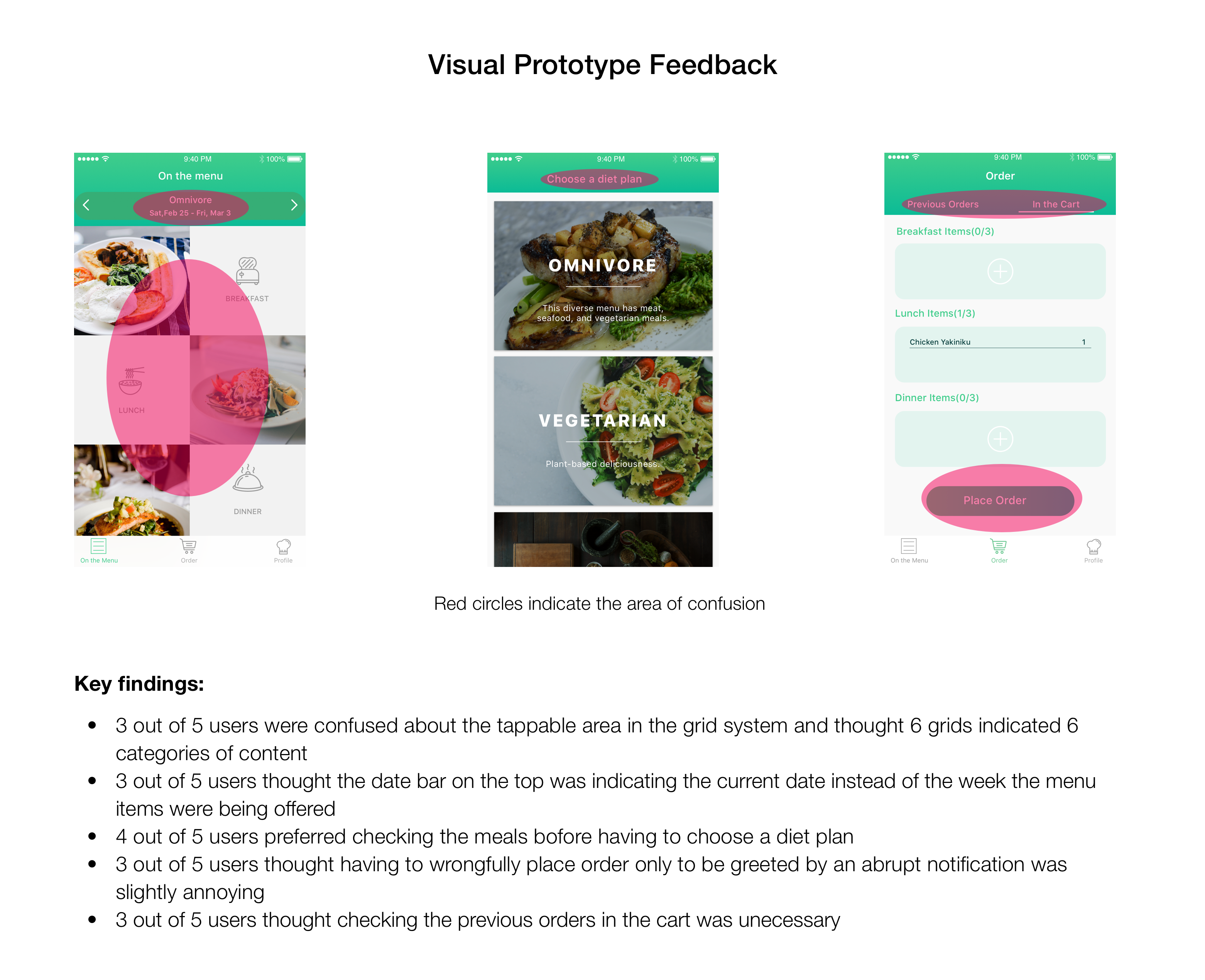
Findings after user tests with digital prototype:

1. Users were confused about the search icon on the navigation bar because of the quantity of contents are not enough to search. It can give users a bad experience if they cannot find result they expected.
2. Users were curious how they can order multiple dishes at the same time. There was no cart function.
3. Users preferred choosing date and time for order separately to selecting a button including both of them.

Changes / Iterations:

1. Removed search icon on the navigation bar and replace it with a cart icon to allow users to order multiple dishes.
This is because, considering time and capacity limits, sorts of dishes that one granny chef can cook per day will be around three to four at max.
Therefore, people still can access all foods on the main page.
2. Reformed the order option which users get when they tap the add to cart button on the detail page.
Users will select available date first and then select time afterwards.
Of course they can edit them on the cart page.
3. Added a popup page that asks users to allow their current location being tracked -> Based on user’s current location, the list of foods is filtered.

Feedback from last week’s critique

1. In UX wise, it looks appropriate to put the sign up page in the back and focus on enticing users first by showing them the contents first.
Considering user engagement, it would be better to show few menus on top and enable the rest of contents and ask users to sign up if they want to browse more
2. Managing hierarchy between ‘Granny chef’s profile’ and ‘Food detail pages’ looks a bit complicated.
3. If the main color including icons and fonts alters according to a food’s color, it can ruin the consistency.


Marvel Prototype Link: https://marvelapp.com/2caccjg/screen/25722004

Tao Wei – #thursdayapp

HEED is an app that helps user to get informed about fashion trends. With HEED, the user can follow the latest fashion trends and style advice, the user can catch streams of runways shows from around the world. The user can also upload a selfie and get personalized styling tips, then participate in the style challenge for a chance to win beauty products from top stylists. It is easy and intuitive to use.

Week2(Feb,23)

App Map:


Wireframes:

This week, I refined the concept. Based on my research on recipe apps, I found out that there are not many of them focusing on the experience of checking when following the recipes. So I decided to focus this part.

I got rid of the editorial feature of the former idea, making it a lighter app. I also added the START COOKING function.


Food Picker – Final Iteration

What I changed in the final iteration:

  • Randomly generate 3 options for the user. But the user can only view one option each time. If the users dislike one restaurant, they can’t go back to that option again.
  • Redesign the filter interface. Reorganize the type of cuisine options.
  • Reorganize the restaurant detailed page. I only keep the information that is useful for the user.


Marvel prototype: https://marvelapp.com/5512hd4

Thursday App – Jieming Yu

Description

Discover Voodoo’s new game: Paper.io.
Your goal? To conquer as much territory as possible. It’s initially very simple, and the game can be mastered immediately, but watch out: there’s competition, and not everyone can win!
Whether you’re bold or more careful, you have to be more cunning than your adversaries by finding the best strategy to conquer the most space. But be careful! You have a weak spot: your tail. If an enemy touches it, that’s the end for you.
Try to stay ahead, because victory in Paper.io is never certain until you possess all the territory. Stealing is allowed, and your enemies won’t hesitate to do so.
After the success of Quiz Run, 1 Pic 8 Words, and Bool, Voodoo now offers you a new gaming and graphics experience inspired by io type games (made popular by agar.io). Enjoy the simplicity and strategy of an io game in a world with unique graphics.
Paper.io is for the whole family and doesn’t require an Internet connection.

The reason I like Paper.io

First of all, I like the mechanics of this game. It is easy to understand but no easy to master. You can easily understand the rule when you playing it for the first time. But it takes a lot of time to master this game. This is a good feature of the mechanics. Also the illustration style is elegant. I like the color combination of the square.