Final Prototype for 3/9: Food Diary

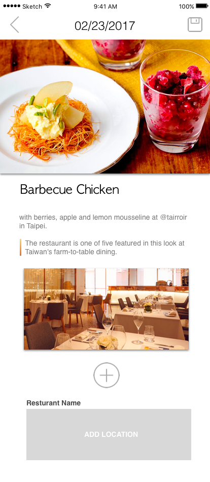
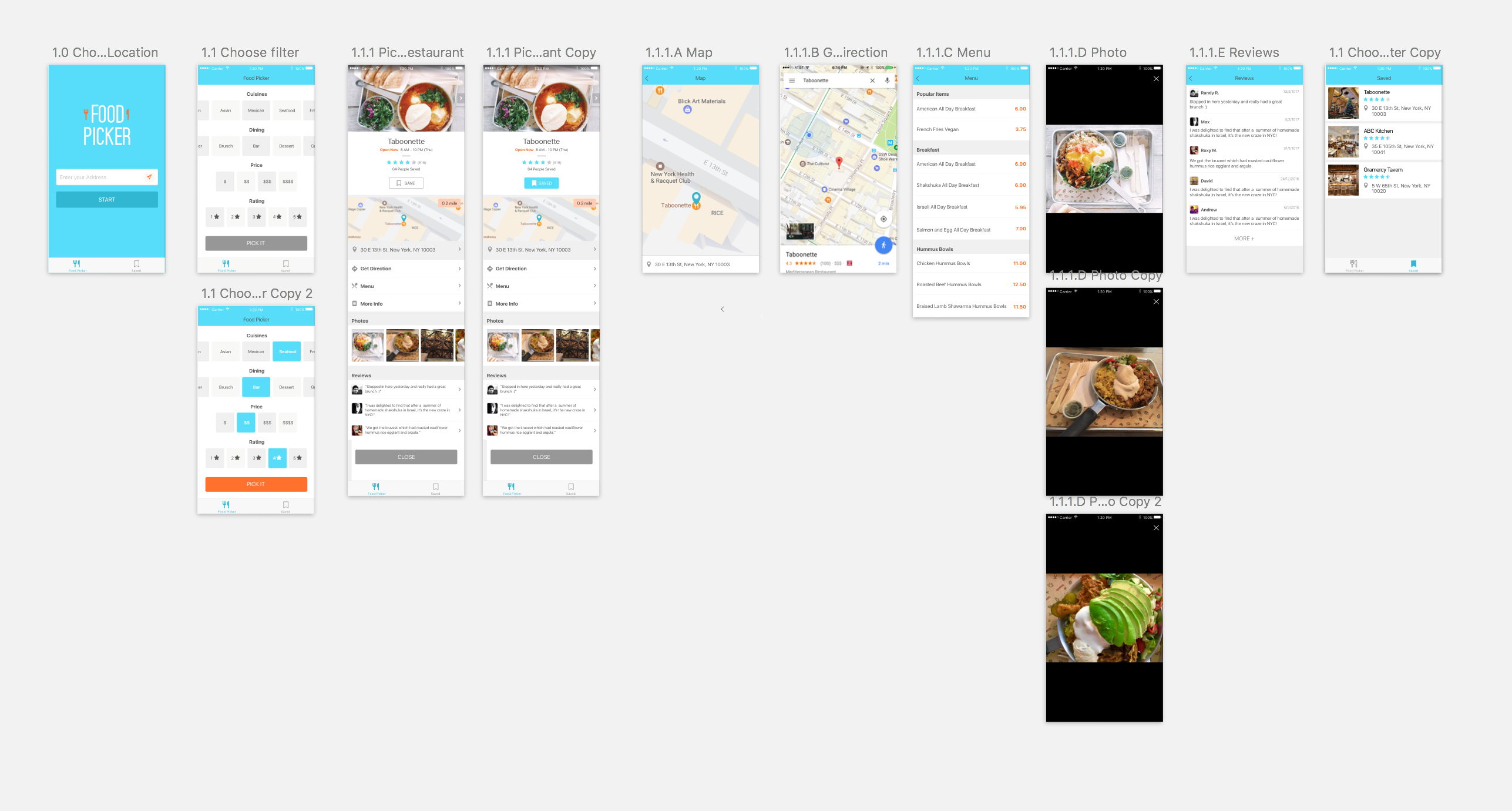
After user testing and feedback from last class, I added more icons to make it more clear to users that which part they can edit on the editing post view.

I also altered the ways that how to go through pictures on “my diaries” view, so that it is consistent to the main discovery view and users won’t get confused.

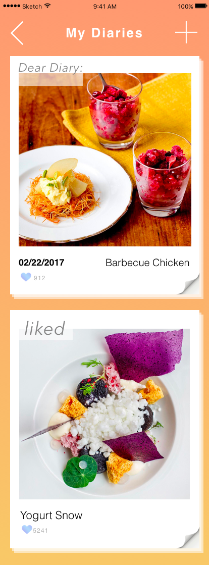
In order to make it easier to find certain dish on the diaries view, I also added a different way to display all the pictures by switching the icon on the right up corner.

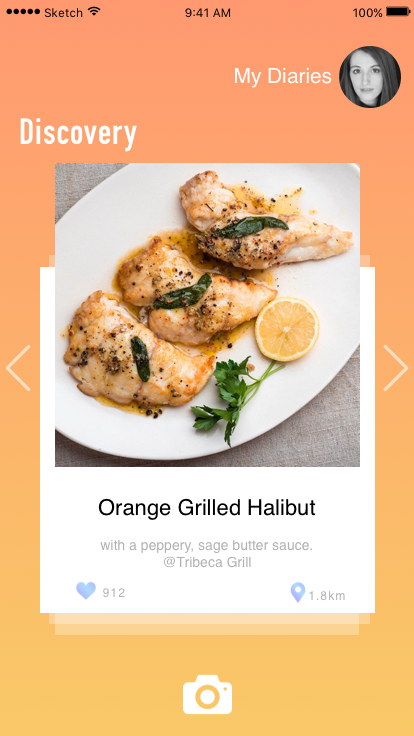
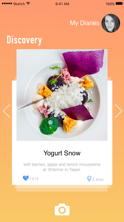
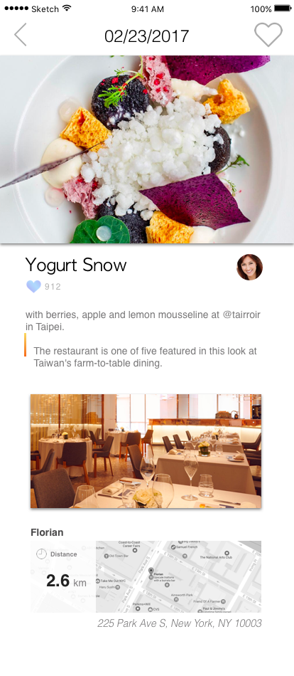
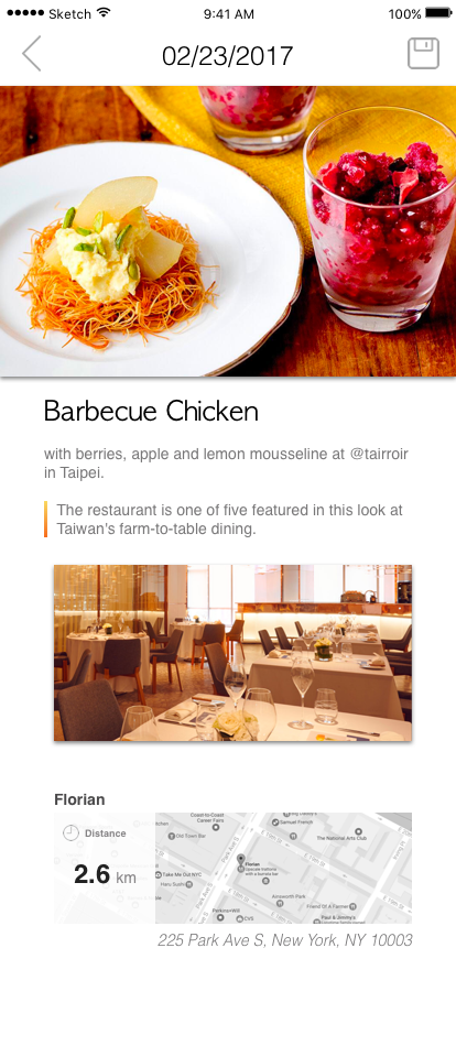
Here is all the screenshots of my app:

food diary final

Here is the link to the interactive prototype on Marvel:

https://marvelapp.com/24b97e4/screen/25470501


For March 16, 2017

For next week:

For project 2, you’ll be adapting your project 1 concept for the AppleTV.  Everyone will present wireframes of their AppleTV app.

AppleTV Parsons 2017 Lecture

Reminder:

I will base your midterm grades off of the work for project 1, and work only counts if it’s on the blog.

Completely optional:

If you’d like to dive deeper into coding and creating apps from Apple’s perspective, they are offering scholarships for attending WWDC this summer. Learn more.

Project 1 Final Iteration

Final Presentation: zhant293_mobilemedia_proj1

Marvel prototype: zhant293_project1_digitalprototype


Design challenges/criteria:

  1. Simple and intuitive
  2. Quick access to foods
  3. Minimize text
  4. Reinforcing/Repetition
  5. Easy to navigate through maps/directions

Things I’ve changed:

  1. First view that user will see upon tapping on a restaurant is the map view of his/her current location. This was done because it would be easier to locate directions and orientations for the user.
  2. The map is now using a 3D view rather than 2D, again, this was done so the user could look at the map and feel that it is closer to reality.
  3. Instructions now are accessed only through the “Text” button on the top right corner. This was done to diminish the amount of text on the screen.

#thursdayplay Milkmaid of the Milky Way

Milkmaid of the Milky Way is a classic puzzle adventure game by solo developer Mattis Folkstead created with Unity. The story is very interesting. In the game, you are playing Ruth, a young woman living alone on a remote farm in a faraway fjord in 1920’s Norway, trying to save her cows from aliens. All the dialogue is written in rhyme, and the story has a certain melancholy to the whole affair, about time passing and losing loved ones.

The scenes in this game is beautiful. It’s a curious mixture between low-resolution, old-school pixel art, but with some surprisingly detailed backgrounds and scenery. To solve the puzzles, you need to explore all the scenes, tap on different characters and listen to their stories, and collect key items to help you go through certain area.

The soundtrack is also amazing. They fit with the story and change constantly when the story goes on. Playing through the whole story took me about two hours, and it was an amazing experience. I would recommend it to anyone who loves adventure games and interested in sci-fi.

Some screenshots:


Prototype 4 for Week 6- visuals and interactive

Based on more user test and feedback, I changed the theme color since blue is too cold for a food app. I add more navigation text to make it clear, which view is the user’s profile and which view is the discovery channel. I also deleted the function that can change background color in post edit view.

Here is the link to interactive prototype on Marvel:

https://marvelapp.com/24b97e4/screen/25470501


#Thursdayapp | Alto’s Adventure | Brandon Palmer

Alto’s Adventure: IOS Game, Android, & Kindle

After hearing many positive reviews about Alto’s Adventure I ended up buying it. The plot takes place on top of a mountain, where you as the player glides down the mountain on a snowboard to rescue runaway llama. Personally I found this game beautiful in all aspects. Not just the interface but the precedents that Alto’s Adventure used as references. Such as Tony Hawks Pro Skater 2, Monument Valley, and Journey. The core mechanics of Alto’s Adventure 2d Platformer  consists of collecting points that your obtain by landing tricks and retrieving coins as you make your way down the endless slope.
Overall I had a great experience and appreciation for playing this game because the color pallet, functionality and setting creates a relaxing experience for the user. I highly recommend this game.


#thursdayapps – Hardbound

Hardbound

Hardbound is a new, unique format of storytelling that’s visual, interactive and designed for mobile. Comparing with the traditional news app which provides many texts in content, Hardbound uses lots of illustrations and graphics to help you digest the information. Most of the story takes about 5 minutes to finish. It is appropriate to read a story during the waiting time. The simple gesture (swipe← →) makes the reading experience smooth and comfortable.

In my perspective, Hardbound creates an innovative way to read the news and make the information clearer and easy to consume.


#Thursdayapps

Color Switch

Color Switch is a challenging game where you tap a ball and must follow the color pattern to cross or move forward.

The game is interactive and changes colors every second. It consists of many levels which you unlock as you go.

This challenging game reminds me of my favorite game – Bounce.

Bounce is a very challenging game that I’ve loved and mastered with time. It helps me concentrate and relieve stress. You climb to the top, take down enemies and grab powers! My high score is 63. What is yours? Download both apps now!


Color Switch: https://itunes.apple.com/us/app/color-switch/id1053533457?mt=8

Bounce: https://itunes.apple.com/us/app/bounce/id951346457?mt=8

-Gunjan

#thursdayapps – Steppy Pants

STEPPY PANTS

This is a very interesting game! I have been playing this for 2 weeks during my commuting time. Basically, you press on the screen to move the character’s leg. The longer you press, the bigger step you take. There are some barriers and gaps which you can’t step on.

The reason I love this game is the graphic style. The character has dramatic movement and the game uses humor conversations. The user can share the falling down GIF to social media. I think this is very fun. Moreover, because there is no limitation of the life,  you can keep playing until you feel tired!

Highly recommend! 😀


Food Picker – Visual prototype

3 thing I changed from paper prototype

In order to focus more on helping people who have choosing disabilities, the main change I did was randomly pick a restaurant for the user.

  1. Bring all filters to the beginning. (user said that choosing pictures is not helpful)
  2. Add the pictures in the restaurant detailed page. (picture increases the appetite)
  3. Add save function. The user can find the previous restaurant easier.

Marvel prototype: https://marvelapp.com/1ei2e52

Digital Prototype Feedback

  • 1.0 Choose Location: confusing about using current location / if user doesn’t input anyplace
  • 1.1 Choose filter: There is no need to select rating range, cuisine/dining categories are confusing
  • 1.1.1 Picked Restaurant: “close” button should change to ex:”find your next meal”.
  • 1.1.1 Picked Restaurant: reorganize the information in this page, what is useful? what is convincing for the user? (too much information now)
  • 1.1.1 Picked Restaurant: The button for changing pictures at the top is not clear.
  • User might be able to get a new random outcome based on the same filter.
  • Some users want to choose food based on taste, ex: spicy, sweet.
  • 1.1.1 Picked Restaurant: Just provide the best part of the restaurant to the user! –> user would be convinced that this is the best restaurant.