WEEK 3 || Frannie Xiao

Learning From Paper Prototype:

  1. The app should be learning from user’s behavior, and try to recommend dishes based on their preference and cooked recipes.
  2. The “favor the recipe” tab and “add to grocery list” tab are similar and seems a little bit repetitive for user to tap on both of them since most of time they will tap on both tabs. The two tabs could be combined together and directly store the recipe into a local account.

Digital Prototype:

https://marvelapp.com/7hhb9jb/screen/38247859

Week3- Kelsey (Yue Yu)

3 Learnings from last week paper prototype:

1: Adjust sidebar position and text size.  Change swipe left to swift up.

2: Change the position of the saved menu icon from upside to downside.

3: Use house icon to take place of the original icon of the homepage.The original icon makes people expect a sidebar, which does not exist.


Digital Prototype:

https://marvelapp.com/2jbeddd

wk03_Stella

User insights I learned from my second paper prototyping

  1. It’s important to keep how users would interact with the app in mind, which means a simple and clear user task flow is vital. Specifically, how people get into a specific view, and how people could get into another view afterwards should be completely logical. For example, users would care about how they could go to the home screen, and where a “back” button would lead them to. They all require us designers’ consideration.
  2. Even a single word on the screen matters. Though users are accustomed to viewing icons and images in a view first, it is still significant to care about every word and text in the app. For example, “alert”, “notice” and “notification” are quite different from each other. Users may also feel confused about “Skip” which is used for users who need to eat outside on a specific day. However, in my user testing, this feature, or maybe this word is really confusing.

Visual Design

Digital Prototype

Week 3 – Franky Wang

Learnings from paper prototyping

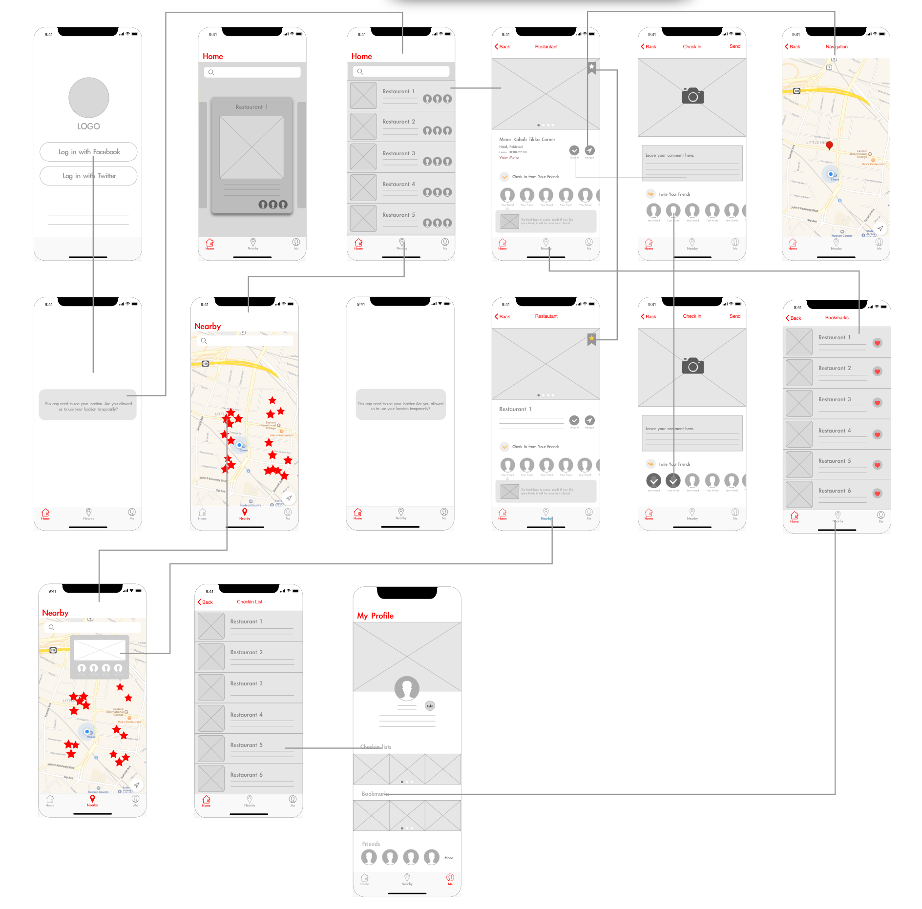
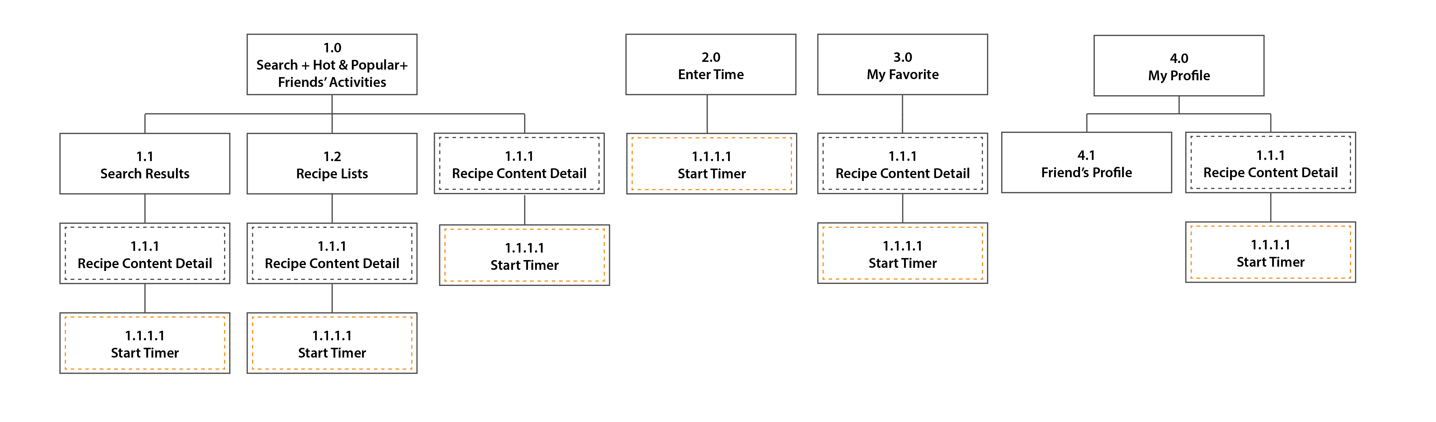
1 – The application should consistently keep focusing on its ease of use, which means minimizing its side functions other than the main feature. From 1.0 to 2.0 prototype, taking advice from user feedback, I cut off some complex steps of photo editing (which can be generated from other APPs) and corrected imprecise descriptions for the better understanding of terms in the APP.

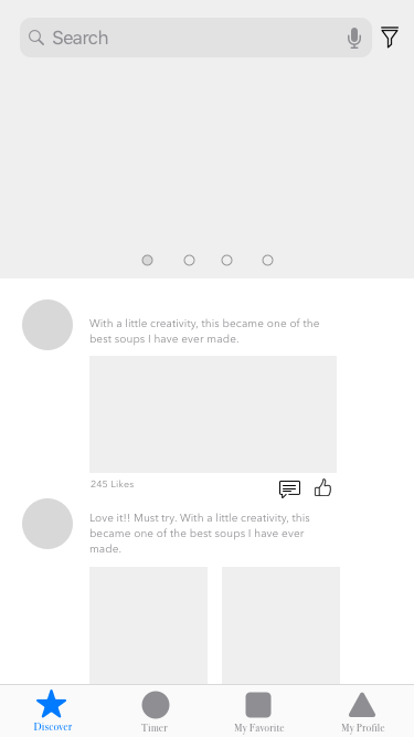
2 – Every button/icon should clearly show its affordance. Some details like terms of “save” and “like” would somehow lead to different subsequences. When it comes to icons, the non-verbal indications from the figure need second consideration.

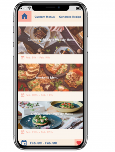
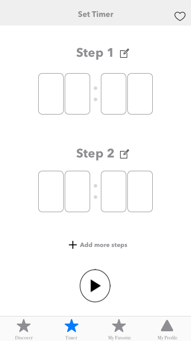
3 – When a specific function is set up, it takes time to reconsider the form of inputting/outputting information. For example, in the post filter page of the APP, there’s a slide bar managing the distance range of the restaurant. But it might not be user-friendly on a mobile display, because of the limited touching area. According to the user insights, it may become better if the form is changed into tapping selections or typing numbers.

Interactive prototype

Week_02

User Feedback from paper prototype_1

  1. Category sorting is not the right system for this app so the users suggest me to change to filter search system.
  2. Since many cat owners make weekly food at once and preserve it. Today’s recommendation is not really working so it would be better to change it to weekly pick.
  3. They don’t understand the meaning of the icons.
  4. Cat’s profile could be added to the future recommendation.
  5.  +,- icon from my recipes tap doesn’t make sense and the users asked me what is it for and why creating a folder is necessary.
  6. The first page could be Tips.

Week3_Qizhao Chen(Eric)

  • Note 2-3 user insights that you learned from paper prototyping
1. The “Chat” function in the app is unnecessary. If the users want to contact their friends for more comment about the restaurant, they will use their frequent-used social media to contact them.
2. The position of the “hunting” tap is quite strange, it seems not be the main function but its position is in the middle.
3. What about many restaurants show up on the map? How to show their friends clearly on the map?
4. How can users find their friends? Should they log in to their Twitter account or their Facebook account?
5. The title of the view lack consistency. Some of them are large and some of them are small.
My modified version:

week2_Ting

Things I learned from prototyping:

1.Saved item is suggested to remove from tabs and have it’s own button floating on the page.

2.Smoothies should combine with recipe. Also, the instructions of choosing the colors are unclear. This week, I designed a CNYK bar which is a pretty intuitive interface for users.

3.Added shop as one of the tabs.

4.During the paper prototyping, my users pointed out several missing “return button”, which I added this time.

week2_map

week2_wireframe

Week 2 Sara Birchard

User Insights:

  • Bubble icon – user thought that this was a place to chat
  • User was drawn to check own profile
      • Expected an account icon
  • Missing back buttons
  • Wanted a way to minimize the about section (chef profile) so that it doesn’t take up the whole screen
  • Wanted to be able to rate recipe at the bottom of a recipe after making it
  • Don’t need a confirmation page for posting a recipe
  • User didn’t think settings was important enough to be its own nav item

Old App Map

I realized that a lot of the items that were on my app map were not actual screens, but rather states that occur on the same screen. I also got rid of the settings tab and replaced it with the profile tab, which houses settings.

New App Map

Detailed Wireframes