Find Free Wifi around the city! Check out the article about GoWex happening in NYC.
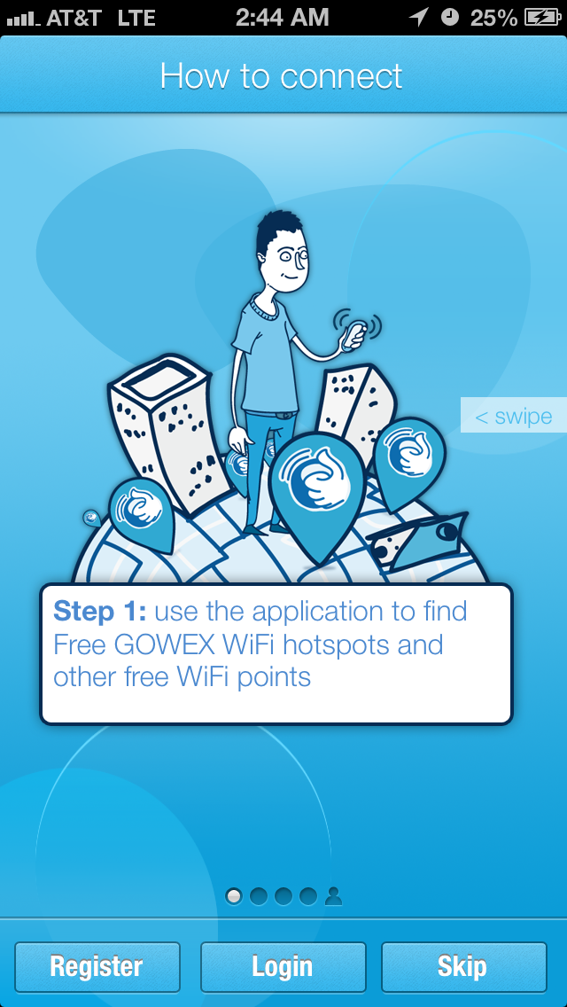
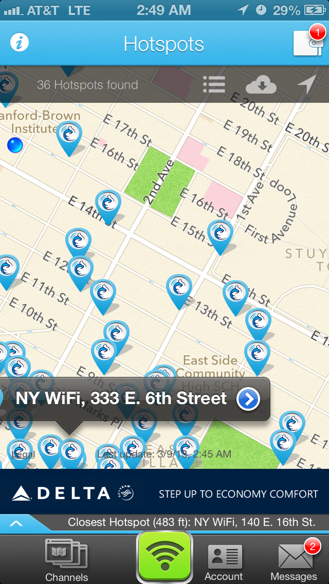
Find Free Wifi around the city! Check out the article about GoWex happening in NYC.
Pandora App :
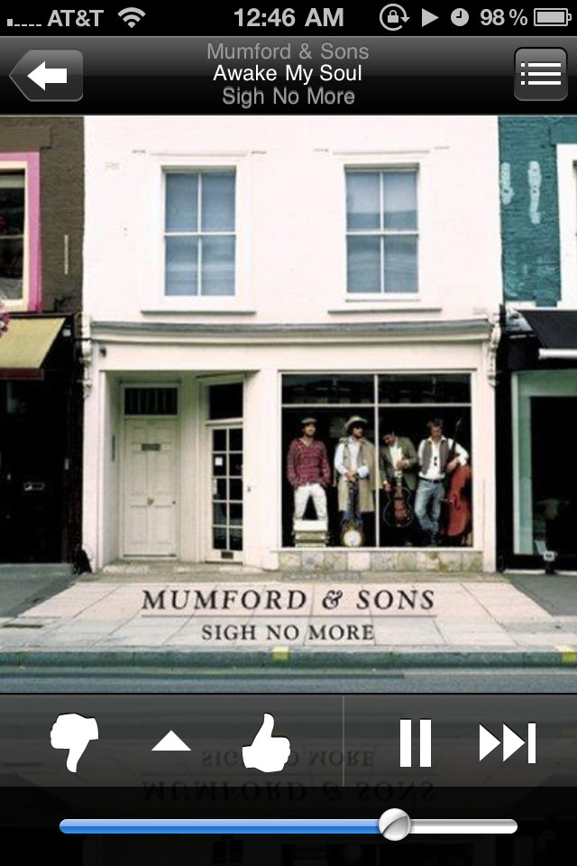
I am one of those weird people that dont like to keep music on my phone. I prefer listening to the Pandora App.Just like the original Pandora you can create Stations and sort through them.Users are able to listen to all of their stations from their mobile phone, tablet, or e-reader. Users can also create new stations, and rate songs using thumbs up and thumbs down. Pandora on mobile devices is fully integrated with Pandora on the web, so everything users create and personalize on their device appears next time you’re back on the web.Overall I love the app but I dislike the fact that you cant go back and re-listen to past songs. Also sometimes the song skips forward in the middle of it and you cant finish it.

Bloop is a game that was featured at IndieCade East, which is why I actually am able to talk about an apple app. Bloop is a multiplayer game (up to 4 players, either every man for himself or teams of 2). Each player is assigned a color, and the object of the game is to tap on your color square whenever it appears. This means that you will be touching everybody’s hands quite a bit. The description of the app on the iTunes store is “WARNING: HAND COLLISION IMMINENT.” And you can’t just tap everywhere, because it’s really easy to give points to somebody else that way. I thought it was interesting to see a local iPad game that allows 4 people to play on it at once. Another strategy would be to shove someone else’s hand away, or bump them so they press the wrong square. It’s really fast paced so that might be hard to pull off.
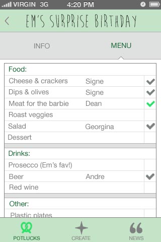
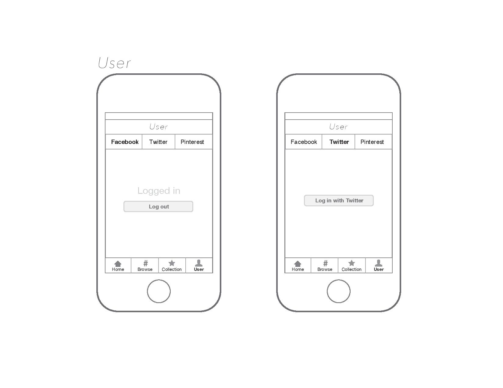
During the user testing for the prototype for my application I didn’t take any pictures but just took down notes while people were testing and giving me their comments. I got a few suggestions like:
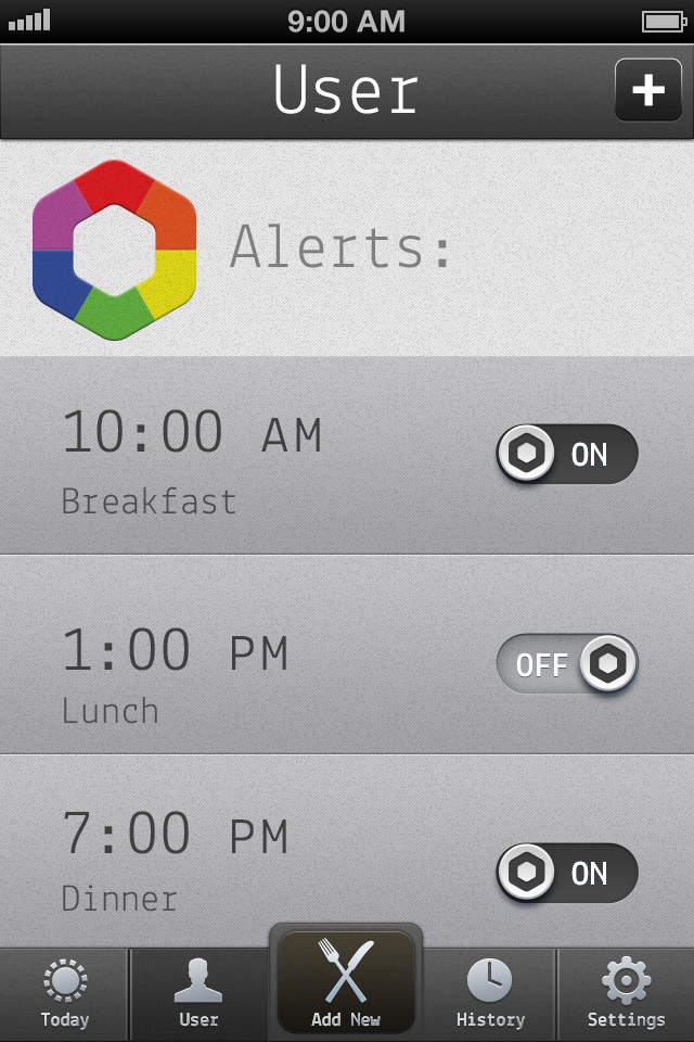
1/ Remove Facebook login, it seems unnecessary since the app does not have any social feature. If Facebook connect os really required then there should be a way to see friends’ activities, maybe a competitive aspect to see who skipped their meals, when did they skip, etc.
2/ Instead of having the “setting-the-alarm” system maybe there can be a way for the user to log in every time they east something and if they haven’t logged in a meal into the app in the last 4 or 5 hours then the alarm starts to ring.
3/ The avatars need to be more “designed” and various other personalities need to be thought of.

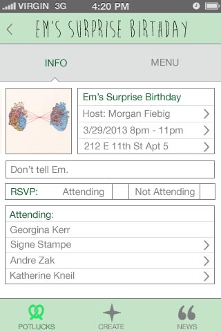
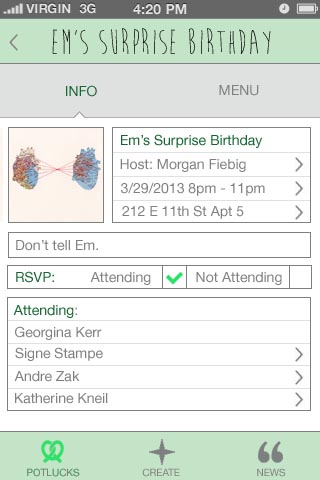
HOST:
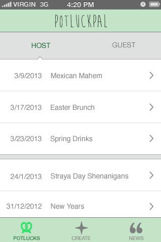


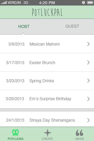
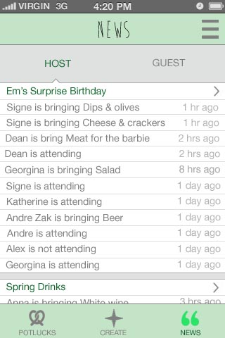
GUEST:

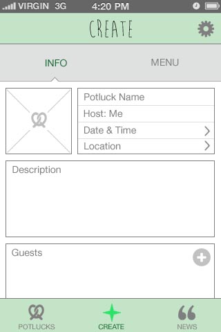
Note: There is no official name for the app yet.
Art Direction
Bread-related colors. A little bit of vintage to keep up with the trend. Homey, but professional.
Icons
There are two versions, with the second one as my preference.
![]()
Interface
Splash screen as a loading page.

The app starts with a buy page that displays photos of selling bread parts with pricing as a gallery in a newest to oldest order. There is the list icon on the top right corner for changing the ordering (nearest, lowest price, mostly random). Next to the list icon is a gear icon for the settings page. On the lower tab bar is a set of icons to access other pages (from left to right: shopping cart, buy, sell/trade, profile).
The (T) icon on the top right corner of each photo indicates that the item is available for trade.
Once tapped on a photo, an item page will pop up over the buy page. Here, the item’s photos can be viewed in the background by swiping horizontally. An information box on the lower part of the page can be turned on/off using the info (i) icon on the top left corner next to the close (x) icon. Under the information box is a row of dots displaying the numbers of item photos.
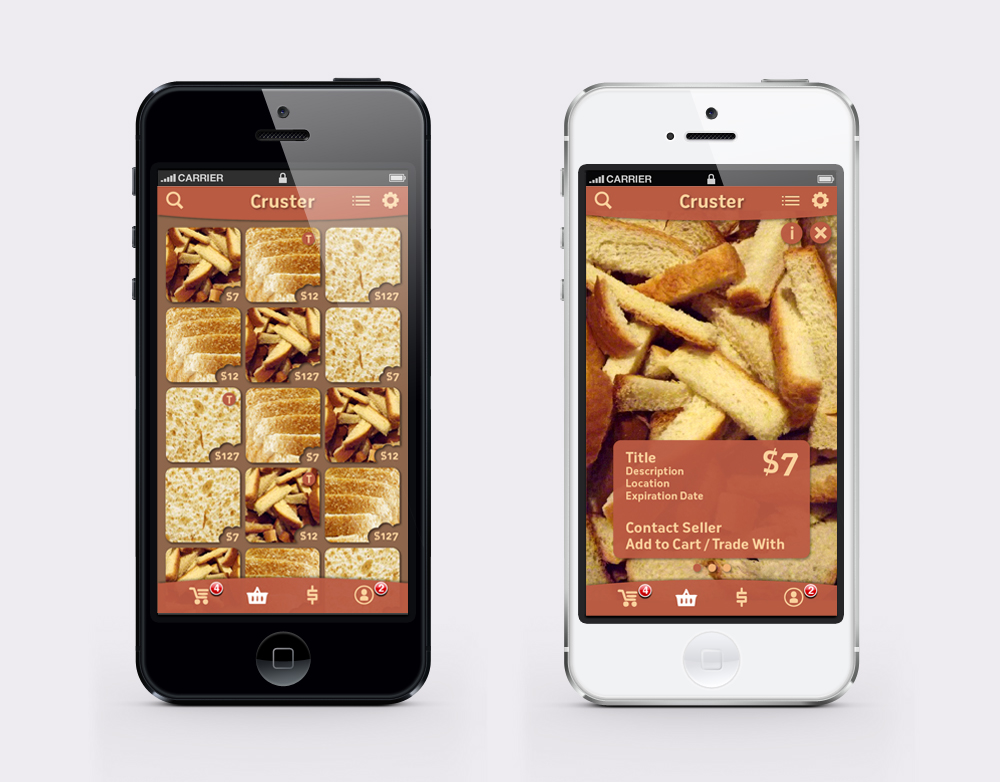
The shopping cart can be viewed by tapping the first icon on the lower tab bar. It will show items you want to buy and trade in separated categories. For the sell/trade page, which is accessible through the third icon on the same tab bar, there will be a form to fill and upload photos.
You can always go back to the previous page using the arrow icon on the top left corner. To go back to the buy page, use the shopping basket icon, which is the second one from the left.

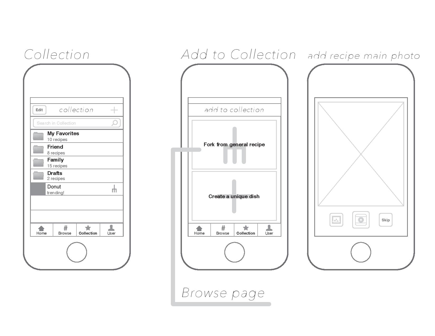
wireframe can be seen here:
4chetteSketch

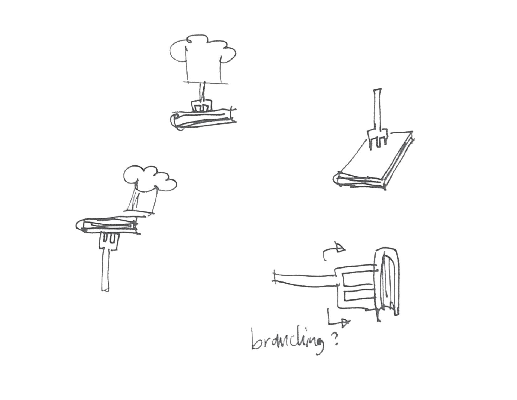
The name 4chette derived from french word, fourchette which means fork.


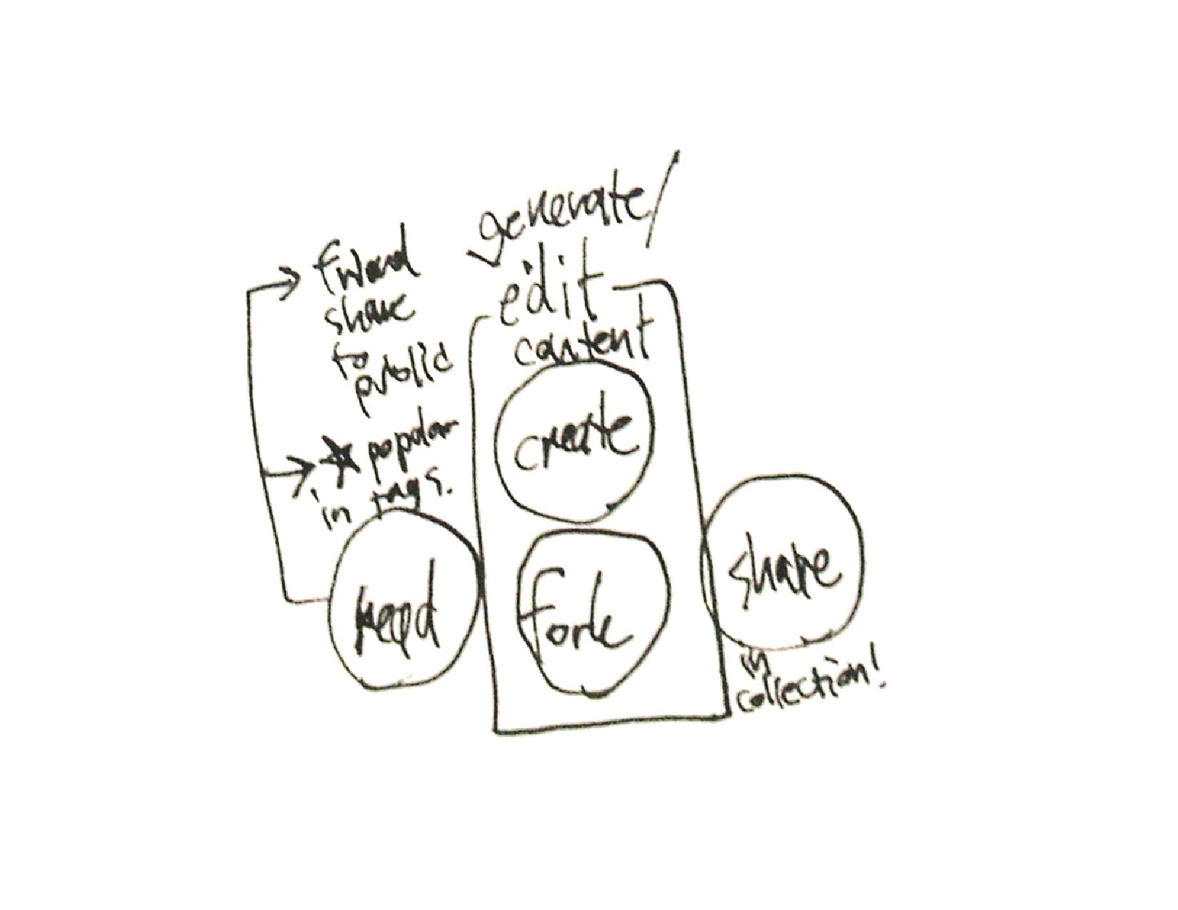
three main interaction on the platform: to read and navigate through content, to create and fork recipe, and to share with social networks friends.
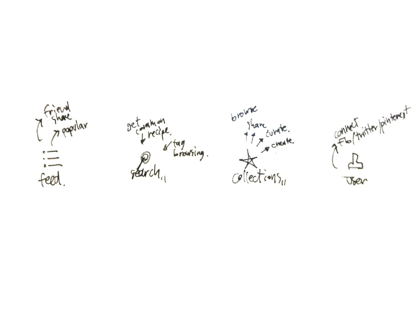
interaction breaks down that would goes into the app’s tab bar

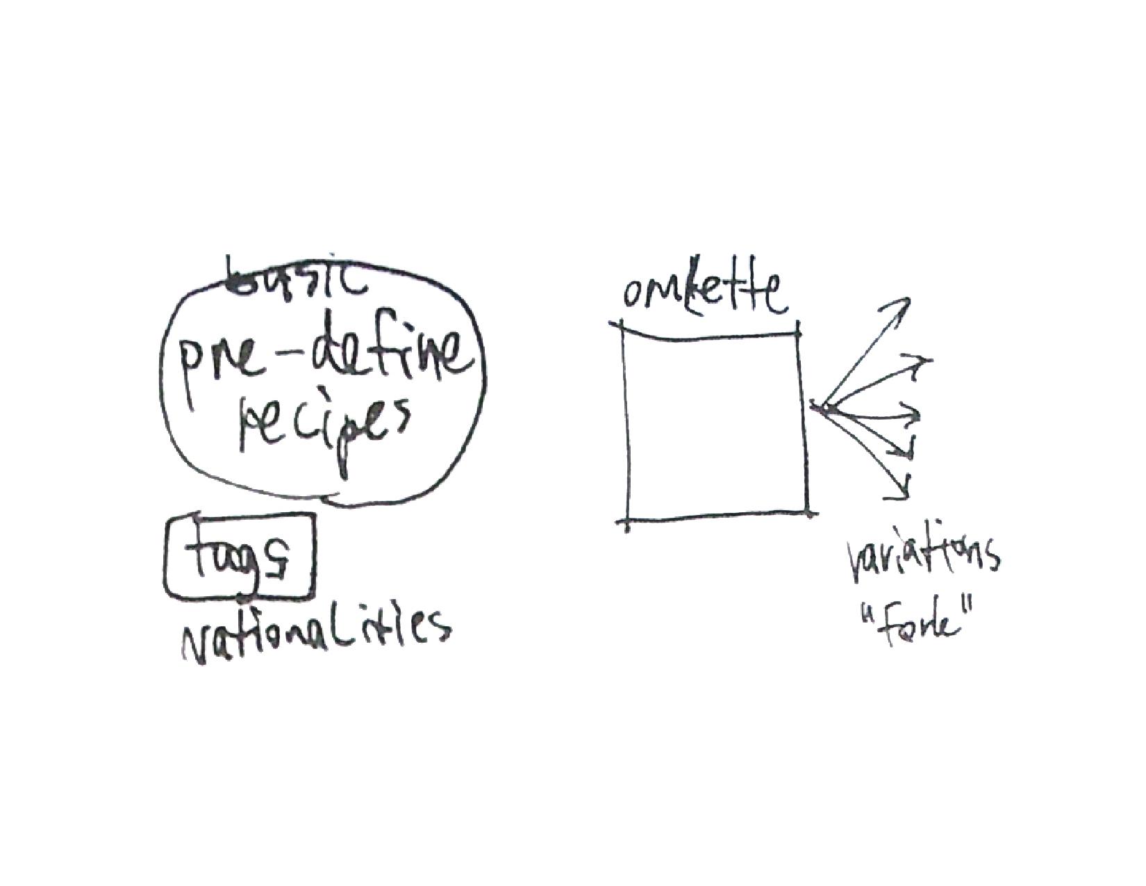
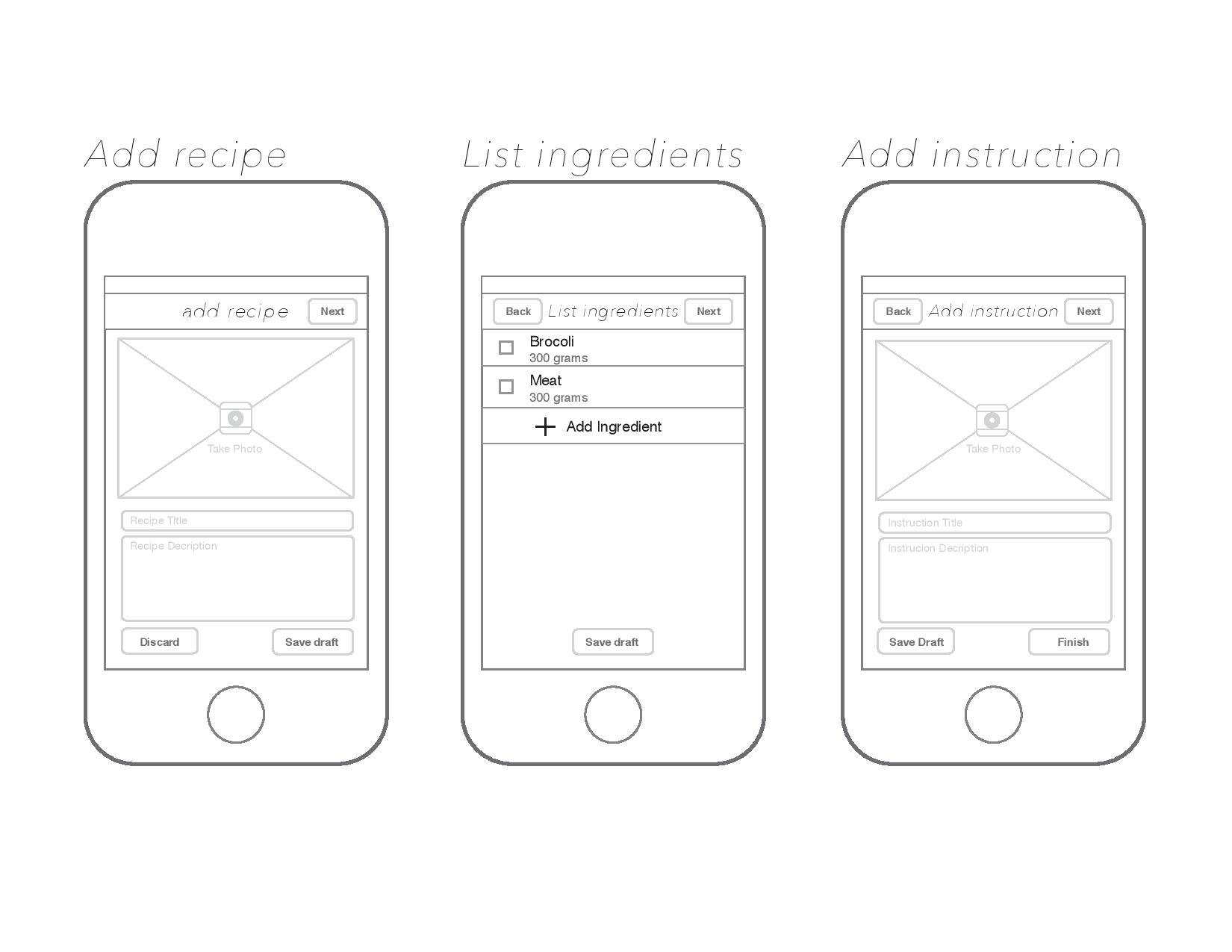
outline for upcoming recipe page
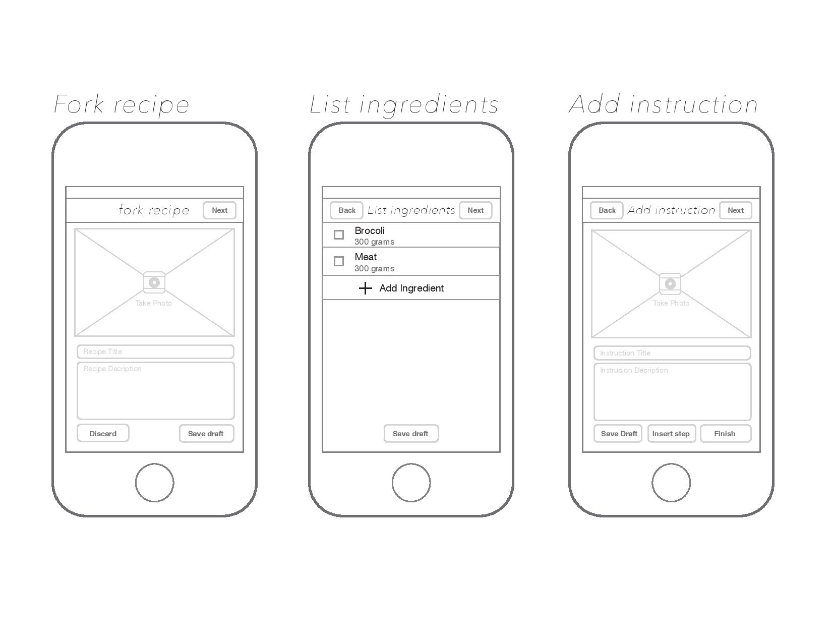
two ways of user generating content: to create new unique dish or to fork a variation of existing dish
Feedbacks
– a bit too hard to imagine the app as a whole with out an app map layout
– similarity of home (feed) page and browse page, these two can be combined as one page.
– How could user check out his own contributed recipe, how that separate with the collection that user curated from other users
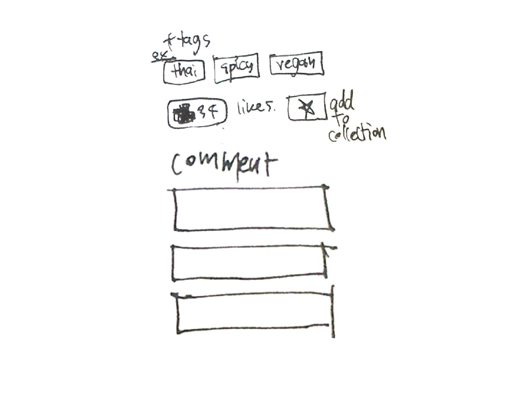
– every steps in food instruction shouldn’t need a photo
– saving draft of the recipe create/fork page is too much, can just take this function out to simplify the app as a whole
– adding content should be more significant function and should have its place in tab bar
– how to edit existing content in forking edit page
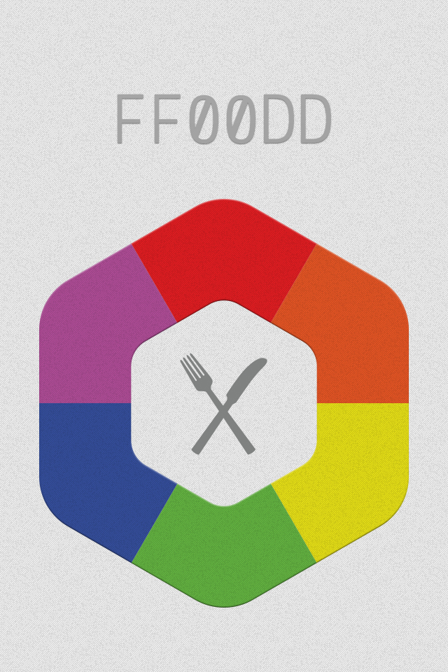
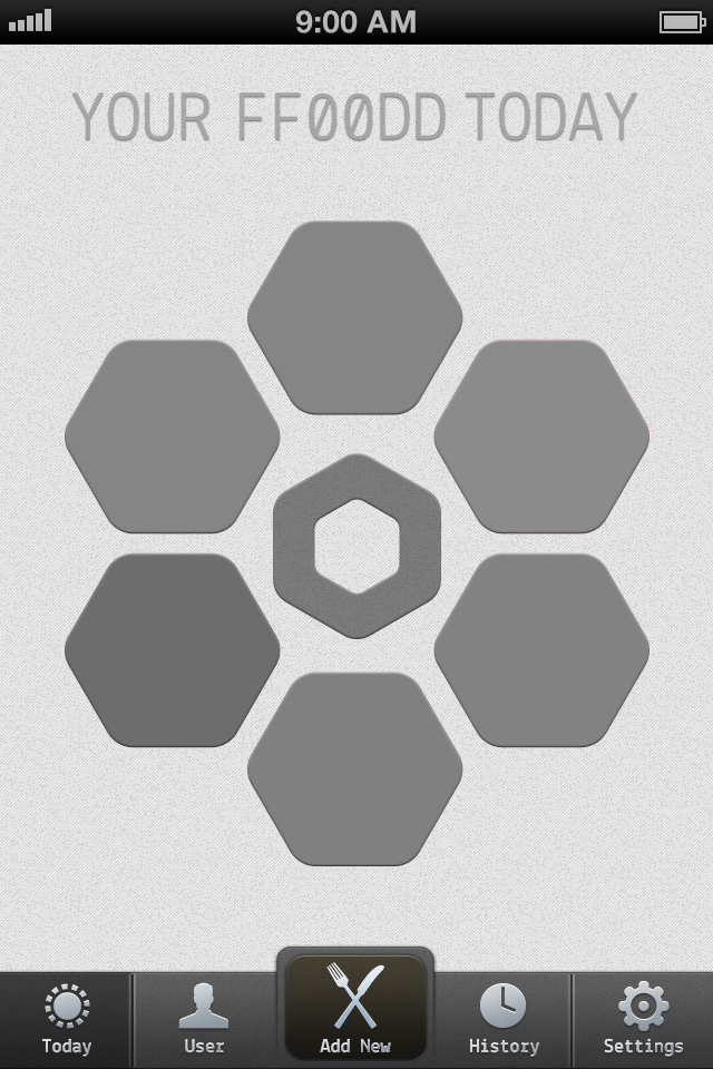
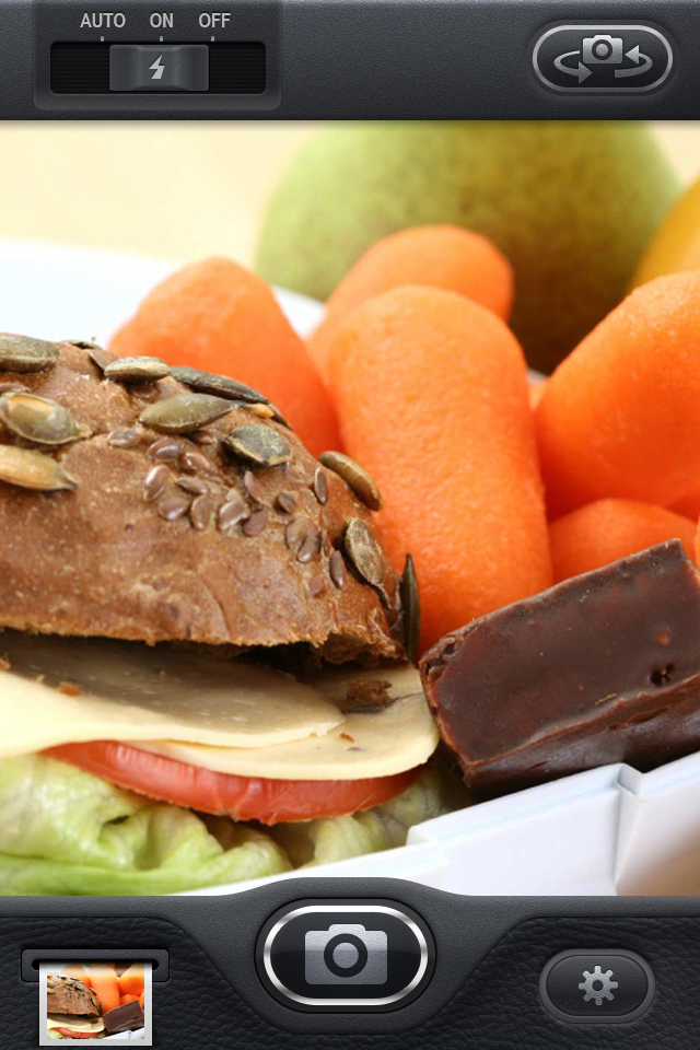
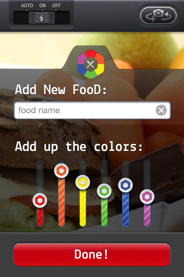
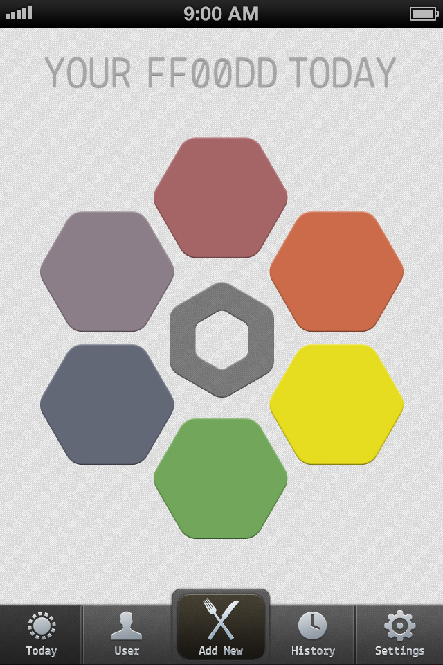
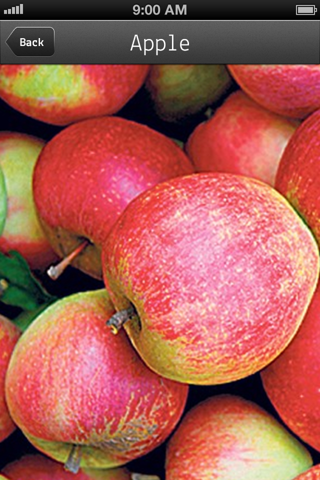
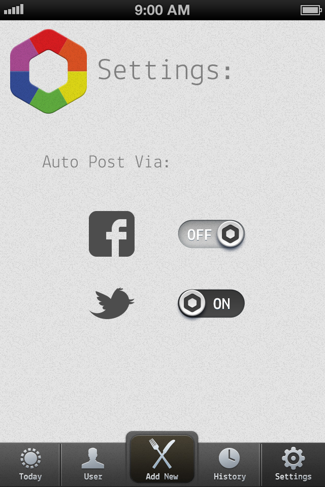
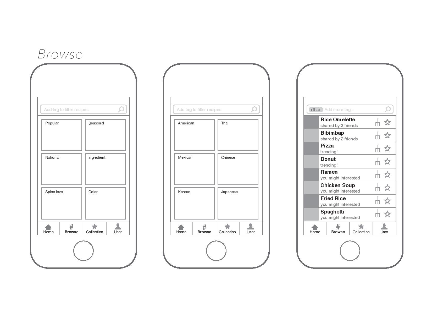
Here are the designed layouts for my ff00dd app. Big help from iPhone GUI from teehanlax and 365psd.com for putting together some great UI elements in PSD that I was able to tweak.
Here’s a working prototype thanks to POP app here.