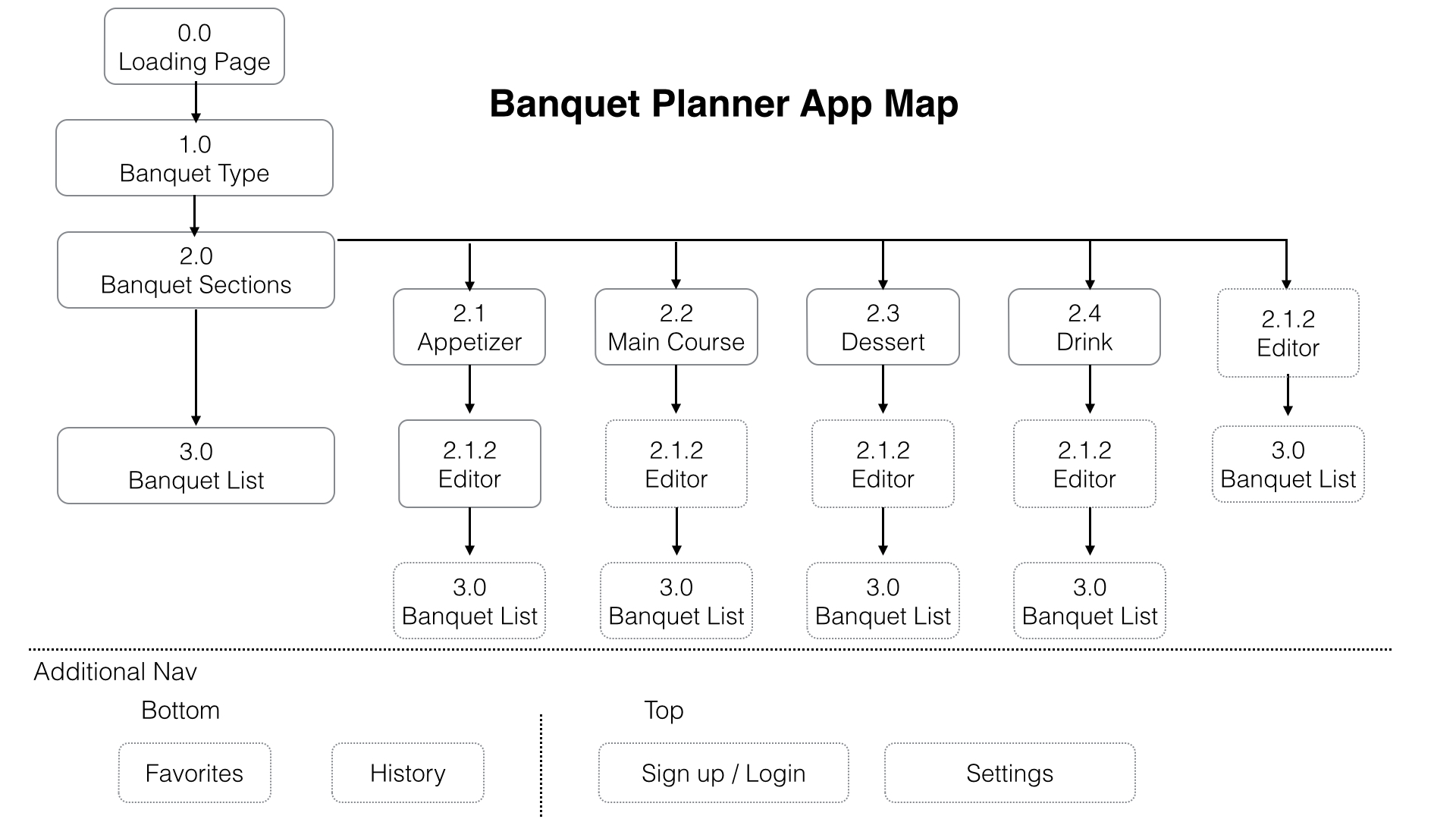
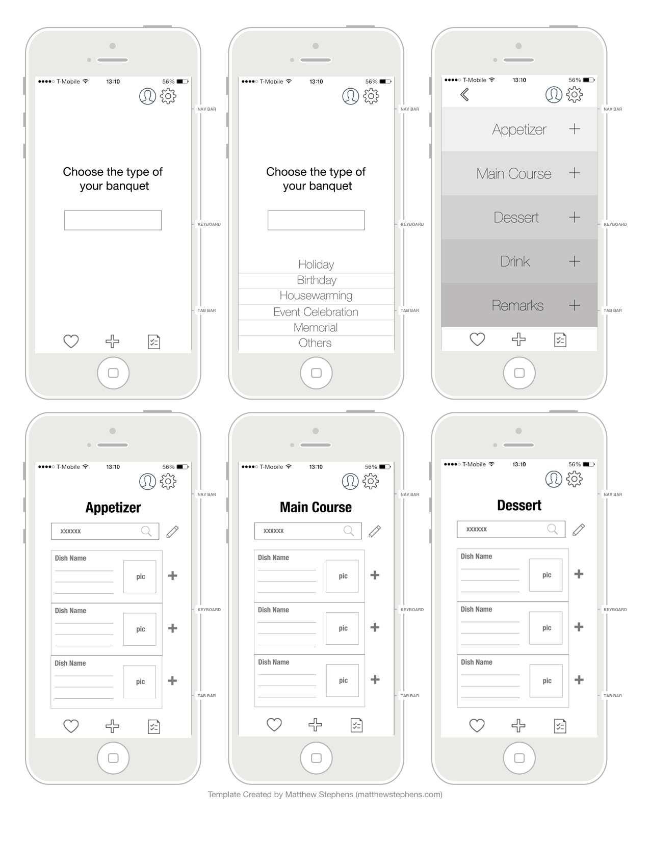
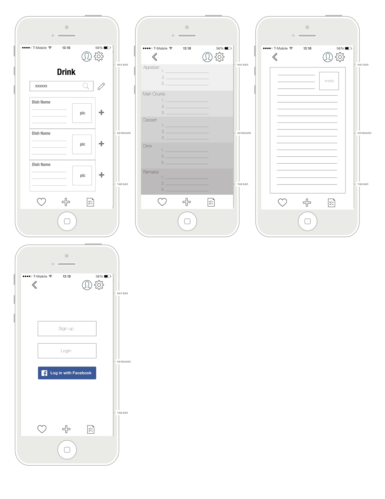
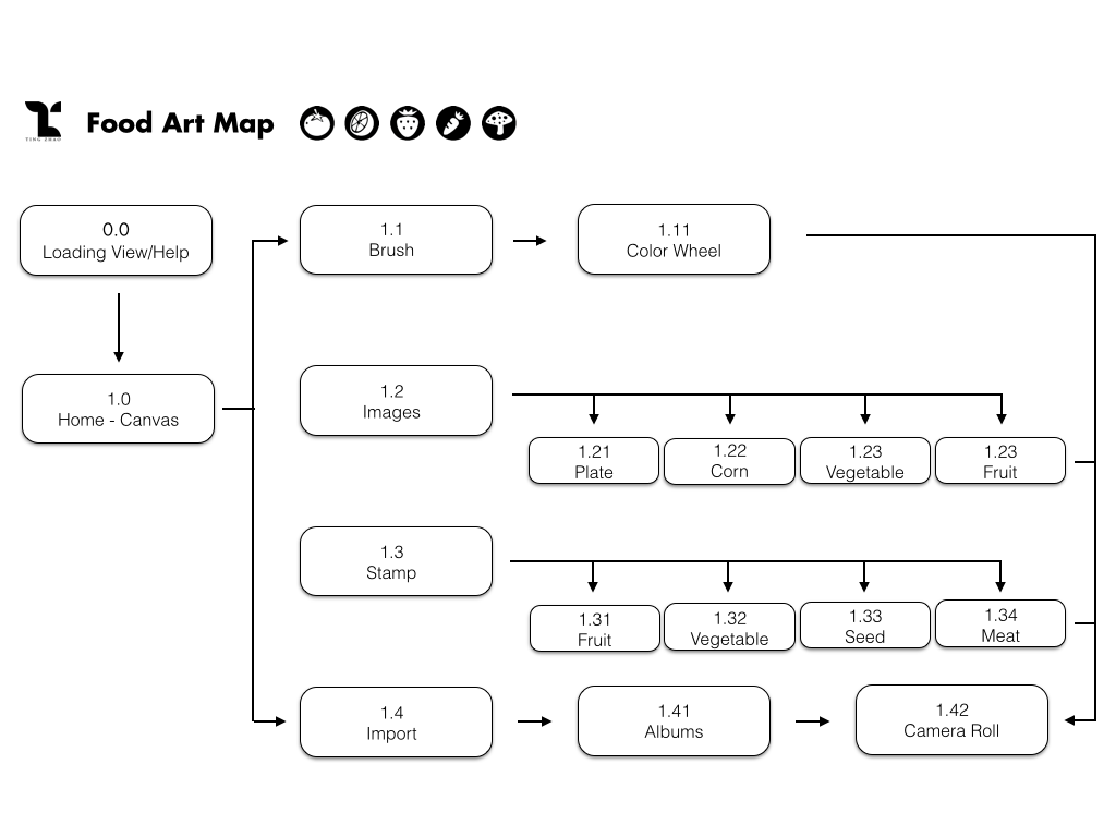
Changes from Wireframes
- Remove main menu
- Add PETs info page
- Add Push Up notifications & 2 missions to increase the interaction
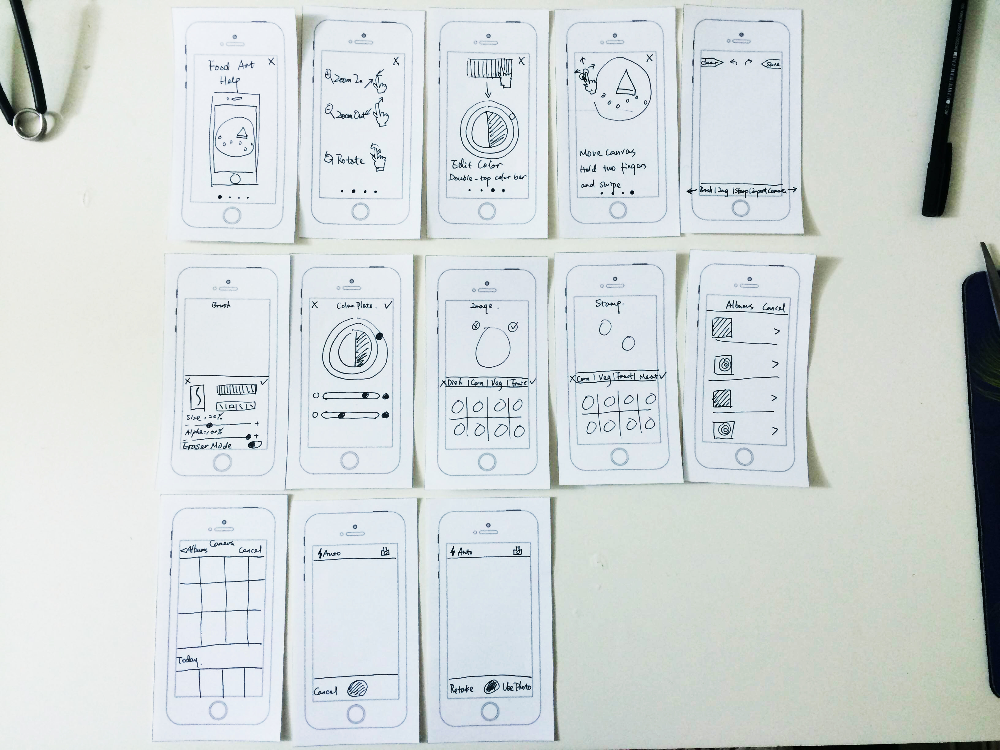
Changes after paper prototype:
1. Add hints to instruct the users.
2. Change info Bar from slide down to slide right.
Changes from Wireframes
Changes after paper prototype:
1. Add hints to instruct the users.
2. Change info Bar from slide down to slide right.
I made the prototype in Adobe Muse and the link is zeqinghong.com/simplejuice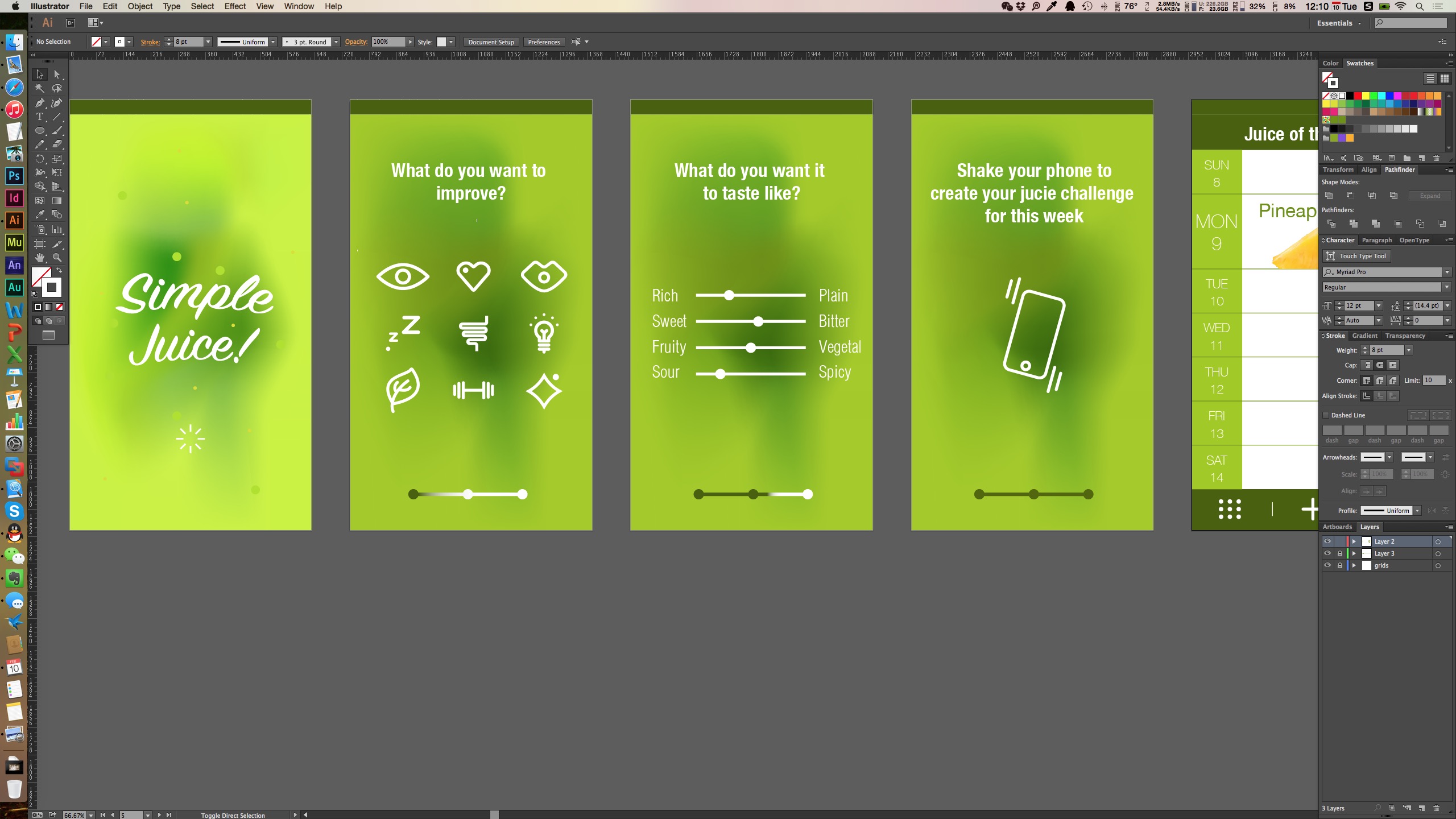
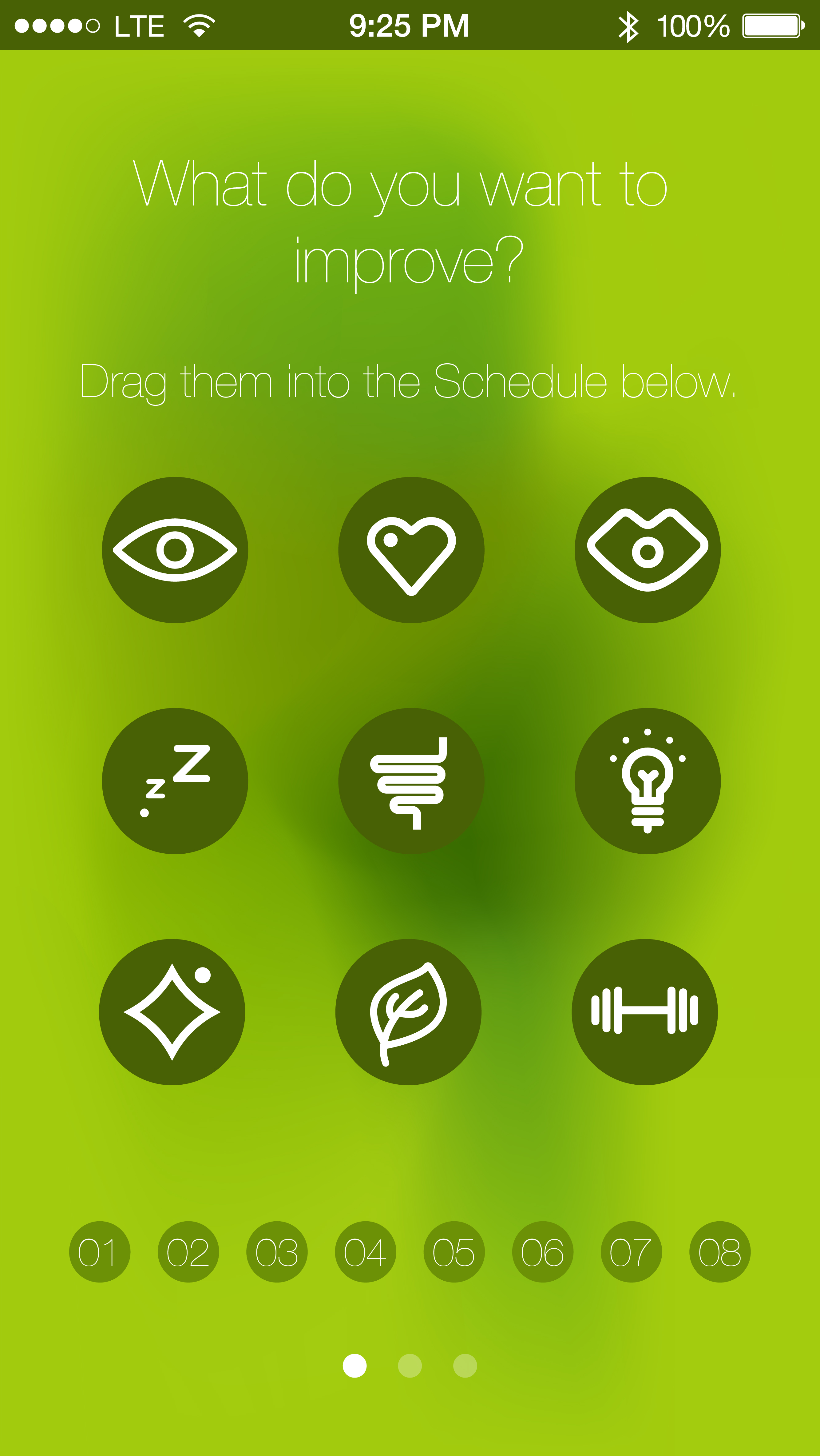
Changes I made
1.To unify the looking of the icons appear on the first screen, I added solid color background.
2. The calendar view is changed and now the user could be able to distribute the functions to the calendar.
3. Procedure bar is changed to three dots.
4. The icon for calendar is changed since it was unclear.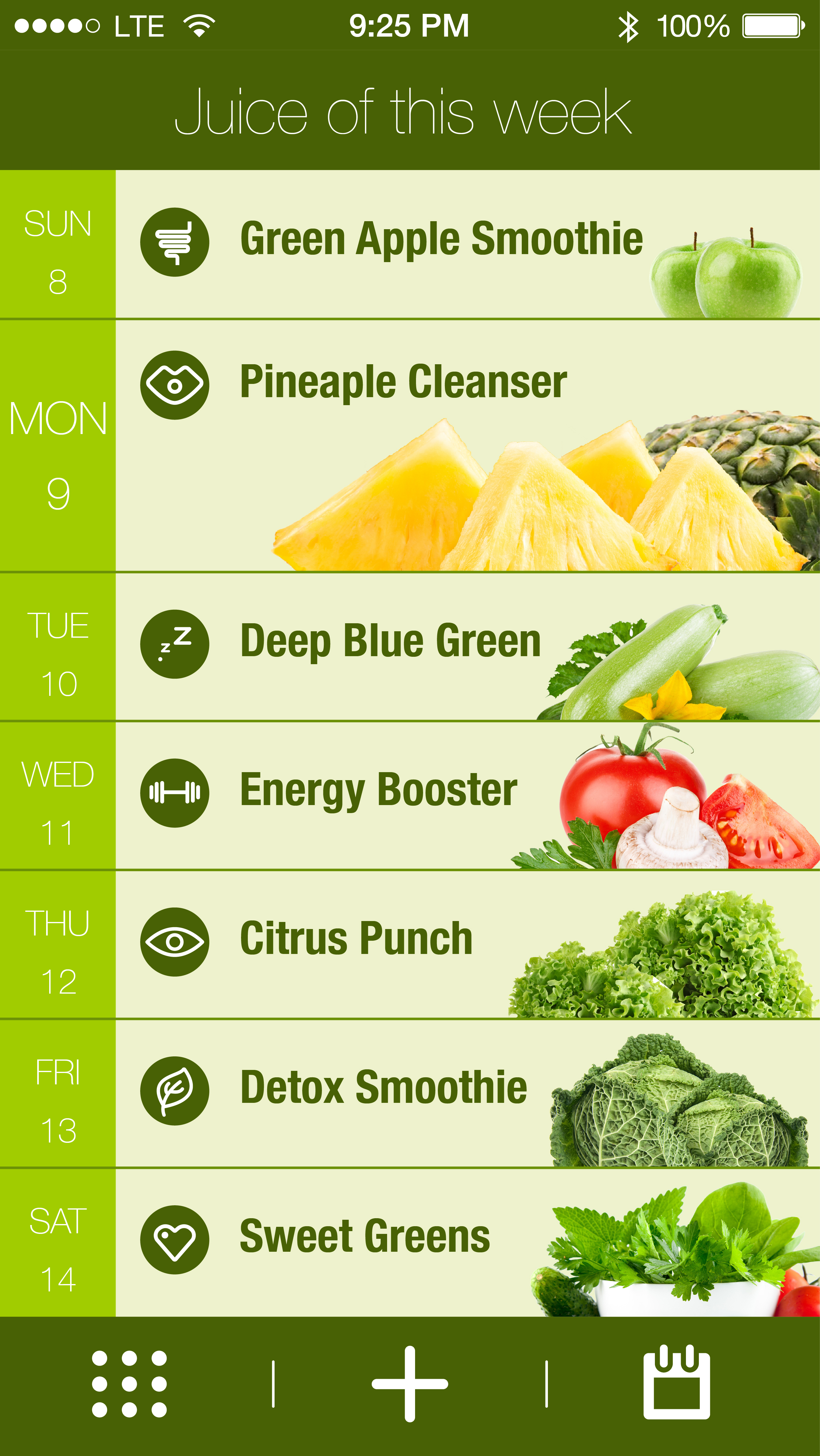
 A link to “we eat” on Flinto https://www.flinto.com/p/2ca9d101
Things I learned from paper prototyping:
Added a current tab for the meal plan so that users know their location and have an easy way to get back
Share meal plan button look like a call to action and not a place to see who you are collaborating with – changed labeling to “members”
In meal plan, changed the first day to be current day. View show upcoming days only
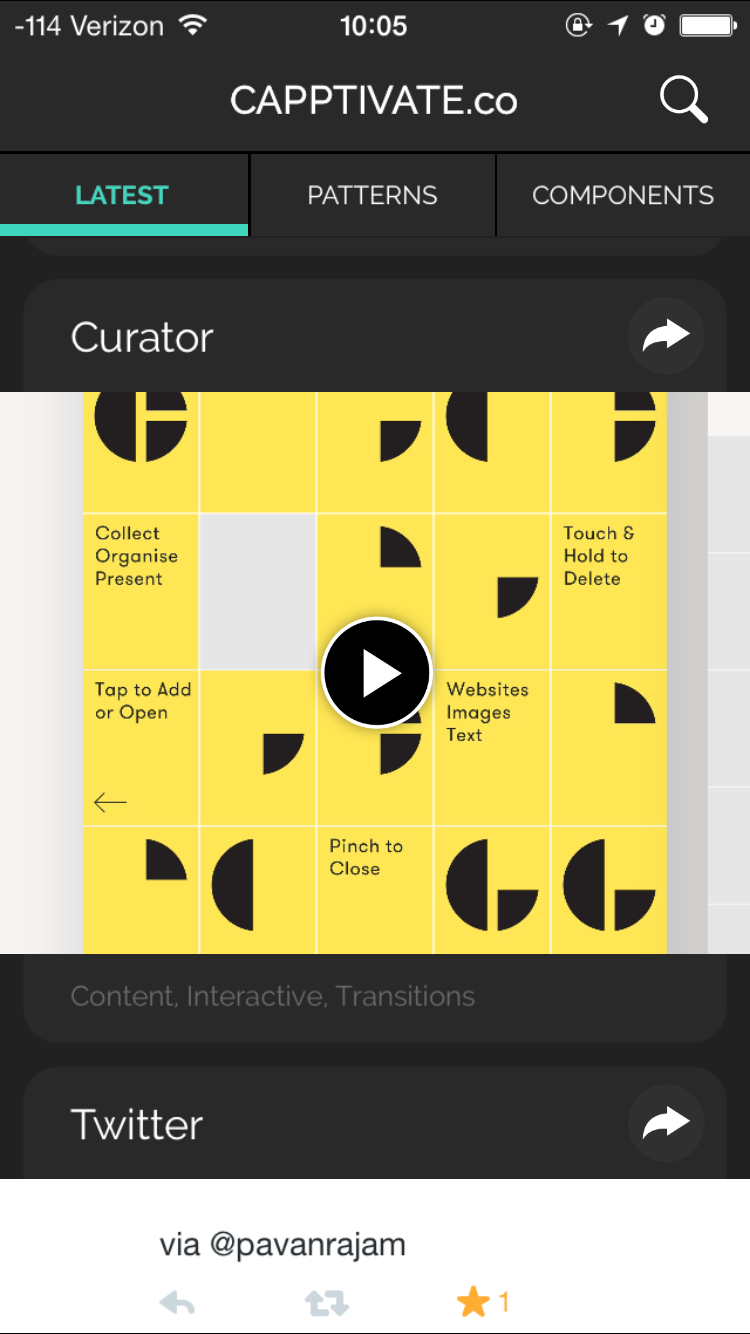
Capptivate.co is originally a website for collecting kinetic iOS UI/UX elements that was launched in June 2013. The author Alli Dryer, together with developer Claude Sutterlin, successfully turned the website to an app in January this year. The app allows users to check short animations showcasing delightful UI/UX design. They are catagorized by patterns and components. You can also view them chronologically. I find it a great asset for interaction designers.