Three things I learned from Apple’s human interface guidelines

Three things I learned from Apple’s human interface guidelines:

1. Always be prepared to stop– when we design we don’t always take this state/flow into account. Having Apple set guidelines and action steps to what to do in this case is super helpful.

2. Text that responds appropriately to changes the user makes to text-size settings– this is something that is important to take in account and test seeing how a different text setting effects the designs and make appropriate design/layout decisions for these cases.

3. Make sure your UI can handle the double-high status bar- this is definitely not something I would have thought of and super important to pay attention to cases where important UI elements may be covered.

Shadowmatic

Shadowmatic is an intriguing puzzle game which gives abstract-shaped 3D objects in a spotlight. Players rotate the objects in different directions to match the silhouette to a certain shape. It is full of exploration because there is no indication of what the final shape looks like in the beginning. However, there are five dots at the bottom of the view which tell how close you are to the final shape. If it took so long and a player still cannot figure it out, there are four hints available for each level to be redeemed by hints-points.

Apart from beautiful interface, graphics and immersive background music, I am mostly amazed by how imaginative the shapes of abstract 3D objects can be, compared to their silhouettes. This is the major aspect that makes me think Shadowmatic can compete with The Monument Valley.

(null)

(null)

(null)

(null)

(null)

For 5 February

  • Review the syllabus to understand class expectations and what we’re doing this semester.
  • Read the Apple HIG or the Android Design Guidelines (Material Design) and post 3 things you didn’t know.
  • Create an app map and wireframe for your app. Group 1 will present. Each person will have about 10 minutes to present and get feedback.
  • Group 2 should create paper prototypes to test next week (Group 1 can also test if they’d like.)

From class today:

Class protocol things:

  • Start posting #thursdayplays.
  • Your work only counts if it’s on the blog.

Travel App : Gogobot

While I am planning a family trip to California, I found Gogobot app.

This application lets the user to plan for group in different locations.

Gogobot has a website too, and their new app looks great and friendly user interface.

Once I create a trip, I can invite other people and add a hotel, restaurant or place.

It has three categories which are Stay, Eat and Play.

Pros:

Plan a trip collaboratively with others

Cons:

The new interface within this app is hard to get used to it.

The information about the restaurant and hotel is not really helpful.

Screen Shot 2014-05-19 at 7.12.28 PM

Thursday Play

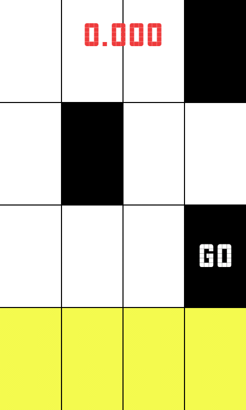
I just downloaded a game called piano tiles. Its a very simple speed based tapping game.  It was most probably made by a developer without the help of a designer because it is pretty plain.

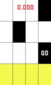
The game could be improved with some simple touches, for instance you are supposed to touch the black squares on a grid, but just bringing some color and texture into the grid to make it more inviting could give the app a new life.

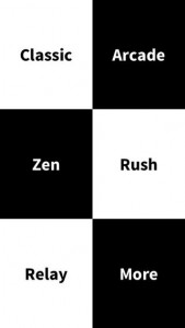
Also, there is little to no variation on the type used throughout the application, some visual hierarchy would have been nice. You can’t really differentiate the buttons from what is just text that is on the screen. Simply making all of the buttons be one color would have been an easy solution, perhaps the same color as the squares you are meant to tap.

The score is just kind of displayed on the top of the screen, center justified, but doesn’t feel like it belongs. Additionally, once the round ends, at the top of the screen it says ‘Piano Tiles (Don’t tap the white tile)’, while I commend the created for saying tap instead of click, it is awkwardly positioned and it is the only thing in the whole app that is right justified. Also, it is displayed after you have stopped playing rather than before you begin.

Right now the application is not pleasant to look at, and that makes me not want to play it. With the addition of nice colors and animations, along with a more careful choice of typeface and visual hierarchy the app would be more pleasant making me feel happy (the feeling I typically want to feel while playing a game). Because the user is rushed to tap fast, it easy to become anxious playing this game, but with some more design consideration that can be changed.

Regardless of what I mentioned, the app is still super successful.
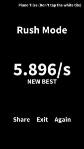
screen568x568 unnamed screen568x568-1


Samir

New version of Project 1


In my new version of the first project, I improved the interface design and logical relationship, and also I add two functions, which are shopping list and expiration alarm.

Before redesign this App, I did a lot of user testing, and almost all of the feedbacks mentioned that expiration alarm and shopping list are necessary. Especially for some target audiences, 40 – 60s housewives, because they do not have a good memory.

In shopping list page, there are three different type modes; Siri, Handwriting Input and auto-update. Auto-update function can scan information from Available page automatically, and then it will list the names of foods, which are already or almost empty.

0 1 2 3 4 5 6 7 8 9 10 11 12 13 14