![]() 3 things you didn’t know from the Apple HIG
3 things you didn’t know from the Apple HIG
- live photos(2.1.3)—the interaction way of live photo is pressing.
- Audio(2.3)—music will not be disrupted after plug in the earphone, but music will be stopped after you plug out the earphone.
- Typography(4.5)—SF UI TEXT is for the size under 19p, and SF UI Display is for the size beyond 20p.

Bio
Shenxun Wang is a designer, technologist, and maker who uses design & technology to enhance our social relationships and physical surroundings. He is a master candidate of Design and Technology in Parsons School of Design. He has a combined experience of sports technology, UI/UX design and design strategy. He is interested in design leadership, making a social impact and creating business profit by using sophisticated design products.
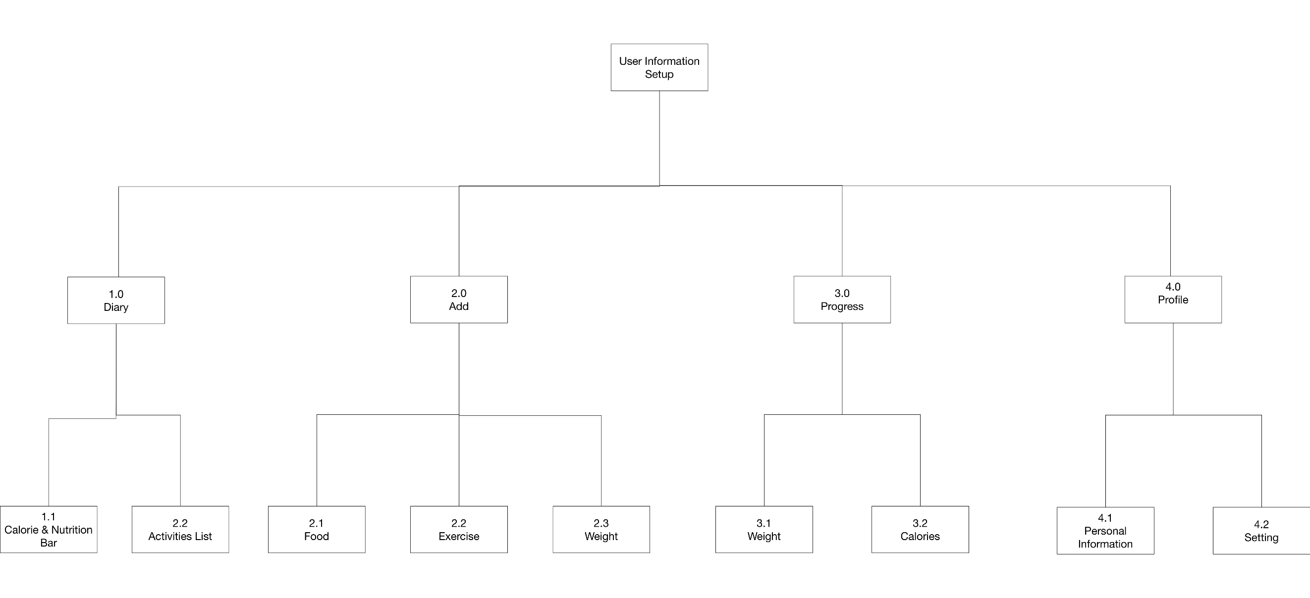
APP MAP
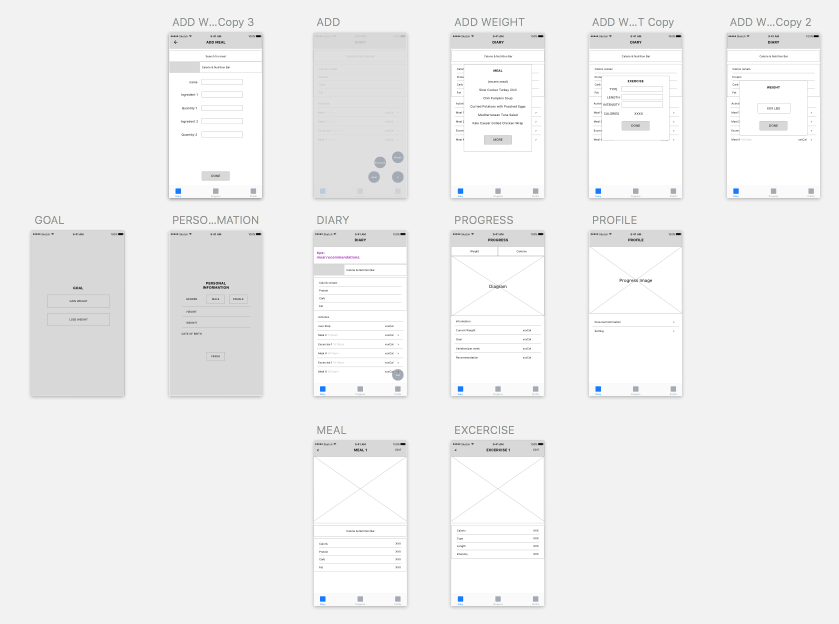
WIREFRAME
Grab me after class and let me show you how to quickly get your lines to line up in your app map.
It’d be very helpful if you numbered your wireframes to match those in your app map. It’s disorientating that you aren’t showing the proper tab selected in the tab bar for the view that you’re on. That plus some being mislabelled, plus no numbers makes it harder for me to respond.
The idea of logging food and exercise to achieve a goal of weight loss or gain is certainly an idea that many apps have explored, so I’d like to see you try and find some new edges as you continue. What particular user or particular user need could you meet that isn’t being met by current apps?
Think about how you users will actually use your app. Some may immediately open up the app and enter data, but many may only fill things in at the end of the day. How can you accommodate for both cases. Is there anything that you can do to help people plan in advance so that they can enter things more easily? What other ways can you save time and effort for your users?
The adding weight and exercise views don’t really consider the mobile interface. The space to type in Add Exercise is too small to tap and would be too small to read once filled in.
There is a bunch of detail missing from your interface right now, and I’m not sure if that is because you haven’t thought through things yet, or you don’t know how to document them in the wireframes.
I’m unsure what the purpose of the profile is.