Next Steps: Currently, I have kept the social aspect simplified. ie there is no following users, just tags, and no comments, just likes for the purpose of keep a list of favorites. This makes the app a jumping off point for sharing to other platforms. Next steps include comments and follows making it a niche instagram. I need to include a notifications tab as well, plus a search filtered by people, tags, and location. I also need to create a mapview for when someone clicks on a location. I would like to make those locations likable as well, in order to keep a list of locations as well. That way, in the “my likes” view I could add a segmented control that shows liked images on one view, then liked locations on the other.
Category: Uncategorized
Furu_Appmap Wireframe 2
Three things I learned from user testing:
1. Tap is the primary action users would conduct instead of swiping.
2. When user want to change the location, she wanted to tap on the work “Bangkok” directly (instead of going to setting).
3. Compared to the “Turkey” icon, the “plate” icon makes more sense as dishes.
iOS Human Interface Guidelines Notes
Hi guys, sorry for the delay. My laptop died last week and I just got a new one.
Here’s what I learned from iOS Human Interface Guidelines.
1 .Make it easy for people to interact with content and controls by giving each interactive element ample spacing. Give tappable controls a hit target of about 44 x 44 points.
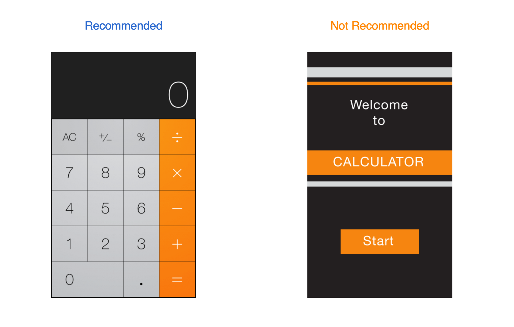
2. As much as possible, avoid displaying a splash screen or other startup experience.
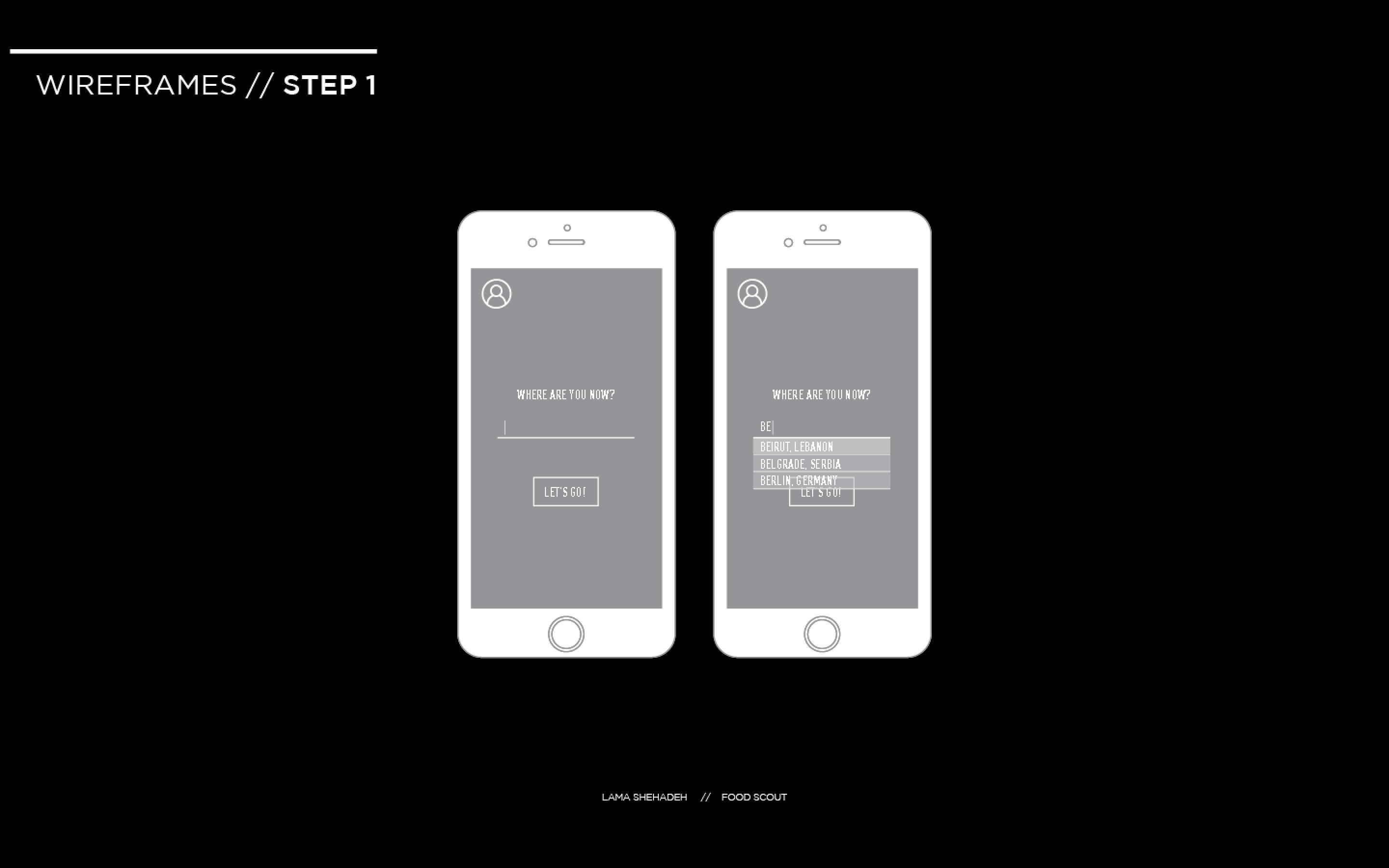
3.Avoid asking people to supply setup information. Instead:
– Focus on the needs of 80 percent of your user.
– Get as much information as possible from other sources.
– If you must ask for setup information, prompt people to enter it within your app.
4 . Delay a login requirement for as long as possible.
5.Think carefully before providing an onboarding experience. (Onboarding introduces an app’s features and explains how to perform common tasks.)Onboarding is not a substitute for good app design.
-Give users only the information they need to get started.
-Use animation and interactivity to engage users and help them learn by doing.
-Make it easy to dismiss or skip the onboarding experience.
6. Navigation
Broadly speaking, there are three main styles of navigation, each of which is well suited to a specific app structure: Hierarchical, Flat, Content- or experience-driven.
-Use a navigation bar to give users an easy way to traverse a hierarchy of data.
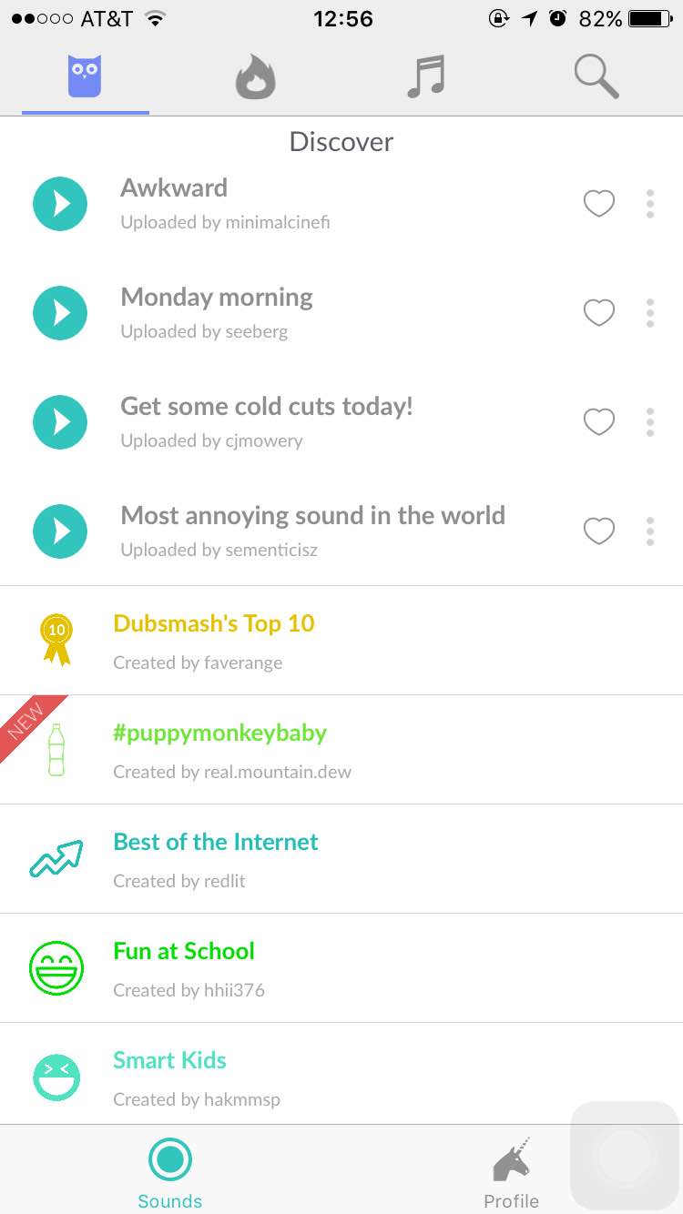
-Use a tab bar to display several peer categories of content or functionality.
Users should always know where they are in your app and how to get to their next destination.Regardless of the navigation style that suits the structure of your app, the most important thing is that a user’s path through the content is logical, predictable, and easy to follow.
Boil Monitor – Wireframe/App map Slides & In-Class User Testing
Here’s my slides of wireframe & app map:
For the in-class user test last week, I learned these:
- The paper prototype I printed was too small and not the actual size of the phone, this will affect the user test.
- My user indicated that when her task is done, there’s no way to return to the beginning and start the next task. (I fixed that at the second iteration)
- My user suggested that in the timer settings, I can provide the function for users to save multiple timers as presets, so they can just turn on the desired timer when needing it again next time. (I’m still considering about this point — more user test needed)
IOS Human Interface Guidelines
The three things i did not know about IOS.
Gi – prototype1 (app map & wireframe) food art app
I designed “food art app”(I don’t have a name right now..)
the purpose of the app is to make food art into a hobby, so many people can join the community and make something fun to look at. There are lots of people ordering food and take pictures before they eat, so it looks like a piece of art. So I searched food art app, but there was no specific app that has a tutorial of making a food art. Also, normally people think it’s too hard to make the food into an art. So I want to focus on making a simple food art app that generates ideas to make a simple food art with everyday food materials.
GI – thursdayplay – paper53
I reviewed one of the interesting app that is named “paper53”, it is a drawing app that has a simple interface.
here’s a pdf
#thursdayapps_Dubsmash
Dubsmash is a mobile app to create short selfie videos dubbed with famous sounds.
I saw this app through some celebrities who have posed some funny videos on the instagram. After sharing the still photos and life videos on those social medias, it seems like people need something new other than the regular life visual contents. So Dubsmash seems like a great cure which can add some flavor in people’s life. Then I downloaded this app to play with it, it’s very easy to follow and play. Also, the funny sound that pre-made behind your video is short, around 5-15 seconds, which is appropriate long for your friends to watch and enjoy. I like this idea very much!
Below are some screenshots from this app.
When you open this app, it will start with this page, which is very easy to follow, you don’t need to set up an account at the first page. Also, the “discover” shows the recent very popular sound in the very begin part, which leads the new users to try in the very first time and determine whether they will keep use it or not.
After you select a sound you would like to have, it will automatically jump to the selfie camera mode, and tap the “camera” icon, it will start to record. The whole process won’t take longer than three minutes, which is a very good idea for people who just join this app and play with it and enjoy!
iOS Human Interface Guidelines Notes
- Embrace borderless buttons
By default, all bar buttons are borderless. In content areas, a borderless button uses context, color, and a call-to-action title to indicate interactivity. And when it makes sense, a content-area button can display a thin border or tinted background that makes it distinctive.
Before, I didn’t there is a default that all bar buttons are borderless. This seems like a new “rule” based on iOS for apple users, because I still remember all the buttons were supposed to be designed like a 3D real button with some shadow, which leads users to think this button is clickable. However, flat design for UI seems like a new trend for designers to follow.
- Make it easy to focus on the main task by elevating important content or functionality
to do this are to place principal items in the upper half of the screen and—in left-to-right cultures—near the left side of the screen:
I never know this rule before. I understood why the upper information is more important because people read from top to bottom, but I don’t know why the left side should be placed more important content. Then I guess, because people read from the left side to right side, and most used control bar is placed on the left side as well.
- Starting and Stopping
It’s often said that people spend no more than a minute or two evaluating a new app. Don’t tell people to reboot or restart their devices after installing your app. Restarting takes time and can make your app seem unreliable and hard to use.As much as possible, avoid displaying a splash screen or other startup experience. It’s best when users can begin using your app immediately.
I totally agree with this guideline, I never thought about this as a designer before, but I did this all the time as a user. I will delete too complicated app after one minute if I can’t start to use it or play it or ask me to register and log in and …….. I guess maybe there are too many apps in the market right now, which makes users losing their patience and want to have the high efficiency and have a great use of the useful apps.
Food Scout // In Class User Testing
Participant 1
Profile
Chis Lee // 25 // South Korea // Based in NYC // Graduate Student
User Input
The user found the interaction direct and had no problem figuring out the first step which is to type in the location
The user did not consider interacting with the profile icon. This means that it’s function was not obvious. Supposedly, it should be linked to the user’s profile. But this is the first page, so it should be a sign in page for the first time, and then a personal profile for returning users. I need to think how to make obvious to the user that this is clickable without confusing them whether to press on it or go to the location first.
The direction of swiping was obvious for the user. However, he was looking for a search option that allows him to look up items. I want to keep the items restricted to local iconic food items. Looking through the icons gives room for more exploration by the traveller. I will do a few more user test in order to decide on the addition of the button or not.
The user did not know that there’s a possibility to scroll down on the page. The user opted to go foe find.
The user was confused by the price indicator and found it too be too small. He was not able to easily tell his location on the map and was confused by the written location as well. The word “change” next to his written location was unclear to the user to what it would be affecting exactly. He was unable to identify “Add to your favorite” spots as a button. The user confused the word “List” to mean the menu list.
The user had no problem going back to the find the profile icon. He preferred to the see the same filtering mechanism used for “Favorite Spots” to be applied to this section.
I will be conducting two more user tests. Thereafter, I will identify what is positive and negative at this stage and iterate on the interface and experience.


