Last week, we submitted a new iteration of FreeBox after receiving the below feedback:
- Inbox and notifications is still a problem for people. Users were confused why it was under the “Me” tab.
- The drop-down menu on the “post message” page to set tags is confusing. Rather then be visible when adding them
- Want more in-between screens to help show how to set notifications etc.
- Alerts would be a better name than notifications
You can read the our previous post on regarding this iterative process with our wireframes here.
Taking the feedback into consideration, Dana and I started addressing the feedback according to previous user testing parameters we had set: the success rate of the task, time taken to complete the task user’s behavior and completion of the core app goals.
The major changes we thought would improve the user’s experience of our app are discussed below, followed by screenshots of the most final we made in response – there was an intermediated designed version that we used purely for testing and quickly iterated on if issue was severe. These versions were not a wireframe, we actually started to design the actual app out, as we were looking to move our prototype past the purely task-oriented phase, and receive feedback on look/feel as well.
Changes we Made Throughout User Testing
- Increase the size of the actionable buttons , to prevent users from accidentally tapping the wrong button.
- Use standard naming conventions for the terminology
- Set alerts for similar materials have been moved to setting tab, for easy access and to make it less redundant.
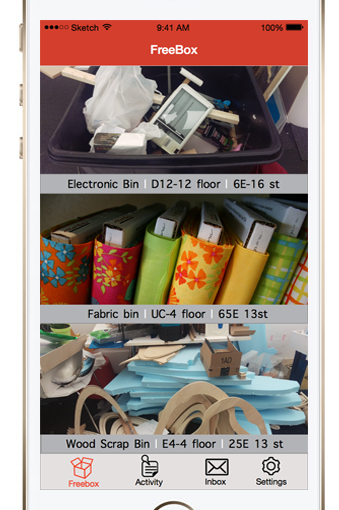
- Inbox and notification are clearly distinguished as separate actions by the moving the inbox function from the “me” tab to a separate tab on the tab bar and making the notifications as a part of the settings where the user could set an alert for the any of the materials they want.
- The actionable UI elements were separated from the non-actionable UI elments. In the previous iteration we placed “for trade” icon (which describes if the material in the post is for trade or sale) right next to the reply button , which rendered the icon to be tappable and confused the user. In the latest prototype we categorized them to make it more clear.
- An additional tab named settings was introduced to integrate profile , about , notification, contact us and account information
- Designed the new intermediate screen(Detail Video screen , Search screen , settings screen and inbox screen).
- Redesigned the tags in the “post a message” screen on to the keyboard for easy access considering the action and ergonomics of the users thumb in relation to the mobile device
Latest Design Screenshots (post user testing)
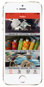
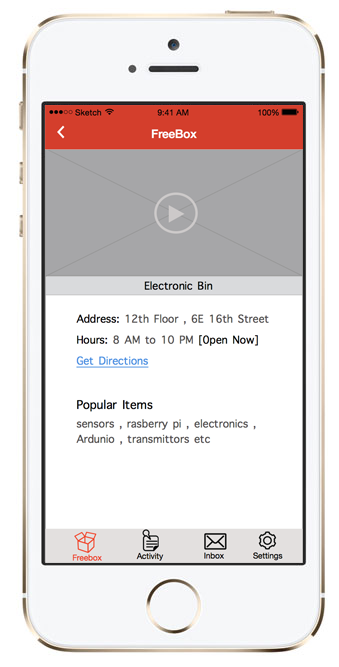
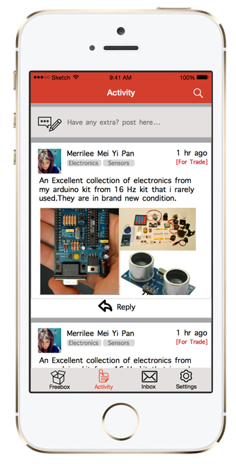
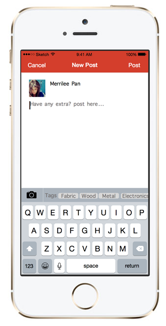
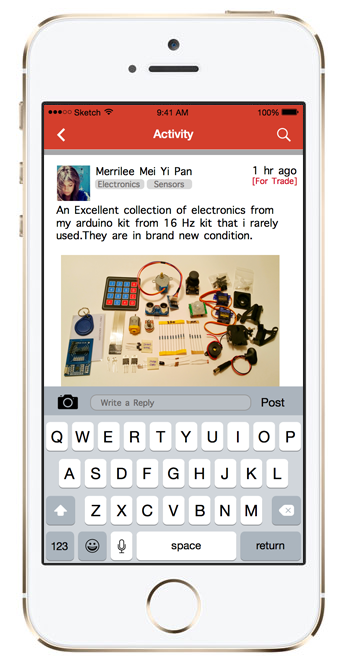
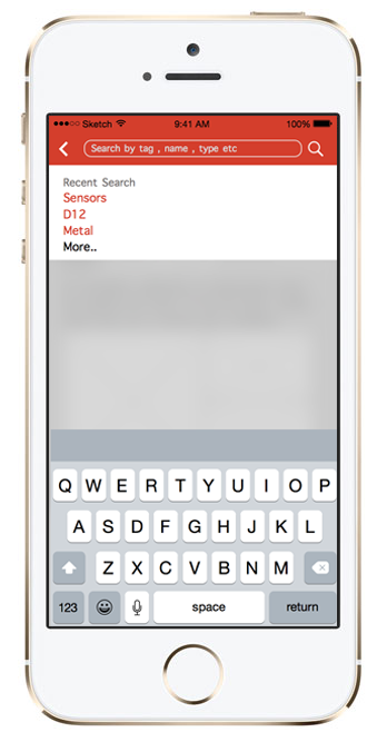
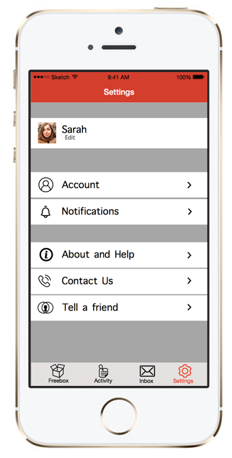
Latest Design Screenshots (post user testing)
Here is a link to the interactive prototype we used for testing, it is available on Marvel.com. (please note that this is a working prototype, so it may change as we make further developments to this app and not reflect the pictures above exactly).
https://marvelapp.com/project/618805/