Superb App:
The user is able to order high quality meal plans that correspond to their personal fitness goals. The user selects their ideal goal, then chooses one of the idles who markets that goal. For example (Arnold Schwarzenegger) Then the user is able to order their idles meal for pre and post workouts.


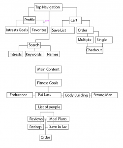
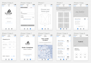
On the app map, I want to see a box for every view (basically every separate wireframe that you make), and I want each box/wireframe to be numbered correspondingly. Lines should represent that you can move between two views.
Push off registration as late as possible. Make users only register when they order or perhaps even after they order to make it easier to order again. Because the app is running local on the device, we can save information about previous orders without an account being necessary even.
On ordering: We spoke about this in class, but what each ‘meal plan’ is got a little lost on me. I wasn’t sure if I was buying one meal or a complete week or some other increment. You want to maximize what people buy in a particular transaction (cart size), so do what you can do explain what a user is ordering, both to help them know what they’re actually getting and to help the company’s business goals.
On editorial: Likewise, you want to display the contents of your store in a way that a user can easily browse them and get what they want to order. You should minimize navigation (e.g. having to choose your fitness goal first), and maximize showing me shallow options. Group goals/themes and then make it easy to view details and add that item to the cart.
Consider 2-3 most helpful way to organize the content for you users and explore how make that easy to move through and add things to the cart.
On checkout: the quantity +/- buttons and the remove button are too close together to be touched. Remember that the rule of thumb for buttons is that their touchable area plus padding be at least 44×44 pts.
Why do I need a add item button? Where would that take me? The checkout button is very small and is the most important one on that view.
Consider checking out Fresh Direct, Blue Apron, and even Bark Box or other subscription services to see what other people are doing to organize purchasable items in an app store and take users through checkout.
On the profile: consider what content you really need and would be willing to put in there. Why would I want to put in a profile picture? I can access favorites elsewhere (though do those deserve their own tab? also would previous orders be more useful? can you just know favorites by how often they’ve been purchased like Fresh Direct does?)