My Recipe Book is an application that allows the user to customize and decorate their recipes with various templates and stickers. Inspired by recipe books that housewives love to write after they finish making delicious meals, My Recipe Book App provides similar functions that allows the users to create their personal and unique recipe books.
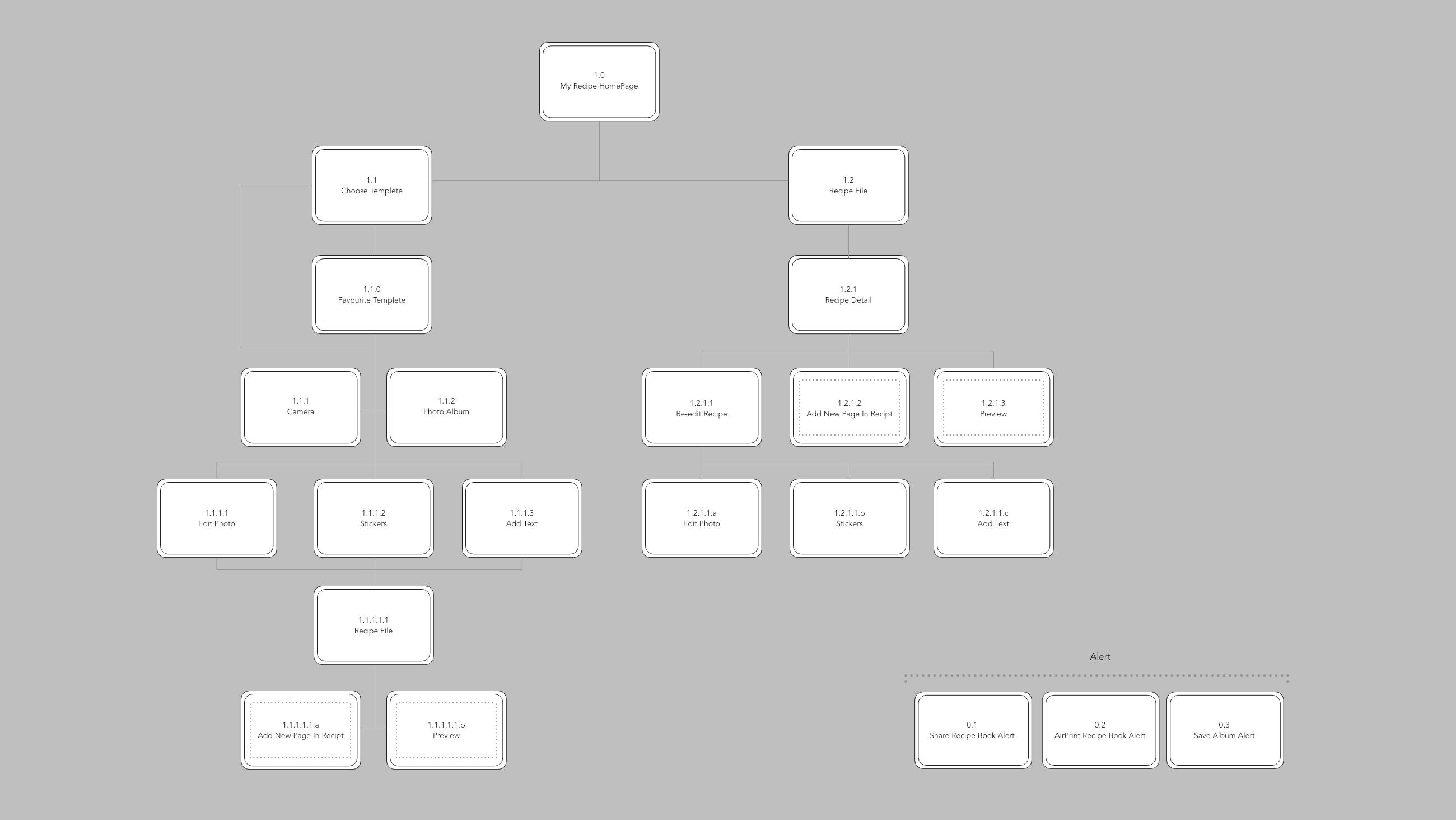
Wireframes
Three things I learnt from IOS HIG (Human interface Guidelines)
- Social Media: Don’t ask people to sign in. iOS employs a single sign-on model for accessing social media accounts, so you can get authorization to access an account without requiring authentication. If the user isn’t signed into an account, you can display a system-provided interface that allows them to do so. (This is something I have strongly common feeling when I was doing the first assignment. It is better to let users at least to try your App first. If users find there are too many requirements or limitations to your App, they will lose interests and even delete your work from their phones )
- Notifications: Don’t include your app name or icon. The system automatically shows this information at the top of each notification. (Always to keep the interfaces of phones clean and neat)
- Refresh Content Controls: Perform automatic content updates. Although people appreciate being able to trigger an immediate content refresh, they also expect automatic refreshes to occur periodically. Don’t make users responsible for initiating every update. Keep data fresh by updating it regularly. (How to save time for users and never bother them to do anything “too simple”, therefore, the users would spend more time o gluing to your App)
The inspiration and idea are super fun. The challenge will be to make sure you can clearly translate the concept to an interface on the phone.
An insight that I think you have here is that home cooking recipes aren’t generally organized and neat. People like the messiness, inexactness, and nonstandard of them, just like home cooking is messy and inexact and nonstandard.
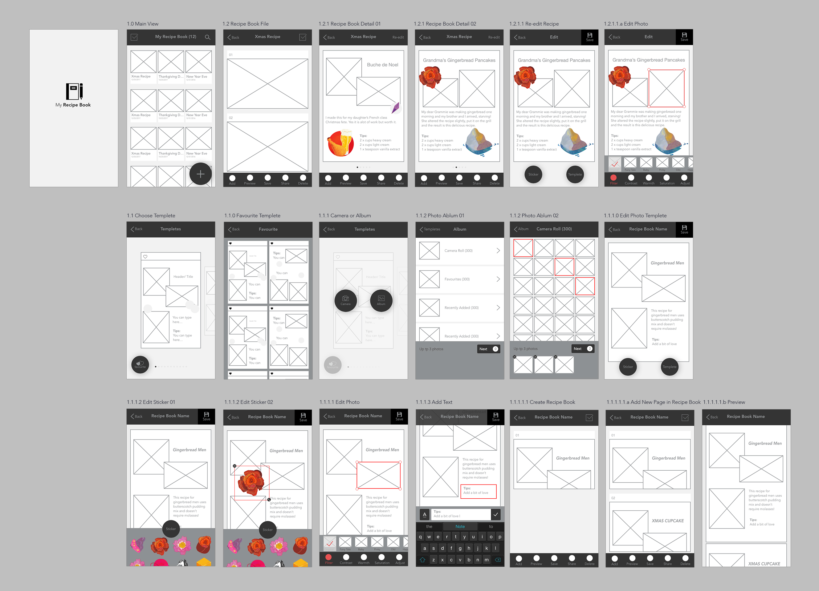
A challenge that I see coming for visual design is how do you create thumbnail versions of each recipe/recipe book and make it meaningful. You’re also using very ordered layouts for the recipe book list and the recipe list. It might be interesting to let some of the messiness of the recipes into the rest of the interface. I’m not sure how to do this and still make it easy to traverse, but it’d be worth exploring.
We spoke through how to simplify bar of buttons on 1.2 recipe book file, and I think that’s important to address.
Make sure and prototype a few templates with real content to make sure that they’re big enough to fit a real recipe. You may need to allow the user to scroll.
In 1.1.1.0 Edit Photo Template, why is there a ‘template’ button? If I tap a photo to edit or text box to enter text, consider how I would finish that and bring back the sticker and template button (if you keep that one.)