Week 1_Jean

About me


Hi! My name is Rudiampai Kuonsongtham, or you can call me Jean. I’m from Bangkok, Thailand. I’m a multidisciplinary designer with a focus on architectural and visual design. I’m currently interested in interactive and branding design. I am an enthusiastic person who is eager to learn new thing everyday!


3 Things I didn’t know about Apple HIG

1. Safe area Layout guide

I didn’t know that there is a safe area layout guide. Before this, I just design according to the whole size of the iPhone frame.

2. Color perception

When choosing the color for my app, I never consider about the culture or beliefs of people in other countries. I never thought that is it appropriate to use or not, I just concerned about its aesthetic. It is important for the app to be accepted and universally use by everyone.

3. Onboarding

A launch screen is important to be considered for the app, because it shows that your app is fast and responsive. It also allows time for initial content to load.
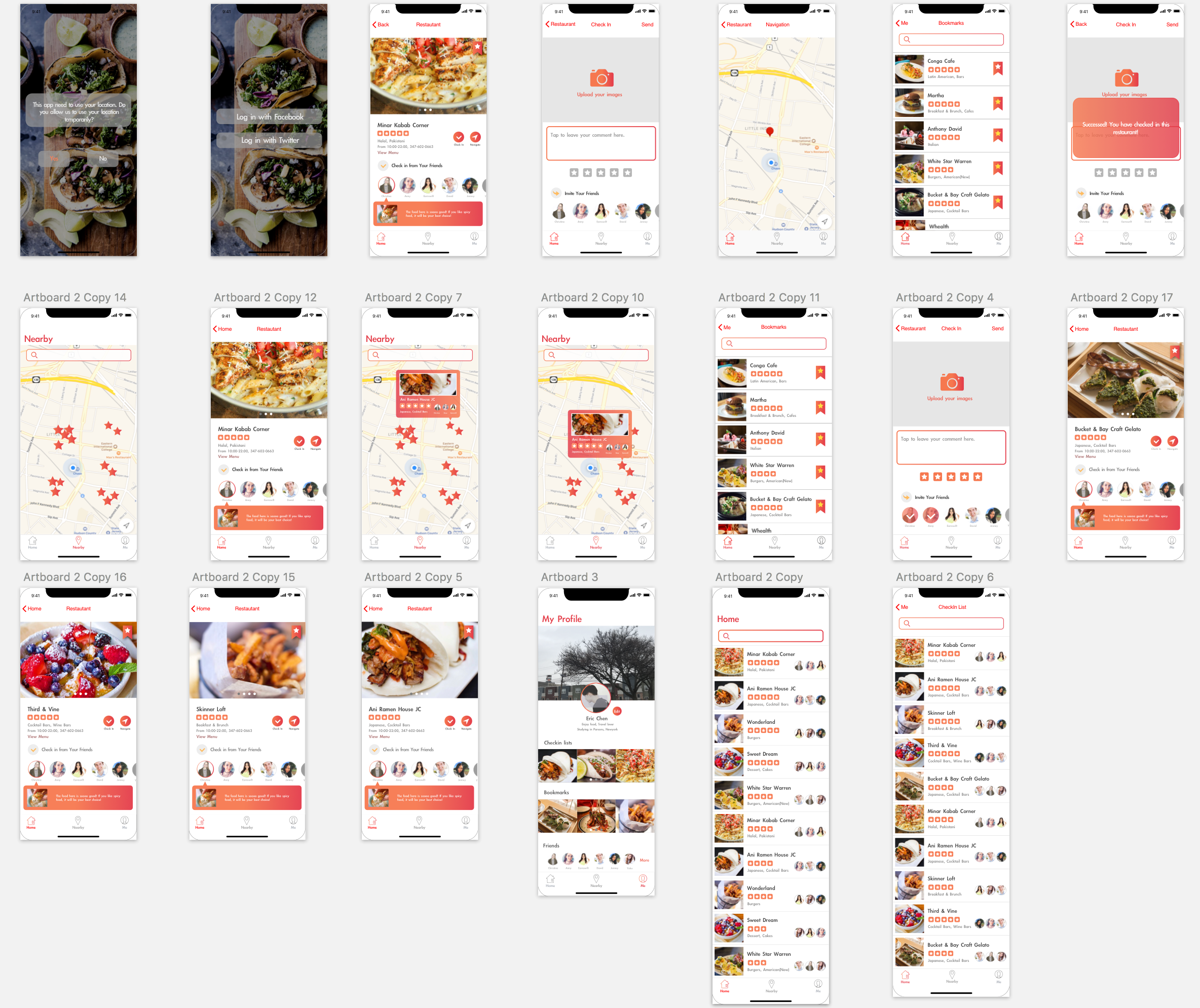
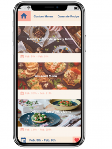
 

Food App :

The concept of my food app is “Healthy in a hurry!”. It creates for busy people who wants to be healthy. The app will make people’s life easier, especially the one who lived in the big city. The features of the app include a quick and healthy recipe, help you find a healthy restaurant nearby and help you organize your healthy shopping list!


App map

Wireframe

Week4_Qizhao(Eric)

After doing some user test, I got some feedback from my users.

Here are the feedbacks I got from them:

  1. In the home view, the horizontal outline of restaurants lists displays fewer restaurants information than the vertical outline. If my goal is to show users a large number of different restaurants, a vertical outline may be a better choice.
  2. The “Save” icon is strange. Since that the icon is similar to “like”, users easily misunderstand the meaning of this icon.
  3. The font size of restaurant detail is too small. They cannot be read on a digital device such as mobile phone.

Then I modified my wireframe and made a digital prototype.

This is how it looks like:

This is the link to the digital prototype:

https://marvelapp.com/2d1e4ja/screen/38563933

WEEK 3 || Frannie Xiao

Learning From Paper Prototype:

  1. The app should be learning from user’s behavior, and try to recommend dishes based on their preference and cooked recipes.
  2. The “favor the recipe” tab and “add to grocery list” tab are similar and seems a little bit repetitive for user to tap on both of them since most of time they will tap on both tabs. The two tabs could be combined together and directly store the recipe into a local account.

Digital Prototype:

https://marvelapp.com/7hhb9jb/screen/38247859

Week3- Kelsey (Yue Yu)

3 Learnings from last week paper prototype:

1: Adjust sidebar position and text size.  Change swipe left to swift up.

2: Change the position of the saved menu icon from upside to downside.

3: Use house icon to take place of the original icon of the homepage.The original icon makes people expect a sidebar, which does not exist.


Digital Prototype:

https://marvelapp.com/2jbeddd

wk03_Stella

User insights I learned from my second paper prototyping

  1. It’s important to keep how users would interact with the app in mind, which means a simple and clear user task flow is vital. Specifically, how people get into a specific view, and how people could get into another view afterwards should be completely logical. For example, users would care about how they could go to the home screen, and where a “back” button would lead them to. They all require us designers’ consideration.
  2. Even a single word on the screen matters. Though users are accustomed to viewing icons and images in a view first, it is still significant to care about every word and text in the app. For example, “alert”, “notice” and “notification” are quite different from each other. Users may also feel confused about “Skip” which is used for users who need to eat outside on a specific day. However, in my user testing, this feature, or maybe this word is really confusing.

Visual Design

Digital Prototype

Week 3 – Franky Wang

Learnings from paper prototyping

1 – The application should consistently keep focusing on its ease of use, which means minimizing its side functions other than the main feature. From 1.0 to 2.0 prototype, taking advice from user feedback, I cut off some complex steps of photo editing (which can be generated from other APPs) and corrected imprecise descriptions for the better understanding of terms in the APP.

2 – Every button/icon should clearly show its affordance. Some details like terms of “save” and “like” would somehow lead to different subsequences. When it comes to icons, the non-verbal indications from the figure need second consideration.

3 – When a specific function is set up, it takes time to reconsider the form of inputting/outputting information. For example, in the post filter page of the APP, there’s a slide bar managing the distance range of the restaurant. But it might not be user-friendly on a mobile display, because of the limited touching area. According to the user insights, it may become better if the form is changed into tapping selections or typing numbers.

Interactive prototype

Week_02

User Feedback from paper prototype_1

  1. Category sorting is not the right system for this app so the users suggest me to change to filter search system.
  2. Since many cat owners make weekly food at once and preserve it. Today’s recommendation is not really working so it would be better to change it to weekly pick.
  3. They don’t understand the meaning of the icons.
  4. Cat’s profile could be added to the future recommendation.
  5.  +,- icon from my recipes tap doesn’t make sense and the users asked me what is it for and why creating a folder is necessary.
  6. The first page could be Tips.