Hidden Folks is an IOS App that requires users to find hidden objects in this 2 dimensional hand-drawn interactive world. Hidden Folks is inspired by the popular book Where is Wally?, however, the most of props in Hidden Folks are interactive not only with animations but also with real-human sound effects. I was attracted by its lovely black and white drawing style and interesting sound effects at first, but lately I found this game really helped me relaxed since there is no punishment if you lose the game. It also can record the screen while you are playing the game in order to be more flexible for you and your friends’ communications. This is the link for this game and please enjoy the game! http://hiddenfolks.com/
Hanyu Zhao | Food App | My Recipe Book | Visual Design
Digital Prototype: https://xd.adobe.com/view/76724b5d-1cad-459d-a9a3-eda71f93bc5b/
PDF: Visual Design-MyRecipeBook
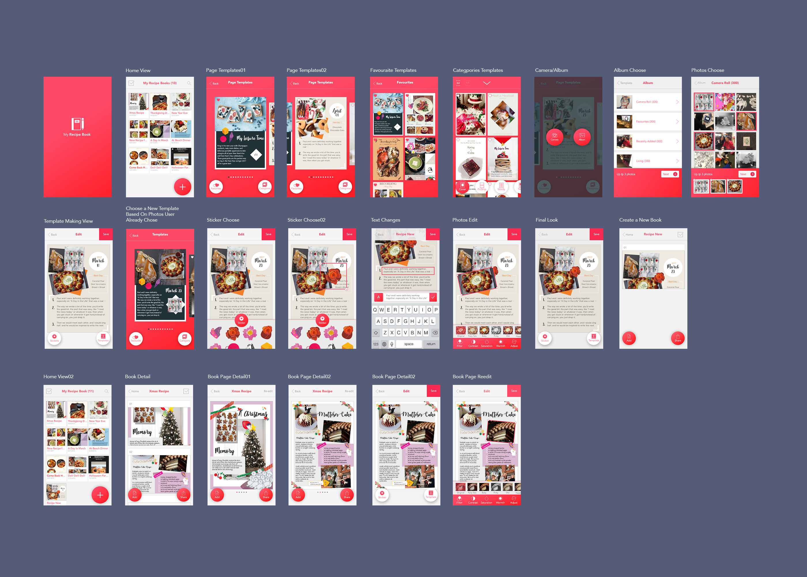
3 things I learnt from paper prototype:
- If I choose to use Android Design element(the “+” button), I need to keep all the design in the same design method and style.
- The Save Icon is looked like a 90s design style. Normally designer can just use the word “Save” as the icon for save function.
- The user might want more choose for their templates. Some people might prefer a messy layout another might prefer a neat layout. It might be helpful to give a categories to these templates.
Tao Wei – Digital prototype
Prototype Link: https://vimeo.com/206620874
Visual Mockups
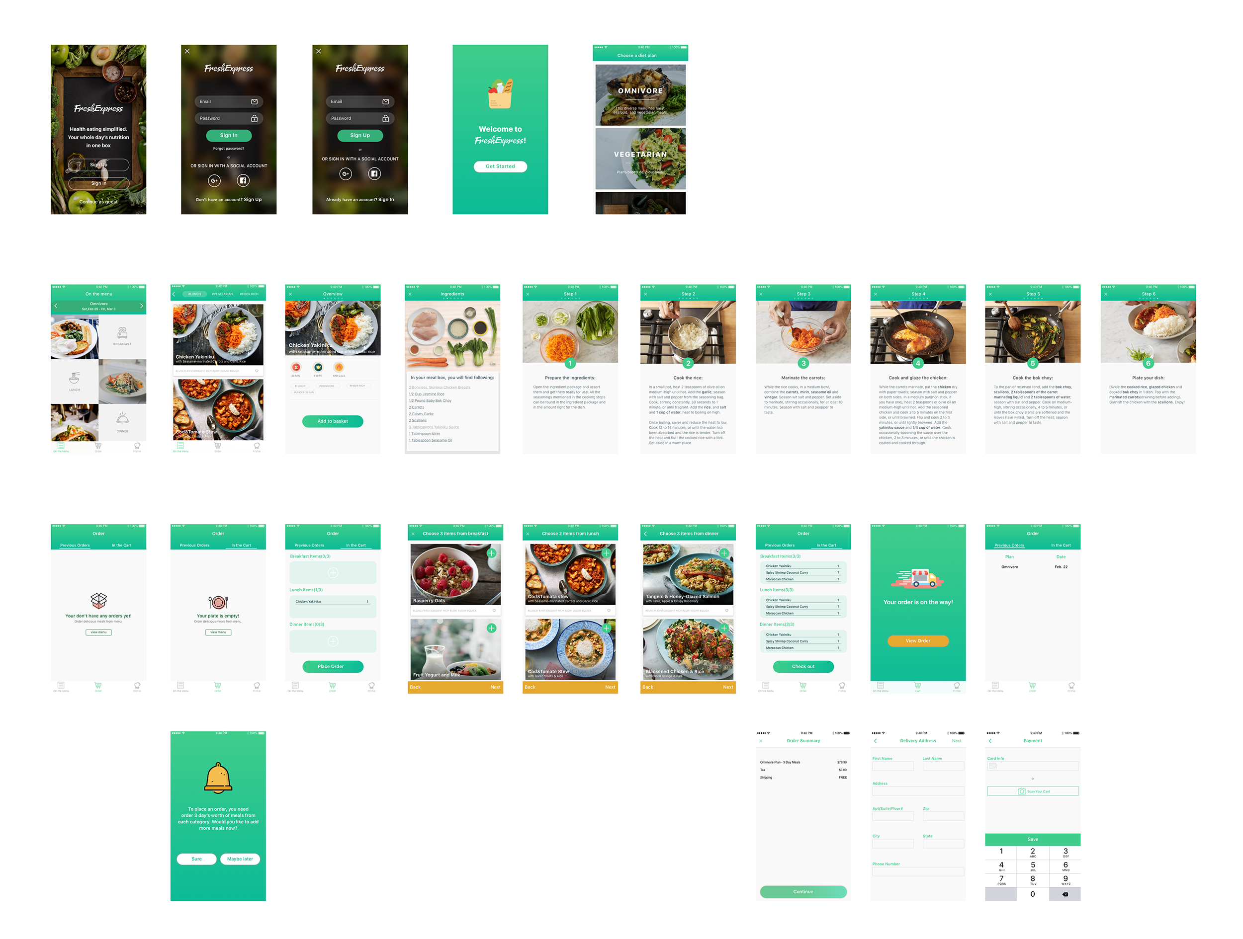
Changes from the paper prototype:
- Took out recipes and diary section to focus on the concept of “one-stop” holistic daily solution through delivery
- Simplified the order view (threw out the “on the way”) for easy navigation
- Enabled users to add recipes to the cart from the menu instead of overwhelming the users by forcing them to order fixed number of recipes from each meal category in a row
#thursdayapp
Scream Go: 8分音符ちゃん

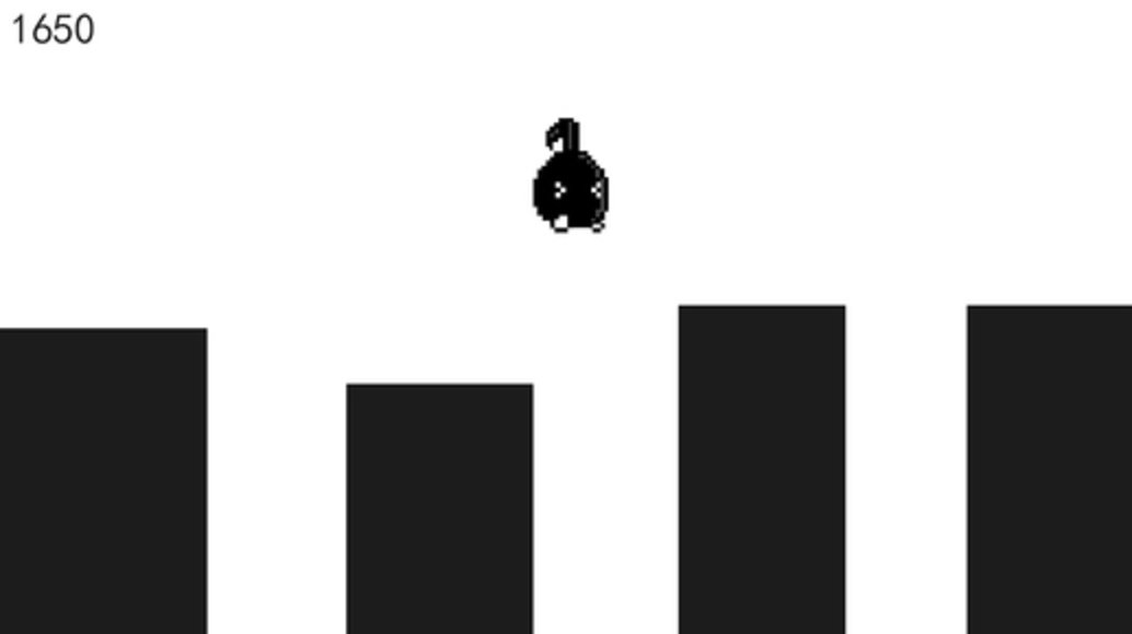
https://itunes.apple.com/us/app/%EF%BC%98%E5%88%86%E9%9F%B3%E7%AC%A6%E3%81%A1%E3%82%83%E3%82%93-%E4%BC%91%E3%82%80%E3%81%AA-scream-go-8-note/id1208078539?mt=8
Scream Go is a sound control mini game. At first, I saw lots of people play this game on the PC version. Then I immediately downloaded it because it looks fun to play with. To be honest, this is my first time use voice to control the character in the game, which is fascinating and super hilarious while you watch someone screaming to the screen. Basically, users need to use the sound to control the character to avoid obstacles on their way. You need to change your pitch of your voice frequently through the game, if you have a higher pitched voice then you can jump higher so that you will not end up falling down to the gap. I feel like this game also can be seen as a tool for singer’s vocal warm-up as well, if you have a performance later you probably can play this game first so that you can use to get your voice ready and performing at its peak in the show.
But it still has some buggy, at first, it is nice to play around with it. But when I ended up the game and want to restart the game. It turns out to the black screen and keeps my phone on hanging. If they can fix that, the game will run smoother without lagging while playing it.
Zhiyang (Rainie) – Digital Prototype
Marvel Demo: https://marvelapp.com/540a9e4
PDF: DiEt – UI
Iterations:
- Added recipe component as the main content of image post
- Got rid of chatting function in the app (on Notification page)
- Got rid of tag feature on image post
Thanks!
Digital Prototype – Assorted
Please click on the links below to check out my digital prototypes.
Link to PDF: Assorted HD
Link to marvel demo: https://marvelapp.com/53h31fh
Feedback:
- This is only a one to one connection. What is there was a way to have a group chat/meal?
- Is there a way for users to add/remove friends to show up?
Three things that I changed from my paper prototype:
-Narrowed down and focused on One Concept. The concept is to eat or grab a meal with a nearby friend. This is map based and you can immediately choose a time/restaurant.
– Simpler navigation and fewer pages. My previous prototype had many components and many pages. With narrowing down my concept and by focussing on one idea, I achieved a simpler navigation.
-Sign in through Facebook to identify nearby friends. To avoid the whole sign up and sign in effect, the user would have to sign in through Facebook to find nearby friends and dine with them.
Thanks! 🙂
things learn from the Apple HIG
User control and metaphors
That reminds me that the “golden rules” of UI/UX design, which are place users in control, reduce user’s memory load and make the interface consistent. The principle taught us that allow the user to customize the interface, and users can directly manipulate interface objects, and in some situation, it is better to display descriptive messages and text to help users to move to next. The user should initiate and control actions, but this could be a little bit challenging in terms of different levels users. For instance, novice users often want apps that can direct lead them to complete a certain task but experienced users tend to more need fully control the app.
Interaction – Navigation
It is crucial to designers to understand the various categories of apps their work and ensure the navigation between app views is logical and natural with the input given and the information displayed. As a designer, we need to find the right design flow for users so that they can easily follow and know exactly where they are in your app, and how to move to next step. In iOS, there are three main styles of navigation, hierarchical navigation, flat navigation and content-driven navigation. In general, navigation bars are able to help navigation through a series of hierarchical app screens whereas a tab bar helps to organize information at the app level.

Nav. bar Tab bar
Technologies – Social Media
I just realized how unbelievably easy it would be to share content or pictures to our social media accounts without requiring authentication because iOS employs a single sign-on model for accessing social media services. It helps the user to save time and make sharing easier. I really like that feature because it quite similar to users register or log in page, just don’t ask people to sign up in the first place.
For March 9, 2017
Take what you have learned from critique and digital prototyping and create a final iteration of your Project 1 app. Prepare a presentation to give to outside critics. You don’t need to show every iteration that you made along the way, just your final concept; it would be nice to call out things reasons that you ended where you did, due to things you learned when doing paper and digital prototyping.
- Post your final iteration presentation with your design and marvel (or other prototyping tool) link to the blog.
- Note 3 things that you changed from things you learned when doing digital prototyping.
- Duplicate instead of working in the same Marvel prototype so that your initial version is kept intact.
As a reminder:
- To get credit for your work, you need to post it on the blog
- You should have posted:
- Wireframes and app map
- Digital design/digital prototype with changes made from paper prototyping
- At least one #thursdayplay
For February 23, 2017
Digital Prototype: marvelapp.com/1e6jc9c
- Users want to see the calories progress directly, instead of just day by day.
- I hide the progress photo in the secondary page of profile, in order to protect privacy.
- Using new page for the Add page, instead of just temporary pop-up window.