- Negative space: I always considered that less is more, meaning that having more things going on in an app could confuse and annoy its users. However, I never thought of negative spaces as a tool for calm and tranquility. A simple-designed app is definitely more coherent than an app that has too many designs.
- iOS App Anatomy: I didn’t know there were different categories of UI elements in an iOS app. I never really thought of the elements as part of a category. I now know that there are four categories: bars, content views, controls and temporary views.
- Starting: when thinking of an interface for my future app, I considered having a “welcome/loading page” before actually starting the app. I thought it could add some nice effects and anticipation to the app itself. However, from the HIG, it’s definitely better when users can begin using my app immediately. It does make sense, we all want a fast and easy app.
Month: February 2015
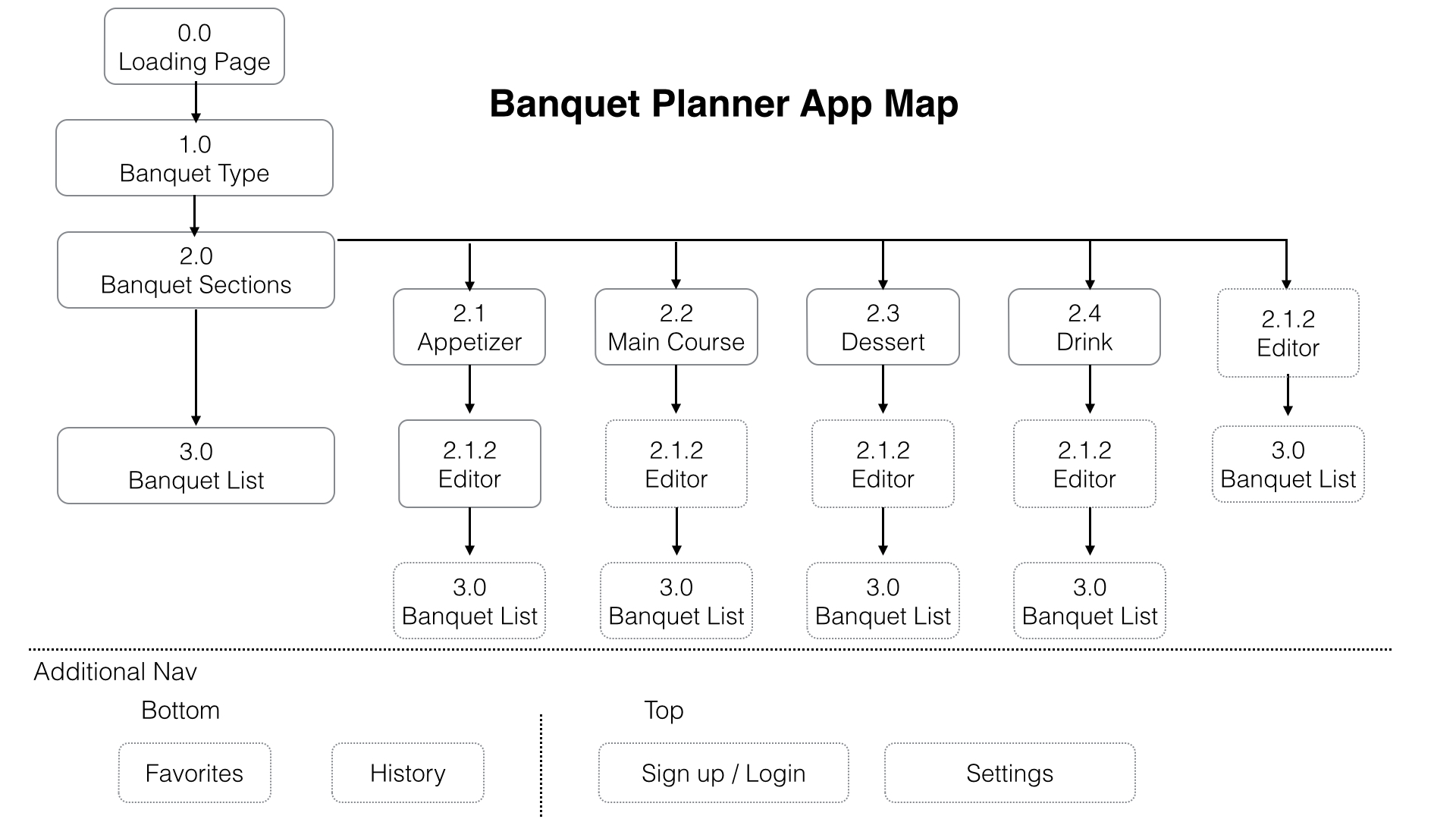
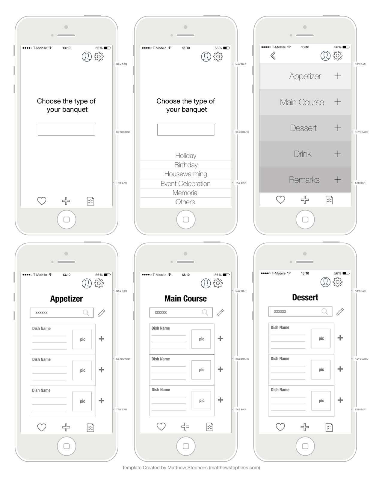
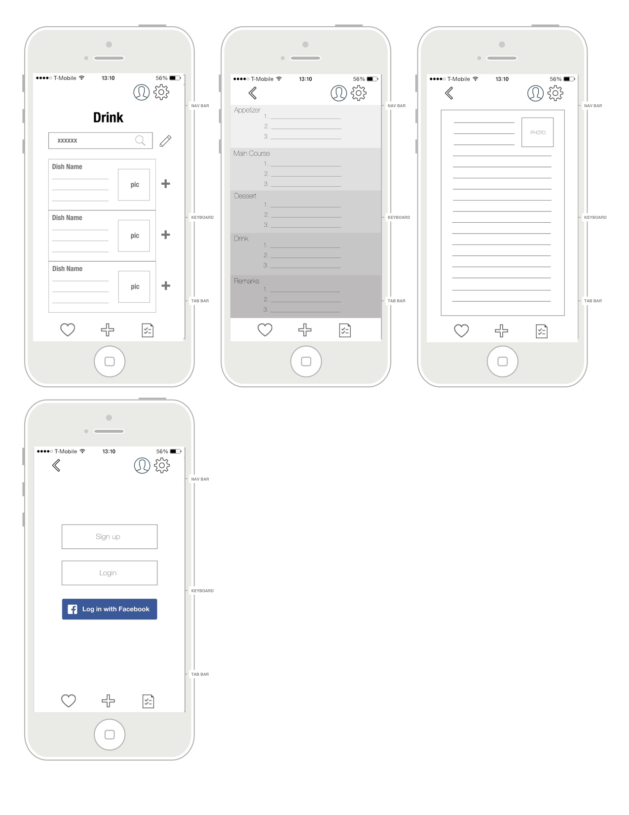
Shuangshuang Huo: Banquet Planner App
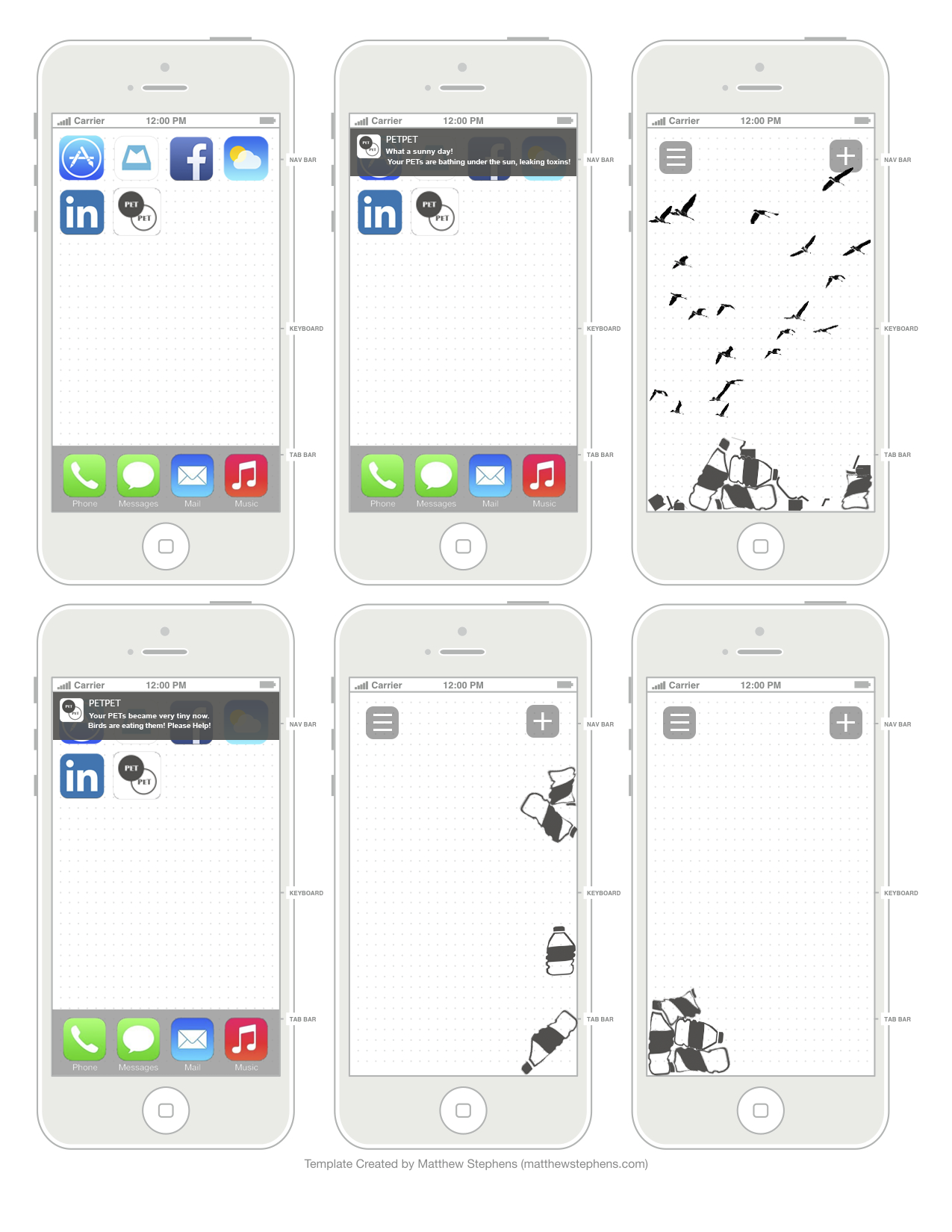
Wireframe/PaperPrototype for Little Kitchen

Refined App Map & Wire Frame- Ning Sui
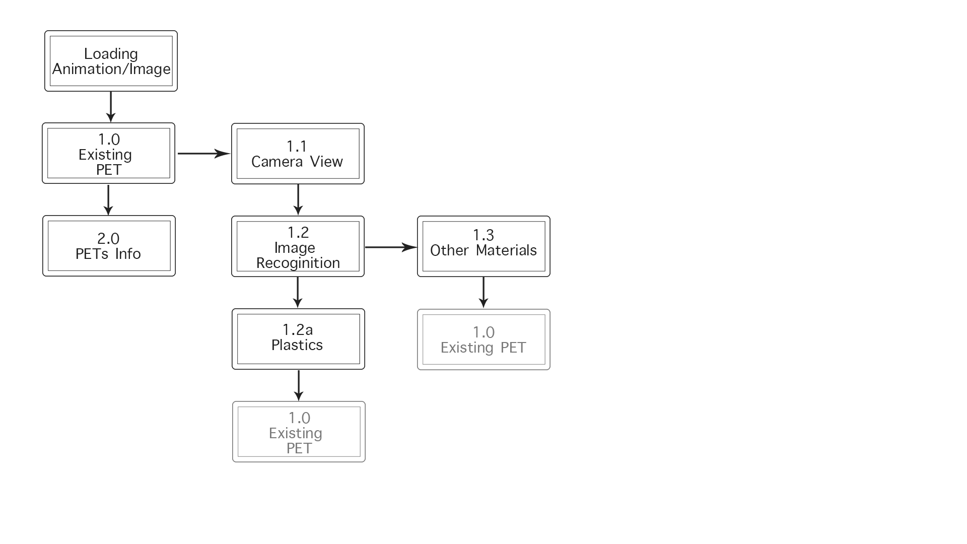

Main Changes:
- Remove main menu
- Add PETs info page
- Add 2 missions to increase the interaction
- Add Push Up notifications
- Show 2 more scenarios
- Add Gravity & Touch effects Demo
Food App – Wireframe and prototype

App map and wireframes V2
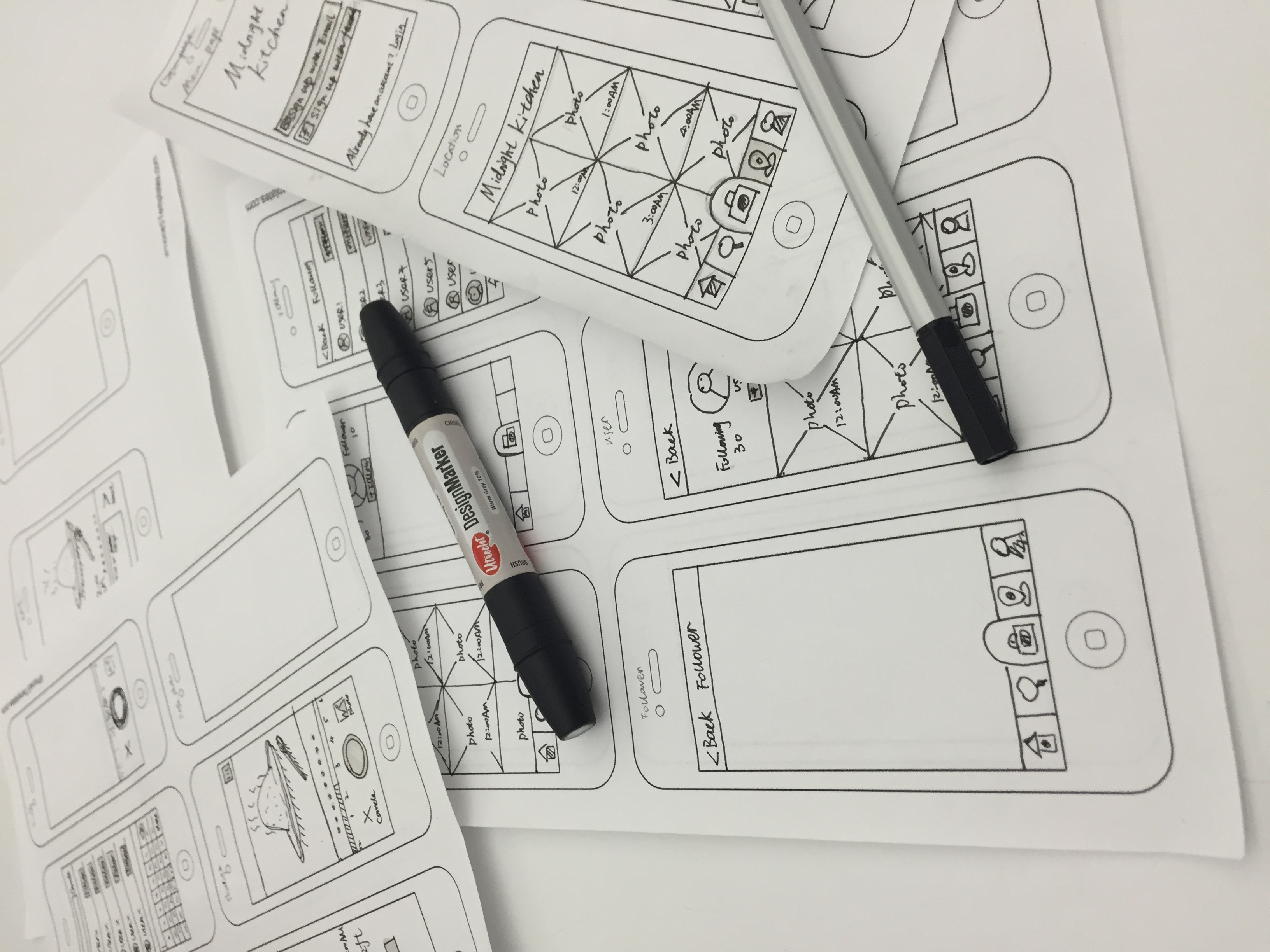
Prototype 1 – Pauline Hadad
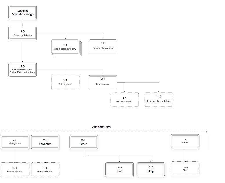
My app is a personal guide for restaurants, cafes, fast-food or bar/clubs. It is similar to Yelp except that I only get my own reviews to remember where I’ve been and what I’ve (dis)liked.
App Wireframe: Wireframe – Pauline Hadad
App Map:
For February 19
- Take your learnings from your wireframes and create a design for your app.
- In your presentation and in your blog post, be sure to call out what you learned from prototyping. Post one to two learnings from your paper prototyping along with your design on the blog.
- Create a Flinto prototype (https://www.flinto.com/) of your app.
- Group 1 will present their designs next week
- Group 2 will prototype
First Project Wireframe–“Food Solo” Jackie(Yueyin Hu)

ThursdayPlays
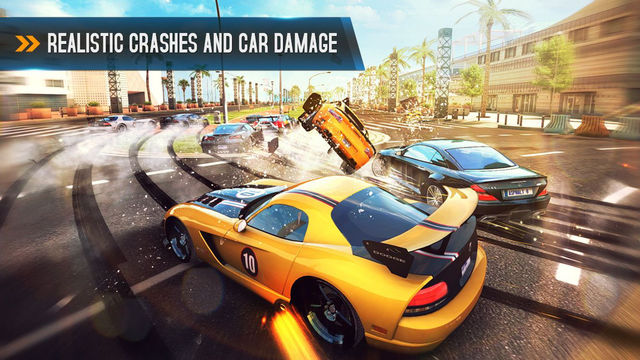
Asphalt : This is actually a car racing game, but it has really good graphics compared to all other racing games out there and awesome and game play, plus they keep updating their features which is cool. though they could do a little more with the UI
![]()