- The designers should avoid displaying a UI element that tells people to rotate the device. Running in the supported orientation clearly tells people to rotate the device, if required, without adding unnecessary clutter to the UI.
- Give tappable controls a hit target of about 44 x 44 points to Make it easy for people to interact with content and controls by giving each interactive element ample spacing.
- We should always take the color blind people’s situation into consideration and be aware of color blindness. Most color blind people have difficulty distinguishing red from green. Test your app to make sure that there are no places where you use red and green as the only way to distinguish between two states or values.
ThursdayApp_Blippar
“Discover a whole new world through your phone’s camera by ‘blipping’ everyday objects, products or images to unlock amazing experiences, including: information, videos, games, music tracks, exclusive offers, shopping and much more!”
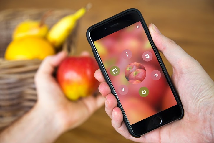
‘Blipping’ is simple:
1. Download the app and you’re ready to start ‘blipping’ almost anything in the world around you – from plants to pets, fruits, even your dinner! Try it and see what you discover.
2. Also, look out for the Blippar logo on packs, magazines and posters. ‘Blipp’ the whole page or product for amazing Augmented Reality experiences from your favourite brands.
Blippar use the way called Visual Marketing. Through augmented reality and computer vision technology, Blippar adds digital content to physical objects. It harnesses image recognition and rewards our curiosity with engaging experiences.

Blippar can also be used in education. Help start an education revolution by transforming classrooms and museums into digitally interactive learning environments. Stoke the imaginations of students of all ages with textbooks and materials that come to life with immersive experiences.
With Blippar, educators can seamlessly enhance learning materials with digital content that students can access using a smartphone or tablet.
#thursdayapps_Artifact Uprising

“Artifact Uprising App (AU Mobile) is an app can make custom, quality photo books, photo albums, cards, and print photos online. Inspired by the disappearing beauty of the tangible.”
Since almost everything is getting more and more digitalized nowadays, photos are taking by phones instead of taking by cameras, and people get used to save their photos in their phones. The reason why I love this app is not only because it’s really well-designed, clean and simple for users, but also the concept of this app is bringing people back to the “physical era”, which means photos are supposed to be printed out and share with friends in person. So the great things about this app are combing the digital software with physical/tangible things, and people who love taking photos by phones still can print out their pictures without so complicated steps by the camera. With this app you can just simply send the photos through either your camera roll or instagram or even VSCO cam.
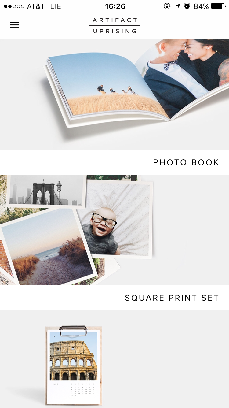
The first view is really simple and clean. It also provides the outcomes of the products for users to explore in different styles. Also, the kerning of the font makes the whole view looking very elegant.

The side bar is very simple and easy to understand. It is obvious to see the “log out” is doing totally different things with the buttons on the top, so users won’t accidentally tap on the wrong one. However, personally speaking, I will combine “my account” with “my orders” if I’m the designer. Because even though they’re doing two different things, they are still under the same category.

One simple key sentence to show the style and also price, which can let users to catch the most important information in a short time.

When you tap “get started”, it will lead you to the picking process, which allows you to pick photos through either photo apps or your photo library. This is very thoughtful to consider those filter lovers, also there are the commercial benefits inside(work with other companies).
After picking the photos, which is the first step, users can edit the photos that they picked into the perfect position and inside of the frame by moving around the picture. Meanwhile, the nice thing about this view is the mock-up style, which allows users can view what the final product will look like.

When users finish processing each step above, the system will automatically upload the photos for you, which is very convenient. Also the “Cancel Upload” locates on lower left side, so users won’t accidentally tap on it to cancel, or very hard to reach if it locates on top side.
Apple tv final version 3/30
Teller tvOS Final
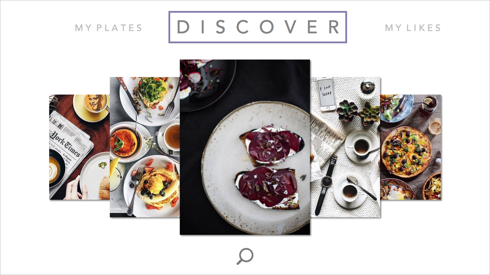

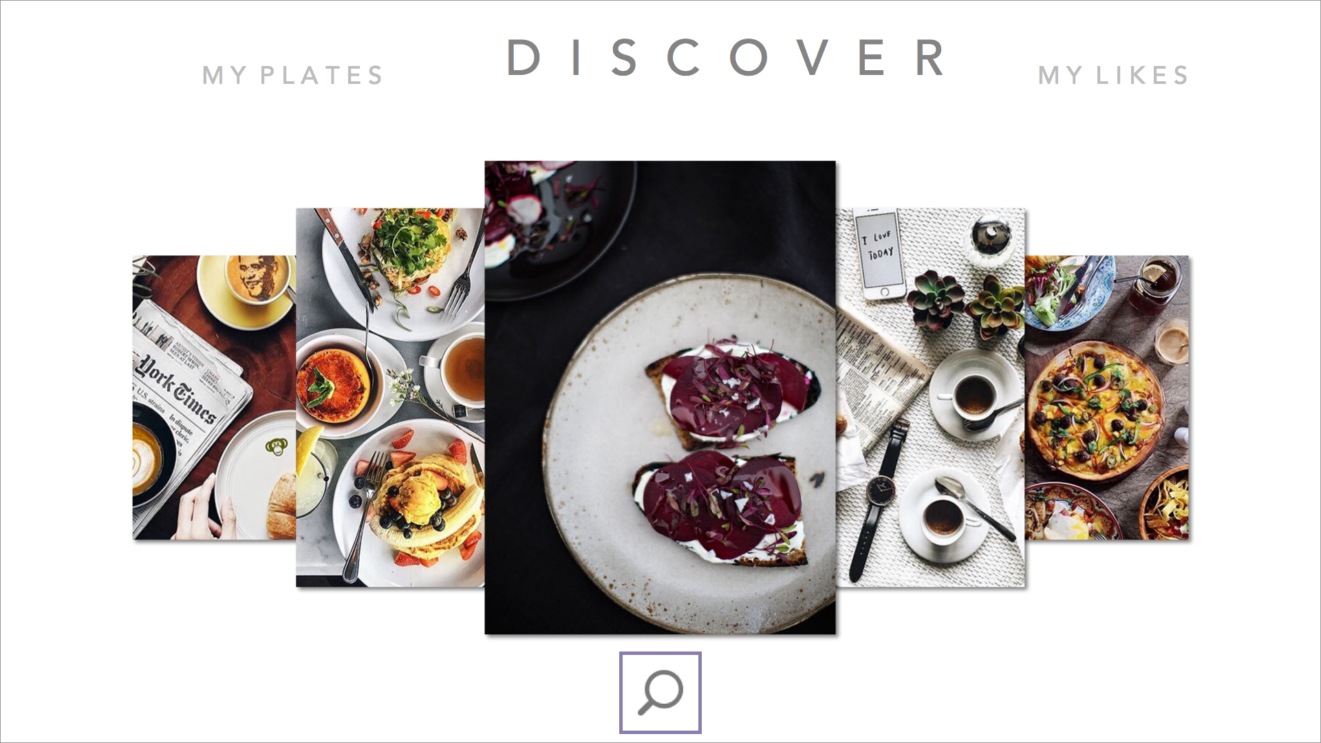

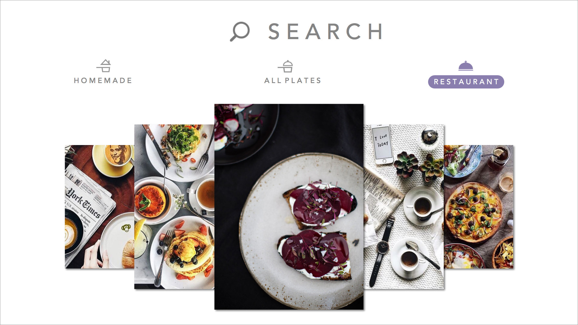


changed the wording of the segmented controller after user feedback saying “both” confused them, and also put the segmented controller into the search view as a way to filter in order to make the main discover page have more room for larger images.
Cookgram for Apple TV: Wireframe & Final Prototype
Cookgram for Apple TV is a recipe app where users can browse their recipes as well-designed recipe album (gif form) on Apple TV as well as explore more recipes from other users’. It will be a community to explore, collect and share recipes.
Feedbacks & Critics from 1st presentation:
1. Horizontal design of apple tv version is not very effective. Use two sides and vertical view.
2. Top bar should follow the apple tv HIG
Paper Prototype:
Based on the feedbacks from the first presentation, I prototyped a new version of Cookgram for Apple TV.
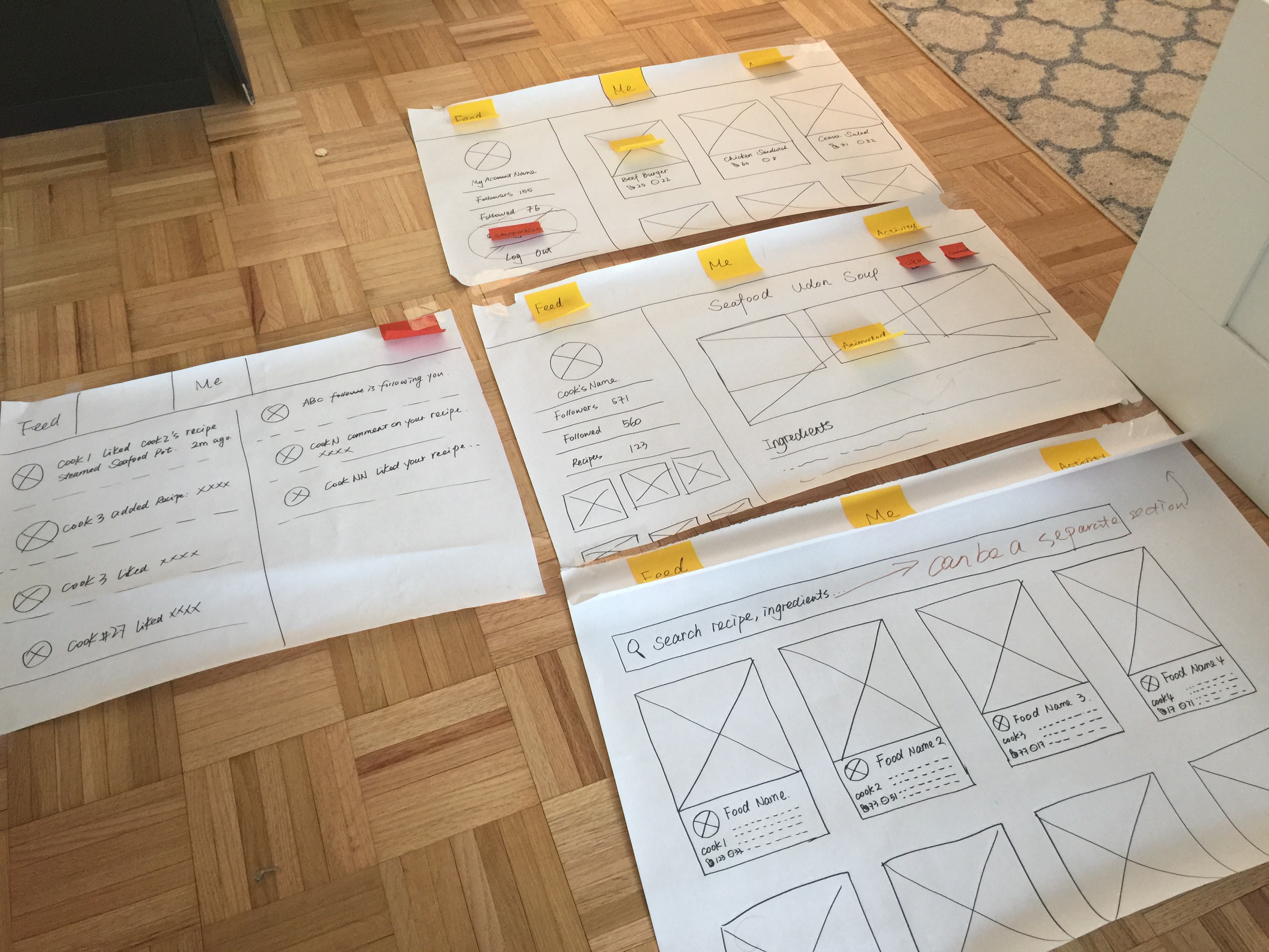 some user insights that I got from the paper prototype are: 1. Search function can be an independent section on the top menu.
2. Shopping list section doesn’t make sense for user to use in apple tv version.
3. Login view is missing.
So in my final prototype, I redesigned the UI and changed some of my UX flow. Here is the Final Prototype Slides
User Insights from the final prototype:
Under the detailed recipe view, the focus is default on “Followers”, while the right part of the screen shows the detailed recipe, which is confusing. Should use left side as a navigation section consistently like the one that I designed under “Me” section.
Whose food? Apple tvOS final prototype
This is my Marvel prototype
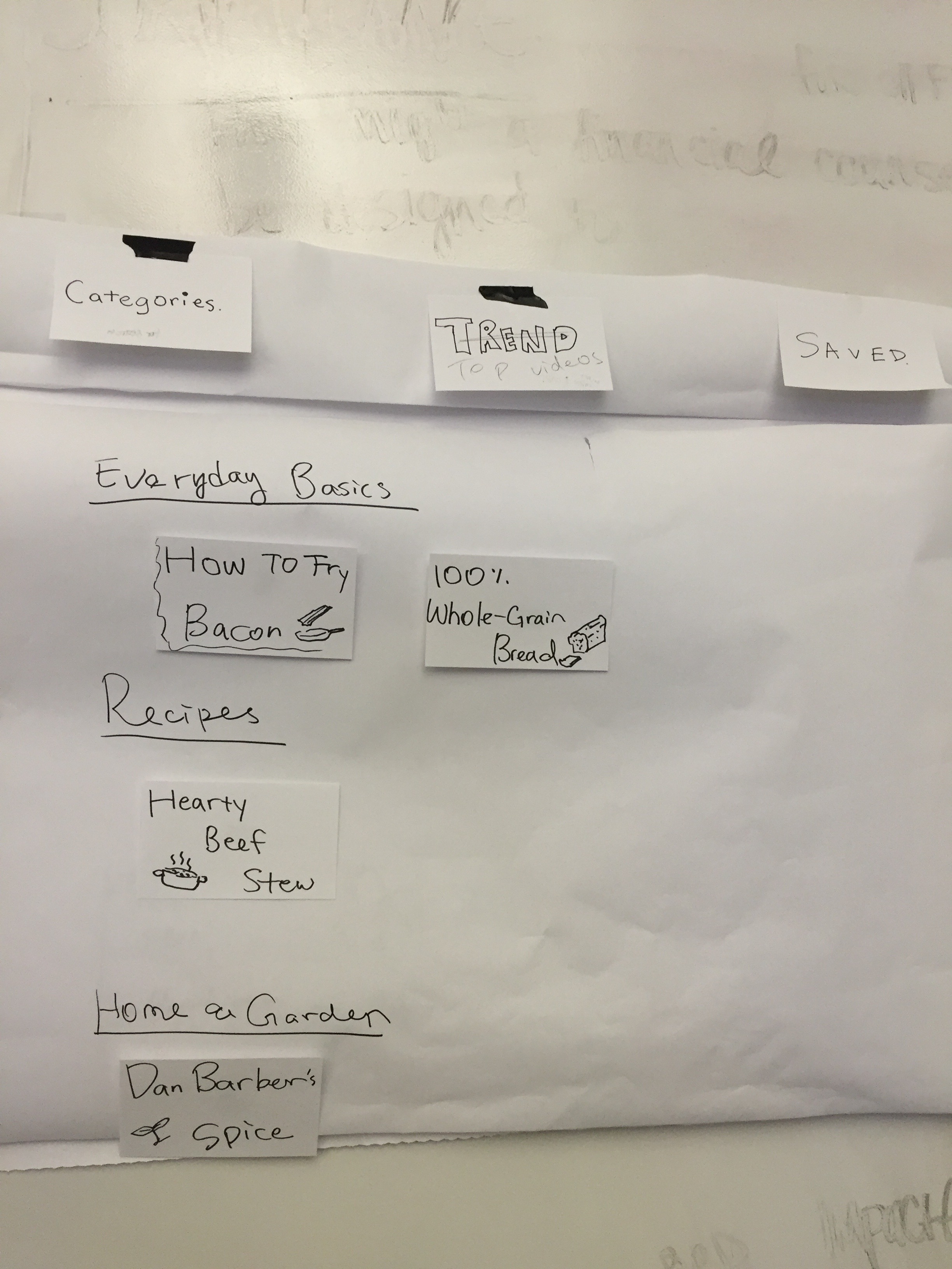
“ingredipedia tvOS
<From last week Paper Prototype>
- Title of each drop down menu… not clear
- The food trend is like commercial use. ( I would expect something trustable and no ADs, if I use your app)
- Home and Garden? try something like “ Food Process ”, or “Food Story”

< Presentation Feedback >
- Fonction of “My Wishlist” is quite overlapped with “Saved”.
- “WISHLIST ” ?! => Watch List
- Where to go back to the last page from watching video? A button ?( UPDATE !! actually down swipe the control pad will drag down the top menu.)
- “Everyday Basics” => is an interesting section, instead of categorized order , maybe show top 5 video of each categories is more attracted (invited) people to keep going on your app.
- “I like the design, clean! “
- ” hmm.. Some of the Single Video page is small to me. “
- from your video detail page, if people finish watching, and then?…. adding a short “Recommendation List” or ” You may like list” for people to continue.
Apple TV New Forker Final Prototype
Apple TV wireframes
This is my first wireframe for the apple tv development of the New Forker app. In designing this app for the apple tv I decided to remove location based services and the rsvp functionality to the app.
Instead the app is now video content driven, where the audience can bookmark and follow their favorite chefs and food critics.