ingredipedia iOS app design 01
For April 7
- Work with your partner to prepare wireframes and paper prototypes for your app
- As a reminder, you Project 3 app can be either a phone or a tablet app on any topic.
- Group 1 will present their wireframes
- Groups 1 and 2 will have time to do paper prototyping
- Post any missing assignments that I identified in your midterm grade emails
- Remember you’ll need to post a second #ThursdayPlay/#ThursdayApp before the end of the semester.
neatycutey – color & design FINAL
my design for the apple tv app(updated)
make up for HIG
Note from HIG
- App’s interface and contents need to be distinguished to each other. Good design of interface and cantent can facilitate each other but not distracting. The most important/attractive content would usually be placed on the top left corner, where as the less important content should be placed on the bottom right corner.
- “Ensure legibility by using the system font. San Francisco (the iOS system font) works with Dynamic Type to automatically adjust letter spacing and line height so that text is easy to read and looks great at every size. Whether you use San Francisco or a custom font, be sure to adopt Dynamic Type so your app can respond when the user chooses a different text size.” Font size is an important element we should pay more attention. The appropriate size of font can contribute to all pages of layout, On the contrary, a wrong size can ruin the proportion of the whole design. Thus, we should follow/obey the system font size strictly when we design.
- If an “onboarding experience” is needed, it should be easy to follow and don’t forget to design a way to exit this part anytime.
neatycutey – second wireframe & paper prototype in class
this is my second wireframe, fixed
apple tv second wireframe
after prototype in class,
apple tv prototype
user insights
- There were lots of designs that needed fixing. One of them were applying filter page, which users had difficulty understanding how to apply filters.
- For the tab menu(on top), I made a several changes in wireframe 1, 2 and after user testing. Unlike websites, search function has to be in the menu. I tried to integrate the filter and search function together, but lots of apps use “categories” tab menu to distinguish between “search” and “filter”.
- For the page layouts, it was difficult to choose which one to show and not to show. Some users didn’t like showing the length of the video, also they asked me to add how many people viewed the video. When they have nothing in mind, users look for videos that are “most viewed” by different people.
- Also, setting the page of “home” was difficult.(what to show, how to select a video and go back) Apple distinguished “home” as a “feature” page which shows most viewed content so I took the design and applied it to mine. I liked the simplicity of accessing the “most viewed” contents without going to a tap named “most viewed”.
Project #2: Food Guardian on Apple TV – User Insights & Design


-
User Insights
- Are showing bigger pictures or images necessary?
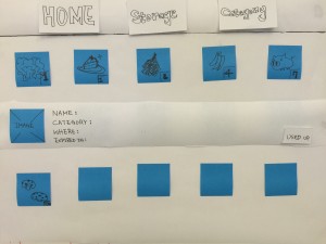
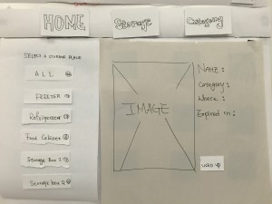
Basically People know what their groceries look like, so it seems not very necessary to show larger pictures to users while browsing. It might be better use the way how details display under Home tag in Storage and Category tags. - How focus move while there is a new layer?
While user click a image, it will shows you a new layer and the details of the image, like name, category, expiration date and where it is. And there is also a button on that layer. Since the layer pop up, where the focus go? It should be more intuitive and simpler to users so they don’t have to think about how to control or where their focus go.
- Are showing bigger pictures or images necessary?
-
Design
–
Dump Cook: Apple TV edition
To translate my app successfully as a companion to my iPhone app, I removed some functionalities like adding recipes sharing, and focused on searching and cooking.
To facilitate a seamless cooking experience, the Apple TV app has a timer that the users can get to from the directions view and main tab bar. Because the TV has a much larger screen, all the directions are written on the same view so users don’t have to use the remote all the time while cooking.
App Map: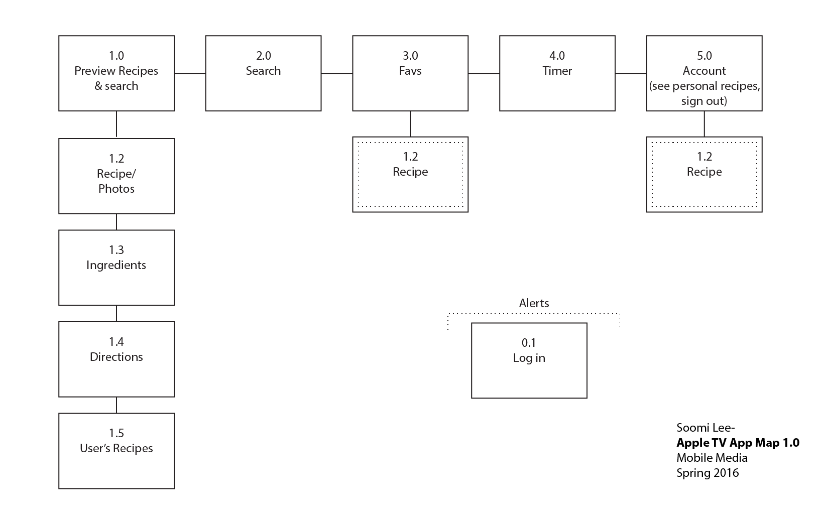
neatycutey – first wireframe for Apple tv
apple tv paper prototype
![]()
![]()
![]()
![]()
user insight:
- This format is much better than the last time, the menu on the top, in the middle and the content on the bottom is more organized and reasonable.
- The page of “challenge” still need to be modify or revise, it still confuse and the content is not that clearly.
- The page of “me” doesn’t show on the paper prototype
- How to fit so many text in apple tv is a challenge!
Food Story_version 2.0
Hi guys, sorry I forgot to post this. It was left in the draft box.
This is the second version of Food Story. Learning from the feedback of the first version (the wireframe), I adjusted the user flow and worked on the visual design.
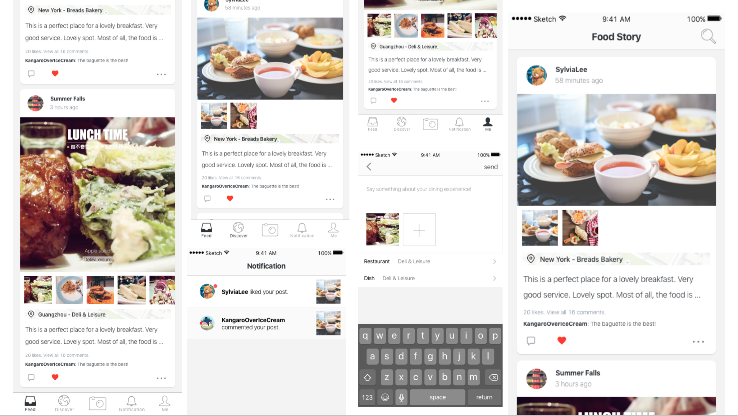
Got great feedback from the class. This is what I learned from the user test.
1 . It takes so many steps to add restaurant&dishes informations. Considering the possible scenarios, I will add a function of “draft box” for users to save the stories later. Also I tried to cut down unnecessary steps.
2. There is too much things going on the feed page. A better visual layout is needed because the users don’t know where is more important.
3. Users are confusing about the difference between the “feed” and “discover”. The feed is for the stories that I followed. And the “discover” is for the stories that are very popular. Partly because I used the exactly the same view for both tabs. So I need to design a new view for the “discover”
4. Users are also confusing about the calendar in the “me ” view. The calendar is designed for a clear view to show which day did the user post their stories. Testing reveals that users care little about it. This function will be cut off.
For this version, you can try the prototype below. Please feel to leave comments here about your experience exploring it. https://marvelapp.com/4db87c6
Pengpeng