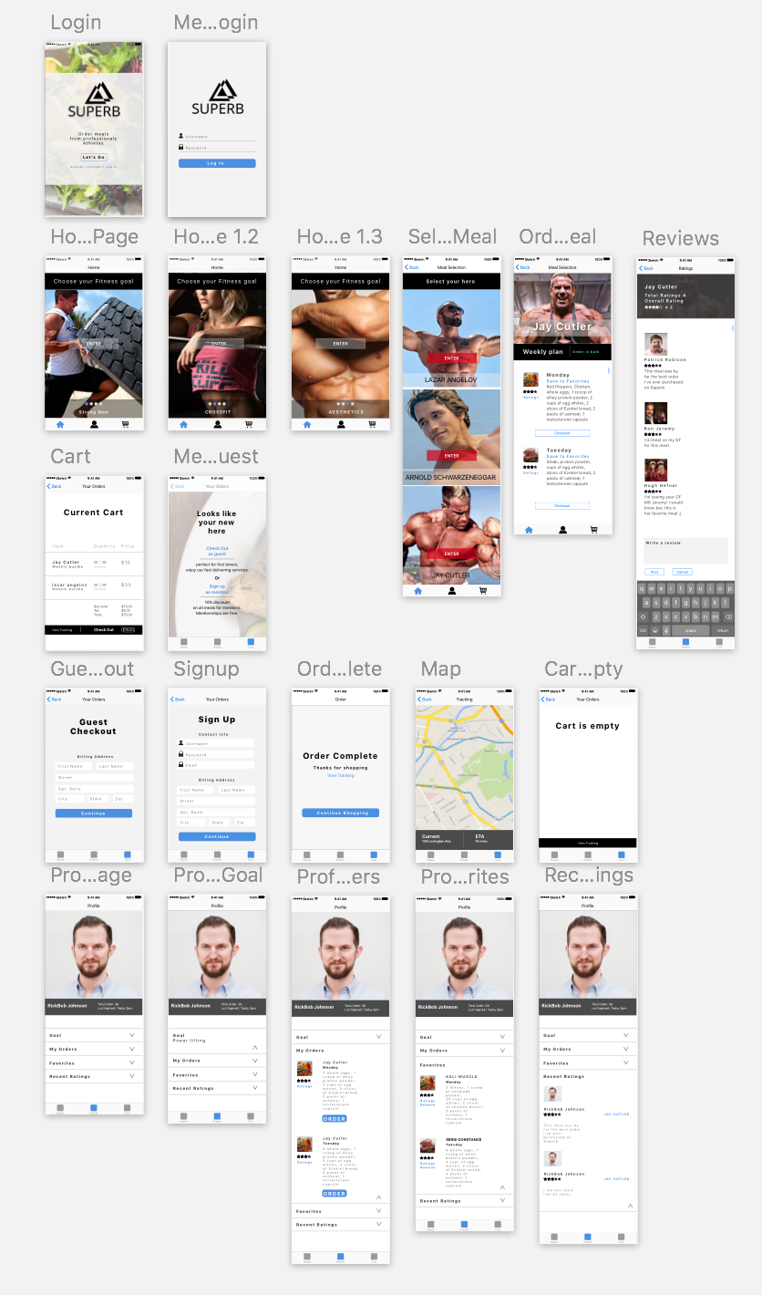
Assignment#2 Elly Lin

Comment from Feb.23

Digital prototype:

https://marvelapp.com/31g9e79/screen/25242643


  • feedback from class
  1. no tap on logo
  2. Text font bigger
  3. Customer_ open page/ follow?
  4. Change words: HOME– PROFILE, SUBSCRIBE– MAP, MAIN VIEW– RECIPE
  5. Main page (1)not reach the content “Map” around the world (2) pic looks not excited (3) special title/ name
  6. Create page (1) first comes form to fill out, and then pulls the library (2) full steps (3) ingredients (4) eg. instagram (multi pics in a time) (5) tags?? (6) regions ?? (people from NY might not make NY food)
  • user’s feedback 1 (Tong)
  1. Map page_ Country lists
  2. Main page_ name country
  3.  Profile- stars on name+ country (must be filled)
  • user’s feedback2 (PengPeng)
  1. Home page’s icons (collect and my recipe is not clear)
  2. collect+ country?
  3. The sequences of the icons
  4. Subscribe (Map) icon: change the icon to a world or…

Three things I don’t know about HIG

3 things I learned from iOS HIG:

  1. Before perusing the HIG, I did not know much about the segmented controls. In my old understanding, I thought segmented control is similar to Tab Bars. One is on the top and the other is on the bottom. After reading HIG, I find that Tab Bars is mainly being used for switching between different section of an App, but segmented control is more likely to be used in displaying different views of one page.
  2. I find that the Apple system has a lot of very unchangeable interaction. I used to think designer can be creative of the look of the interaction animation. But after reading the HIG, I found that animation must follow certain principles, or the user will be confused about what’s going on. Such as the progress indicator should look like a spinning icon, the progress bar should look like a track fill from left to right.
  3. I didn’t know HIG has so many different gestures. Such as drag, tap, swipe, flick, pinch, touch and hold. And the most strange one is shake, I never find out that users can shake their phone to undo or redo delete. Knowing these gestures help me to better design the interaction.

Brandon Palmer | Wireframe & Prototype_2 | 3 Things I learned from Paper Prototyping

Three Things I learned from Paper Prototyping:

What I learned from prototyping is that most people will not take the time to signup to use an app that they’re unfamiliar with. So I found that adding a guest login option is an alternative direction to take. Regarding the feature for signing up for a free membership, the benefits consists of giving users a 10% discount on all meals they purchase. I also have learned that the way things are worded are key for simplifying the users experience. For instance, my landing page stated “Meals designed by professionals.” Instead of specifying who the professionals are. Another key value that I have learned from user testing is that there had been confusion with the profile page. The users didn’t understand the functionality of what this feature had provided. Overall the feedback that I have obtained had been positive, There is still much work that needs to be iterated through the next developmental process. But I have gained useful feedback.

Critique Notes

• Change display name on the landing page. (“Meals designed by professional athletes”).

• Change “Homepage to Meals”
• Homepage should consist of all categories and specific meals assigned to their parent. (Allows the user to analyze most data without having to search.) Faster traffic for consumers
• Fix typography, Color Scheme, Make 40px of padding in-between each tappable element. (Between ratings and favorites inside the profile page).
• Make the interface on the Meal page(Orig Homepage) more engaging and visually appealing through hieratic elements.


This is the PDF


Superb_Remodel_optimized


Tao Wei – 3 things learned from iOS HIG

3 things I learned from iOS HIG:

  1. Before perusing the HIG, I did not know much about the specs regarding typography except that San Francisco is the default system font. There is so much more to it than just the font choice. There is variation regarding the display and tracking specs depending on the font size as well. As a iOS user, details like this often go unnoticed because we get so used to the design and take the experience for granted. However, as a designer, it is critical to pay attention to details so that we can craft the experience that lives up to the user’s underlying expectations, since good design is often invisible. When the design principle is not strictly enforced, even the smallest detail can be raise a red flag to the user’s eyes.
  2. I find interaction design about feedback is so critical in delivering a smooth user experience. I used to think a stand-alone page of dialogue telling the users what to do is sufficient for communicating with and guiding the users to navigate. Little did I know that there was a whole art of communicating using feedback in a way that enhances the discoverability of the app while not obstructing the flow. As a designer, we are in charge of how the user will be interacting with the system. Much like any communication system, a designer should pay attention to the semiotics of the system because the language of the system determines how easy and delightful it is for the user to quickly pick up and adapt to the app.
  3. Animation breaths life into the experience, evoking delight and building a visual sense of connection with the users. But animation should be used with caution. Excessive animation can create visual clutter and distraction, taking away from the integrity of the app in terms of the services it provides.

Visual Design Prototype

Prototype visual design demo:

https://marvelapp.com/fci5big 

Things I’ve learned from last class feedback and user testing

The first thing I noticed was that there is no need to have a log in page. From the class feedback, I got to know that favorites and recently viewed can be saved locally since the app will run locally. So I get rid of the log in/sign up view compared to last time prototype.

In addition, I agree that there is no need to shop ingredients based on each dishes. Once you type Grocery lists view, there are two separate dishes shown up, I agree it is better to combine all the ingredients on the same view since some needed ingredients may overlap. For example, salmon dishes needs salt and oil so does chicken fajitas; hence, there is no need to purchase twice in terms of the list.

Other than that, I realized that it seems more logical to put ingredients first then direction behind it because users are supposed to collect ingredients first and then do the rest of steps. So I think it is better to switch the position so that the recipes looks more engaging.


#thursdayapps | Hidden Folks | Hanyu Zhao

Hidden Folks is an IOS App that requires users to find hidden objects in this 2 dimensional hand-drawn interactive world. Hidden Folks is inspired by the popular book Where is Wally?, however, the most of props  in Hidden Folks are interactive not only with animations but also with real-human sound effects. I was attracted by its lovely black and white drawing style and interesting sound effects at first, but lately I found this game really helped me relaxed since there is no punishment if you lose the game. It also can record the screen while you are playing the game in order to be more flexible for you and your friends’ communications.  This is the link for this game and please enjoy the game! http://hiddenfolks.com/

Hanyu Zhao | Food App | My Recipe Book | Visual Design

Digital Prototype: https://xd.adobe.com/view/76724b5d-1cad-459d-a9a3-eda71f93bc5b/

PDF: Visual Design-MyRecipeBook


3 things I learnt from paper prototype:

  1.  If I choose to use Android Design element(the “+” button), I need to keep all the design in the same design method and style.
  2. The Save Icon is looked like a 90s design style. Normally designer can just use the word “Save” as the icon for save function.
  3. The user might want more choose for their templates. Some people might prefer a messy layout another might prefer a neat layout. It might be helpful to give a categories to these templates.

Tao Wei – Digital prototype

Prototype Link: https://vimeo.com/206620874

Visual Mockups

Changes from the paper prototype:

  1. Took out recipes and diary section to focus on the concept of “one-stop” holistic daily solution through delivery
  2. Simplified the order view (threw out the “on the way”) for easy navigation
  3. Enabled users to add recipes to the cart from the menu instead of overwhelming the users by forcing them to order fixed number of recipes from each meal category in a row

#thursdayapp

Scream Go: 8分音符ちゃん

https://itunes.apple.com/us/app/%EF%BC%98%E5%88%86%E9%9F%B3%E7%AC%A6%E3%81%A1%E3%82%83%E3%82%93-%E4%BC%91%E3%82%80%E3%81%AA-scream-go-8-note/id1208078539?mt=8

Scream Go is a sound control mini game. At first, I saw lots of people play this game on the PC version. Then I immediately downloaded it because it looks fun to play with. To be honest, this is my first time use voice to control the character in the game, which is fascinating and super hilarious while you watch someone screaming to the screen. Basically, users need to use the sound to control the character to avoid obstacles on their way. You need to change your pitch of your voice frequently through the game, if you have a higher pitched voice then you can jump higher so that you will not end up falling down to the gap. I feel like this game also can be seen as a tool for singer’s vocal warm-up as well, if you have a performance later you probably can play this game first so that you can use to get your voice ready and performing at its peak in the show.

But it still has some buggy, at first, it is nice to play around with it. But when I ended up the game and want to restart the game. It turns out to the black screen and keeps my phone on hanging. If they can fix that, the game will run smoother without lagging while playing it.