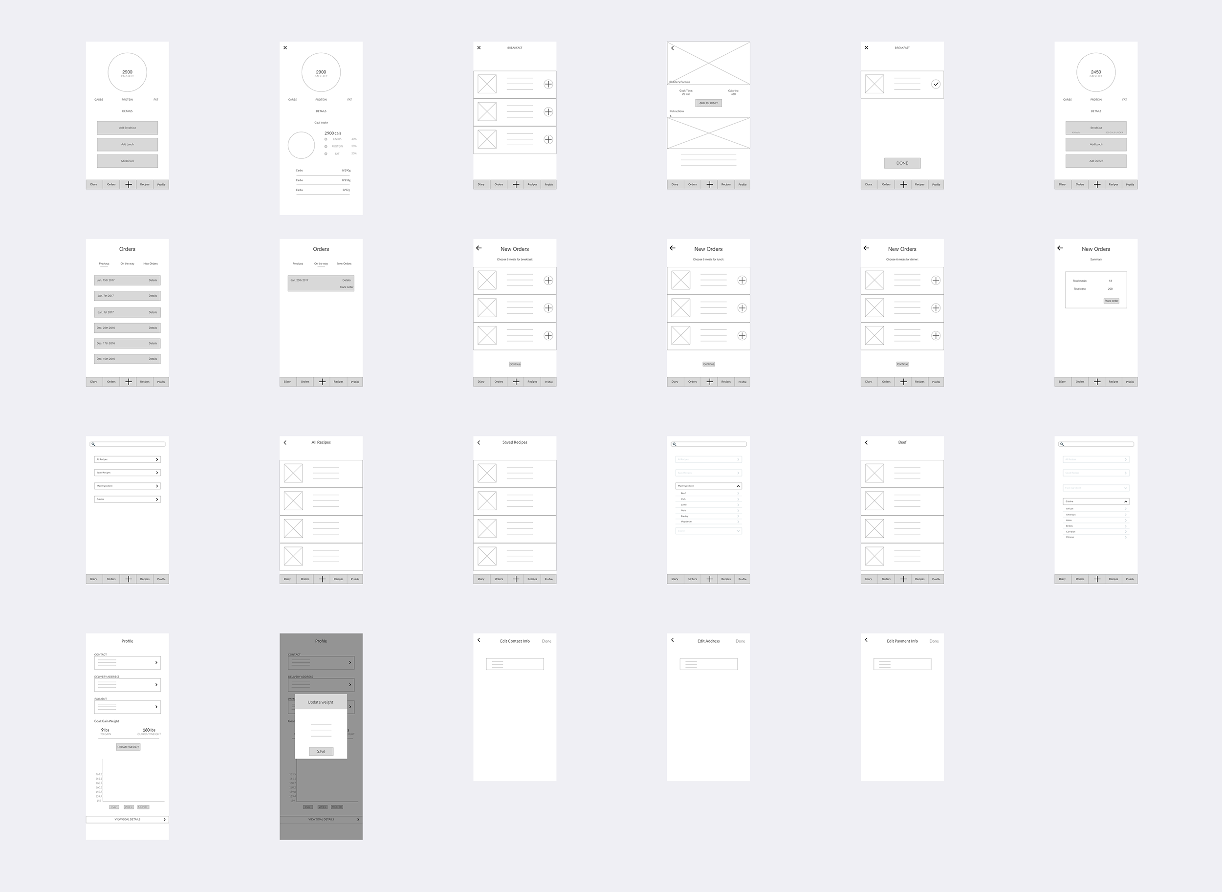
Marvel Demo: https://marvelapp.com/540a9e4
PDF: DiEt – UI
Iterations:
- Added recipe component as the main content of image post
- Got rid of chatting function in the app (on Notification page)
- Got rid of tag feature on image post
Thanks!
Marvel Demo: https://marvelapp.com/540a9e4
PDF: DiEt – UI
Iterations:
Thanks!
Please click on the links below to check out my digital prototypes.
Link to PDF: Assorted HD
Link to marvel demo: https://marvelapp.com/53h31fh
Feedback:
Three things that I changed from my paper prototype:
-Narrowed down and focused on One Concept. The concept is to eat or grab a meal with a nearby friend. This is map based and you can immediately choose a time/restaurant.
– Simpler navigation and fewer pages. My previous prototype had many components and many pages. With narrowing down my concept and by focussing on one idea, I achieved a simpler navigation.
-Sign in through Facebook to identify nearby friends. To avoid the whole sign up and sign in effect, the user would have to sign in through Facebook to find nearby friends and dine with them.
Thanks! 🙂
User control and metaphors
That reminds me that the “golden rules” of UI/UX design, which are place users in control, reduce user’s memory load and make the interface consistent. The principle taught us that allow the user to customize the interface, and users can directly manipulate interface objects, and in some situation, it is better to display descriptive messages and text to help users to move to next. The user should initiate and control actions, but this could be a little bit challenging in terms of different levels users. For instance, novice users often want apps that can direct lead them to complete a certain task but experienced users tend to more need fully control the app.
Interaction – Navigation
It is crucial to designers to understand the various categories of apps their work and ensure the navigation between app views is logical and natural with the input given and the information displayed. As a designer, we need to find the right design flow for users so that they can easily follow and know exactly where they are in your app, and how to move to next step. In iOS, there are three main styles of navigation, hierarchical navigation, flat navigation and content-driven navigation. In general, navigation bars are able to help navigation through a series of hierarchical app screens whereas a tab bar helps to organize information at the app level.

Nav. bar Tab bar
Technologies – Social Media
I just realized how unbelievably easy it would be to share content or pictures to our social media accounts without requiring authentication because iOS employs a single sign-on model for accessing social media services. It helps the user to save time and make sharing easier. I really like that feature because it quite similar to users register or log in page, just don’t ask people to sign up in the first place.
Take what you have learned from critique and digital prototyping and create a final iteration of your Project 1 app. Prepare a presentation to give to outside critics. You don’t need to show every iteration that you made along the way, just your final concept; it would be nice to call out things reasons that you ended where you did, due to things you learned when doing paper and digital prototyping.
As a reminder:
Digital Prototype: marvelapp.com/1e6jc9c
I went on to do some quick informal interviews to further define my app. I found out that people who meticulously count calorie for their diet also tend to work out more, which sets my app up for a dilemma. I either had to scale up to incorporate the fitness component or scale down to throw out the hassle of calorie counting and diary logging to streamline existing convoluting relationship between diary, orders and recipes. I ended up going for a lightweight approach and focusing on saving the trouble of grocery shopping and food preparation for those who want to eat healthy in general but do not have time to do so on their own. As this broader audience are less likely to be fussy about calorie counting as long as the food itself fits into the healthy category. This way I ensure the app excels at doing on thing for the target audience. The caveat is that I still want to maintain the one-stop nutrition concept as much as possible so I keep the idea of providing whole day’s nutrition.
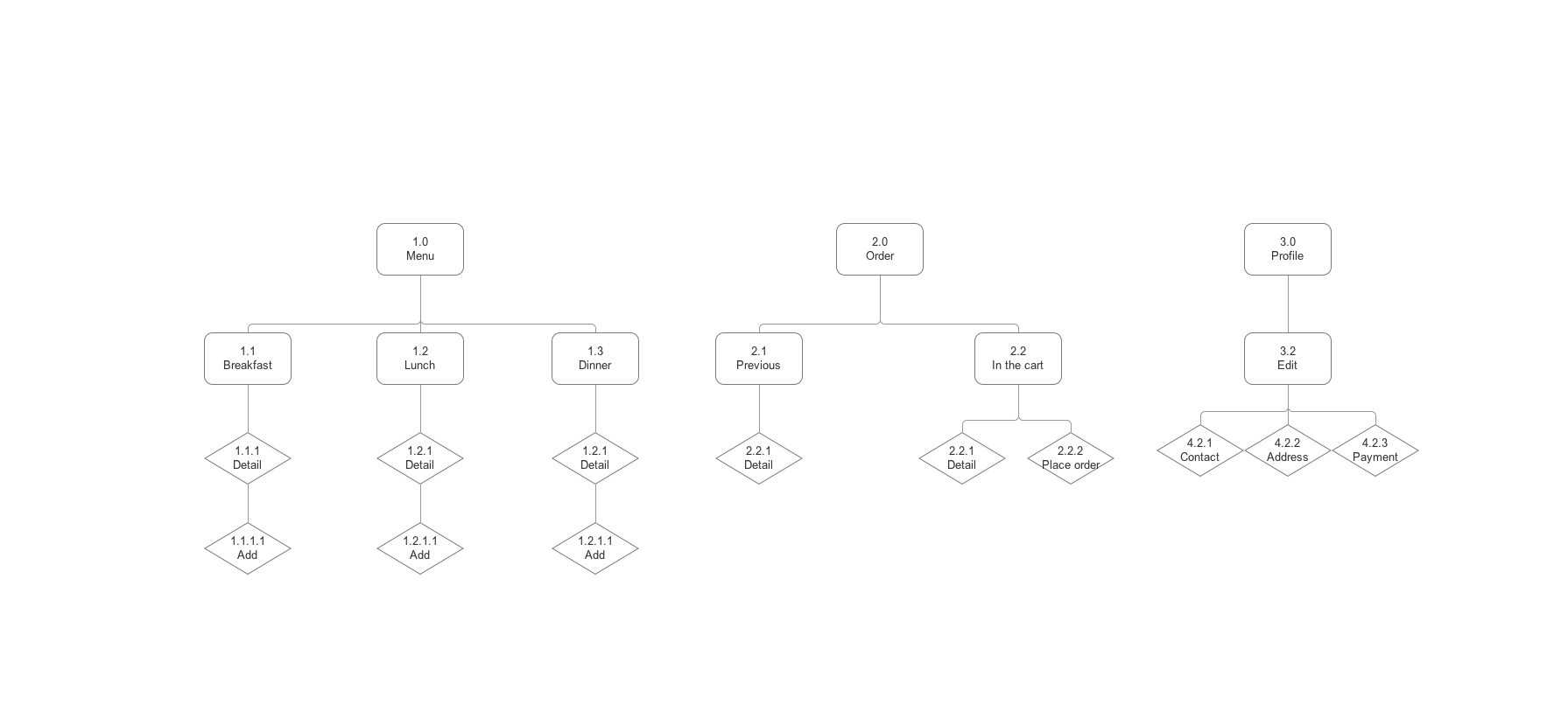
I’m trying to create a mobile app that provides holistic nutrition plan by delivering customized meal plan based on body type and fitness goal.
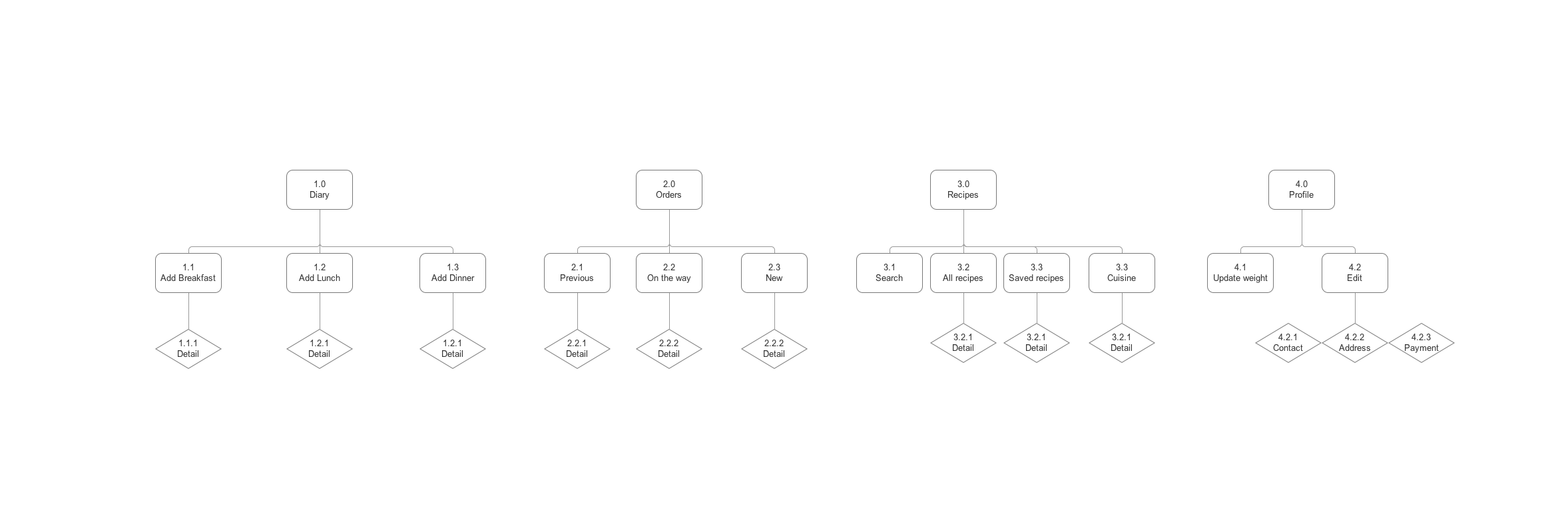
The major flow I intend for the app to have is to allow the user to order meals according to the preference set through onboarding and log the each delivered meal into the diary so the user can keep track of their healthy eating progress.