https://www.flinto.com/p/373910b3
Project 1 Prototype
https://www.flinto.com/p/373910b3
Project 1 Prototype
Next week will be your final project 1 presentation. We’ll have two outside critics joining us, so let’s show them our best work!
Post a Flinto prototype, along with a sentence or two about what you learned from digital prototyping, to the blog before 5pm.
Hopefully the room projector will act nicely, and I’ll load all the prototypes on my phone for us to present from.
Also after next week, I will give you your midterm grades. If you have any assignments that you haven’t posted to the blog, they will not be counted.
https://www.flinto.com/p/2c345cca
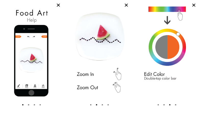
What I learned from Prototyping:
 Flinto demo: https://www.flinto.com/p/08a3e519
Updated designs based on the feedback I received in class last week.
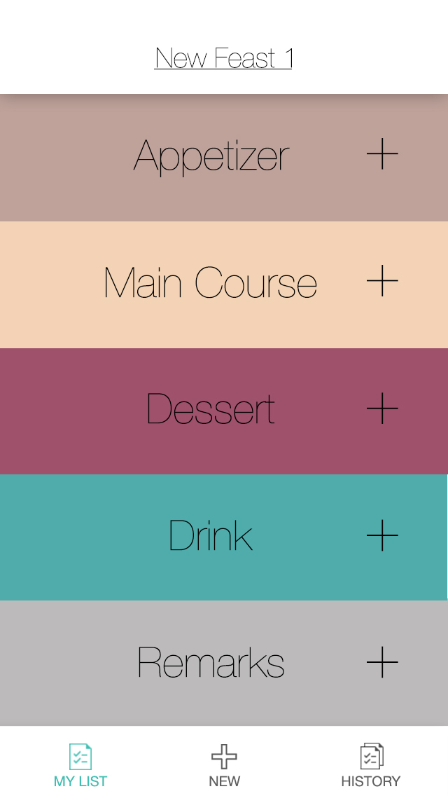
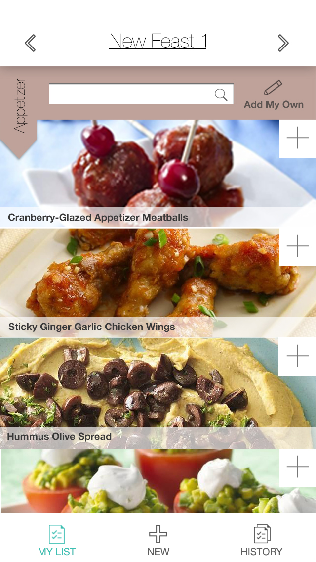
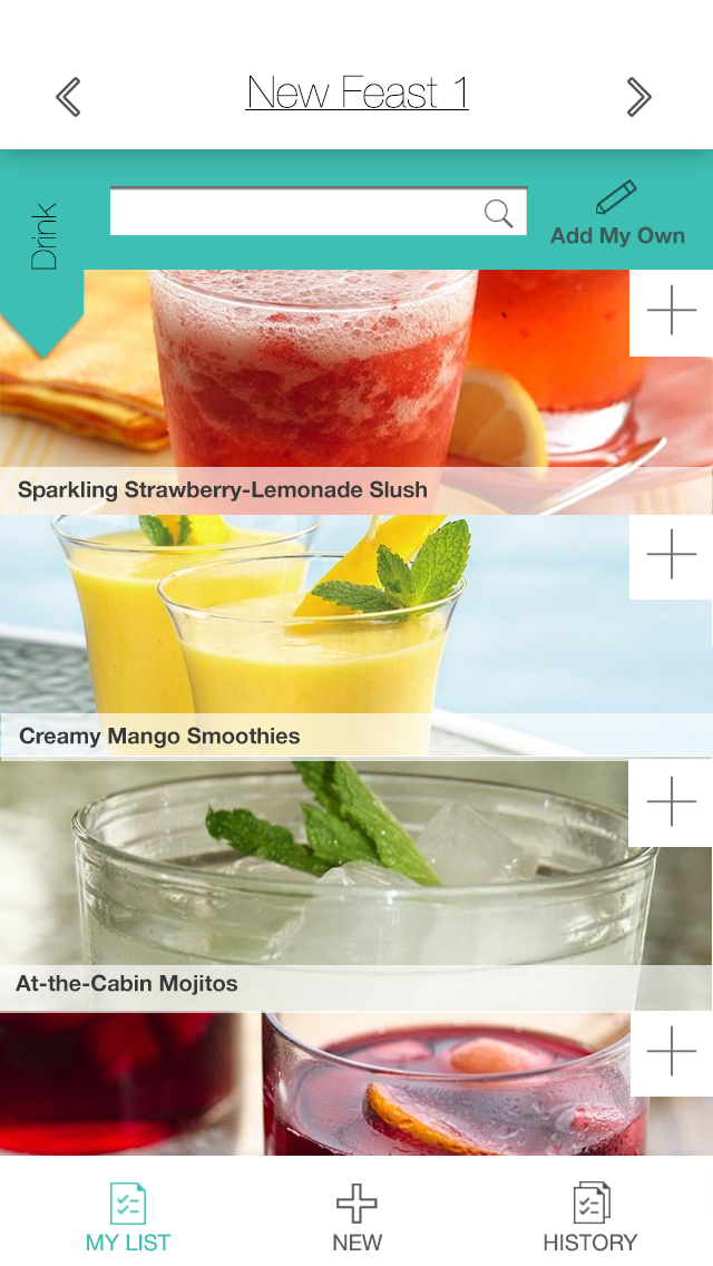
The first thing that I changed was emphasising the “meal plan” tab in the bottom bar navigation
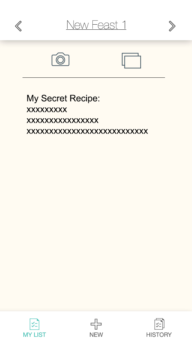
A further update is the addition of the password field in the sign-up view. And changing the sign-up view to be seen contextually when selecting the “members” or “settings” tabs
Another update is located in the “add a meal” screen. In the meal name type area, I added an autocomplete which pulls from past meals
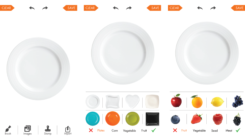
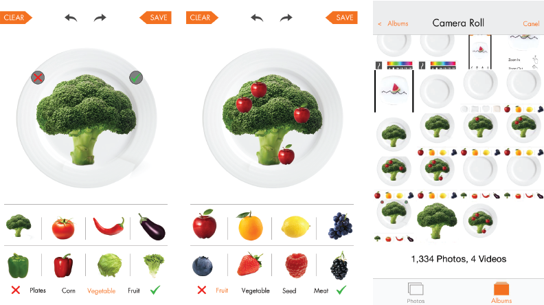
https://www.flinto.com/p/2824602f
When I made this prototype according to the app map and wireframes, I made some design changes.
1. I removed the social functions according to teacher’s suggestion. Without the social functions, I found the sign up and sign in functions and “favorite” bottom tab are not necessary any more, as well as my first view of choosing feast type. That view was just to categorize the feast list in order to let other people find feast lists more conveniently. Therefore, I removed them all and I found the app structure became clearer.
2. I removed the “settings” button on the top. Last week, I thought putting a settings button in an app is like a custom, but this week, I found it doesn’t have many actual functions, so I removed it to make the app clearer.
3. I differentiated the “add my own” view and “remarks” view. At first I thought they are all just text editors, but this time when I actually drew them out, I found they are totally different.
4. I redesigned the final list view to make it more visual.


Completed Prototype for play testing
Slight changes i made from from the wireframe based on feedback:
Here’s just a layout design of the main pages.

sorry for the delay, but here is the re-worked .pdf Wire frame from the first feed back i got for the app