Click to see presentation slides
original app/web:
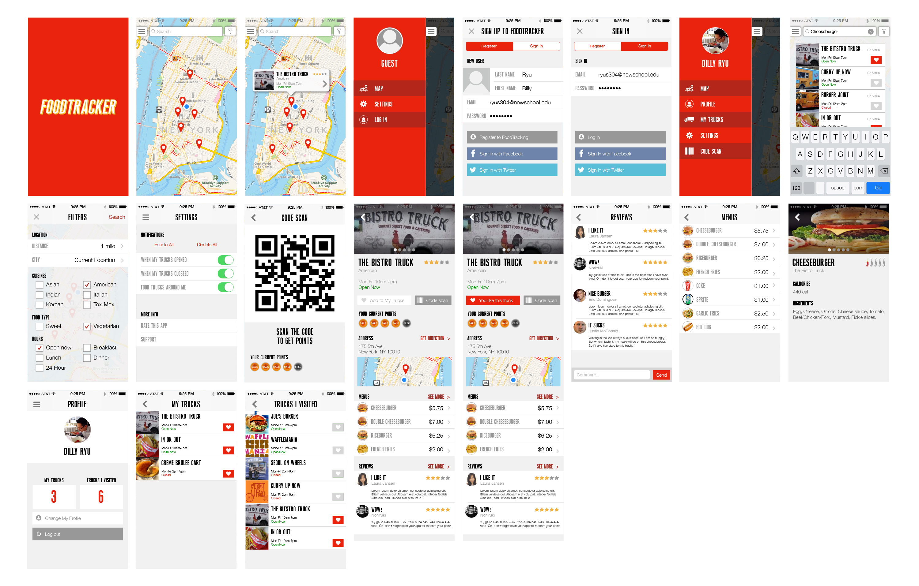
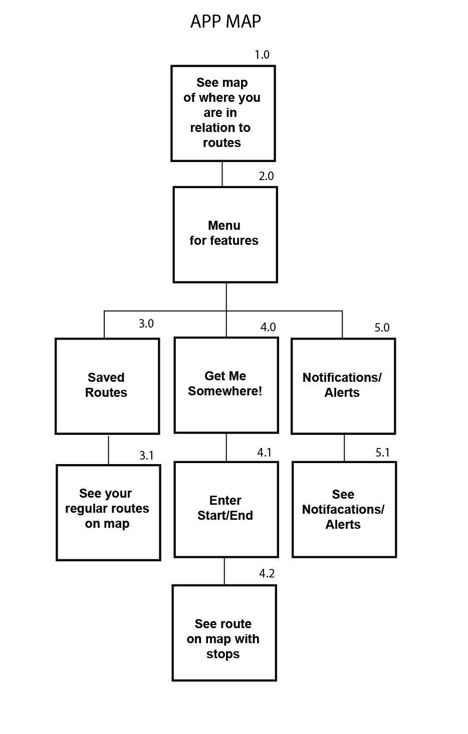
App map:
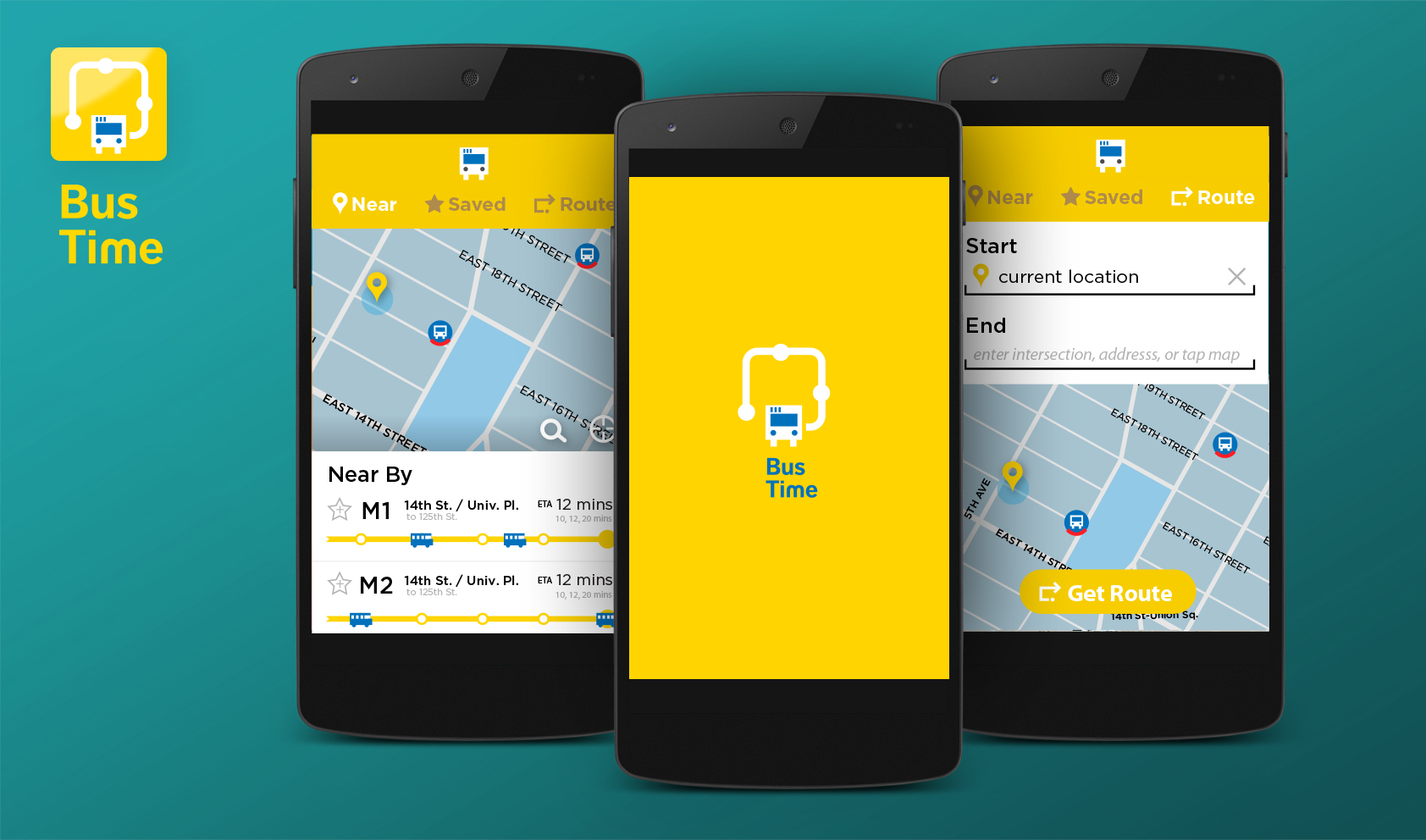
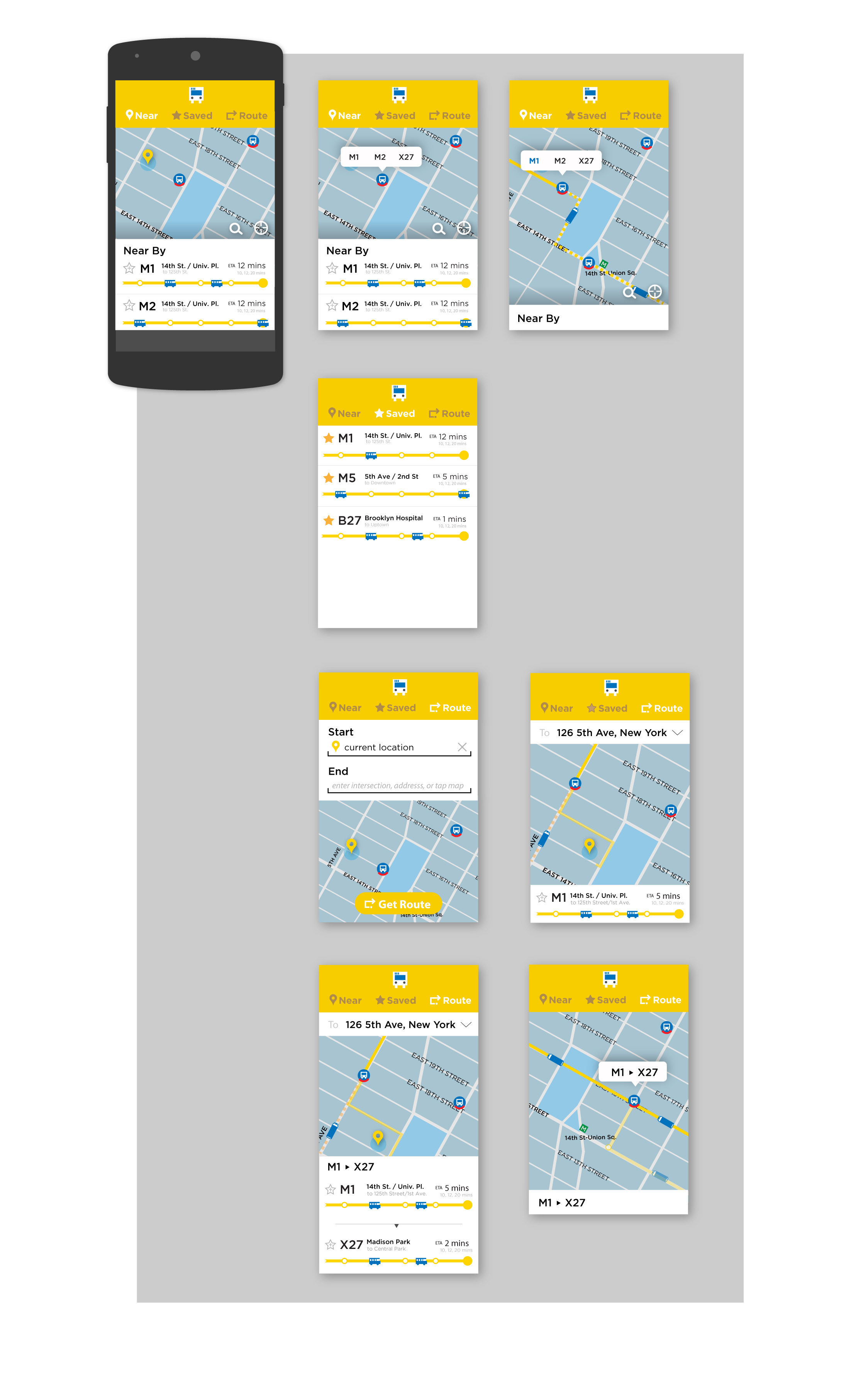
Visual Mock up:
Team: Carrol, Kamilla and Seungkyun
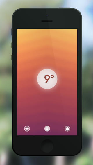
Haze is a mobile app for weather which combines with color and sound. Compare to other weather apps, Haze doesn’t show any graphics of sun, cloud, rain, snow, etc. Instead, it gives users some moods of weather by showing colors and sound effects so that they often feel emotional appeal from Haze.
It is build around the idea of giving you a radiantly crafted forecast at a glance. Swipe through temperature, sunshine hours and rain chance or dive even deeper and get detailed information about the weather. Swipe down to get a 5 day forecasts and unlock multiple colorful themes to personalize the look.
We’ll be presenting our projects to the other Mobile Media section. Look at this as a dry run for your final presentation. Iterate in your designs from last week. You’ll have around 10 minutes from presentauon and feedback
point_UserTesting (presentation slides)
https://popapp.in/projects/535058c113493d94050835ba/preview (POP)
<What we’ve learned from user testing>
1. 3D main view may be hard to see detail information. (–> revised to have 2types of main view- 2D and 3D)
2. Request of a view for seeing whole events (–> added to have an overview view to see daily whole event in the city)
3. 3D point display has illogical process. (–> revision of detail designs and the way of interaction so that users can easily understand how to play with Point application)
I recently downloaded the application ‘NOW’, which is interesting. I found it because it is similar to what I am making for my thesis. The idea is that it is a map of what is going on around you right now. It pulls data from instagram and Vine to figure out where people are. It doesn’t feel like what it is a native application, runs a little slow and the design, while nice, seems like it was a web app that was embedded into the iPhone.
It has a menu that pops up which I don’t like as much as a toolbar and it runs a little slow, but that may be due to my phone being old. I do like when you expand a view to see all of the photographs that some are different sizes than others, like what Facebook has done with the newsfeed.
It uses a condensed typeface which is fine for the tittles, but in areas where there is more writing, like tweets describing the events it gets to be a bit difficult to read.
It regularly has the map displayed at the top third of the screen, but doesn’t let you expand the map which is a bit annoying because I would like to see where everything around me is when I click on the map.
The application is also sparsely populated. While it is supposed to be about sharing things that are happening now, all that it displays is events that occurred in the past. This is problematic because the application doesn’t do what it sets out to do. While one could argue that that is because the application is not popular yet, it really doesn’t make a difference because the data is being drawn from instagram and vine instead of users posting so it is a flaw in the design of the application. When I sign on I want to find out what to do now, rather than see all the things that happened in the past that I can never go to.
It also has these cute little icons, and when you click one on the menu page the map displays the icon to let you know what page you are on, but it doesn’t say the name of the page, like “Local” or “Sports” which is inconvenient because their are 12 categories which is too many to memorize what all of the icons stand for.
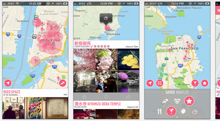
http://www.getnowapp.com
Recently, I just fell in love with this app. Because of numbahs design designed from Samir and Joo-Hee, I started to pay attention on math game. The rule of the game is very simple. You swipe numbered tiles back and forth, combining like numbers — two 2 tiles make a 4, two 4 tiles make an 8, and so on — until you reach the final goal of a 2048 tile.
Here is the website version: http://gabrielecirulli.github.io/2048/


