Week 2 – Franky Wang

User insights from paper prototyping on Feb 1st

1 – The order of functions after logging in the APP

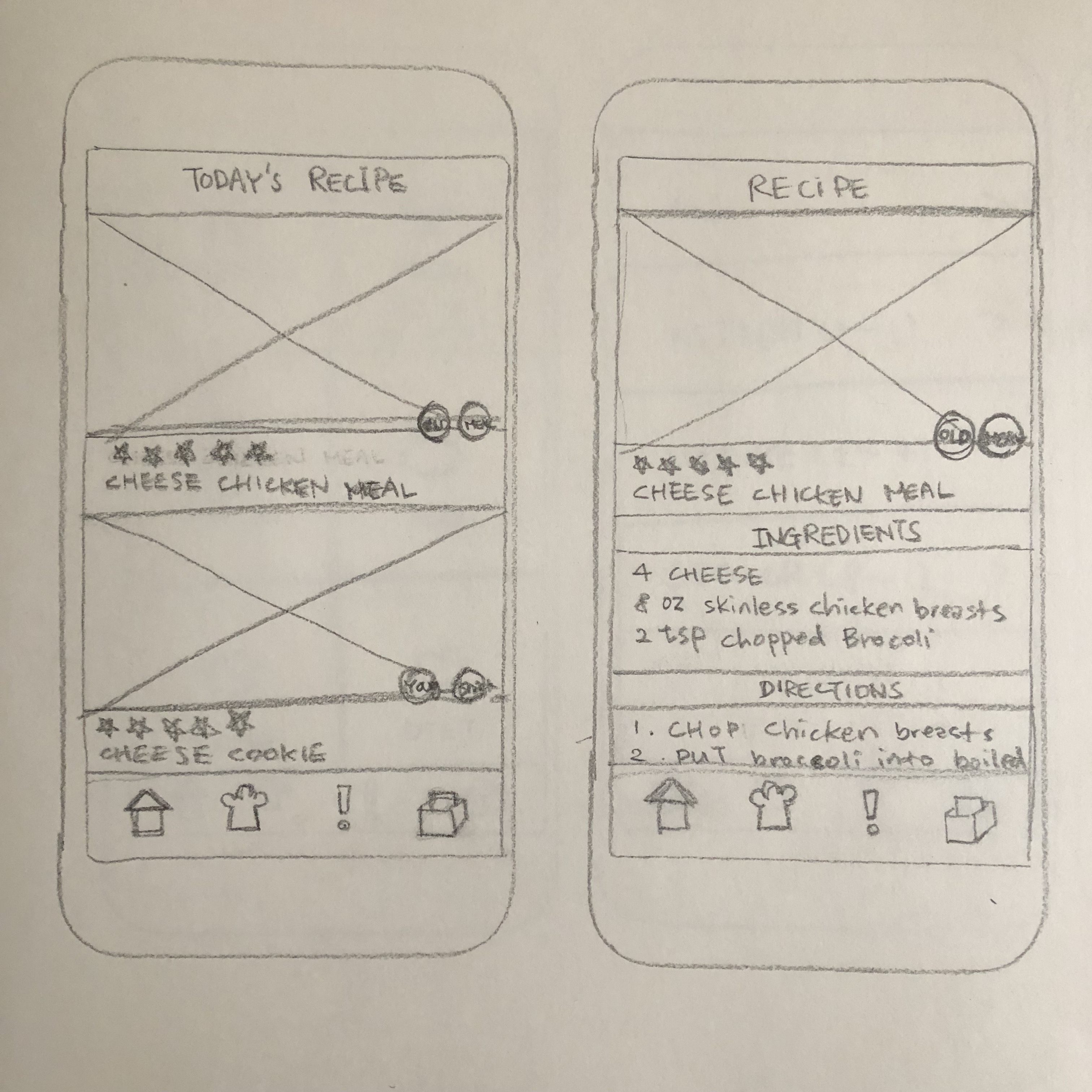
The APP is originally designed to immediately enter the page of capturing dish photo after logging in. Some users think it’s kind of inconsiderable for a dish recommendation APP to start camera function at the very beginning (Usually filter application does). It might be more reasonable to enter the “Expo” page, where dish photos are displayed when users first enter the APP. Then they could decide whether touching the camera button to upload photos, or just having a random glance.


Currently, the camera is designed as the index page, which might be better if replaced by the photo display page.


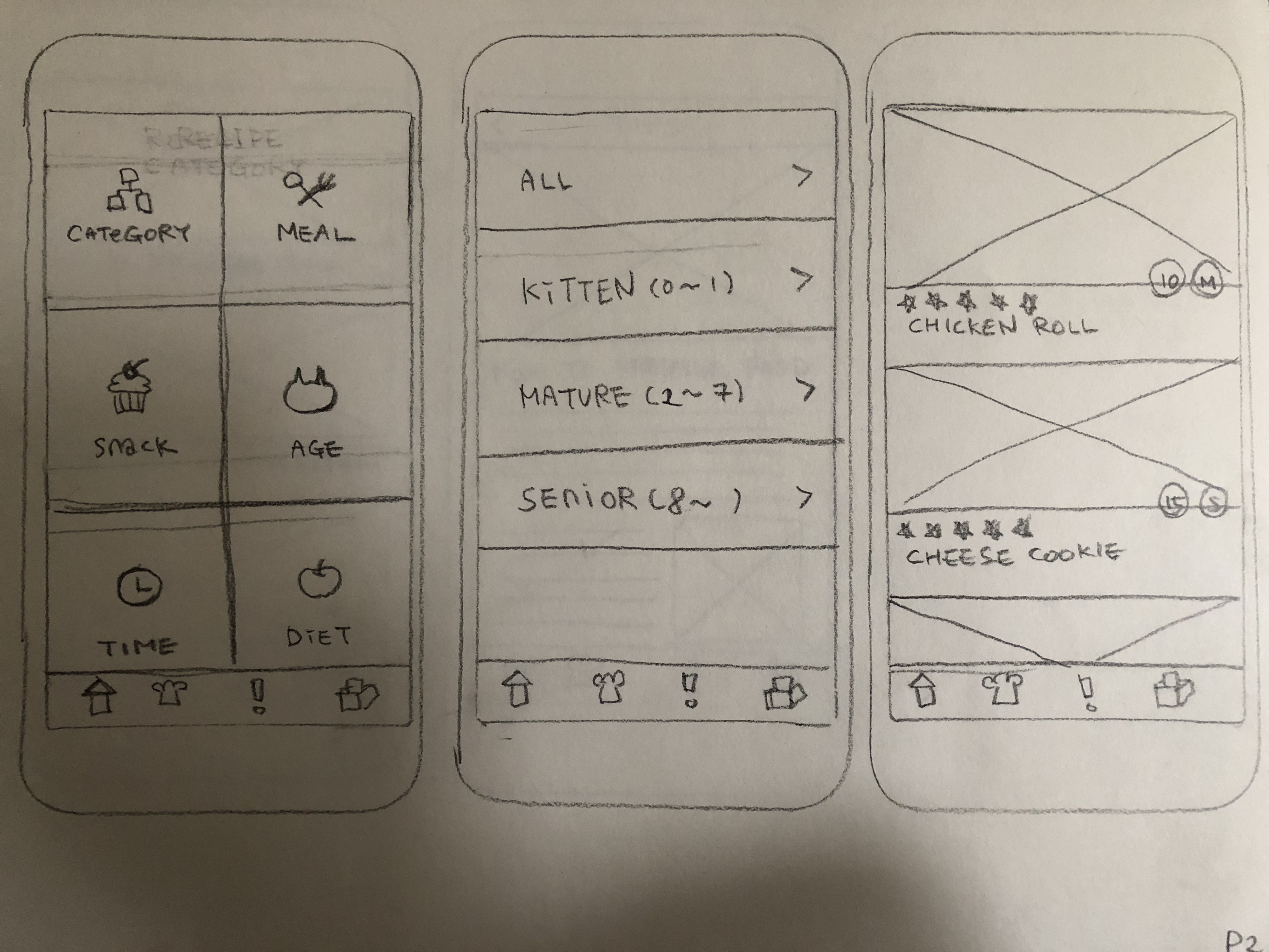
2 – Imprecision of categorizing in filter descriptions

In the filter page where users select choices to screen out their favorite kinds of dishes, the users gave feedback that the descriptions are not precise, which causes misunderstanding.

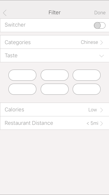
For example, the description “categories” is easily interpreted as terms like “breakfast”, “dessert”, “drink”… On the other hand, if the dish is categorized by cultures and countries, it would be better to use the word “Nationality”. And the description of calories is also not reasonable to simply use the term “high” or “low” without the specific number of the range. These are detailed problems but still worth considering.


3 – The unreasonable settings of “All Posts”


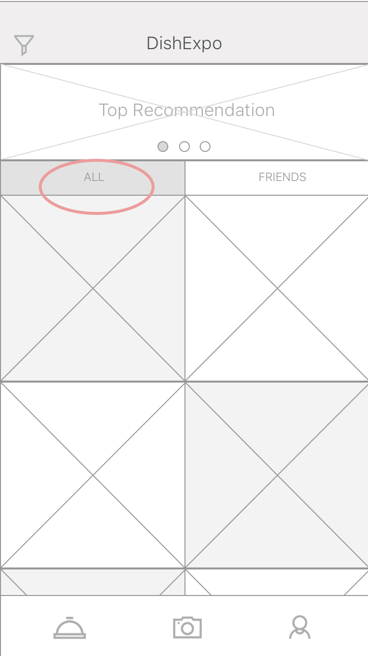
In the “Expo” page (currently defined as the index page), I created a segmented bar and separated the posts into the “all” tab, which includes all the current users’ photo upload, and the “friends” tab, which only shows the photos of connected users. However, there would be a huge amount of information refresh for displaying posts from millions of online users, which would definitely cause a mass flow and challenge the capability of the backend system. Also, users do not tend to see the photos which have little connections to them.

It might be better if the first tab is displayed based on location, showing the users the photos from nearby restaurants. The location-based recommendation could be more practical and build up the solid connections between users and information in this case.

Wireframe 2.0

APP Map 2.0

Week2- Kelsey (Yue Yu)

  • Note 2-3 user insights that you learned from paper prototyping

1:country selections and calendar is too small

2: The saved menu should exchange the position with current menu.The Current menu is important and it’s should in the tab-bar.

3: Add a remind interface to ask people if they want to generate a new plan and covered the original one during a week.


Week2 wireframe

WK1_Yin Hu

Three things I didn’t know about HIG

  1. Navigation: Hierarchical Navigation, Flat Navigation, Content-Driven or Experience-Driven Navigation. I didn’t consider much about the types of navigations. This helps me to analyze the information architecture.
  2. 3D touch: in the past, when I design interactions, I didn’t consider applying varying levels of pressure to the touchscreen to access additional functions.
  3. Layout Guides and Safe Area: it aids with the positioning, alignment, and spacing of content. I didn’t know safe areas and margins in UI.

About me

 My name is Yin Hu, currently a first-year student in MFA DT. I studied Mass Communication in the undergraduate study. And I have two internships in UI&UX area. One is at the user experience lab of Tongji University, in China, the other one is at an internet company. I want to further study UI&UX design more systematically in my graduate study, so I chose Designing for Usability the last semester.


App Map

Wireframe

wireframe


Week 1

3 things I didn’t know from the HIG

System capability – Multitasking (Slide Over, Split View, Picture in Picture) It lets people to quickly switch from one app to another at any time through a multitasking interface.

Layout Guides and Safe Area: Guide to leaving some margin space.
Every time I create a mobile digital prototype, it was not 100% fit to screen, sometimes it was oversized or looked ugly. Also, a great thing to know about was, how to deal with a screen when people play a game vertically.

Drag and Drop function in new iOS: With a single finger, a user can move or duplicate selected photos, text, or other content by dragging the content from one location to another, then raising a finger to drop it. Never know about this function.

About me

Hello, I am Haemin Kwon. I am an interaction designer from Korea. I am interested in User experience design (UX research, sketches, wireframes, prototypes) and UI design.


User Flow


wireframe

Week1_Ting

Hello! This is Ting.

My background is Industrial Design with a year experience in exhibition design.

3 things I learn form IOS Human Interface Guideline is mostly about iPhone X:

1.Bolder navigation. To improve clarity and context when browsing and searching, apps can implement navigation bars that include large, bold titles.

2.Safe area layout guides. Adhering to the system’s safe area ensures appropriate insetting of content within layouts and prevents content from underlapping the status bar, navigation bar, toolbar, and tab bar.

3.Minimize the use of modality. Generally, people prefer to interact with apps in nonlinear ways. Consider creating a modal context only when it’s critical to get someone’s attention, when a task must be completed or abandoned to continue using the app, or to save important data.

Week1_Qizhao(Eric)


My name is Qizhao Chen, you can call me Eric. I come from Guangzhou, China. I am a digital designer. I am interested in UI & UX design and want to develop more skills about them.

Three things I didn’t know from the Apple HIG:

  1. Modality:

    Modality creates focus by preventing people from doing other things until they complete a task or dismiss a message or view. Action sheets, alerts, and activity views provide modal experiences. When a modal view appears onscreen, the user must make a choice by tapping a button or otherwise exiting the modal experience.

  2. Auto Layout.

  3. Differences between Hierarchical Navigation and Flat Navigation.


Here is my app map:


Here is my wireframe:

Week 1 – Sara Birchard

About Me

I was born & raised in the East Village, just a few blocks away from Parsons. I studied psychology for my undergrad and after graduating, I took an immersive UX Design course at General Assembly. Since then, I have been doing freelance UX and have found myself primarily designing mobile apps.

3 things I didn’t know from the HIG

  1. Avoid permanently hiding the status bar. I never actually knew that it was an option to hide the status bar until I played the Animal Crossing game for iOS. I thought that it was a poor choice on their part because I forced me to leave the app to check the time. It makes sense that Apple would strongly advise against it but I never really thought about it until now.
  2. Custom Keyboards. I didn’t know that this was an option either. In all of the apps that I’ve helped design, it never even came up as a consideration. I’m sure that I’ve seen it before in some apps but just totally ignored the fact that it was different from Apple’s dark and light themes.
  3. App Icon Customization. This is also something that I didn’t know was possible. According to the HIG, you can provide a set of app icons within your app and allow the user to choose which one displays on their phone.

About the App

For my food app, I created an app that is essentially a social media platform for chefs to share recipes. It works similarly to Instagram in that you can follow chefs, discover new chefs, and even post as a chef yourself. This is the very rough framework for how the app will function.

App Map

Wireframes

#thursdayapps_Aim


Reigns Her Majesty 

It is a text adventure app that players have to make decisions for the queen during her reign to make her be alive as long as possible and when she dies to make the decision for the next reigning queen. I like the app because the player can explore the story through an experience like tinder, swiping left and right to approve and disapprove the person she has the make the decision on.

Week01 _jaeky Cheong


About Me

Hi! my name is Jaeky. I have 3D animation and special effects background. I have no experience with UI/UX design so I want to learn professional skills from class.

Three things I don’t know about HIG

  1. Layout Margin: I didn’t know there is hidden margin and I have to think about rounded corners.
  2. Provide a full-screen experience. I didn’t know the details about how to make a full-screen.
  3. Bars.  I learned that all the action bars have to be ‘verb’ when it’s a word

App Map

Wireframe