Prototype II

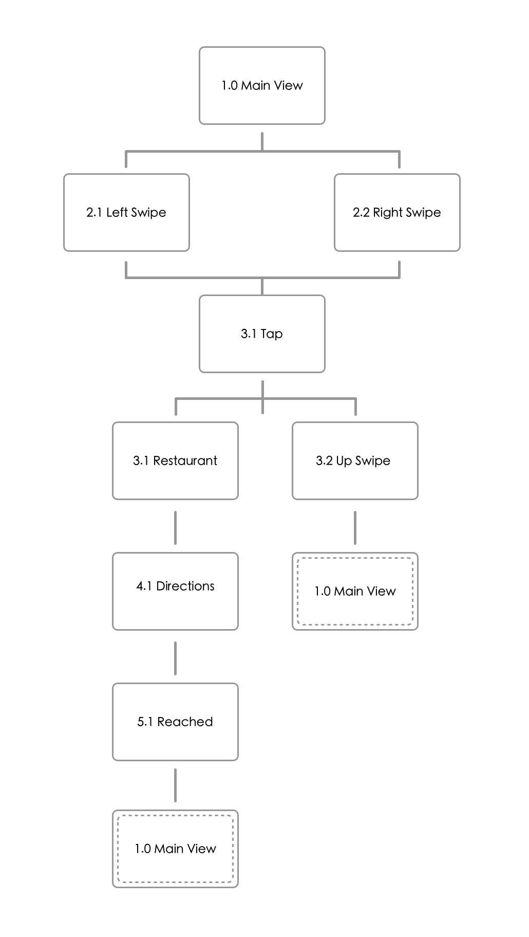
Based on the feedback from last week, several classmates suggested to reconsider the way in which cards are presented in the main view. In the second prototype, I took one of the suggestions to provide the user an overview of the previous and next card so the user can intuitively understand that he/she must slide in order to view the list.

Because of the nature of my app, I decided to not include as much text as possible. Therefore, I used icons to give the user a hint onto what to do to view details of the card. Again, the same method was employed in the detailed restaurant card. The user can now click either the X icon to go back or the Heart icon to continue to the address view.

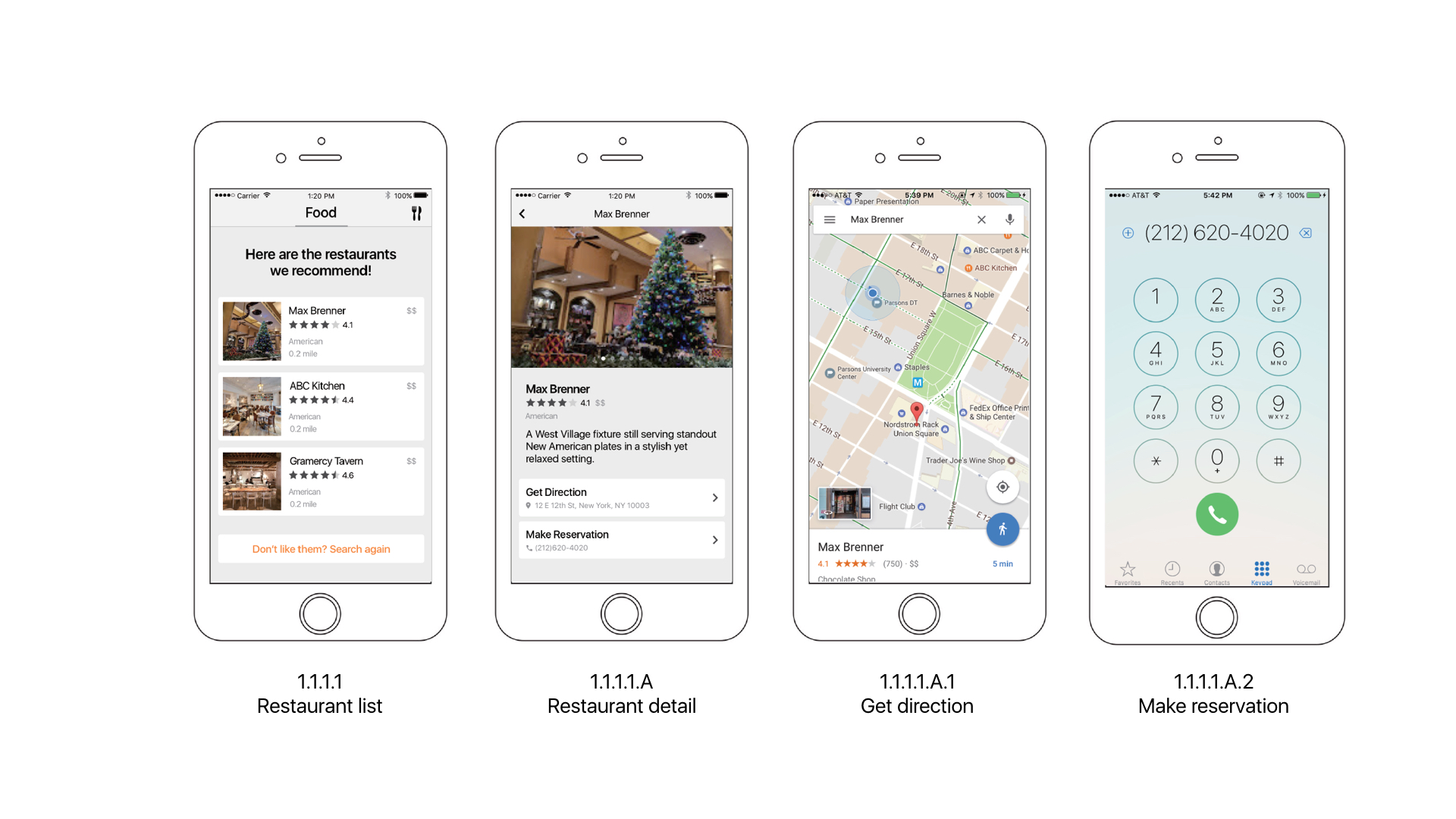
The feedback on the address view was that the direction rose was a confusing way to indicate address. Many users believed that despite being drunk, they would still be able to follow directions given in Google Map form. Therefore, I chose to replace the screen with Google Map. If the user were to not be able to read things clearly, he/she can still tap the Microphone button to hear audio instructions.

zhant293_prototype_ii

Week1_Liang

3 things I learned from Apple HIG:

Adjust levels automatically when necessary, but not the overall volume. Your app can adjust relative, independent volume levels to achieve a great mix of audio. However, the final output should always be governed by the system volume.

Explain the benefits of authentication and how to sign up for your service. If your app requires authentication, display a brief, friendly explanation on the login screen that describes the reasons for the requirement and its benefits. Also, remember that not everyone using your app has an account from the start. Make sure you explain how to get one, or provide a simple in-app way to sign up.

Briefly and precisely describe the operation to be undone or redone. The undo and redo alert title automatically includes a prefix of “Undo ” or “Redo ” (including the trailing space). You need to provide an additional word or two that describe what’s being undone or redone, to appear after this prefix. For example, you might create alert titles such as “Undo Name” or “Redo Address Change.”

APP Map:


Wireframes:

1.0

1.1

1.2

2.0

2.1

3.0

3.1


3 things I learn from the Apple HIG

1. Integration with Siri

Apps can integrate with Siri and let people use their voice to perform specific types of app-specific actions, such as making calls, sending messages, and starting workouts.

2. Expanded Notifications

You can enhance notifications with an expanded detail view that opens when people use 3D Touch to press your notification or swipe your notification down on an unlocked device. Use this view to give people quick access to more information about a notification and the ability to take immediate action without leaving their current context.

3. Peek and Pop

A peek lets people use 3D Touch to preview an item, such as a page, link, or file, in a view that appears temporarily above the current context. To peek at an item that supports this functionality, apply a little pressure to the item with your finger. Simply lift your finger to exit the peek. To open the item and see more detail, press a little harder until the item pops and fills the screen. In some peek views, you can swipe up to reveal related action buttons. For example, while peeking at a link in Safari, you can swipe up to reveal buttons for opening the link in the background, adding the link to your reading list, and copying the link.

For February 16, 2017 (previously Feb 9)

****Moved because of snow day****

  • Iterate on your app map and wireframes. Group 2 will present. Each person will have about 10 minutes to present and get feedback. Post your wireframe on the blog.
  • Both groups should iterate on their paper prototypes to test next week. When you post your designs, you will need to post 2 things that you changed due to things you learned observing users using your prototype.
  • Keep posting #thursdayapps. You need to post at least one before midterm, and one between midterm and the end of the semester.

Assignment I

Apple HIGG:

  1. Testing icons against different backgrounds
  2. Temporality hiding navigation bar to display full contents
  3. Make sure your interface works with a double-high status bar

Bio:

I was born in Guangzhou, China. At the age of 3 (or 2.5?), my parents and I moved to Iquique, Chile. I’ve lived there ever since, and consider Chile my home. In 2011, I came to New York to study Computer Science and Economics at Fordham University. I also spent a lot of time studying Theology, Philosophy and Medieval History to satisfy my school’s requirements (if you need a tour guide for the Cloisters, call me up!). After graduating, I worked as a UI/UX designer for DeepIntent and NYHRE. I am not familiar with many UI/UX terminologies and functionalities, which is why I am taking this course. My other interests include Physical Computing and Web Development (and Japanese food).

App Map:


Wireframe:

wireframe_tong

#thursdayapp

Love You To Bits

This iPhone game tells the story of a boy going out to space in search of his girlfriend. The visuals of this game are beautiful and the contrasting color between each screen are inspiring and relaxing to look at. Moreover, each world within the game contain different visuals that make the game less repetitive and makes the story more immersive.

http://loveyoutobitsgame.com