apple tv outline
Boil Monitor (TVOS) – Slides, Design
Here’s my slides of Boil Monitor for latest iteration:
Prototype:
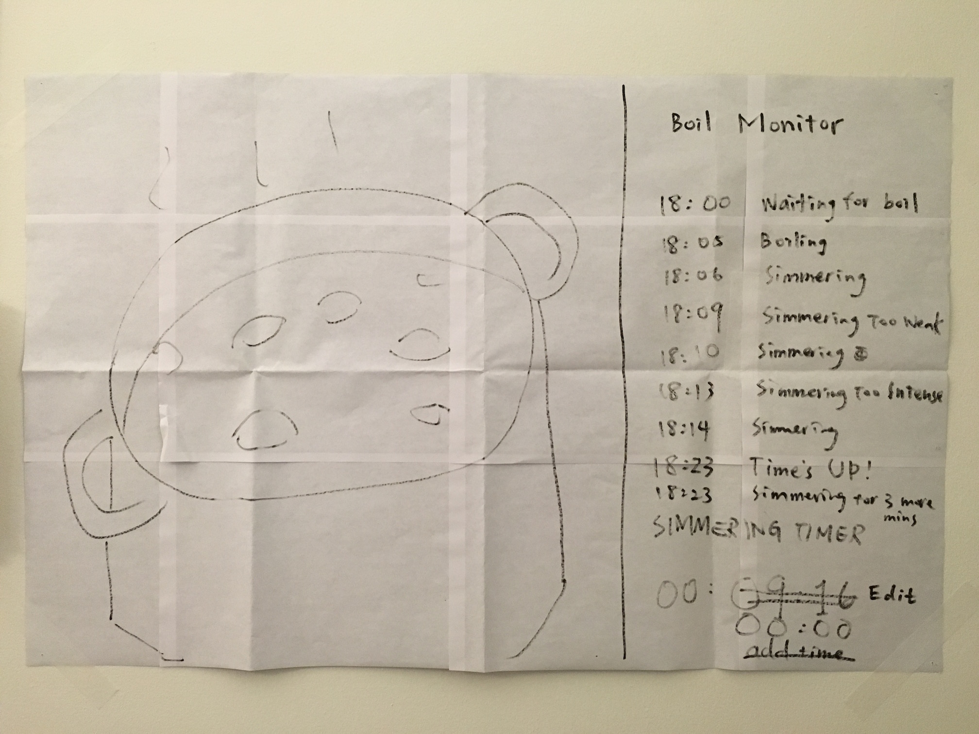
User insights:
- User hopes to start a timer near the pot (like on phone/watch) so he can accurately measure the time right after he adjusts the heat (walking back to the couch and then interacting with the TV would take ten to twenty seconds). But when he sits in front of the TV and the pot in monitor seems good, he want to edit the timer just on TV without going to kitchen.
- User doesn’t want to attach and detach the phone above a hot pot frequently (which increases chances the phone falls into the pot), so the function to edit/reset timer on another device like TV or watch is important.
- When user is watching TV using the picture in picture function to monitor the pot, he won’t switch back to the app if he doesn’t need to edit the timer.
- User wants to keep all the cooking status in app temporarily for reference, before the app goes back to initial view, even if he detaches the phone.
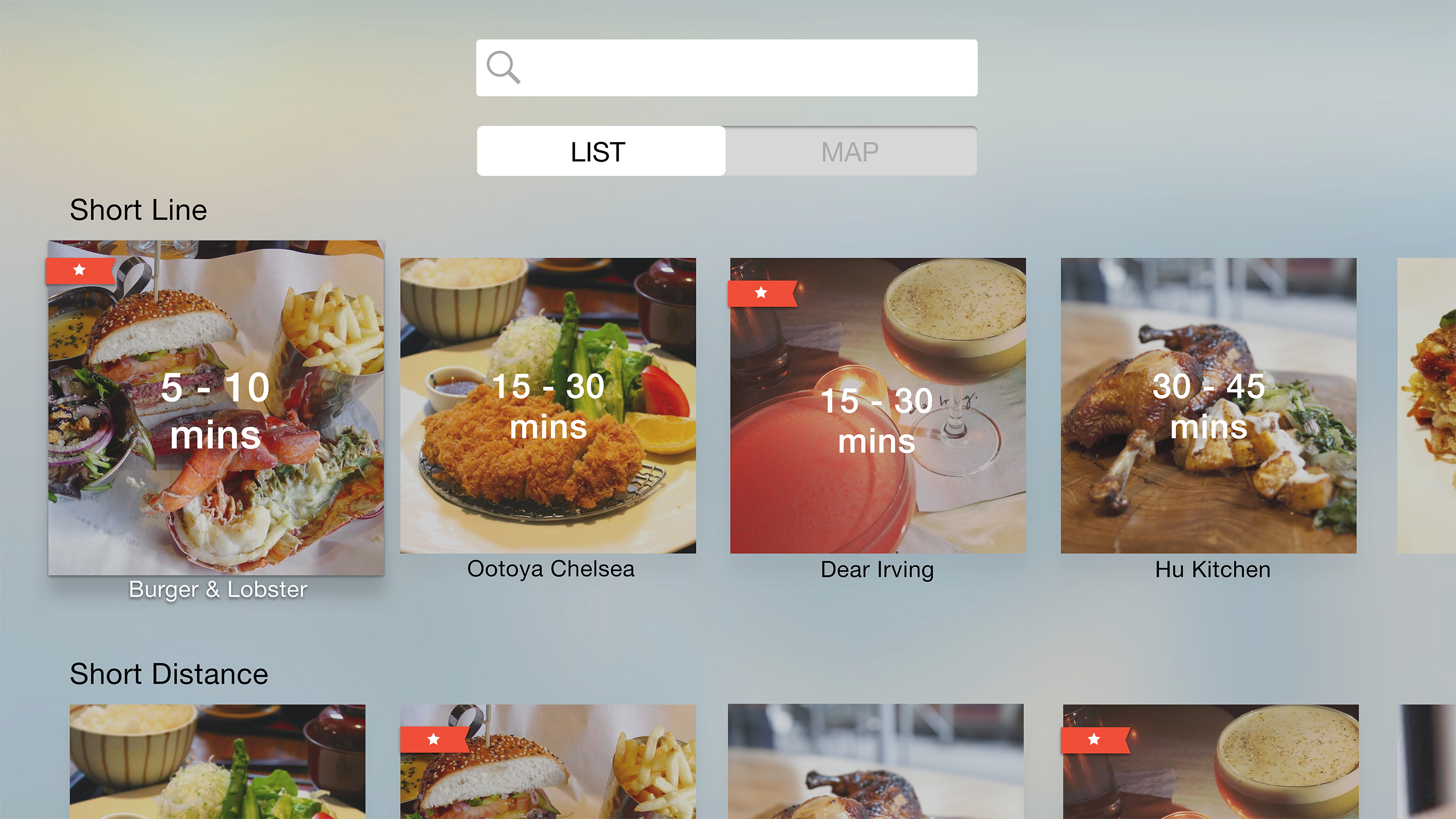
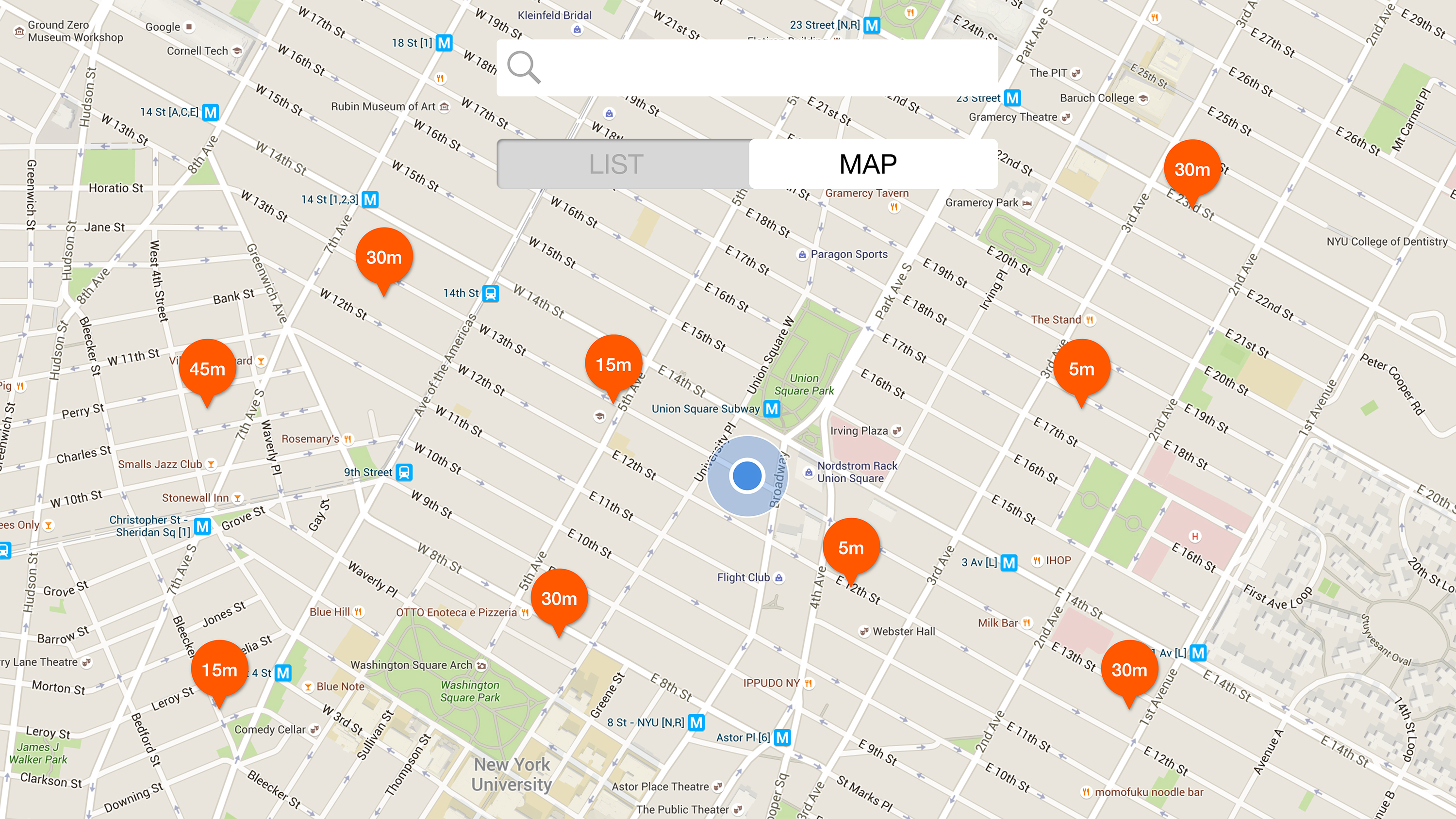
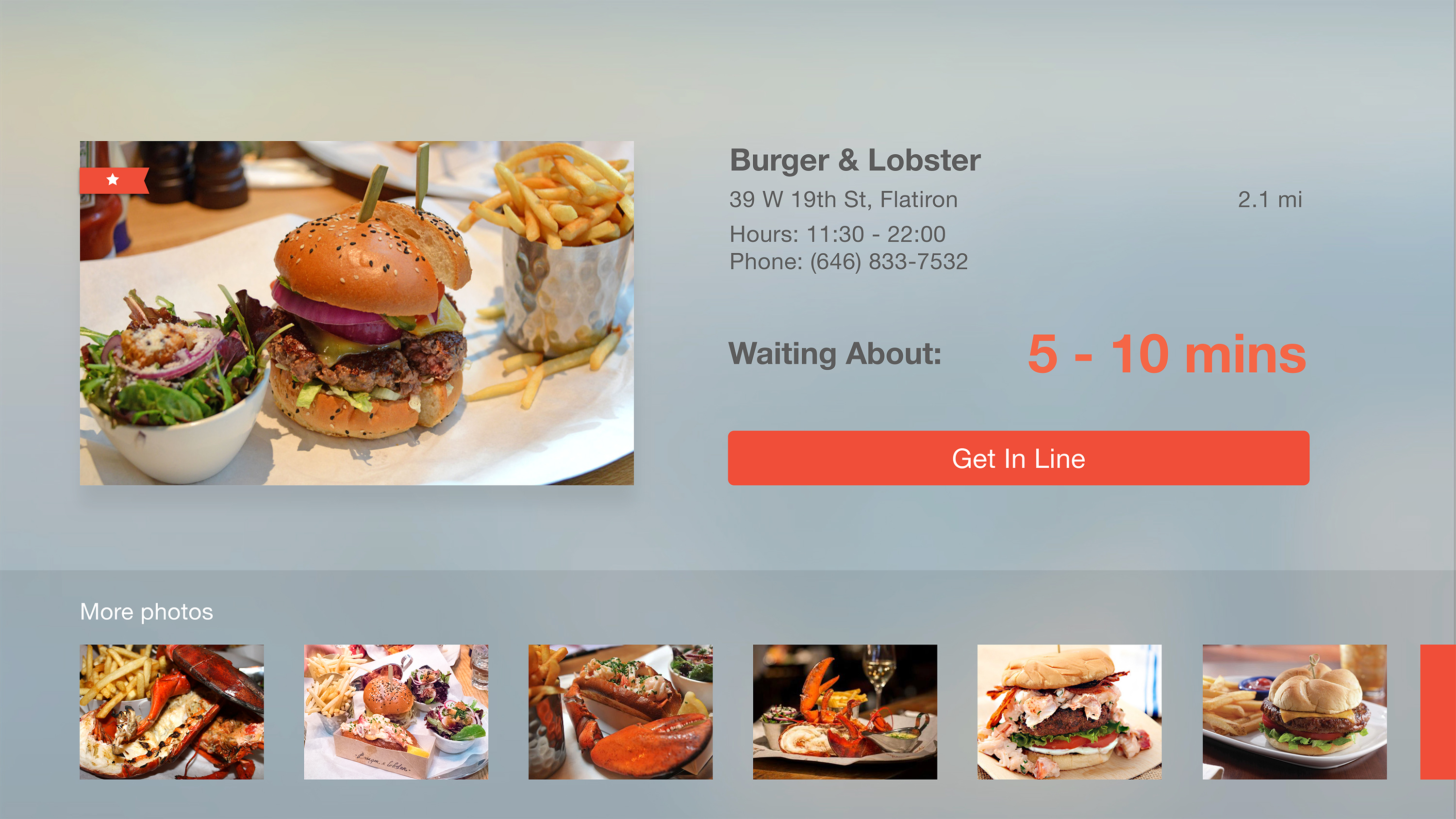
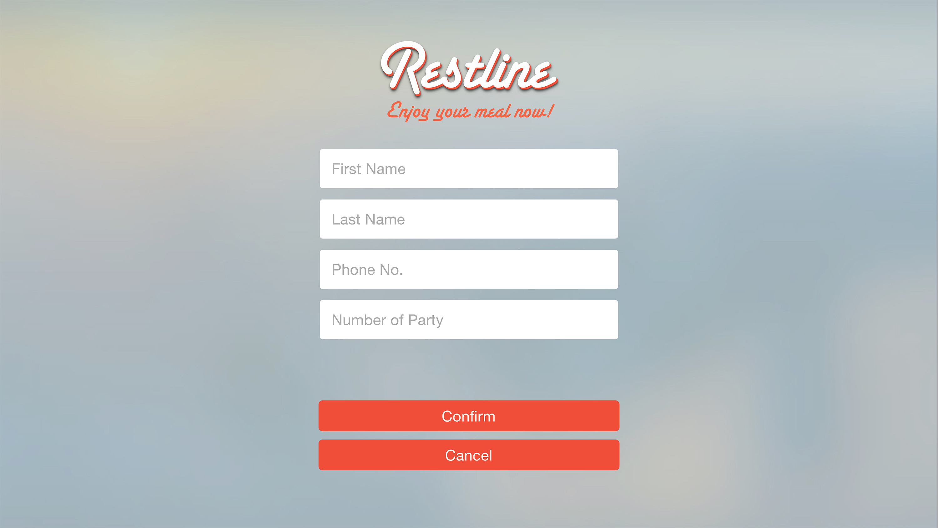
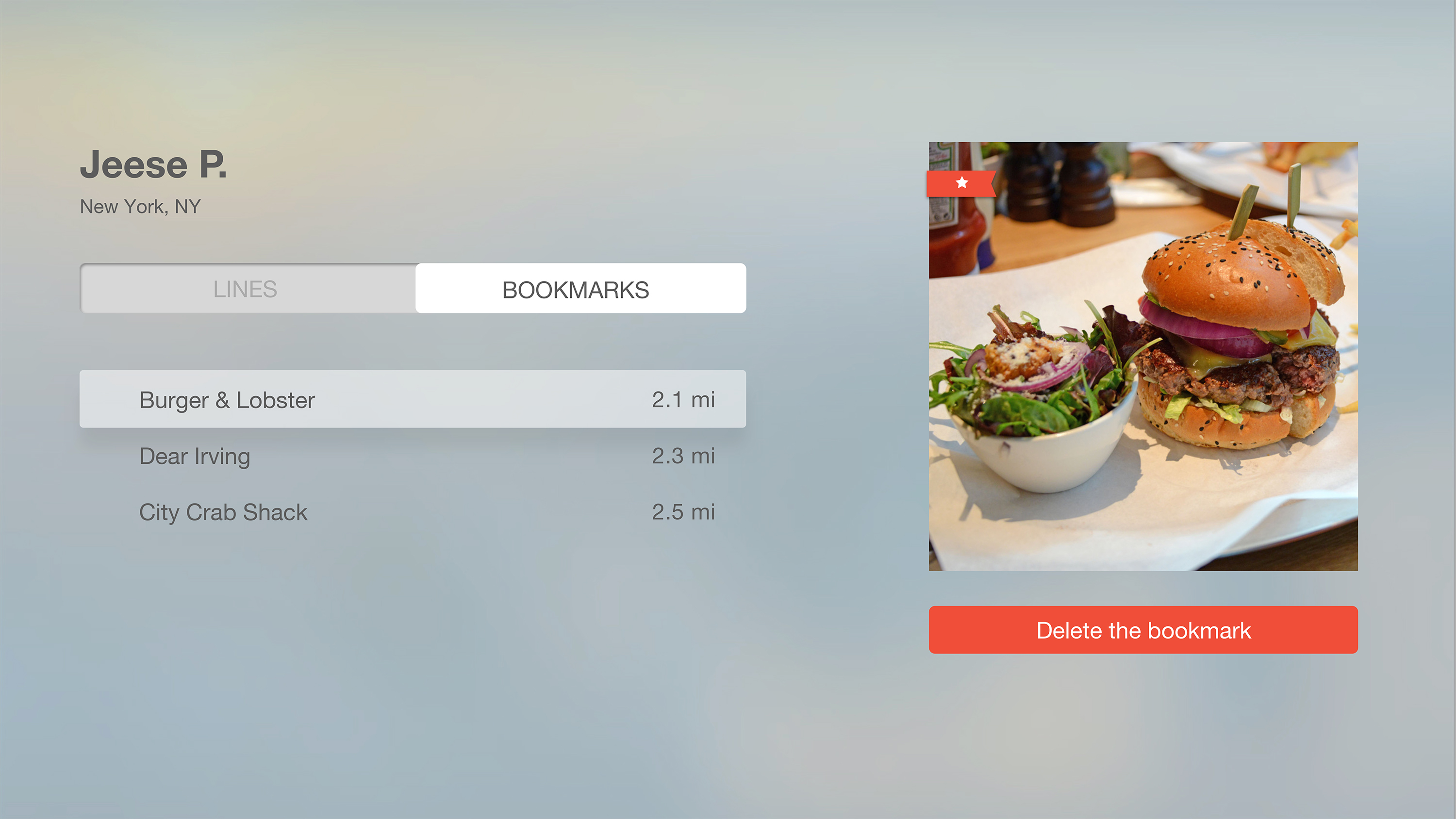
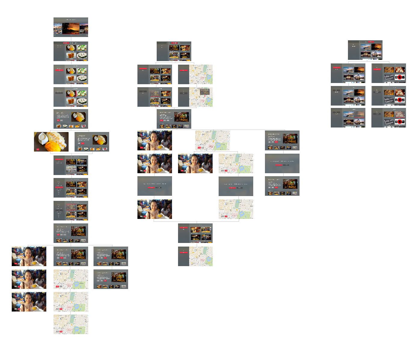
ProjectOne_“Restline”_tvOS_Version2


tvOS Concept Presentation & Paper Prototyping
Below you’ll find my early tvOS concept presentation, which was developed in response to the need for a version of my previous dietFinder iOS app for the Apple TV platform. Given its grounding in geolocation and mobility, the iOS app didn’t translate well conceptually to the latter platform, so a genuine rethinking was necessary. The new, tvOS app presents diet and lifestyle video content.
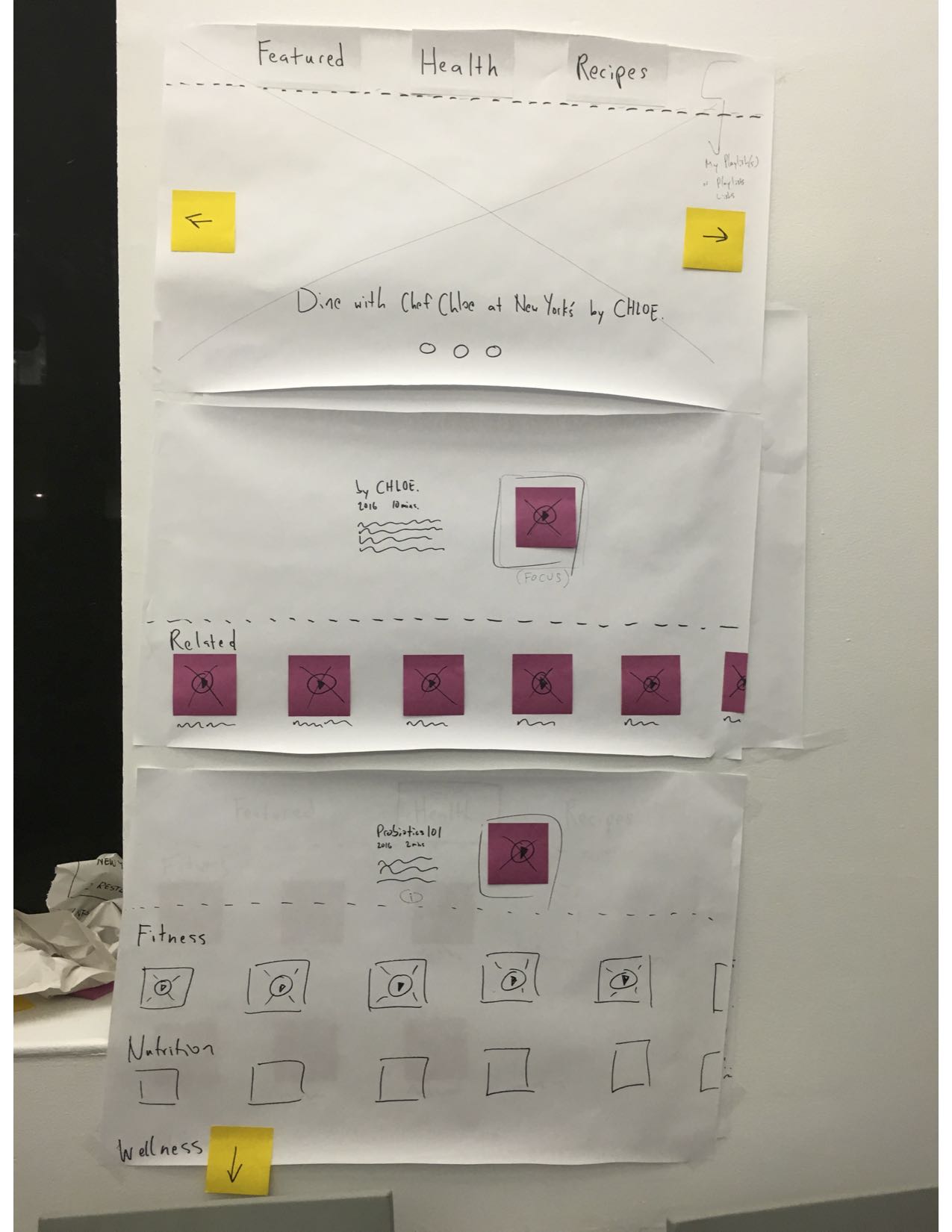
I continue to prototype to address concerns raised in user testing, e.g., what happens after the user views a video—i.e., is there an autoplay function or are there recommended videos. In addition, I am addressing a desire for making playlists. More updates soon!
Apple Tv Paper Prototyping in Class
 ‘
‘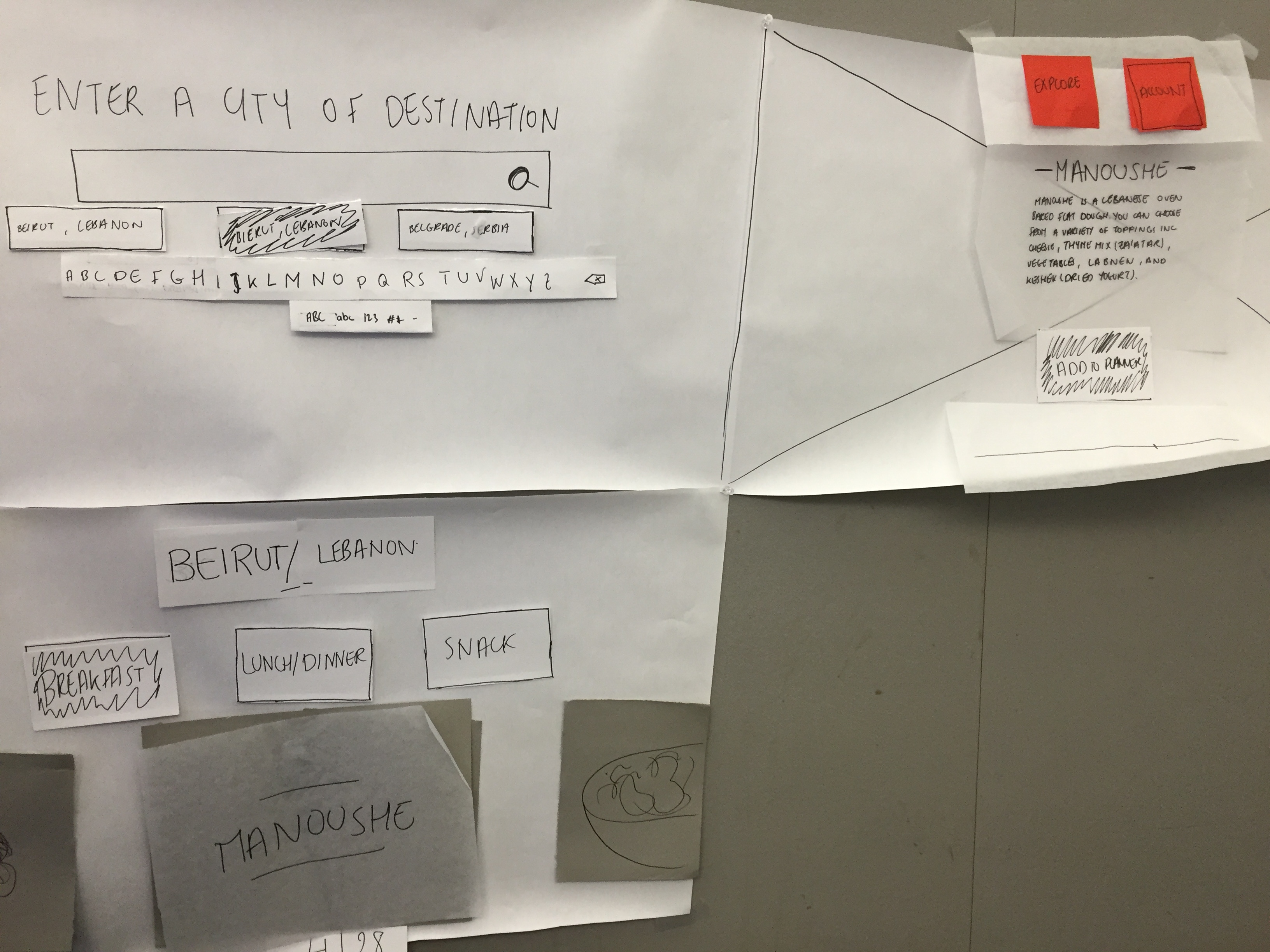
Paper prototyping for Food Scout on Apple TV was pretty useful. User testing in class, I realized I can enhance the interaction with the video. I wanted the information to show about the food item when the user pauses the video. But this step did not seem intuitive and instead, some information that fade out when the video starts playing could be an indication that there’s an interaction when paused. I will have to user test this aspect as well.
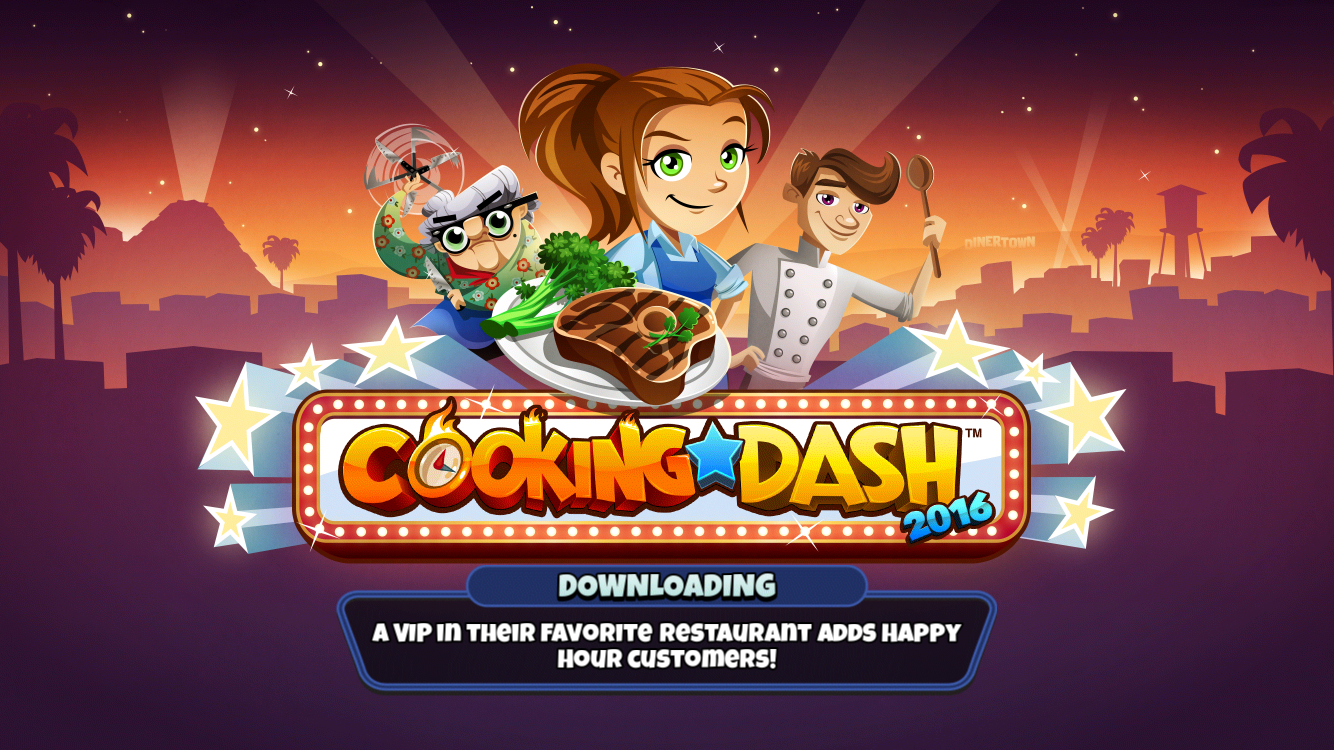
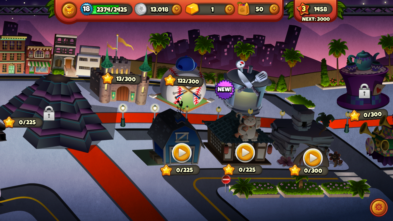
#thursdayplay / Cooking Dash
Cooking Dash is a game that I started playing recently. It would be really enjoyable for foodies or anyone who gets excited about cooking or eating in general. The goal of the game is to cook and serve all customers at a chosen restaurant. Each level is time based and has a goal to make a specific number of money. When all the levels are completed the user can open a new restaurant. I enjoyed playing the game for a while and got pretty hooked even though it can get a bit stressful. But later on it seemed that it is impossible to do upgrades without purchasing coins because the ones collected just from playing are not enough. Sometimes each level gives the player a certain recipe with instructions. The instructions never show again, so if the player forgets the recipe it is almost impossible to remember without going online.

Furu_TVOS_Iteration2
Updated AppMap:
Findings from user testings:
- Instead of having a “trash can” delete button, use a filled heart button that users can tap to unfavorite – consistent UI/interactions
- There can be only one thing in focus – so if there is one item highlighted in red, there cannot be another item highlighted
- Do not need “go to favorites” link – not necessary; users can just swipe down to view the tab bar and go straight to the “favorites”
- Need to find some other Icons for the pin on the map, and the pin shouldn’t be in red – again, only one item can be in focus
- There need to be some indicators that indicates the pictures below are from other restaurants/other types of cuisine
- A hierarchy under hierarchy is confusing
- Redundant filter page
Design:
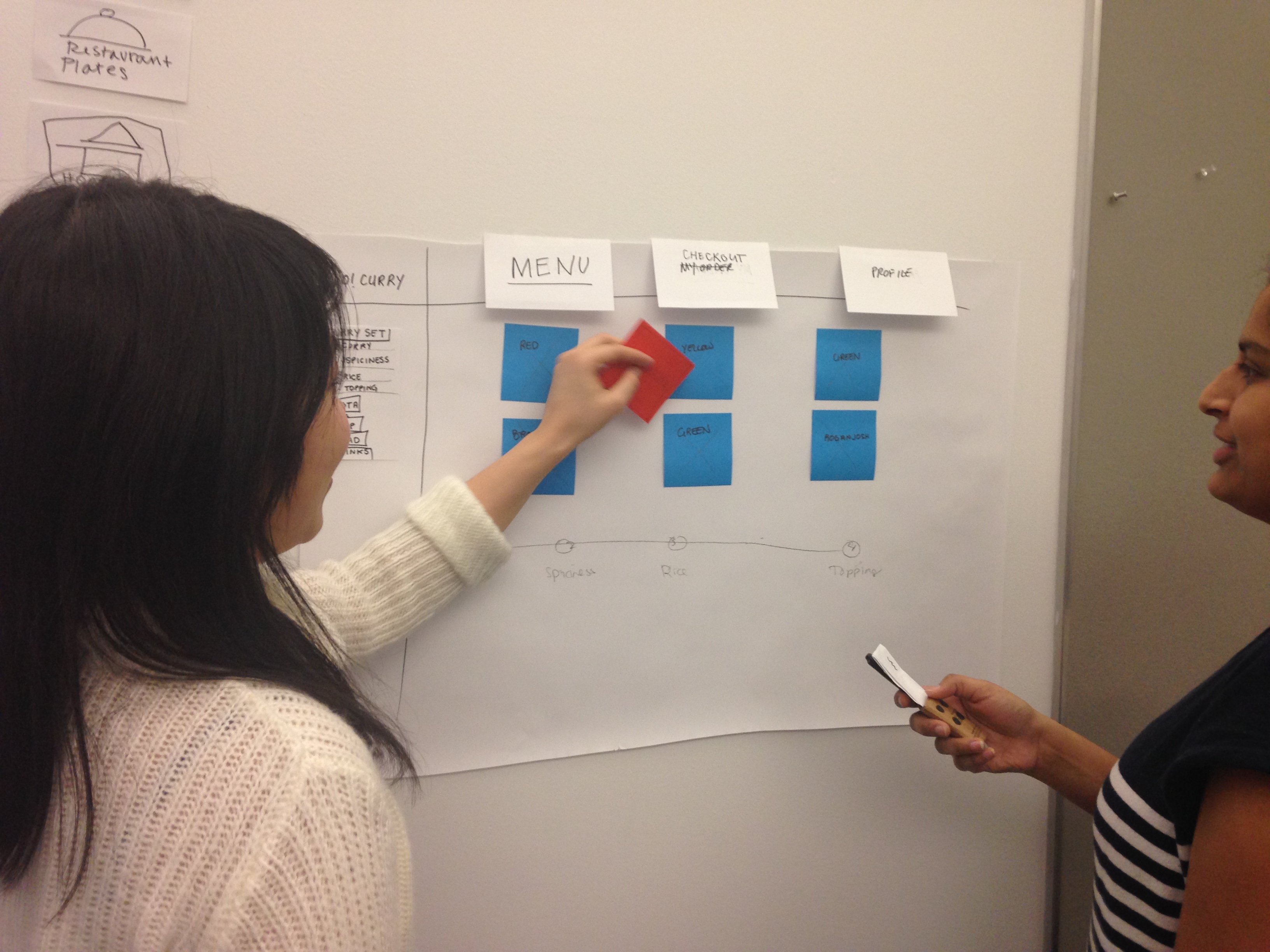
Apple tvOS Go!Curry App
Hey everyone!
I present to you Project 2: Go!Curry. Go! Go! Go!
I’m super stoked about this project as designing for the TV is a new experience for me. I used the Apple TV seldom times in Jakarta for watching YouTube videos with family, so it was refreshing to hold the remote and test it out in class. It not only gave me insight to potential users, but also really helped me envision contexts in which users would use this Go!Curry app.
For instance, I could imagine my family or friends sitting on the couch watching TV and wanting to order food because everyone was hangry. With that thought, I considered a feature that I want to continue exploring, (which I also encountered in the Chipotle iOS app), which is the ability to name your orders to ease the customer experience once the food arrives (“Don’t be hangry any longer! This is yours!”)
Although Venmo has made it much easier for us to split the bill, I would say that this scenario seems to be a hassle:
- You’re in your apartment with seven other friends, hangry and wanting to order food.
- “Let’s order food! What do you want?”
- You all order food on your app. You’re responsibile for asking your friend what they want. “Hey, do you want brown rice or white rice…? Chicken teriyaki, salmon teriyaki, sushi etc.? Anyone else?”
- A big sum is charged under your account.
- “We’ll Venmo you. Don’t worry”
- Open the venmo app to notify everyone that they owe you money.
- Delivery man comes in and hands your bags of food.
- It gets a bit messy trying to figure out who’s food belongs to which person. “Ok guys, is this yours? Wait… I think I ate someone else’s sushi. This is yours.”
- You’re too busy eating, time passes and everyone forgets to Venmo you.
- The next day, you text them saying, “Hey… remember… ?”
- Process is delayed.
Attached is my first attempt at two quick wire framing directions for translating my Go!Curry app into an Apple tvOS app.
Many preferred the simplicity of the first direction with regards to user flow. With the second direction, I was inspired by viewing my classmate, Sumi’s work. I was explored the functionality and how users would engage with the content on the screen, as also a viewing experience.
Next steps include:
- Explore a direction further in depth
- Utilizing design to indicate the user experience (highlighting what is in focus and what is not in focus)
- I assumed that one day we could use ApplePay to pay for our meal. Another option would be syncing that account information from your phone.
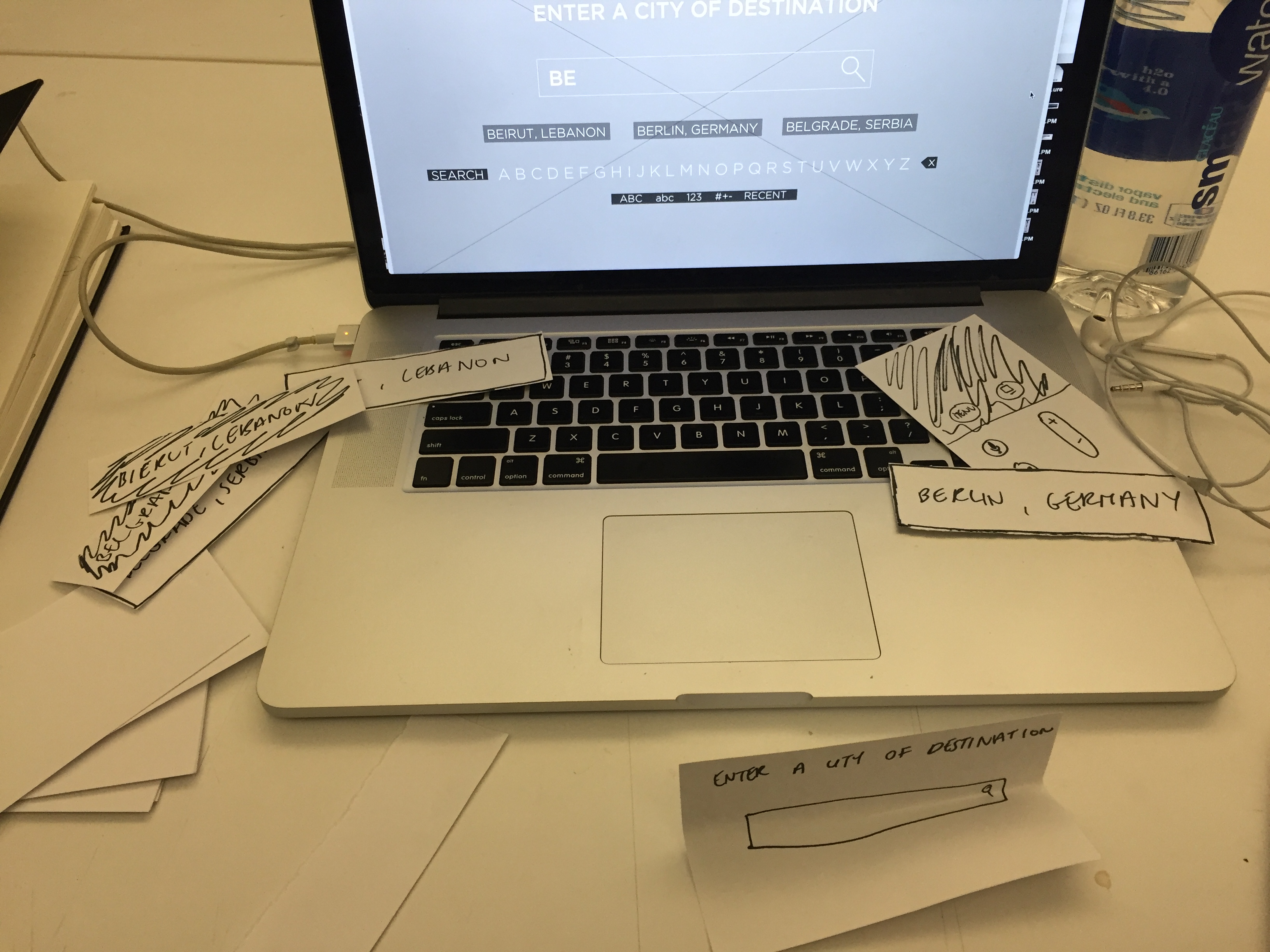
03.10.16_mobilemedia_appletvOSapp
After the paper prototyping exercise, I learned that:
- I want an Apple TV!
- A more efficient way of paper prototyping for the TV is preparing all the individual TV screen views that you can flip up, as the user navigates through it, rather than only using sticky notes. Things become less sticky after several user testings! Ha!
Notes: To be continued in next post along with updates….
Getting the hang of paper prototyping for Apple tvOS!

Boil Monitor (TVOS) – Slides, Wireframe
Here’s my slides of wireframe: